Intensive Outdoor Fitness Landing Page Template
The Grit outdoor boot camp free trial landing page template is built for fitness coaches and outdoor training brands ready to convert scrollers into session sign ups. It uses a scroll-reveal, quiz-driven layout to personalize content for each visitor, paired with a raw Organic Flow visual identity that feels earned, alive, and unmistakably outdoors.
by Rocket studio
Quick summary
Grit is a scroll reveal fitness landing page template designed for outdoor boot camp coaches and fitness professionals who want a landing page that earns trust before asking for a commitment. The layout personalizes content through a built-in quiz, uses raw social proof to convert visitors, and guides every scroll toward a single, frictionless free trial signup form.
Who this template is for
This fitness landing page template was built for a specific kind of coach or fitness business owner: one whose program happens outside, in real weather, with real effort. It speaks directly to the people drawn to that kind of training and the coaches brave enough to offer it.
- Personal trainer or boot camp coach running outdoor fitness classes in parks, fields, or trail settings
- A fitness business owner looking to drive sign ups for a free trial week without a polished gym aesthetic
- Fitness professionals who want a landing page that reflects grit, community, and results rather than stock-photo polish
What problem this template solves
Most fitness landing page designs struggle with the same core challenge: visitors arrive skeptical and leave without acting. A generic gym membership page does not speak to someone who has already abandoned a gym membership out of boredom. This template solves the problem of irrelevance by meeting each visitor exactly where their barrier is.
- Time-poor visitors lose interest when a landing page does not immediately show them a realistic, short session commitment
- Motivation-seekers need community and momentum, not just feature lists, to feel pulled toward a fitness program
- Beginners feel excluded by pages that assume experience; this template routes them to coach bios and movement context instead
What you get with this template
This is a complete, single-page fitness landing page built on a scroll-reveal progressive architecture. Every section loads as the visitor scrolls, building momentum the way a good warm-up does. The template gives you a landing page content structure that does the persuasion work automatically.
- A quiz-driven layout that reconfigures visible content based on the visitor's selected barrier, time, motivation, or experience
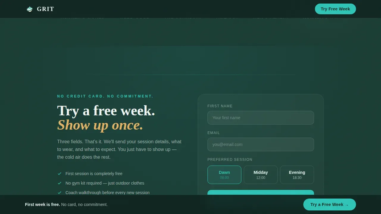
- A three-field signup form asking only for first name, email, and preferred session time, with no credit card required
- A secondary conversion path offering a free PDF park workout download to capture emails from visitors not yet ready to show up in person
Feature list
This template includes several purpose-built features that separate it from a standard fitness landing page template. Each one is grounded in what high converting landing pages actually need: clarity, momentum, and trust.
Quiz-Driven Page Personalization
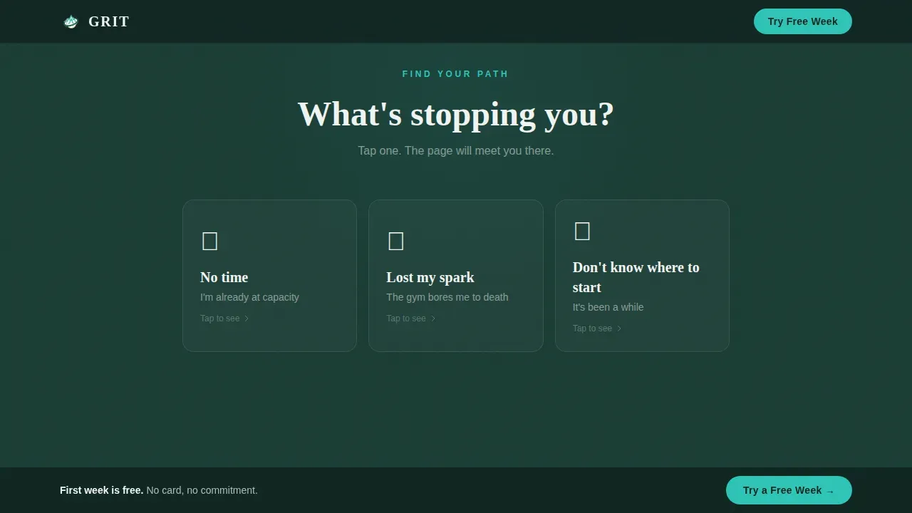
A single question, "What's stopping you?", appears as the visitor scrolls past the hero. Three illustrated answer cards rise into view covering time, motivation, and not knowing where to start. Selecting one reconfigures the rest of the landing page to show content matched to that barrier. This is one of the most effective ways to convert visitors who arrive with different objections, because the page feels like it is listening.
Scroll Reveal Progressive Disclosure
Every section of this fitness landing page reveals itself as the visitor scrolls, using CSS-first animations and Intersection Observer triggers. Content does not dump everything at once. It builds. This approach mirrors user behavior on mobile devices naturally and creates a sense of earned discovery that static layouts cannot replicate.
Testimonial Card Hero
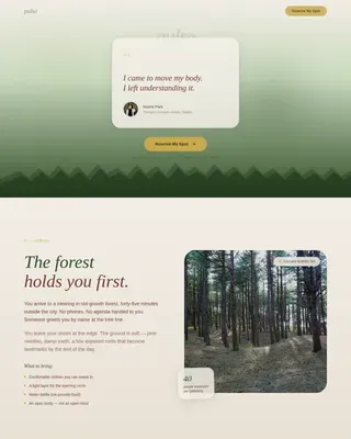
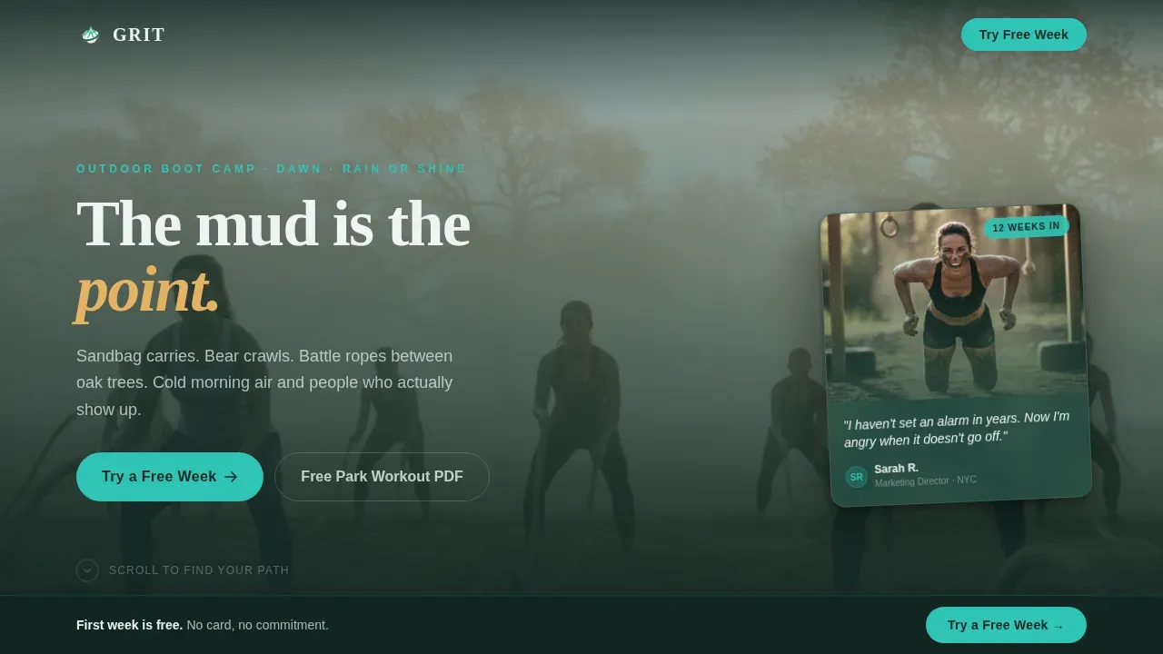
The hero image treatment is not a polished studio shot. It is a rain-speckled phone photo of a real member mid-burpee, slightly tilted, overlaid on a softly blurred parkland background. A short, raw sentence sits beneath their name and a "12 weeks in" label. This is a great example of social proof placed at maximum impact: before the visitor has read a single feature claim, they already believe.
Sticky Free Trial Call to Action Bar
Once the visitor scrolls past the third section, a sticky bottom bar appears carrying the primary "Try a Free Week" call to action. This prominent call to action follows the visitor without blocking content, keeping the conversion goal visible throughout the entire landing page experience.
Secondary PDF Download Path
Not every visitor is ready to show up in person. A secondary path offers a free downloadable park workout as a lead magnet. The signup form for this path captures the email address and enters the visitor into a nurture sequence. This dual-path design increases total sign ups from a single fitness landing page without splitting focus.
Organic Flow Visual Identity
The full Teal Catalyst color system is baked into every section. Deep forest floor backgrounds, electric teal buttons, sun-through-canopy gold accents on achievement moments, and morning fog white body text all work together as a visually appealing design that tells visitors immediately this is not a generic gym brand.
Page sections overview
| Section | Purpose |
|---|---|
| Hero Testimonial Card | Opens with raw social proof and a blurred parkland hero image to establish emotional credibility immediately |
| Quiz Barrier Selection | Presents three illustrated answer cards and reconfigures the page based on the visitor's chosen barrier |
| Dynamic Personalized Content | Reveals session breakdowns, community stories, or coach bios depending on the quiz answer selected |
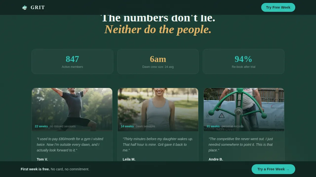
| Social Proof Community | Shows raw member photos, streak data, and specific outcome quotes to build trust before the ask |
| Free Trial Signup | Three-field signup form plus secondary PDF download path; no credit card, no commitment language |
| Footer | Linear single-row footer pattern with essential links and minimal distraction |
Design & branding system
The visual identity follows an Organic Flow theme using the Teal Catalyst color system. The palette is built to feel like a trail run at 6 a.m., blue-green and dewy, then a shaft of gold breaks through. Every color has a role, and that discipline gives the landing page design a professional layout that never feels corporate.
- Deep forest floor (#1A3C34) anchors all section backgrounds; electric teal (#2EC4B6) drives buttons, progress indicators, and interactive states; sun-through-canopy gold (#E4B363) highlights personal results and achievement moments; morning fog white (#F0F4F2) carries all body text
- Typography pairs Fraunces serif display headlines with DM Sans body text, creating a contrast between rawness and readability that suits both the fitness world tone and the practical landing page content needs
- Animations include staggered card entries, quiz reconfiguration transitions, and scroll-triggered reveals; all are CSS-first with no heavy JavaScript libraries required
Mobile & speed optimization
This fitness landing page was designed mobile-first, which reflects how most potential clients discover an outdoor boot camp: on their phone, early in the morning, through a social media post or ad. A fitness landing page built for mobile devices first naturally performs better across the full range of screen sizes.
- CSS-first animations and Intersection Observer-based scroll reveals keep the page feeling fast and responsive without relying on heavy front-end libraries
- The sticky bottom call to action bar and three-field signup form are both optimized for thumb-friendly tap zones and single-handed use on smaller screens
- High quality images and video testimonials are handled through softly blurred background treatments and phone-photo-style assets that load naturally without requiring heavy media files
How this template helps you convert
A well designed landing page for a fitness program does more than look good. It moves visitors toward a decision. This template uses a layered strategy to convert visitors at multiple points throughout the scroll, making it one of the more high converting landing pages in the outdoor fitness space.
- The quiz personalizes the experience immediately after the hero, which makes each visitor feel understood before they have read the signup form; an effective fitness landing page earns the click by solving for the objection first
- The three-field signup form removes every unnecessary barrier: no credit card, no gym equipment requirements listed, no commitment language; the clear call to action is "Try a Free Week," and the form delivers exactly that promise with minimal friction to drive sign ups
Other information about this template
This template sits at the intersection of several best practices drawn from real world examples of effective fitness landing page design. Understanding the broader context helps any fitness business or personal trainer make the most of what this layout offers.
A fitness landing page is a standalone web page designed specifically for a marketing or advertising campaign for a fitness product or service. As a standalone web page, it strips away navigation distractions and focuses every element on a single goal: capturing free trial signups. Tracking landing page performance through click-through and conversion rates is important, and this template is structured to make that tracking straightforward.
Social proof is crucial for building trust on fitness landing pages. Including client testimonials, success stories, and user generated content helps address the skepticism of first-time visitors. Customer testimonials presented in raw, authentic formats, like a rain-speckled phone photo and a single honest sentence, often outperform polished studio shots. Video testimonials and before-and-after photo formats can also be incorporated into the social proof section. A strong social proof section can be the deciding factor for visitors contemplating a free trial signup.
Creating fitness landing pages that convert requires more than a great hero image. Only half the battle is attracting the visitor. The other half is keeping them engaged through content that solves their actual problem. This template addresses that by routing visitors through personalized content paths based on their stated barrier. Fitness landing page examples from across the fitness industry show this approach works: pages like those from The Fort NYC that emphasize personalized experience, or FitOn Health's single-outcome focus, consistently outperform generic layouts. Crossrope's landing page addresses a common problem faced by users, connecting with their audience in the same way this quiz-driven layout does. Orangetheory Fitness uses vivid pictures and videos on their landing page to help visitors visualize the workout experience, which is mirrored here through the hero's cinematic photo treatment and raw member imagery.
Fitness landing page examples from well-known brands offer useful lessons. Kayla Itsines' ebook landing page features a bold headline and social proof to build trust with potential customers. Aaptiv's landing page features a bold image and a clear call to action to encourage sign ups for their audio-based workout programs. Daily Burn's landing page effectively uses visuals to demonstrate their programs and highlight key benefits. StrongLifts 5x5 uses a minimal design to highlight key details and calls to action. Ulisses Williams Jr.'s landing page effectively uses social proof to build credibility with potential clients. Peloton's landing page features dynamic images and a clear value proposition. Jillian Michaels' landing page incorporates animated visuals to convey energy. MyFitnessPal's landing page uses statistics to motivate users to start a free trial for their premium service. Nerd Fitness employs an informal tone to resonate with its audience, while LifePro fitness uses a bold headline with a unique selling proposition to attract visitors. These real life examples from the fitness world reinforce what this template already bakes in: a compelling unique value proposition, high quality images, and a clear call to action.
For fitness professionals looking to create landing pages without coding, tools like Moosend, Leadpages, and Unbounce offer drag and drop editor environments where a fitness landing page template like this one can be adapted quickly. Unbounce provides a landing page builder that allows users to create high converting pages without coding skills. Moosend offers a drag and drop landing page builder with ready-to-use templates for fitness businesses. Leadpages helps users create impactful fitness landing pages with customizable templates and no coding required. Rocket.new is an AI-powered platform that allows users to build production-ready apps and websites from natural-language prompts, making it another option for fitness businesses exploring online training or marketing campaigns.
This template supports marketing campaigns targeting desk-bound professionals, new parents, and former athletes. It can also serve as a foundation for a personal training practice offering online training or hybrid fitness services alongside in-person sessions. A business owner in the fitness industry can use this layout to drive traffic from social media, search engines, or email campaigns and guide potential customers toward a single, clear decision: start a free trial today.
- The free version of this template includes all core sections and scroll-reveal behavior; a premium version with extended color and typography customization options may be available depending on the platform
- The landing page is built without gym equipment showcase sections, reflecting the outdoor boot camp context where no gym equipment is needed
- The signup form collects only three fields, minimizing friction while still capturing the data needed to follow up with potential clients
Theme
Organic Flow
Creative direction
Quiz & Personalize
Color system
Teal Catalyst
Style
Scroll Reveal (Progressive)
Direction
Freemium/Trial
Page Sections
Quiz-driven Page Personalization
Scroll Reveal Progressive Layout
Testimonial Card Hero
Sticky Free Trial Call to Action Bar
Dual Conversion Paths
Teal Catalyst Visual Identity System
Related questions
What makes this different from a standard fitness landing page template?
Does the free trial signup form require a credit card?
Can a personal trainer use this template for a solo outdoor fitness program?
How does the secondary PDF download path work?
Is this template suitable for social media marketing campaigns?