Modern & Landing Page Template
Compile is a hero-dominant landing page template built for paid engineering communities. It targets mid-career backend and full-stack developers ready to move from senior to staff-level roles. With a calm editorial layout, email-gated workshop previews, an interactive curriculum, and real member social proof, the page earns trust before asking for a subscription.
by Rocket studio
Quick summary
Compile is a landing page template for a paid technical community aimed at backend and full-stack engineers. The design follows a Healing Space visual identity with a Slate and Sky color system. The page flows from a full-bleed hero into a weekly rhythm section, real member profiles, a curriculum preview, and a single pricing card, all built to convert mid-career developers into paying members.
Who this template is for
This template is built for founders and community builders running paid developer education products. It is best suited for someone offering structured, async technical content to a professional engineering audience.
- Backend engineers or developer educators launching a paid membership
- Engineering leads building a structured learning resource for their team
- Community builders who want a calm, content-first page that earns trust before the sale
What problem this template solves
Mid-career engineers are overwhelmed by scattered tutorials, shallow content, and no clear path toward senior-to-staff progression. A generic landing page cannot carry the weight of that specific frustration. This template is designed to speak directly to that gap.
- Generic templates look like SaaS products, not learning communities
- Developer audiences distrust marketing language and need proof of teaching quality before subscribing
- Most membership pages lead with pricing before earning credibility with content
What you get with this template
You get a fully structured, hero-dominant landing page with every section pre-built and ready to customize. The layout is desktop-first with full mobile responsiveness and uses a defined typography and color system throughout.
- A full-bleed hero section with headline fade-in animation and dual call-to-action buttons
- An interactive curriculum accordion organized by engineering level, plus an email-gate modal for workshop preview access
- A bento-style member social proof section and a single centered pricing card with email call to action
Feature list
This template includes six pre-built section types and a cohesive visual and interaction system. Every component is grounded in the brief and built for a developer-education use case.
Full-Bleed Hero with Fade-In Headline
The hero opens with a full-width editorial photo of a developer at a clean wooden desk in morning light. The headline, set in bold DM Sans, fades in after a brief pause using a GSAP line reveal animation. Two call-to-action buttons sit below: a primary action to browse the current workshop and a secondary path to view the full curriculum.
Weekly Rhythm Layout
A three-column asymmetric schedule section communicates the community's regular cadence. Office hours, architecture teardowns, and async code review threads are each given their own column. The layout makes the membership feel like a place with a real weekly pulse, not a static content archive.
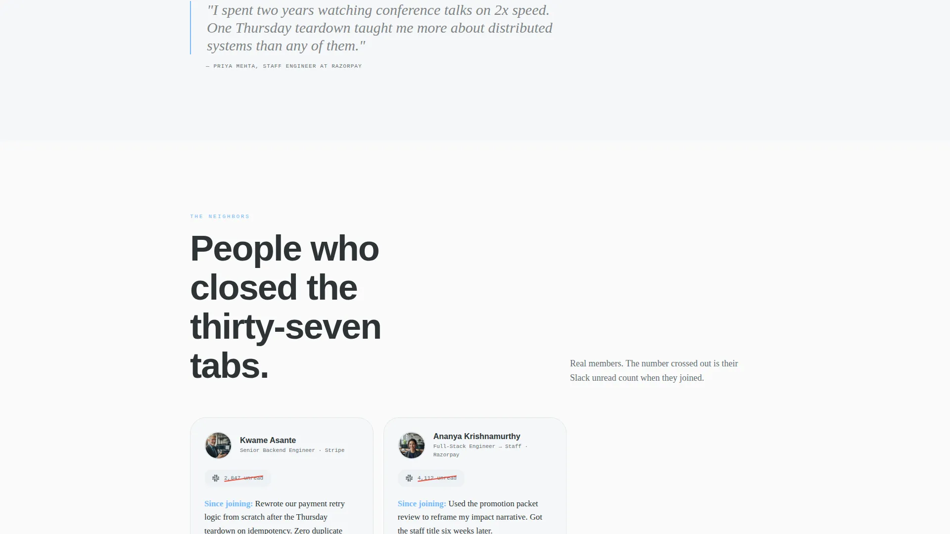
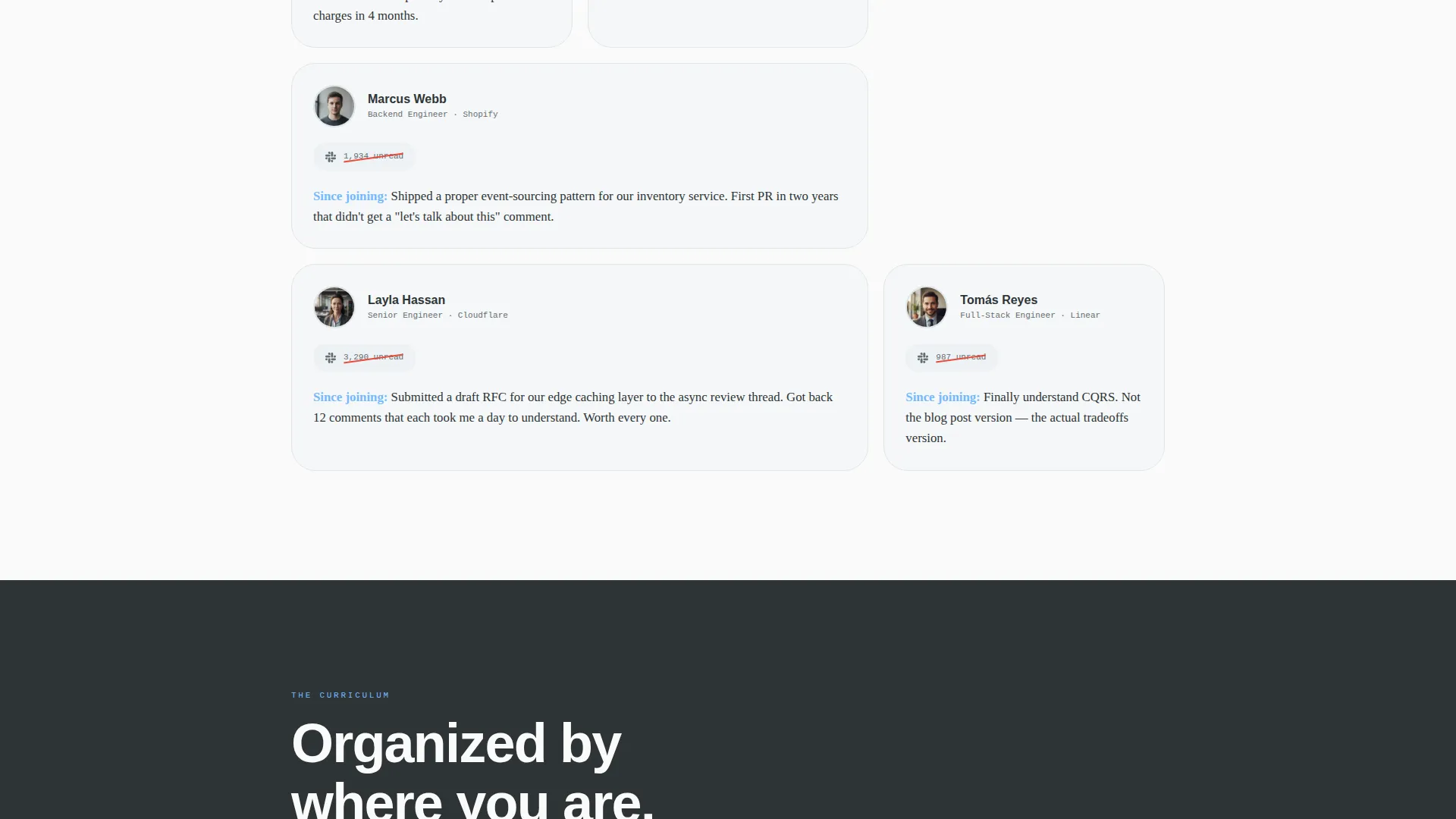
Bento Member Cards with Social Proof
The member section uses bento-style cards showing real member photos alongside a visual gag: a crossed-out count of unread Slack notifications replaced by a single sentence about what that member built since joining. This format converts abstract promises into specific, believable outcomes.
Interactive Curriculum Accordion
The curriculum preview is organized by engineering level rather than by topic. Visitors self-identify their level before they subscribe, which improves fit and reduces churn. One full lesson transcript is included as a free sample to demonstrate the teaching voice.
Email-Gate Modal for Workshop Access
The primary call to action links to a gated preview of the current week's technical deep-dive. Visitors unlock it by entering only an email address. The modal keeps friction low while capturing leads and giving prospects a direct experience of the content quality.
Single Centered Pricing Card
The pricing section uses one clean, centered card. The layout removes complexity and focuses the visitor on a single decision. The card includes an email call-to-action field so the conversion path stays consistent with the workshop gate established earlier in the page.
Page sections overview
| Section | Purpose |
|---|---|
| Hero fold | Introduce the community with editorial photo and dual call to action |
| Weekly Rhythm | Show the recurring schedule of office hours and async reviews |
| The Neighbors | Display member bento cards with specific transformation proof |
| Curriculum Preview | Let visitors self-identify level and read one free lesson |
| Pricing Card | Present a single membership option with email call to action |
| Footer | Linear single-row footer with essential links |
Design & branding system
The visual identity follows a Healing Space theme. Deep graphite slate dominates the upper fold and backgrounds, giving the page a calm, grounded feeling. Sky blue appears only on interactive elements and call-to-action buttons, making every actionable moment feel deliberate. Generous whitespace between sections treats each paragraph like it has room to breathe.
- Typography: DM Sans for bold headings, Crimson Text for body copy and member quotes, JetBrains Mono for any inline code references
- Colors: deep graphite slate (#2D3436) for backgrounds, soft cloud gray (#DFE6E9) for content surfaces, open-sky blue (#74B9FF) for buttons and highlights, pale dawn white (#FAFAFA) for spacing and breathing room
- Motion: low-to-medium animation using GSAP for the hero headline reveal, scroll-triggered fades for secondary sections, and a counter animation for member stats
Mobile & speed optimization
The template is built desktop-first to match the primary developer audience's browsing context, but every section is fully responsive and tested for mobile layouts. Interactive components like the curriculum accordion and email-gate modal adapt cleanly to smaller screens.
- Bento member cards reflow into a single-column stack on mobile without losing the crossed-out Slack count visual detail
- The curriculum accordion collapses to a full-width tap-friendly layout on touch devices
- Server Components handle static sections while Client Components manage interactive elements, keeping the interaction model efficient
How this template helps you convert
The page is built around a content-first trust sequence. Visitors receive real value before they see a price, which lowers the resistance that developer audiences typically bring to paid subscriptions.
- The email-gated workshop preview captures leads at the top of the funnel by offering a concrete piece of content, not a vague promise, in exchange for an email address.
- The free lesson transcript inside the curriculum section lets visitors evaluate the teaching voice directly, giving them enough to decide without giving away the full membership value.
Other information about this template
This template was designed for the specific intersection of developer education and paid community membership pages. It is built to serve a B2B and B2C hybrid audience, meaning it works for individual engineers signing up and for engineering leads evaluating it as a team resource.
- The Local and Neighborhood creative direction makes the scroll feel like exploring a familiar place, not reading a sales page
- The page uses English copy, USD pricing conventions, and US date formatting throughout
- The hero-dominant layout (90 percent hero weight, 10 percent supporting sections) keeps attention on the core value proposition before presenting supporting proof
- This template suits community platforms and async learning products built for professional developers at the senior-to-staff transition stage


Theme
Healing Space
Creative direction
Local & Neighborhood
Color system
Slate & Sky
Style
Hero-Dominant (90/10)
Direction
Content/Resource
Page Sections
Full-bleed Hero with Animated Headline
Email-gated Workshop Preview
Interactive Curriculum Accordion
Bento Member Social Proof Cards
Three-column Weekly Rhythm Section
Single Centered Pricing Card
Related questions
Who is this landing page template designed for?
Can I customize the curriculum section for my own content?
How does the email-gate modal work?
Do I need coding experience to edit this template?
Is this template suitable for a free community?


