Puzzles & Brain Teasers Store Careers Website Template
Enigma is a modular card grid landing page built for a print-on-demand store selling brain teasers, optical illusions, and lateral thinking puzzles on t-shirts, mugs, and art prints. A sunset gradient palette, animated flip cards, and a comparison-driven scroll guide curious shoppers from first glance to product click without any checkout friction.
by Rocket studio
Quick summary
Enigma is a single-page, card grid landing page designed for a print-on-demand shop selling wearable and hangable puzzles. The page uses a warm sunset gradient, animated product flip cards, and a three-row comparison journey to guide curious visitors straight to the product they want, handing them off to the storefront already engaged.
Who this template is for
This template is built for creative e-commerce founders who want to sell brain teaser merchandise without building a complex storefront from scratch. It works especially well when your goal is discovery and click-through rather than on-page checkout.
- Print-on-demand shop owners selling puzzle, optical illusion, or brain teaser products
- Gift retailers and niche apparel creators who want a visually bold, curiosity-driven landing page
- Math teachers, puzzle enthusiasts, or hobbyist founders turning lateral thinking concepts into physical goods
What problem this template solves
Most generic e-commerce templates flatten every product into the same grid. When your inventory has personality, a flat catalog kills the story before the visitor even scrolls. Enigma solves this by turning browsing into an experience, reshuffling the same products through different lenses so every type of buyer finds their way in.
- Visitors leave before connecting with a product because standard grids show no context or editorial angle
- Gift buyers cannot tell what is worth buying without a clear intent filter like price tier or difficulty level
- Print-on-demand shops struggle to convey product quality and tactile appeal through a static page
What you get with this template
You get a fully structured, single-page layout built around a comparison journey scroll pattern. Every section earns attention on its own while funneling curiosity toward a product click.
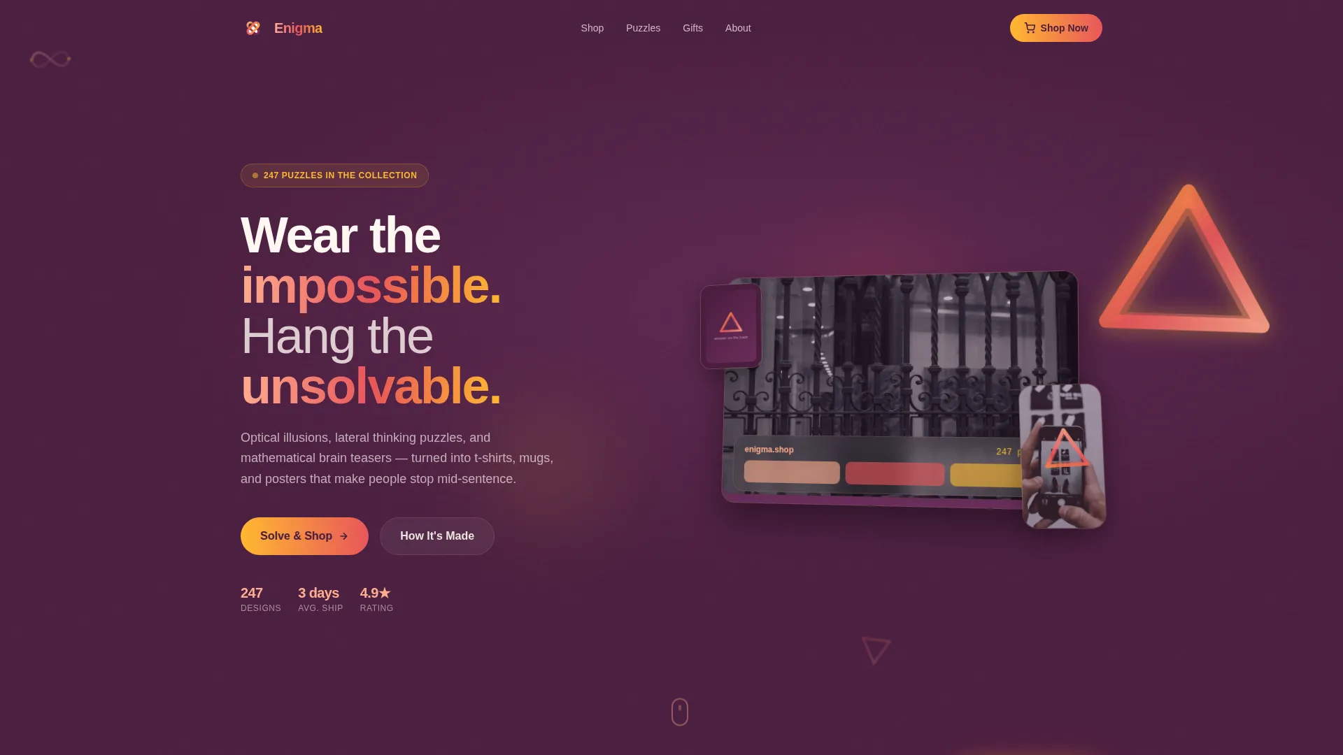
- A hero section with an isometric device mockup displaying products across a laptop, phone, and framed poster, with a looping animation on one impossible shape
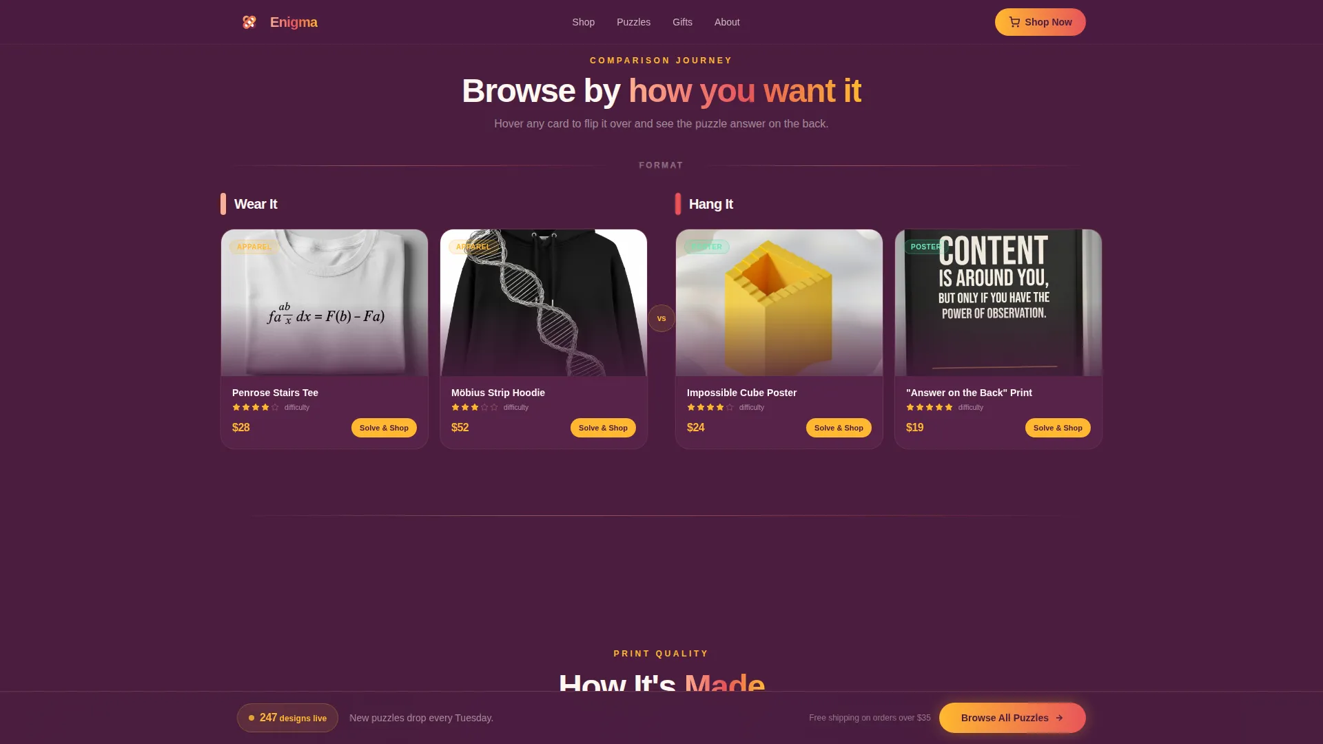
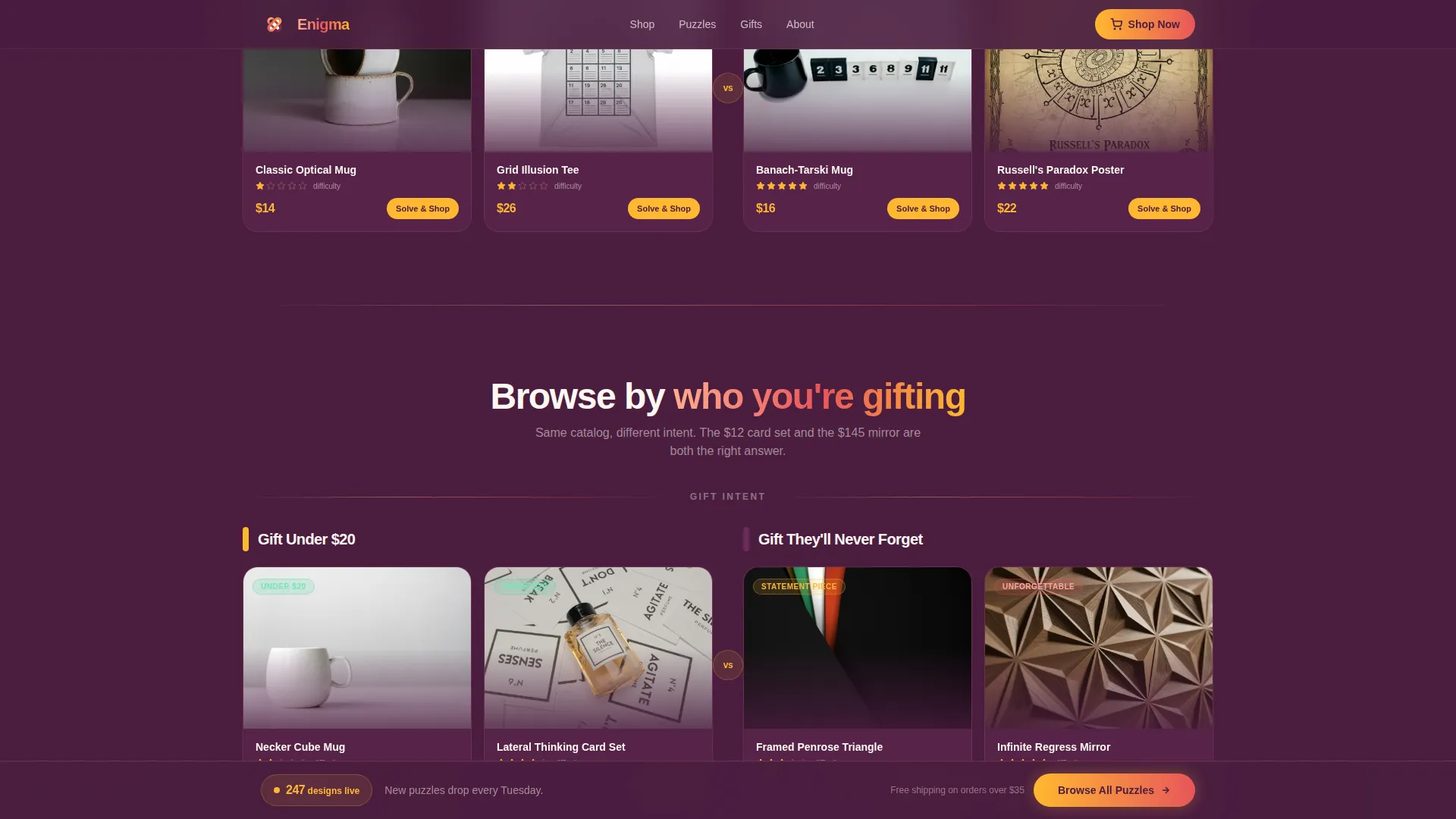
- Three comparison card rows covering apparel versus prints, difficulty tiers, and gift price intent, each card flipping on hover to reveal the puzzle answer on the reverse
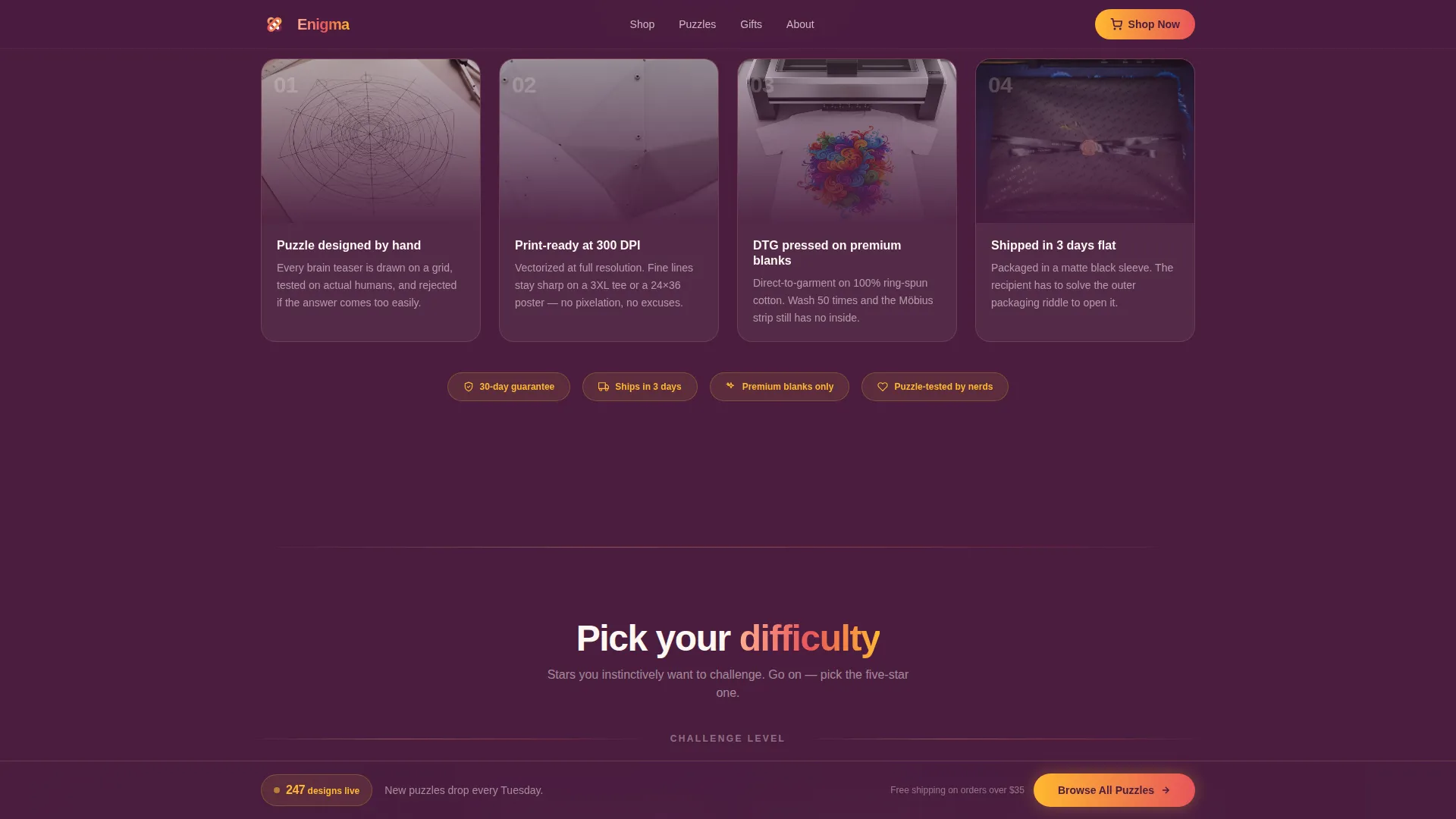
- A mid-page "How It's Made" quality strip, a "Puzzle of the Week" feature card with comment-style social proof, and a sticky bottom bar with a live design count and hero call to action
Feature list
This template delivers a tightly focused set of interactive components, each one grounded in the playful geometric brief.
Isometric Device Mockup Hero
The header arranges a laptop, phone, and framed poster in a slightly isometric composition. Each surface shows a different brain teaser product. The phone screen runs a subtle looping animation that rotates an impossible shape, setting the exploratory tone immediately.
Hover Flip Product Cards
Every product card in the comparison rows flips on hover to reveal the puzzle answer printed on the reverse side. The interaction mirrors the physical experience of turning over a product, making browsing feel like handling the actual merchandise.
Three-Row Comparison Journey
The scroll is organized into three editorial matchups: "Wear It versus. Hang It," "Easy versus. Diabolical," and "Gift Under $20 versus. Gift They'll Never Forget." Each row reframes the same catalog through a different buyer lens, increasing the chance that any visitor finds their entry point.
Puzzle of the Week Feature Card
A dedicated feature card spotlights one product with comment-style social proof showing visitors debating the puzzle answer. Star difficulty ratings appear alongside each card, giving shoppers an instinctive reason to pause and engage.
Sticky Bottom Bar with Live Count
A sticky bar anchored to the bottom of the viewport holds the primary "Browse All Puzzles" call to action alongside a live count of designs in the collection. It stays visible throughout the scroll so the path to the storefront is never more than one click away.
"How It's Made" Quality Strip
A mid-page strip shows print quality close-up imagery to build trust around the physical product. This section addresses the key hesitation print-on-demand shoppers have before clicking through to purchase.
Page sections overview
| Section | Purpose |
|---|---|
| Hero Device Mockup | Introduce the store with an isometric product display and looping animation |
| Wear It versus. Hang It | Compare apparel and print products side by side with hover flip cards |
| How It's Made | Show print quality close-ups to build trust in physical product quality |
| Easy versus. Diabolical | Sort products by difficulty tier with star ratings visitors want to challenge |
| Gift Under $20 versus. Gift They'll Never Forget | Reframe catalog through gift intent and price tier |
| Puzzle of the Week | Feature one product with comment-style social proof arguments |
| Sticky Bottom Bar | Keep "Browse All Puzzles" and live design count always visible |
| Footer | Single-row linear footer pattern |
Design & branding system
The visual identity follows a Playful Geometric theme grounded in a warm, saturated sunset gradient. The color palette moves from soft peach through deep coral into rich plum, with golden amber used for hover states and price tags. Typography pairs Cabinet Grotesk for headings with DM Sans for body copy, keeping the tone bold but readable.
- Color palette: peach (#FFAD8E) bleeding into coral (#E8555A), anchored by plum (#6B2D5B), sparked by amber (#FFB830) on interactive elements
- Typography: Cabinet Grotesk for display headings, DM Sans for body text and product descriptions
- Motion and interactivity: card flip animations on hover, floating geometric shapes, scroll reveal transitions, and a live-updating sticky bar
Mobile & speed optimization
The template is built desktop-first with a strong mobile fallback, meaning the layout prioritizes the full comparison grid on wide screens while adapting gracefully for smaller viewports. Interactive components like flip cards and the sticky bar remain functional on touch screens.
- Desktop-first layout with a responsive mobile fallback for all card grid rows
- Static server components handle non-interactive sections for reliable load performance; client components handle flip cards, live count, and sticky bar interactions
- Scroll reveal animations are scoped to individual section triggers so they do not block rendering of off-screen content
How this template helps you convert
Enigma is built around one goal: get a curious visitor from first scroll to a product page click. Every layout decision removes friction and adds forward momentum.
- The comparison journey structure gives every visitor type, gift buyer, puzzle fan, or casual browser, a clear path in without requiring search or navigation
- Each "Solve & Shop" button routes directly to the full product page, keeping the handoff clean and the visitor already primed with curiosity about that specific product
- The sticky bottom bar with a live design count creates persistent visibility for the main call to action, so the route to the storefront is never buried by scroll depth
Other information about this template
Enigma is a specialized landing page template built for the puzzles and brain teasers print-on-demand niche inside the broader retail and e-commerce category. It ships as a card grid modular layout, meaning individual card rows and feature sections can be rearranged or replaced to match your specific catalog without breaking the overall visual system.
- Template style: Card Grid (Modular), suitable for catalog-style landing pages with editorial framing
- Niche alignment: Puzzles and brain teasers store, lateral thinking merchandise, optical illusion gifts, mathematical brain teaser apparel
- Localization defaults: English language, USD pricing, US market framing
- No on-page checkout or cart component is included by design; the page routes all purchases to an external storefront product page
Theme
Playful Geometric
Creative direction
Comparison Journey
Color system
Sunset Gradient
Style
Card Grid (Modular)
Direction
Click-Through
Page Sections
Isometric Device Mockup Hero
Hover Flip Product Cards
Three-row Comparison Journey
Puzzle of the Week Feature Card
Sticky Bottom Bar with Live Count
How It's Made Quality Strip
Related questions
Does this template include a shopping cart or checkout?
Can I change the product categories in the comparison rows?
What kind of store works best with this template?
How does the Puzzle of the Week section work?
Is the sticky bottom bar visible throughout the full page scroll?



