Payroll & Benefits Platform Portfolio Website Template
The Enroll landing page template turns employee benefits chaos into a clean, conversion-focused experience. Built with a 50/50 split-screen layout, an animated enrollment ticker, a five-question interactive assessment, and three before/after case study panels, this template helps HR teams, People Ops leads, and CFOs show their workforce that choosing benefits no longer means drowning in PDFs and broker spreadsheets.
by Rocket studio
Quick summary
The Enroll landing page template is a high-impact, split-screen benefits marketplace landing page built for HR Tech and B2B SaaS products. It combines an animated digit-flip enrollment ticker, a case-study narrative proof stack, and a five-question Benefits Health Score quiz into one cohesive landing page. The template is desktop-first with full mobile responsiveness and targets People Ops, HR Directors, and CFOs at scaling companies.
Who this template is for
This landing page template was designed with a specific, focused target audience in mind. It speaks directly to the professionals who own benefits enrollment decisions at growing companies. If your product helps teams escape the annual chaos of renewal season, this template positions it with clarity and credibility.
- People Ops leads at Series B through D startups scaling past 80 employees who need a faster, cleaner enrollment process
- HR Directors at mid-market companies who spend renewal season buried in broker decks and cross-referenced spreadsheets
- CFOs who have discovered their broker has not renegotiated rates in three or more years and want a measurable alternative
What problem this template solves
Employee benefits enrollment is one of the most confusing experiences a company puts its people through. Most teams still rely on a broker portal, a shared spreadsheet, or a 47-page PDF renewal deck. Employees ask the same confused questions in Slack. HR spends weeks chasing completions. This landing page template solves the communication and conversion problem between a better platform and the buyers who desperately need it.
- Fragmented, PDF-driven enrollment leaves employees confused and HR chasing completion rates well past the deadline
- No clear comparison layer means employees cannot easily evaluate health plans, HSAs, commuter stipends, fertility coverage, or pet insurance side by side
- Weak social proof and unclear value proposition on existing pages leave visitors in the consideration phase without a reason to move forward
What you get with this template
This landing page template delivers a complete, launch-ready single-page layout built around proof, interactivity, and a decisive call to action. Every section is purpose-built to move a skeptical HR buyer from awareness to action without unnecessary friction. The layout guides visitors through a narrative that makes their current process feel obsolete and the product feel inevitable.
- Full 50/50 split-screen landing page structure with a dark midnight-teal left panel and a clean whiteboard right panel across every major section
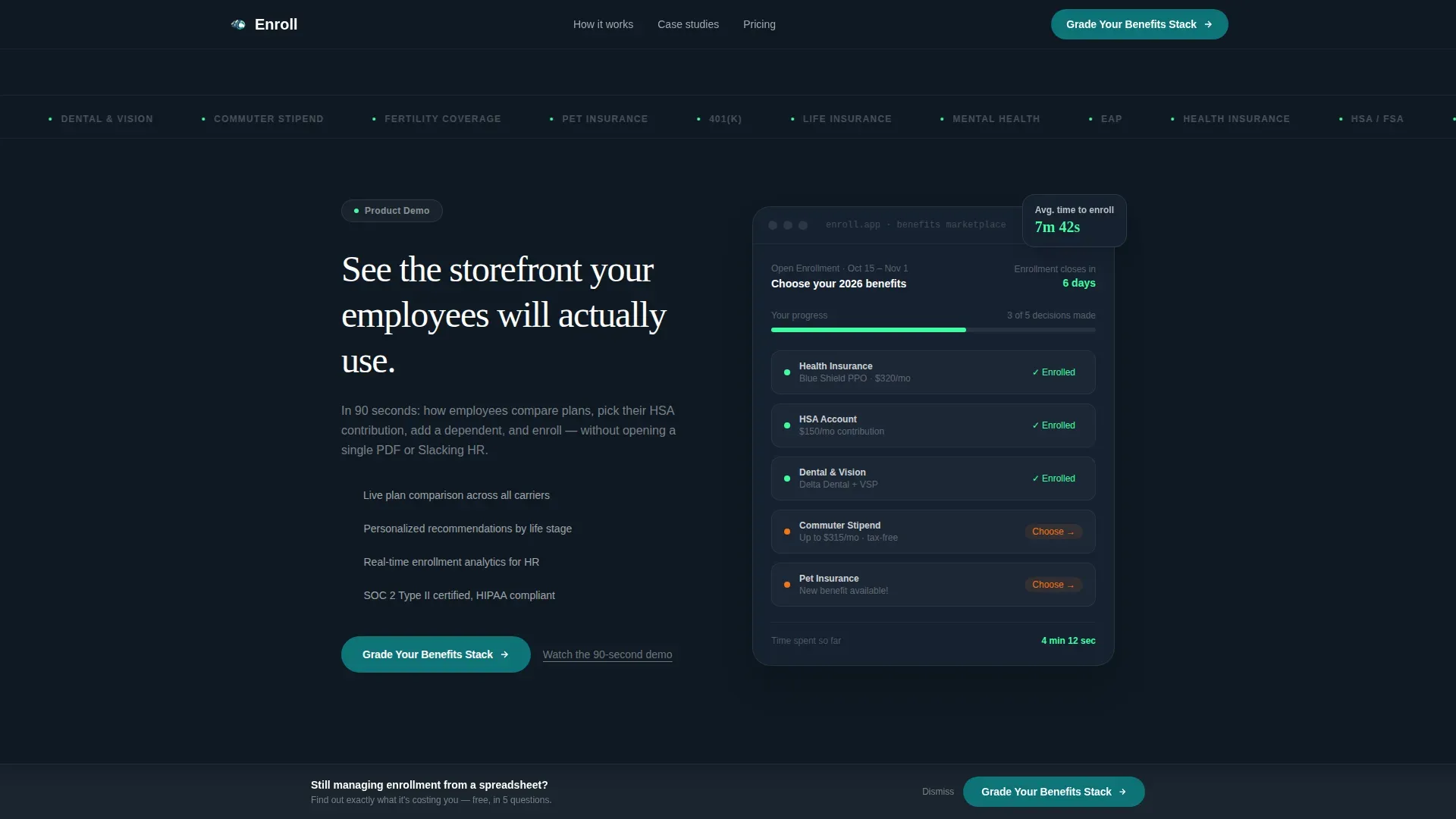
- Interactive five-question Benefits Health Score quiz that updates a live visual gauge in real time as visitors answer each question, delivering immediate perceived value before the final ask
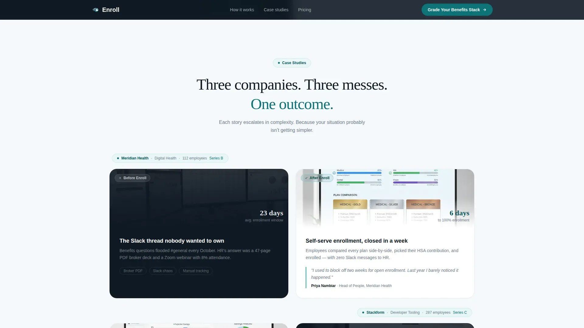
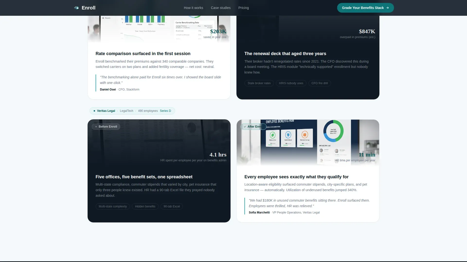
- Three before/after case study panels using named startup examples with escalating company size and complexity, each displaying enrollment completion rates and time-to-enroll metrics as social proof
Feature list
This landing page template is packed with purposeful, conversion-focused features. Each element serves a direct role in reducing friction, building trust, and moving visitors toward the primary call to action.
Animated Digit-Flip Enrollment Ticker
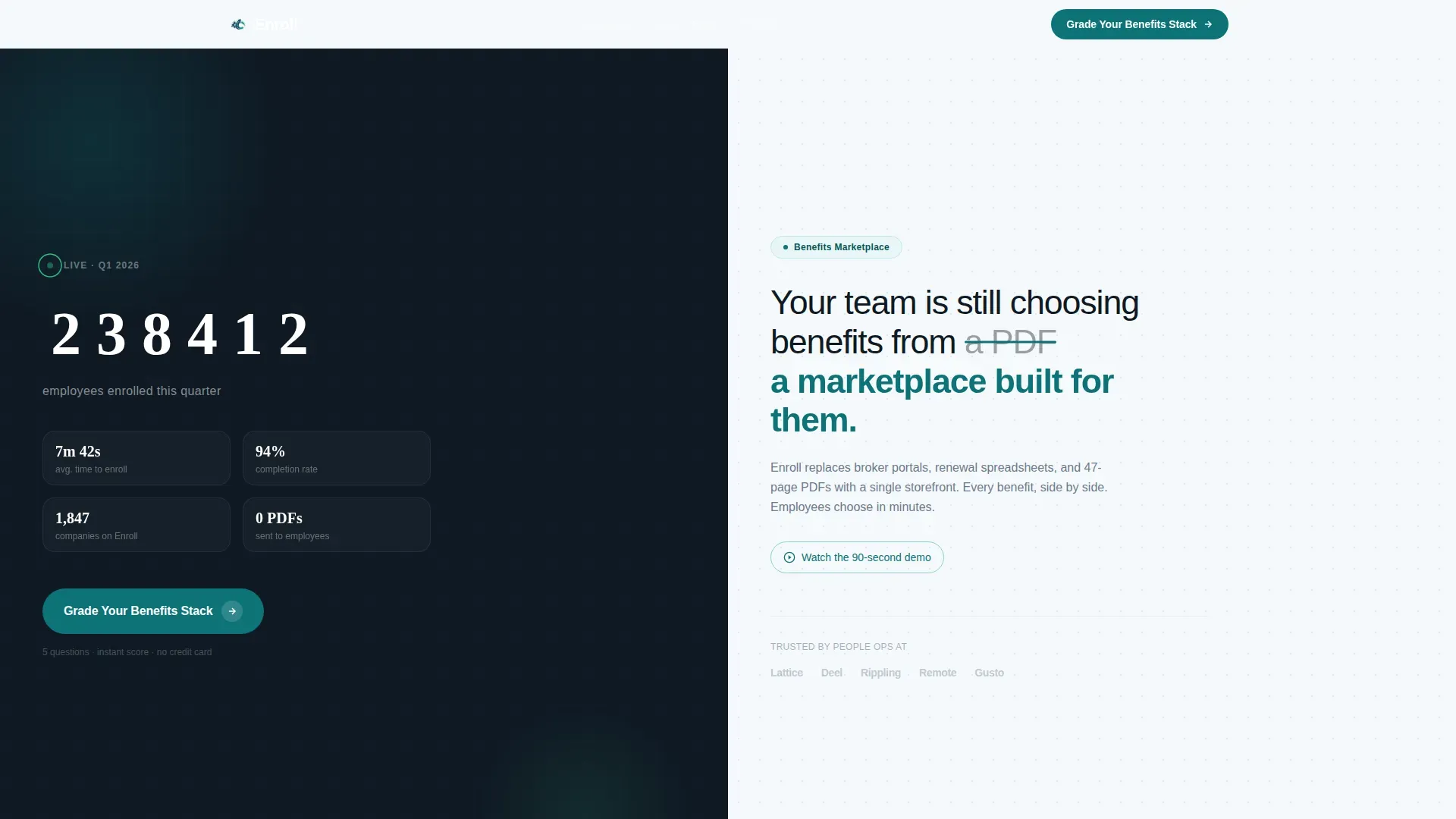
The hero section opens with a live-style animated counter on the dark left panel. Individual digits flip like a departure board, displaying a running total of employees enrolled this quarter. Catalyst green micro-bursts fire on each tick, making the ticker feel alive and urgent without being distracting. This feature immediately communicates scale and social proof before a visitor reads a single line of copy.
Split-Screen Hero with Strikethrough Headline
The right panel of the hero section carries a single oversized headline in medium-weight sans-serif type. A subtle strikethrough animation crosses out the word "PDF" and replaces it with "a marketplace built for them," creating a visual moment that frames the entire value proposition in one line. This hero image of text-as-motion draws the eye and anchors the narrative immediately.
Three-Company Case Study Proof Stack
After the hero section, three scroll-triggered split panels each tell a named startup's before-and-after story. The left side of each panel displays the messy before state: the Slack thread full of questions, the broker's renewal deck, the spreadsheet. The right side shows the clean after state: the marketplace dashboard, the enrollment completion rate, the time-to-enroll metric. Each case escalates in company size and complexity, building a stacking proof structure that strengthens the value proposition with every scroll. These success stories directly address the consideration phase for skeptical buyers.
Five-Question Benefits Health Score Quiz
The primary conversion engine is a progressive five-question assessment. Visitors set their company size with a slider, select their current enrollment method from a dropdown, choose their renewal month, multi-select their top employee complaints about benefits, and enter their work email. Each answer instantly adjusts a visual gauge from red to green, giving immediate value before the final screen offers a personalized teardown report. This interactive form uses shorter forms best-practice logic: the breadcrumb technique keeps perceived effort low by revealing one question at a time.
Sticky Bottom Call to Action Bar
After the second case study panel, a sticky bottom bar locks to the base of the viewport and persists for the remainder of the landing page scroll. It carries the primary call to action, "Grade Your Benefits Stack," alongside a secondary "Watch the 90-Second Demo" text link. This dual-path approach keeps high-intent visitors moving forward while giving the consideration-phase visitor a lower-commitment next step.
Scroll-Triggered Section Reveals and Gauge Animation
Every major section enters the viewport through a staggered card entrance animation. The Benefits Health Score gauge animates from empty to filled as the visitor completes each question. Counter animations, progress indicators, and scroll-triggered reveals all use the catalyst green accent color exclusively on elements that move, count, or confirm, keeping the animation system visually consistent and meaningful.
Page sections overview
| Section | Purpose |
|---|---|
| Hero Ticker Panel | Displays animated enrollment counter and strikethrough headline to frame the value proposition immediately |
| Case Study One | Before/after split panel for first named startup, showing messy enrollment versus clean marketplace dashboard |
| Case Study Two | Before/after split panel for second company with increased headcount and enrollment complexity |
| Case Study Three | Before/after split panel for third company at highest scale, completing the proof stack |
| Benefits Health Score | Interactive five-question quiz with live gauge animation and personalized report offer |
| Demo Strip | Ninety-second demo video offer with secondary call to action path |
| Sticky call to action Bar | Persistent bottom bar anchoring the primary call to action after the second case study |
| Footer | Horizontal flow footer pattern with supporting navigation and sign-up links |
Design & branding system
The visual identity for this landing page template follows the Startup Velocity theme through a Teal Catalyst color system. The palette is technical enough to signal credibility and alive enough to generate excitement. Every color plays a specific role: teal anchors authority, midnight frames the dark panels, catalyst green marks motion, and whiteboard opens up the light side of every split.
- Color roles: Deep mission-teal (#0D7377) on headers and primary buttons; midnight interface (#0F1923) on left-panel backgrounds; bright catalyst green (#3DFFA2) exclusively on counters, progress indicators, and confirmation elements; clean whiteboard (#F6F9FC) on right-side content panels
- Typography: DM Sans handles body copy and all user interface text for clean readability; Fraunces appears at editorial moments such as oversized headline treatments, creating a warm contrast against the technical layout
- Visual appeal and white space: The clean layout uses generous white space on the right-side whiteboard panels to reduce visual overwhelm and direct attention toward the calls to action, following the F-pattern reading behavior that high converting landing pages rely on
Mobile & speed optimization
This landing page template is built desktop-first, reflecting the reality that People Ops leads and HR Directors typically review vendor options on laptops during the workday. However, the layout is fully mobile responsive so employees and secondary decision-makers can access the landing page on any device. Mobile responsiveness is essential for anyone reviewing details on the go, and the template accounts for this without sacrificing the split-screen visual identity.
- Desktop-first layout with full mobile responsiveness: The 50/50 split stacks gracefully on smaller screens, preserving the dark-panel and light-panel hierarchy while adapting to single-column flow
- Server and client component separation: Static sections use server-rendered components for fast initial load; interactive elements such as the ticker, quiz gauge, and sticky call to action bar use client components to keep animations smooth without blocking page paint
How this template helps you convert
Landing page performance comes down to alignment between messaging, layout, and intent. This landing page template was architected around a single conversion goal: getting a qualified HR buyer to submit the Benefits Health Score quiz. Every design decision, from the strikethrough headline to the sticky bar, serves that single action.
- Proof before ask: The three case study panels deliver social proof at scale before the quiz ever appears. Visitors see named companies, real metrics, and escalating complexity. By the time they reach the assessment, the product value has been demonstrated three times over, reducing the perceived effort of engaging with the form.
- Interactive value delivery: The five-question Benefits Health Score quiz gives visitors a tangible, personalized output before they commit. The live gauge moving from red to green creates immediate reward, which keeps completion rates high and helps the landing page increase conversions by making the next step feel worthwhile rather than risky.
- Dual conversion path: The sticky call to action bar presents both the primary quiz path and the secondary demo video link. Visitors in the consideration phase who are not ready to submit their work email can still engage with the ninety-second demo, keeping more visitors on the page and inside the funnel rather than bouncing to other pages.
Other information about this template
This template belongs to the HR and Hiring category, specifically the Benefits Marketplace niche within the Payroll and Benefits Platform subcategory. It is part of a broader library of landing page templates built for B2B SaaS and HR Tech products. Below are additional details relevant to buyers evaluating this template against other landing page templates in the marketplace.
- Landing page templates for comparison: Platforms like Webflow, Unbounce, and HubSpot CMS Marketplace offer customizable landing page templates across many industries; this template is purpose-built for the benefits marketplace niche, giving it a more focused landing page layout than general-purpose alternatives
- Product landing page template context: A well-designed product landing page template can significantly enhance the success of a product launch; this template applies that principle to HR Tech by combining compelling copy, strong social proof, and a high-converting assessment flow in one ready-to-use landing page
- Best landing page templates for HR Tech: Among the best landing page templates for benefits platforms, this design stands out for its proof-stacking case study narrative, its interactive gauge-driven form, and its colorful design system that stays on-brand while remaining technically credible
- Surfer-aligned fact coverage: Zoho offers over 100 high-converting landing page templates for various purposes, demonstrating broad market demand for industry-specific templates; this template addresses that demand for the benefits marketplace specifically, with a landing page layout tuned to HR buyers rather than general product sales or food delivery or travel booking use cases
- AI-enhanced design principles: AI tools can optimize landing page design by testing different layouts and elements to determine which combinations yield the highest conversion rates; this template's structure follows those data-backed principles, including the use of shorter forms, high-contrast calls to action, and action-oriented button copy such as "Grade Your Benefits Stack" or "Enroll Today"
- Successful landing page examples for context: Pages like Netflix's landing page, Calm's landing page, and Spotify's landing page all succeed by communicating a clear value proposition without unnecessary details; this template applies the same discipline to the benefits marketplace, keeping the landing page focused on a single action rather than overwhelming visitors with product sales copy or unrelated services
- Content marketing and qualified leads: This template functions as a content marketing asset as much as a conversion page; the personalized report offered after the quiz creates a qualified leads mechanism where visitors self-identify their pain level before any sales conversation begins
- Template customization notes: All colors, typography, copy, and section order can be adjusted to match your brand; the landing page layout is built so teams can swap case study companies, update enrollment metrics, and rewrite calls to action without restructuring the page
- Landing page versus homepage: It is important to understand the difference between a landing page and a homepage; this is a standalone landing page with simple navigation removed, focused entirely on driving a single measurable action rather than serving as a general website entry point
- Product value and sign-up path: Visitors who complete the quiz receive a personalized benefits health teardown, giving them direct product value before they sign up or speak with a sales team; this approach lowers the barrier to conversion and builds trust early in the relationship
- Good Eggs, DoorDash, and other examples: Successful landing pages like Good Eggs' landing page and DoorDash's landing page use clear promotional hooks to drive conversions without overwhelming visitors; similarly, Zola's landing page simplifies a complex decision into a clean one-stop-shop experience, and Lyft's landing page addresses visitor motivation directly; Rover's landing page and Campaign Monitor's landing page both use testimonials and clean benefit-driven design to build trust; Mailchimp's landing page grabs attention through a bold visual choice; this template borrows from all of these proven patterns while staying grounded in the benefits marketplace context
- A/B testing readiness: Continuous A/B testing of headlines, call to action button colors, and form lengths can find effective combinations for specific audiences; this template's modular section structure makes it straightforward to test the hero headline, quiz entry copy, or sticky bar text independently
- Slower load times and performance: Slower load times can reduce conversions by up to 7% for every second of delay; the template's server and client component split is designed with this in mind, keeping the static layout fast while reserving client rendering for interactive elements only
- Landing pages with video: Landing pages with video can increase conversions by as much as 86%; the ninety-second demo strip included in this template gives visitors that video path as a secondary conversion route, supporting both high-intent and lower-intent visitors in the same landing page layout
Theme
Startup Velocity
Creative direction
Case Study Narrative
Color system
Teal Catalyst
Style
Split Screen (50/50)
Direction
Quiz/Assessment
Page Sections
Animated Digit-flip Enrollment Ticker
Split-screen Strikethrough Headline
Three-panel Case Study Proof Stack
Five-question Benefits Health Score Quiz
Sticky Bottom Call to Action Bar
Scroll-triggered Animations and Gauge Motion
Related questions
Who is this landing page template designed for?
Can I customize the case study companies and enrollment metrics?
How does the Benefits Health Score quiz work in this template?
Is this landing page template mobile responsive?
What makes this different from a general product landing page template?


