Decentralized Clinical Trial Platform Landing Page
Enroll is a split-screen landing page template built for decentralized clinical trial platforms. It combines a director-level testimonial card, an animated enrollment map, a scroll-driven checklist audit, and a five-question readiness quiz with a live meter. The design uses a Nordic-inspired Arctic White palette to feel both clinically trustworthy and genuinely human.
by Rocket studio
Quick summary
Enroll is a single-page, desktop-first landing page template for decentralized clinical trial (DCT) platforms. It opens with a split-screen hero featuring a real director quote and an animated US enrollment map, then walks visitors through three checklist audit sections before closing with a gated readiness quiz that qualifies leads while delivering a personalized scorecard.
Who this template is for
This template is built for B2B SaaS companies operating in clinical research technology. It speaks directly to the people who feel the pressure of trial complexity every day.
- Clinical Operations Directors managing multi-site studies and watching dropout rates climb
- Biotech sponsors running Phase II through Phase IV studies who need to protect per-participant investment
- Contract Research Organization (CRO) teams hitting enrollment targets in rare disease populations across rural geographies
What problem this template solves
Traditional trial infrastructure forces participants to travel, and that travel costs retention. Site-dependent studies lose roughly 30% of participants to dropout, and clinical operations teams often manage that complexity through spreadsheets. This template gives DCT platforms a page that speaks to those exact pain points with operational precision.
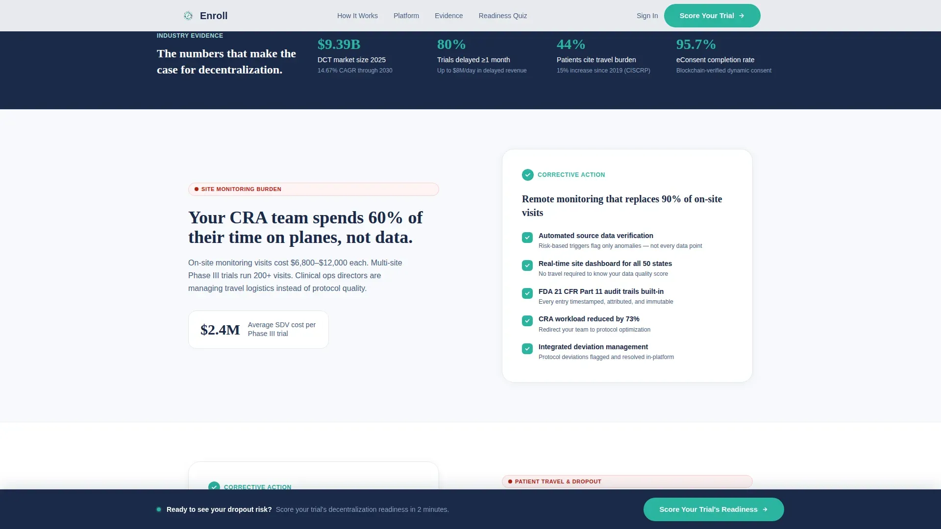
- Site monitoring burden that consumes coordinator time and delays data review
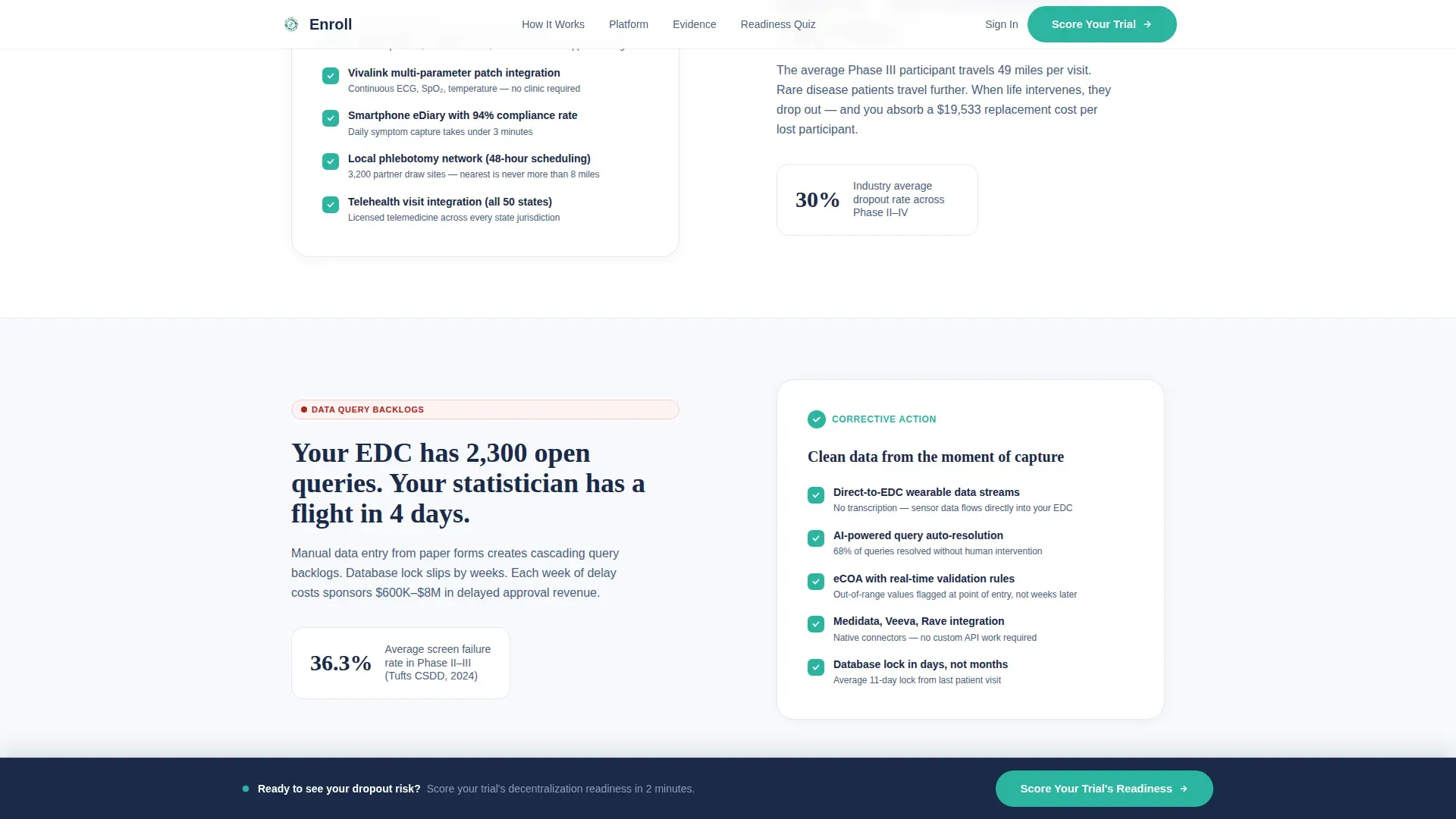
- Patient travel costs and geographic barriers that drive dropout before primary endpoints
- Data query backlogs caused by disconnected, site-level electronic data capture (EDC) workflows
What you get with this template
You get a fully structured, section-led landing page that mirrors the decision journey of a clinical operations buyer. Every section is purposeful and paired with a clear resolution to an operational problem.
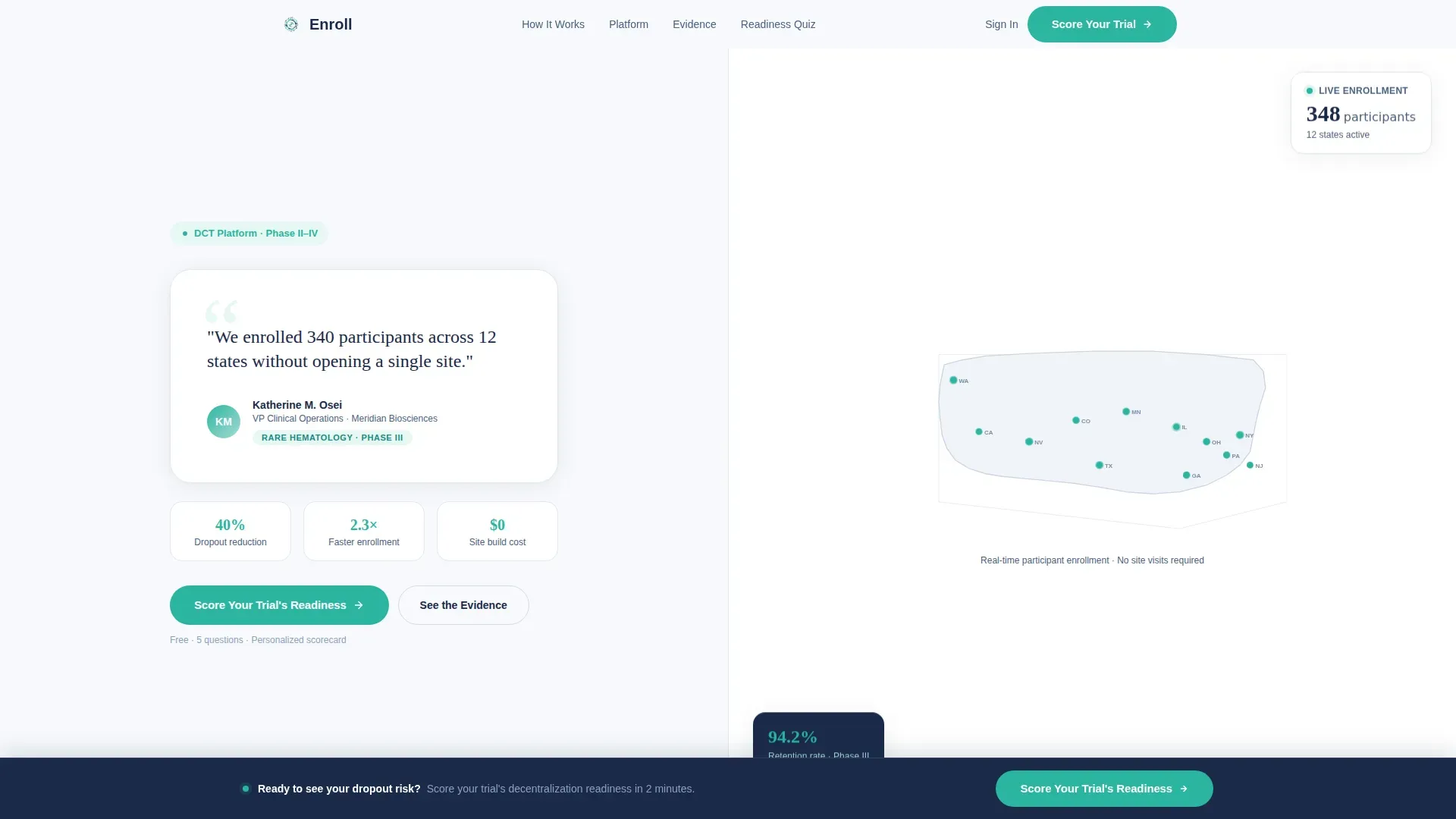
- A 50/50 split-screen hero with a testimonial card, enrollment statistics, and an animated US map showing real-time participant dot placement
- Three scroll-triggered checklist audit sections, each pairing one pain point on the left with a self-ticking resolution checklist on the right
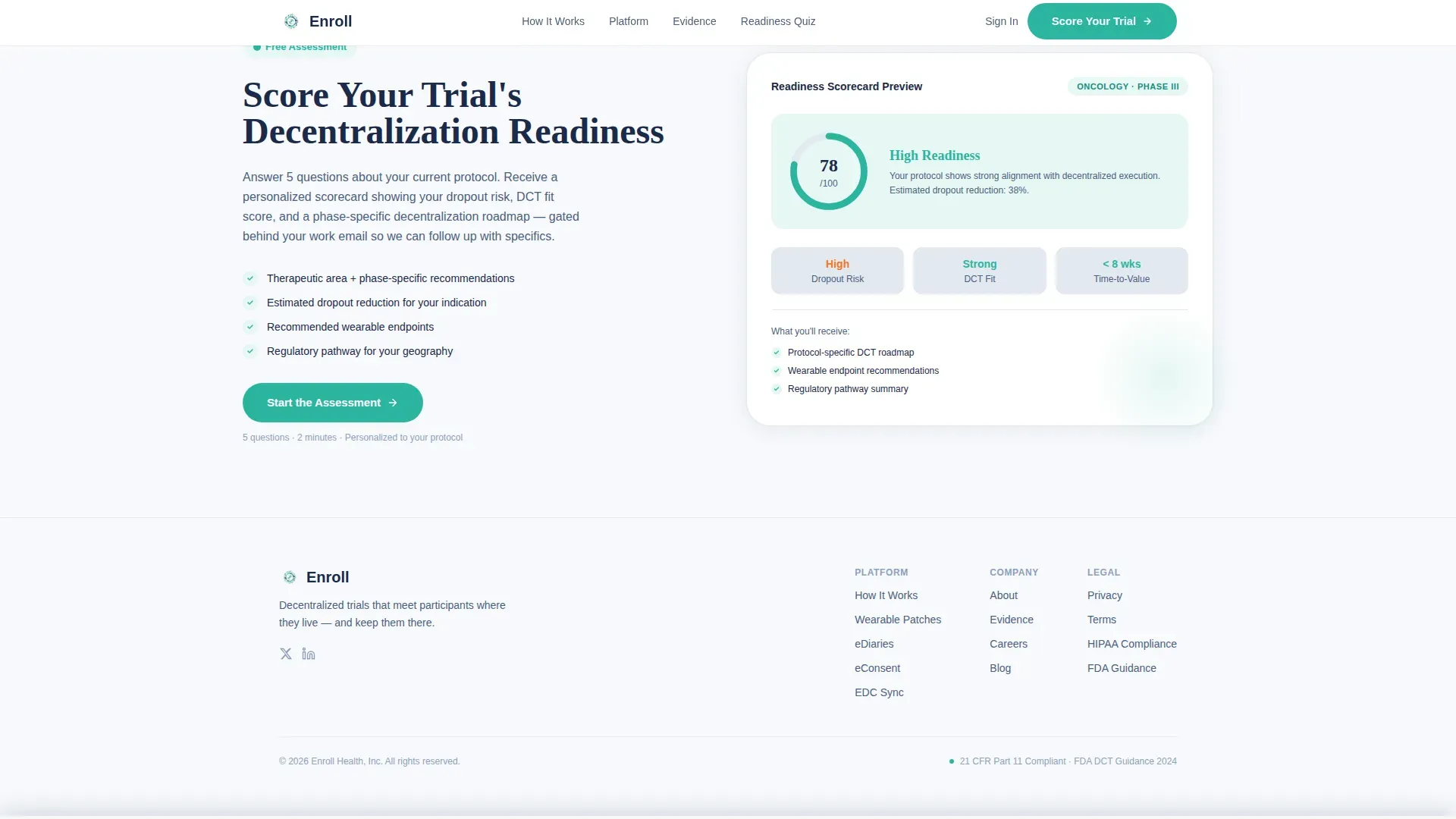
- A five-question interactive readiness quiz with a live decentralization readiness meter and an email-gated personalized scorecard
Feature list
This template packages several high-interactivity components designed specifically for a clinical research technology audience.
Split-Screen Testimonial Hero
The hero opens with a clean, oversized testimonial card on the left. It features a director-level quote, an avatar, name, title, and a therapeutic area tag. The right panel shows enrollment dots blooming across a US map with a gentle pulse animation, grounding the page in real-world evidence from the first scroll position.
Scroll-Triggered Checklist Audit Sections
Three dedicated audit sections each present one operational problem on the left side and a checklist that ticks itself complete on the right as the visitor scrolls. The sequence covers site monitoring burden, patient travel and dropout costs, and data query backlogs. The effect builds accumulating clarity rather than anxiety.
Five-Step Decentralization Readiness Quiz
The interactive quiz opens with a therapeutic area selector, then asks five progressive questions: current site count, average patient travel time, primary endpoint type, dropout rate range, and whether electronic consent (eConsent) is already in use. A live readiness meter updates in real time with each answer.
Email-Gated Scorecard Delivery
On completing the quiz, the visitor receives a personalized decentralization scorecard. Delivery is gated behind a work email address and company name field, qualifying the lead while providing immediate, specific value the buyer can bring into their next internal planning meeting.
Persistent Bottom-Bar Call to Action
After the third checklist section, a persistent bottom bar fades in carrying the primary call to action: "Score Your Trial's Decentralization Readiness." It stays visible during scrolling so the invitation to self-assess is never more than a glance away.
Arc-Style Split Footer
The footer follows a split layout with the platform logo and tagline on the left and navigation links on the right. It closes the page cleanly without adding visual clutter, keeping the buyer's attention on the quiz conversion path above it.
Page sections overview
| Section | Purpose |
|---|---|
| Split-Screen Hero | Testimonial card plus animated US enrollment map with quiz call to action beneath |
| Checklist Audit One | Site monitoring burden versus automated remote monitoring checklist |
| Checklist Audit Two | Patient travel costs and dropout versus home delivery and wearable checklist |
| Checklist Audit Three | Data query backlogs versus real-time EDC sync checklist |
| Readiness Quiz | Five-question interactive assessment with live meter and gated scorecard |
| Split Footer | Logo and tagline left, navigation links right |
Design & branding system
The visual identity follows an Organic Flow theme built on a Nordic laboratory aesthetic. Clinical precision and organic warmth coexist in every color and type choice.
- Color palette: permafrost white (#F7F9FC) as the dominant canvas, glacier mist (#E2E8F0) for card surfaces and dividers, deep fjord (#1B2A4A) for all body and heading text, and living teal (#2BB5A0) as the sole accent across buttons, progress indicators, and interactive elements
- Typography: DM Sans for body text and interface labels; Fraunces for editorial headlines that carry the emotional weight of section openers
Mobile & speed optimization
The template is built desktop-first, reflecting the reality that clinical operations buyers evaluate tools during work hours on a full-size screen. A mobile fallback layout is included for completeness.
- Static sections use Server Components to keep the initial page load lean and fast
- The quiz module and map animation use Client Components, isolating interactive JavaScript to only the sections that need it
How this template helps you convert
This template is engineered around a single conversion goal: getting the right buyer to self-identify and submit their contact details in exchange for a scorecard they actually want.
- The hero testimonial with enrollment statistics (340 participants across 12 states) establishes credibility before the visitor reads a single feature claim, reducing skepticism immediately.
- The three checklist audit sections create a progressive mental mapping experience, so by section four the buyer is already imagining their own protocol on the platform, not just evaluating a vendor.
- The readiness quiz converts passive curiosity into active self-assessment, and the email gate feels fair because the visitor receives a specific, personalized deliverable in return.
Other information about this template
This template is designed for the decentralized clinical trial market, a segment valued at approximately $9.39 billion and growing as FDA 2024 guidance continues to support home-based and remote trial models. A few additional details worth noting:
- The localization defaults to English, USD pricing, US-centric 50-state compliance framing, and MM/DD/YYYY date formatting
- Animation intensity is set to high: pulsing map dots, self-ticking checklists on scroll, a live readiness meter update, and a persistent bottom bar fade-in are all included by design
- No stock photography or lab coat imagery is used anywhere; the visual language relies on data, geography, and motion to communicate credibility
- The template supports a desktop-first evaluation experience while providing a mobile fallback for participants or stakeholders reviewing on smaller screens
Theme
Organic Flow
Creative direction
Checklist & Audit
Color system
Arctic White
Style
Split Screen (50/50)
Direction
Quiz/Assessment
Page Sections
Split-screen Testimonial Hero
Scroll-triggered Checklist Audit
Five-step Readiness Quiz
Email-gated Scorecard Delivery
Persistent Bottom-bar Call to Action
Related questions
Who is this landing page template built for?
Can I replace the testimonial and enrollment statistics with my own data?
How does the readiness quiz qualify leads?
Does the checklist audit animation require custom coding?
Is this template suitable for rare disease or rural enrollment messaging?



