College Student Insurance Cost Calculator Website Template
Enroll is a sidebar companion landing page built for college student health insurance. It uses a stats-first scroll experience to turn confusion into clarity, then clarity into action. The persistent sidebar holds a free coverage calculator and a primary call to action, while the main column walks students, international enrollees, and parents through the real cost of being underinsured.
by Rocket studio
Quick summary
Enroll is a single-page insurance template designed for college students, international enrollees, and parents navigating coverage gaps. It leads with hard data, holds attention through a stats-driven scroll, and converts through a free inline coverage gap tool. The sidebar stays visible throughout, keeping the call to action one click away at all times.
Who this template is for
This template is built for anyone selling or explaining college student health insurance. It speaks directly to the people who feel most lost in the process.
- Sophomores and juniors comparing a health plan for the first time
- International students on a student visa who need to navigate an unfamiliar insurance system
- Parents co-signing or funding coverage from another state who want a clear, trustworthy summary
What problem this template solves
Most health insurance pages overwhelm students with policy jargon before they understand why coverage matters. This template flips that approach entirely.
- Students land on a page that shows them the financial risk first, in plain numbers they can understand
- The free coverage gap report personalizes the problem, so the upgrade to a paid plan feels logical rather than pressured
- Parents and students get a shared path through the "Send to My Parents" email capture, removing the coordination friction that often stalls sign-ups
What you get with this template
You get a fully structured sidebar companion landing page ready to present college student health insurance with confidence. Every section is purposeful and prompts action.
- A giant headline section with an animated oversized stat and a single clarifying subline
- A stats-first scroll sequence where each viewport moment surfaces a new data point before product copy begins
- A persistent sidebar with a coverage calculator, inline enrollment tool, and always-visible call-to-action button
Feature list
This template packages several purposeful components into one focused layout. Each feature below maps directly to a real design or functional detail in the brief.
Giant Headline Stat Block
The header opens with a single oversized number rendered in teal at 180 pixels. The surrounding sentence assembles word by word as the page loads. No imagery competes for attention. The stat does all the work.
Stats-First Scroll Sequence
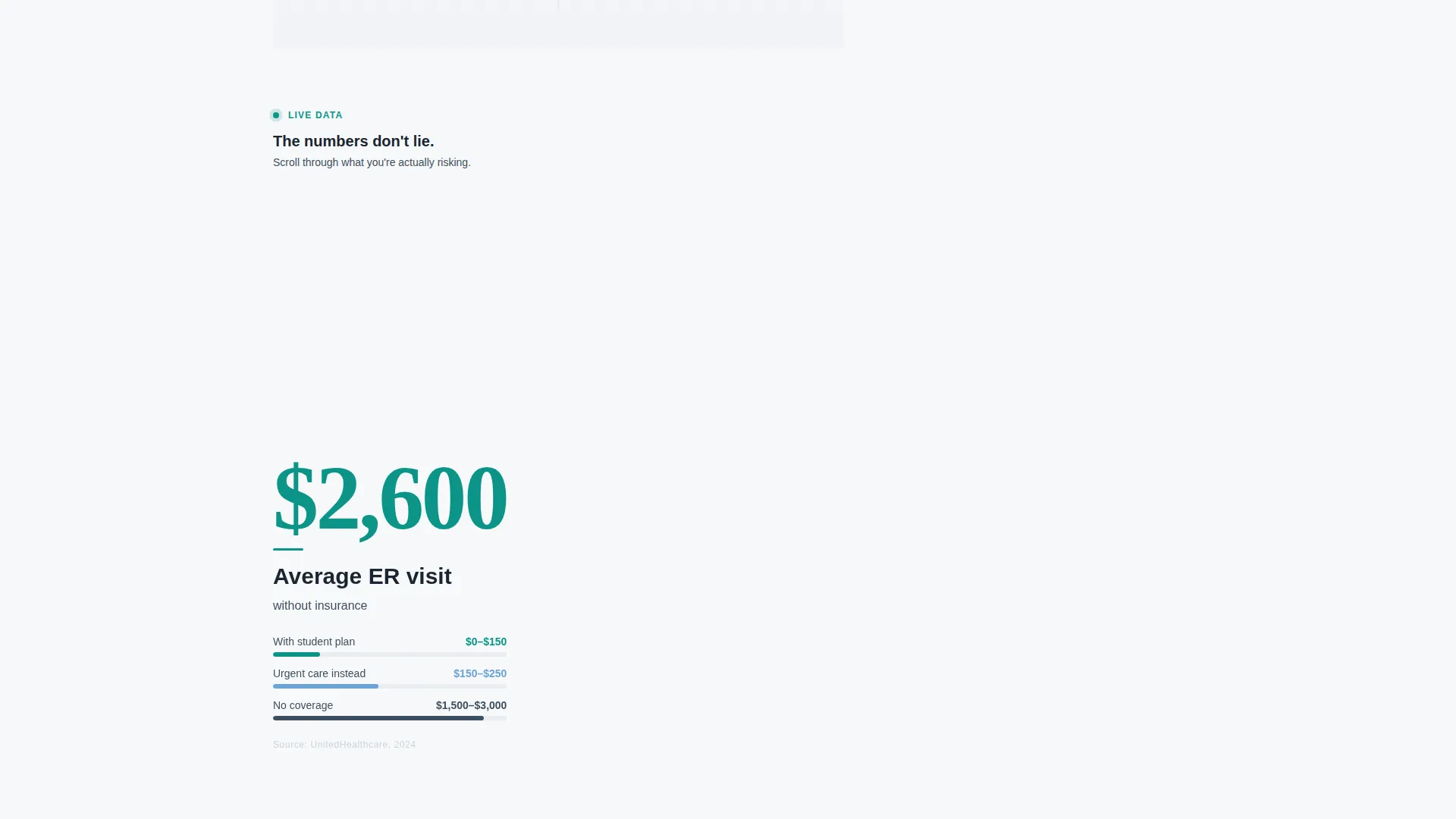
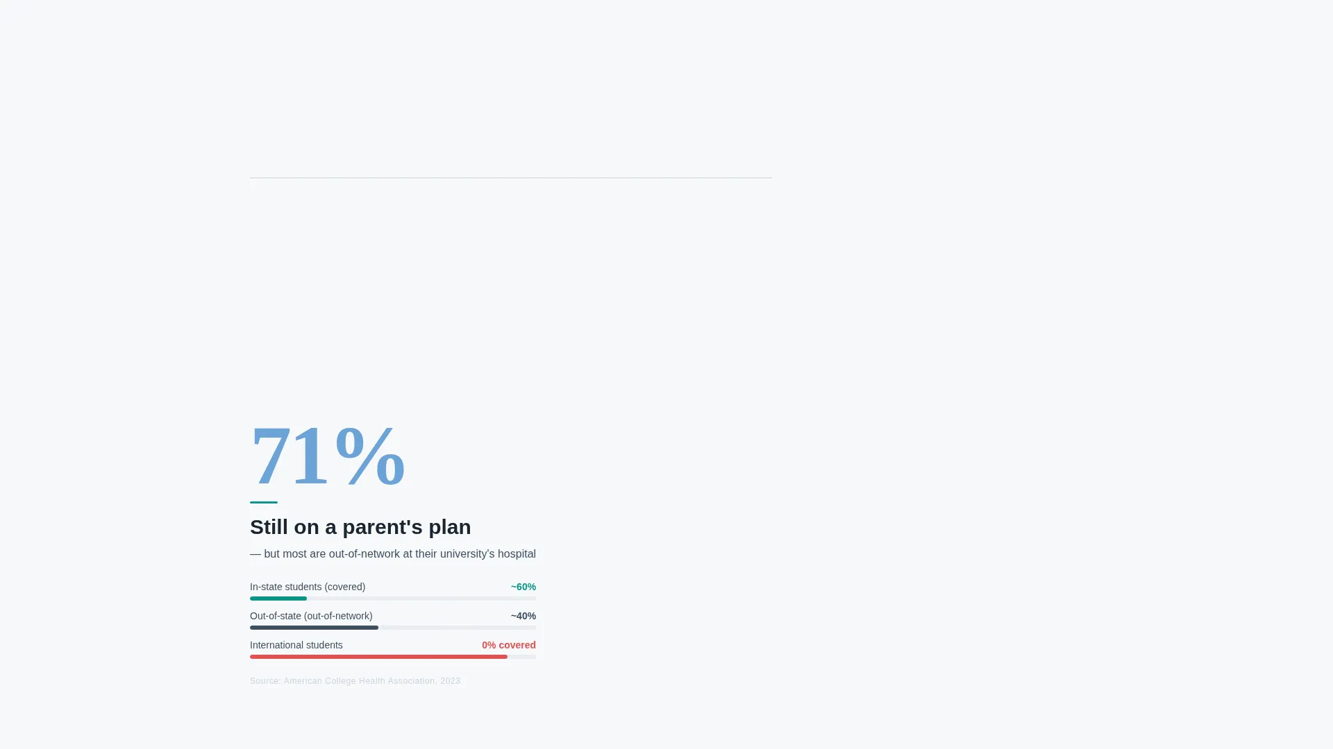
Every scroll step in the main content column delivers one data point before any product description appears. Average emergency room cost, campus mandatory coverage rates, and prescription out-of-pocket comparisons each occupy their own viewport moment. The page converts skepticism into arithmetic before asking for anything.
Persistent Sidebar with Coverage Calculator
The sidebar stays anchored as the user scrolls. It holds the coverage calculator, the inline enrollment tool, and the primary call-to-action button. Nothing important disappears as the reader moves through the data.
Inline Free Coverage Gap Tool
The primary call to action opens an inline tool directly inside the sidebar. It asks for school name, enrollment status, and date of birth. The free output is a personalized coverage gap report that shows exactly what the student is missing.
"Send to My Parents" Email Capture
A secondary conversion path captures an email address and forwards the coverage gap report with a co-sign prompt. This is designed for students who need a parent's involvement before committing to a plan.
Corporate Precision Visual Theme
The layout uses the Cloud Canvas color system: soft cumulus white, institutional slate, calm sky blue, and a decisive teal accent reserved for buttons and live data highlights. The result feels clinical enough to build trust and warm enough to keep the reader relaxed.
Page sections overview
| Section | Purpose |
|---|---|
| Giant Headline Block | Opens with the oversized animated stat and subline |
| ER Cost Stat | Shows average emergency room cost without insurance |
| Campus Coverage Stat | Highlights mandatory coverage rates across campuses |
| Prescription Cost Stat | Compares median out-of-pocket cost with and without a plan |
| Sidebar Calculator | Holds the coverage calculator and enrollment input tool |
| Free Report call to action | Triggers the inline coverage gap tool on click |
| Parent Email Capture | Collects email to forward the report with a co-sign prompt |
Design & branding system
The visual identity follows a Corporate Precision theme. Every color choice reinforces trust without feeling cold or clinical to the point of discomfort.
- Cloud Canvas palette: soft cumulus white (#F7F8FA) for backgrounds, institutional slate (#3D4F5F) for body text, calm sky blue (#6BA3D6) for supporting elements, and decisive teal (#0D9488) for buttons and live data highlights
- Typography uses variable-weight type, with the hero stat rendering at 180 pixels and the surrounding text assembling dynamically around it
- The overall aesthetic resembles a clean clinic waiting room with natural light through frosted glass: trustworthy, calm, and purposeful
Mobile & speed optimization
The sidebar companion layout is structured to remain functional and readable across screen sizes. The persistent sidebar behavior adapts to ensure the call to action stays reachable on smaller displays.
- The stats-first scroll sequence is designed for full-viewport moments, keeping each data point isolated and impactful on both desktop and mobile screens
- The inline tool inside the sidebar is lightweight by design, asking only for three inputs: school name, enrollment status, and date of birth
How this template helps you convert
The conversion path is built into the structure of the page. Nothing about it feels like a hard sell.
- The stats-first scroll sequence builds urgency through data before any product pitch appears, so the reader is already motivated when they reach the call-to-action section.
- The free coverage gap report gives immediate, personalized value, making the upgrade to a paid plan a natural next step rather than a cold ask.
Other information about this template
This template sits at the intersection of the Finance and Insurance category with a focus on college student health insurance. It is designed for teams and solo operators who need a credible, conversion-ready landing page without building from scratch.
- The Freemium/Trial conversion direction means the primary offer is risk-free for the visitor, which lowers the barrier to engagement significantly
- The "Sidebar Companion" template style keeps the most important tools visible throughout the entire scroll journey, reducing drop-off at key decision moments
- This layout is well-suited for use during open enrollment periods, orientation seasons, or any campaign targeting students aging off a parent's health plan at twenty-six


Theme
Corporate Precision
Creative direction
Stats-First Impact
Color system
Cloud Canvas
Style
Sidebar Companion
Direction
Freemium/Trial
Page Sections
Giant Animated Stat Headline
Stats-first Scroll Sequence
Persistent Sidebar Layout
Inline Free Coverage Gap Tool
Parent Email Capture Path
Cloud Canvas Color System
Related questions
Who is this landing page template designed for?
What does the free coverage gap tool actually do?
Can parents use this page too?
Does the sidebar stay visible while scrolling?
Is this template suitable for international students?


