Benefits Platform | Free Website Template | Rocket
This comparison table landing page is built for HR-focused platforms that turn passive benefits enrollment into guided financial journeys employees actually complete. A testimonial card header, stat-driven scroll transitions, and a frictionless five-question diagnostic quiz work together to show HR directors, benefits brokers, and CFOs exactly what leaving enrollment participation at 34% is costing them.
by Rocket studio
Quick summary
This single-page template transforms a tired benefits enrollment pitch into a data-led, experience-first landing page. It opens with a real HR director's quote, moves through stat-anchored comparison tables, and closes with a personalized quiz that segments prospects before asking for a single piece of contact information.
Who this template is for
This template is purpose-built for platforms that help mid-market companies improve employee benefits participation. It speaks directly to the people who feel the pain of low enrollment numbers every year.
- HR directors at companies with 200 to 2,000 employees watching open enrollment participation stall year after year
- Benefits brokers fielding the same confused employee calls every January and looking for a better story to tell prospects
- CFOs and finance leads who recognize that unused benefits are budget line items delivering zero return on investment
What problem this template solves
Most benefits platforms lead with features. Buyers already know what a portal does. What they cannot easily see is how their current approach compares to a smarter one, or what the gap is actually costing them. This template fixes that.
- Open enrollment participation rates at many mid-market companies hover near 34%, and standard marketing pages do nothing to make that number feel urgent or solvable
- Prospects arrive skeptical and leave unconvinced when a page leads with product screenshots instead of proof
- The path from "interested" to "booked a demo" is broken when there is no low-friction next step that delivers value before asking for anything
What you get with this template
You get a fully structured, single-page layout built around comparison logic, social proof, and a diagnostic quiz flow. Every section is designed to move a skeptical buyer one step closer to a personalized demo without applying pressure.
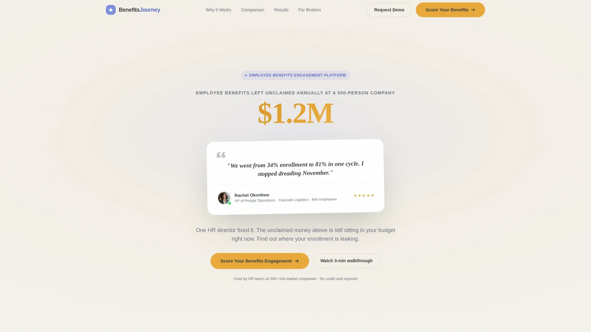
- A testimonial card header with a real quote, HR director attribution details, and a live animated counter showing unclaimed benefits dollars at a 500-person company
- Three-way comparison tables that stack traditional PDF guides, generic benefits portals, and the platform side by side across metrics like completion rates, time-to-enroll, and support ticket volume
- A five-question "Score Your Benefits Engagement" quiz that requires no email until results appear, segments respondents into one of three tiers, and then offers a personalized demo
Feature list
This template is built from a tightly chosen set of components. Each one earns its place by doing specific conversion work.
Testimonial Card Header
A floating card component centers a verified HR director quote on screen. Name, title, company size, and a small avatar sit beneath the quote. A soft animated counter behind the card ticks from $0 to $1.2 million, labeled as employee benefits left unclaimed annually at a 500-person company. The contrast between one person's success and one universal problem is immediate.
Stats-First Scroll Transitions
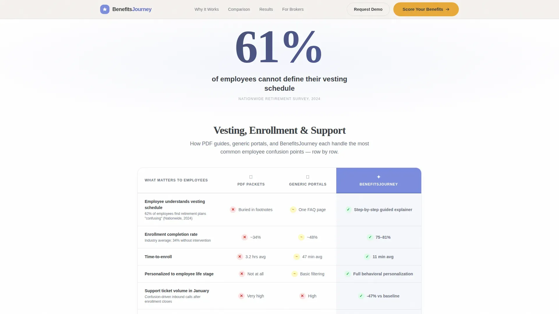
Every scroll section opens with a bold, isolated statistic before any explanation appears. For example, "61% of employees cannot define their vesting schedule" appears alone first, then the comparison table below it unfolds the context. The sequence makes each reveal feel like a discovery rather than a sales pitch.
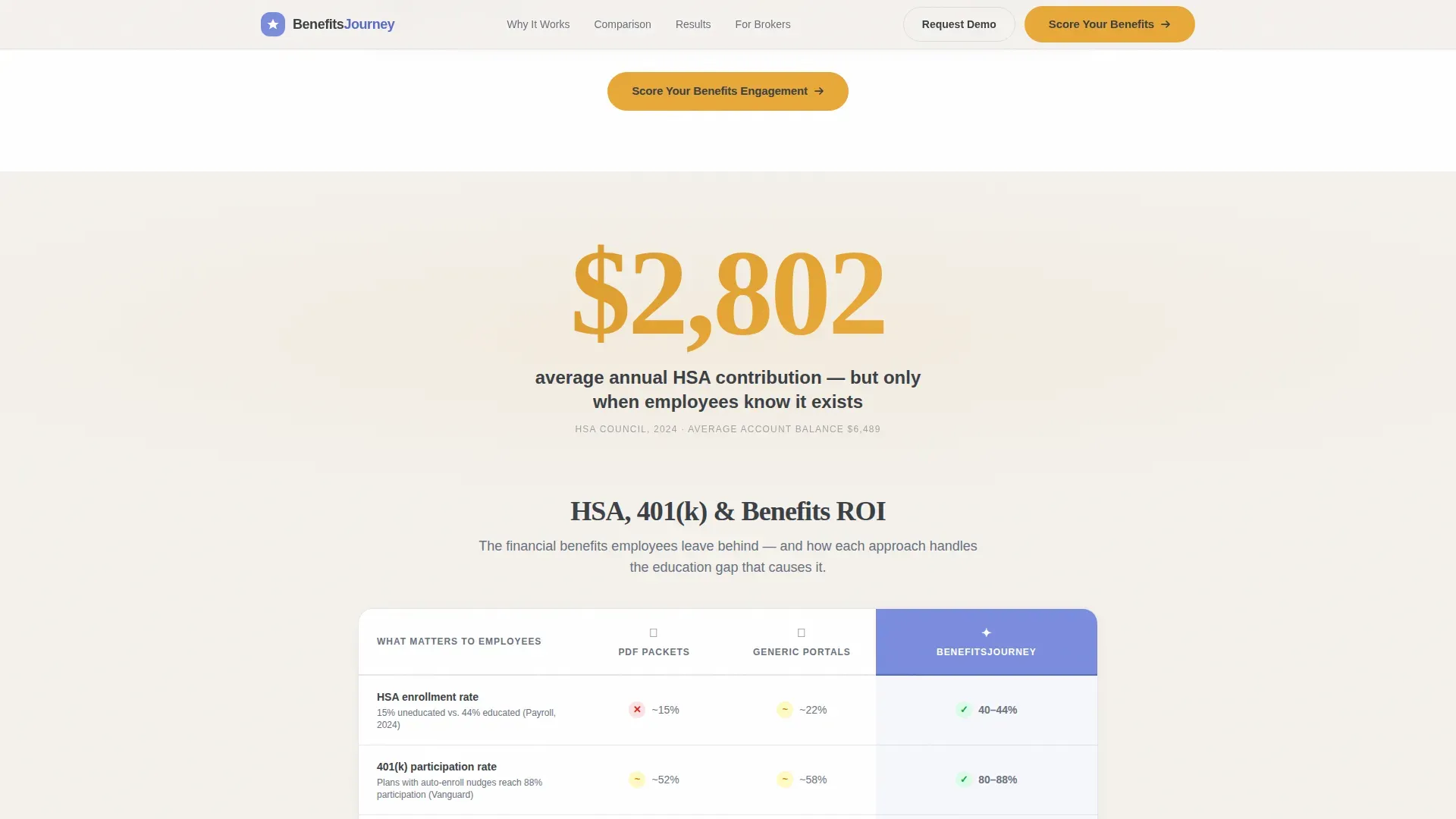
Three-Way Comparison Tables
Each table places traditional PDF guides, generic benefits portals, and the platform across rows covering metrics such as completion rates, time-to-enroll, and support ticket volume. The tables do the arguing; the surrounding copy simply narrates the obvious conclusion. Each row is designed to be a small surprise.
Five-Question Diagnostic Quiz
The quiz asks about company size range, current enrollment participation percentage, number of benefits offered, whether the company tracks engagement analytics today, and the biggest open-enrollment pain point. No email is required until after results appear. This removes the primary friction point that kills quiz completion rates.
Tiered Results and Demo Offer
After the quiz, the platform segments the respondent into one of three tiers based on their answers. Each tier receives a results page with a specific, personalized summary and an offer to book a tailored demo. The conversion is earned by delivering real value before requesting contact information.
Recurring call to action Anchor Points
The "Score Your Benefits Engagement" call-to-action appears first directly beneath the header card, then repeats as an anchor at the bottom of every comparison table. The repetition is intentional and unobtrusive, keeping the next step visible without interrupting the reading flow.
Page sections overview
| Section | Purpose |
|---|---|
| Testimonial Card Header | Opens with social proof and animated unclaimed-benefits counter |
| First Stat Callout | Isolates a bold enrollment statistic before context loads |
| Vesting Education Table | Compares three approaches to vesting schedule education |
| First Quiz call to action | Invites visitors to score their benefits engagement |
| Second Stat Callout | Delivers a more surprising enrollment metric to maintain momentum |
| Completion Rate Table | Shows time-to-enroll and support ticket volume side by side |
| Third Stat Callout | Escalates the data sequence with the final most impactful number |
| Engagement Analytics Table | Contrasts tracking capabilities across all three platform types |
| Bottom Quiz Anchor | Repeats the diagnostic call to action after the final comparison table |
| Quiz Diagnostic Flow | Collects five answers and segments the respondent into a tier |
| Personalized Results Page | Delivers tier-specific insight and books a tailored demo |
Design & branding system
The visual identity follows an Educational Guide theme built on a Cloud Canvas color system. The palette feels like a well-designed whiteboard after a brilliant explainer session. Every color has a single job, and nothing competes for attention.
- Soft chalk white (#F4F1EC) serves as the primary background, keeping the layout open and the data easy to absorb
- Muted graphite (#3B3F45) handles all body text and table borders, while a calm periwinkle (#7B8CDE) marks interactive highlights and selected states
- Warm saffron (#E8A838) is reserved exclusively for calls-to-action and data callouts, so every conversion trigger is visually distinct without being aggressive
Mobile & speed optimization
The layout is built as a single-page flow with stacked sections, making it naturally suited to mobile reading patterns. Stat callouts and comparison tables reformat cleanly for narrower viewports so the three-way comparison remains scannable on a phone screen.
- The quiz component is designed for thumb-friendly interaction, with multiple-choice answers sized for easy tap targets and a low step count to reduce drop-off
- The animated counter in the header is a lightweight visual element that adds motion without adding page weight or slowing the initial render
How this template helps you convert
The conversion architecture on this page is deliberate. Every element builds toward the quiz, and the quiz earns the demo request by giving something useful first.
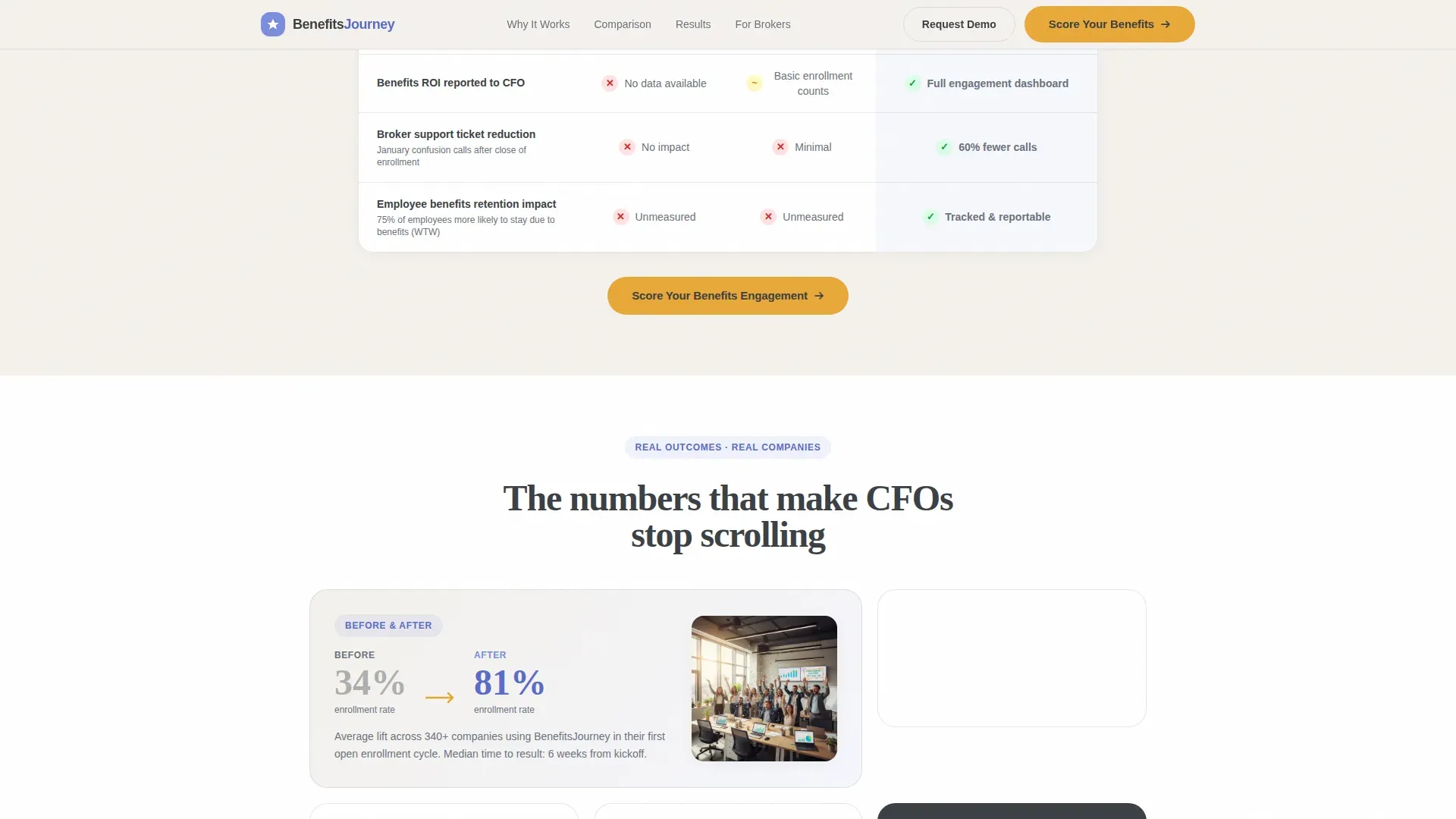
- The header creates immediate emotional tension: one HR director's breakthrough result sits directly above a counter showing how much money a typical 500-person company leaves unclaimed, giving visitors a personal benchmark before they read a single feature claim
- The comparison tables remove the need for a prospect to take your word for anything; the rows speak in metrics that HR directors, brokers, and CFOs already track internally, so the argument lands in their own language
- The quiz converts passive readers into active participants with zero email friction at entry; by the time results appear and a demo is offered, the prospect has already invested five answers and received something genuinely useful in return
Other information about this template
This template is categorized under HR and Hiring, with a specific focus on the financial services employee engagement platform niche. It is a strong fit for any platform selling into mid-market human resources workflows.
- The template style is a Comparison Table layout, meaning the core persuasion logic relies on side-by-side metric rows rather than narrative storytelling alone
- The header concept is a Testimonial Card, which establishes credibility in the first viewport without requiring the visitor to scroll to find social proof
- The creative direction is Stats-First Impact, which means every section leads with a number before delivering context, a pattern suited to analytically minded buyers like HR directors and CFOs
- The landing page direction is a Quiz and Assessment flow, which is particularly effective in HR technology markets where buyers want to see their own data reflected back before committing to a conversation
- The Educational Guide theme and Cloud Canvas color system make this template adaptable across financial wellness, benefits administration, and broader HR technology use cases
Theme
Educational Guide
Creative direction
Stats-First Impact
Color system
Cloud Canvas
Style
Comparison Table
Direction
Quiz/Assessment
Page Sections
Testimonial Card with Animated Counter
Stats-first Scroll Reveal
Three-way Comparison Tables
Frictionless Five-question Quiz
Tiered Results with Personalized Demo Offer
Recurring Call to Action Anchor Strategy
Related questions
Can I replace the sample quote with a real client testimonial?
Does the quiz require an email address before showing results?
What does the quiz results page deliver to each respondent?
Who is this landing page template built for?
Can the comparison table rows be edited for different metrics?


