Bold Brutalist Zoning & Land Use Consulting Landing Page
Entitle is a bold brutalist zoning and land use consulting landing page template built for firms that decode municipal code for developers, attorneys, and architects. It pairs an Ink & Paper color system with immersive scroll-triggered illustrations, a stamp-reveal hero, and a dual-path lead generation layout that turns complex entitlement expertise into immediate client action.
by Rocket studio
Quick summary
Entitle is a storybook-style, single-page landing page template for zoning and land use consulting firms. It uses a bold brutalist design aesthetic rooted in an Ink & Paper palette to communicate authority and precision. Every section performs the entitlement process visually, moving qualified leads toward a zoning assessment request or a gated PDF download.
Who this template is for
This template is built for professional services firms operating at the intersection of real estate, law, and urban planning. It speaks directly to the people who work inside complex regulatory environments every day.
- Real estate developers holding constrained or landlocked parcels who need a clear entitlement path
- Real estate attorneys untangling nonconforming uses and overlay district conflicts
- Architecture and urban planning agencies whose designs have been flagged by planning staff
What problem this template solves
Most consulting websites look polished but say nothing specific. They use stock imagery, generic headlines, and vague service lists. For a firm whose entire value is in reading what others miss, that approach is a credibility problem. This landing page solves it directly.
- Visitors arrive and immediately see expertise demonstrated, not just claimed
- The scroll-driven illustration sequence performs the complexity of the entitlement process rather than describing it in abstract text
- The dual-path lead generation layout captures both high-intent prospects and early-stage researchers in the same visit
What you get with this template
This template delivers a complete, conversion-focused landing page with five structured sections, high-animation visuals, and a dual call-to-action layout. Every design decision reflects the zoning document aesthetic established in the brief.
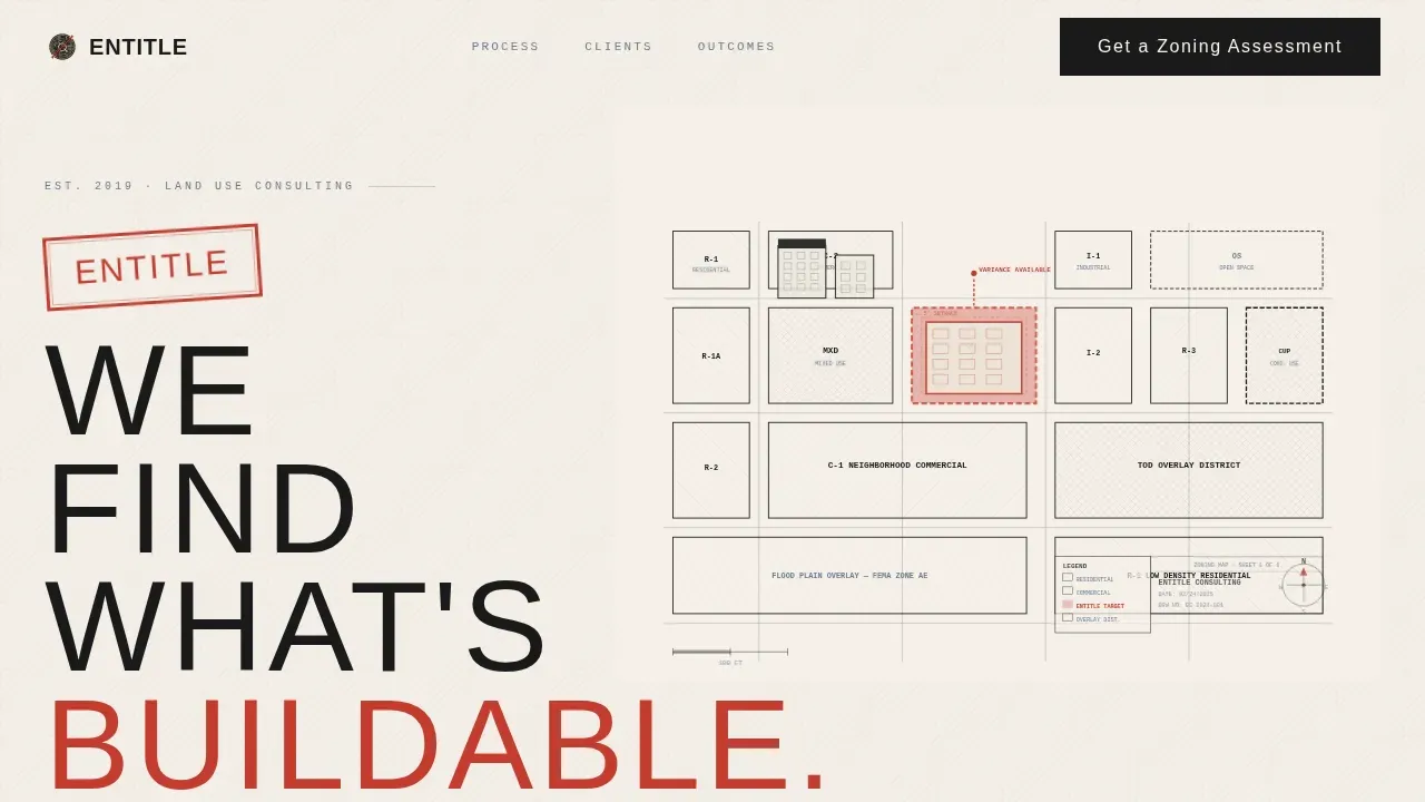
- A hero section with an SVG isometric cityscape, a pulsing red parcel, and a slab-serif stamp headline
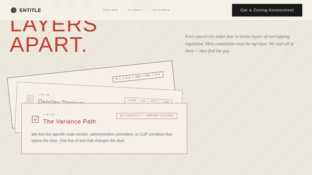
- A scroll-linked zoning layer peel sequence, a hearing room illustration, and a final approved-parcel drawing
- A dual lead generation block combining a short-form zoning assessment intake and a gated PDF download
Feature list
This template includes several key features that make it immediately usable and visually authoritative for zoning and land use consulting work.
Scroll-Linked Illustration Sequence
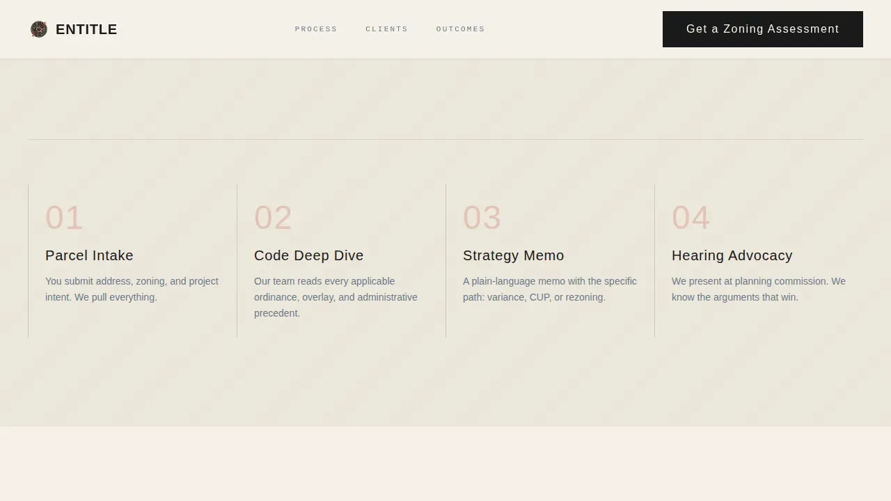
Four full-page illustrated scenes guide users through the entitlement process from tangled overlay to approved parcel. Scroll-triggered animations use CSS and IntersectionObserver so the sequence runs without heavy libraries, keeping load times lean.
SVG Isometric Hero with Stamp Reveal
The hero opens with a hand-drawn-style isometric cityscape rendered in ink on cream. One parcel pulses in surveyor's red on load. A bold slab-serif headline stamps itself onto the composition, placing the primary value proposition and call-to-action above the fold immediately.
Dual Lead Generation Block
The landing page closes with two conversion paths side by side. The primary path is a short intake form asking for property address, current zoning designation, and a single open field labeled "What are you trying to build?" The secondary path gates a one-page PDF download behind an email field.
Who We Serve Bento Grid
An asymmetric bento grid section presents three distinct client profiles: developers, attorneys, and architects. Each tile names a specific pain point, making it easier for each visitor type to self-identify and stay engaged.
Case Outcome Testimonials
A dedicated social proof section presents deal-specific testimonials with concrete metrics such as square footage unlocked and variance timeline. This approach lets the firm showcase real work results rather than generic praise, building trust before the form appears.
Simplified Navigation and Footer
A single-row linear footer and a streamlined navigation bar reduce visual decoration and keep users focused on the content. The site does not compete with itself for attention.
Page sections overview
| Section | Purpose |
|---|---|
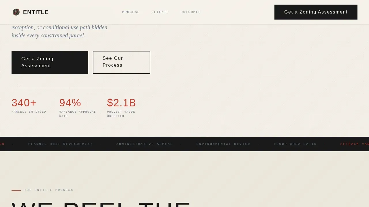
| Hero Illustration | Stamp headline, pulsing parcel, primary call to action above fold |
| Process Layer Peel | Scroll-animated zoning layer sequence performing entitlement steps |
| Who We Serve | Bento grid with developer, attorney, and architect pain points |
| Case Outcomes | Deal-specific testimonials with concrete project metrics |
| Lead Generation | Dual call to action: zoning assessment form and gated PDF download |
| Linear Footer | Single-row footer with simplified navigation links |
Design & branding system
The visual design is rooted in web brutalism translated into a professional editorial register. The Ink & Paper color system anchors every design decision, drawing from the look of a stamped and filed zoning ordinance. Bold typography and high-contrast color combinations make information immediately readable without decoration for its own sake.
- Deep registration black (#1A1A1A), archival cream (#F5F0E8), surveyor's red (#C43B2E), and blueprint steel (#6B7B8D) form the four-color palette
- Bebas Neue handles display and stamp text; DM Serif Display handles editorial headings; JetBrains Mono labels zoning codes and form fields in a raw, industrial monospace style
- All imagery is illustration-only: hand-drawn isometric visuals in ink-on-cream, with no photography or stock images anywhere on the landing page
Mobile & speed optimization
The template is desktop-first by design, reflecting the conference room presentation context its clients inhabit. Full mobile support is built in, with the layout adapting to smaller viewports without losing visual weight or functionality.
- Animations rely on CSS and the IntersectionObserver browser application programming interface (API), avoiding heavy third-party libraries and keeping the site performant at any connection speed
- Minimal graphics and a focused content structure support fast loading times by keeping the design simple and free of unnecessary visual overhead
- The brutalist grid-based layout uses structural shapes rather than decorative imagery, which reduces asset weight and supports a clean rendering experience across devices
How this template helps you convert
The landing page earns trust before asking for anything. By the time a visitor reaches the form, they have watched the firm decode entitlement complexity in real time through illustrated scroll storytelling.
- The stamp headline and pulsing parcel immediately signal a distinctive approach, making users stop and notice the firm's point of view before reading a single line of body text
- The scroll-driven layer sequence functions as a live portfolio of thinking, demonstrating methodology rather than just listing services, which builds confidence in the firm's approach
- The dual-path lead generation block captures both ready-to-engage prospects and early researchers in a single visit, maximizing the conversion value of every site session
Other information about this template
The Entitle bold brutalist zoning and land use consulting landing page template sits within a broader movement of brutalist web design that has grown significantly since the early days of web brutalism in Europe. Brutalism in web design refers to an approach that emphasizes raw, unpolished aesthetics as a deliberate concept rather than a lack of polish. Brutalist websites are characterized by simplicity, raw materials of layout, and functionality over refined decoration. Brutalist web design emerged as a reaction against the polished aesthetics of mainstream commercial sites, and a well-executed brutalist website can help brands stand out while keeping visuals honest and direct.
This template is a strong fit for agencies, boutique consultancies, and solo practitioners who want their web presence to reflect the same rigor they bring to the field. It is fully customizable and can support portfolio additions, service redesign, and updated case outcomes without requiring custom code. Designers and developers talking through the template will notice that the brutalist design approach also brings practical benefits: bold typography and high-contrast color schemes can make information easier to absorb, and the raw aesthetic creates a sense of authenticity that more refined interfaces sometimes lack. Examples of brutalist websites across architecture and urban planning niches show that this style communicates expertise in a way that generic web design templates simply cannot achieve.
- Brand terms in the Surfer keyword set used naturally in this section include references to web brutalism, brutalist web, and the broader brutalist movement as design-history context
- This template is suitable for firms talking to sophisticated B2B audiences: developers, attorneys, and architecture agencies who will recognize and respect the visual language
- The article-style scroll narrative, stark text hierarchy, and absence of unnecessary decoration all reflect the core principle that a brutalist website should prioritize function and content above all else
Theme
Bold Brutalist
Creative direction
Immersive Visual
Color system
Ink & Paper
Style
Storybook/Full-Page
Direction
Lead Generation
Page Sections
Scroll-linked Illustration Sequence
SVG Isometric Hero with Stamp Reveal
Dual Lead Generation Block
Who We Serve Bento Grid
Case Outcome Testimonials Section
Streamlined Navigation and Footer
Related questions
Who is this landing page template designed for?
Can I customize the colors and typography without writing code?
What lead generation tools does the landing page include?
Does the template work well on mobile devices?
Is this template suitable for professional services firms beyond zoning consulting?



