Site Assessment Landing Page Template
A single-page landing page built for environmental site assessment firms serving commercial real estate attorneys, lenders, and developers. It opens with a testimonial card, leads into a Phase I versus. Phase II versus. Limited Subsurface comparison table, and drives visitors toward a detailed intake form through two strategically placed calls to action.
by Rocket studio
Quick summary
This landing page template is designed for environmental consulting firms that specialize in Phase I and Phase II environmental site assessments. It opens with a powerful attorney testimonial, builds credibility through a peer-validated comparison table, and moves visitors toward a scoped intake form. The layout feels like a well-organized due diligence file, structured, authoritative, and easy to act on.
Who this template is for
Environmental engineers and geologists need more than a generic service page. This template is built specifically for firms whose clients arrive with deadlines, liability questions, and deal-critical decisions already in motion.
- Commercial real estate attorneys closing acquisitions on tight timelines
- Lenders requiring Phase I or Phase II reports before funding a transaction
- Developers who have received a recognized environmental condition flag and need immediate soil documentation
What problem this template solves
Most environmental consulting websites bury their value in dense technical language. Visitors who are already under pressure, closing a deal, satisfying a lender, or racing an option period, leave before they find what they need. This template solves that by leading with social proof and organizing service information like a case file.
- Visitors can immediately compare Phase I, Phase II, and Limited Subsurface scope, timeline, and deliverables
- Peer testimonials reassure each audience type without requiring extra reading
- Two clear calls to action reduce friction and guide visitors toward commitment or lead capture
What you get with this template
This template delivers a fully structured, single-page layout purpose-built for environmental site assessment firms. Every section is designed to build trust and earn the next click.
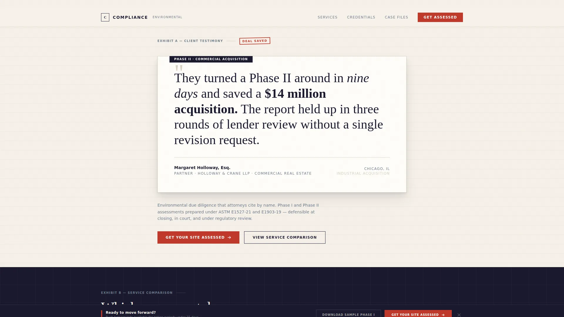
- A header testimonial card featuring an oversized attorney quote in large serif type against a cream background
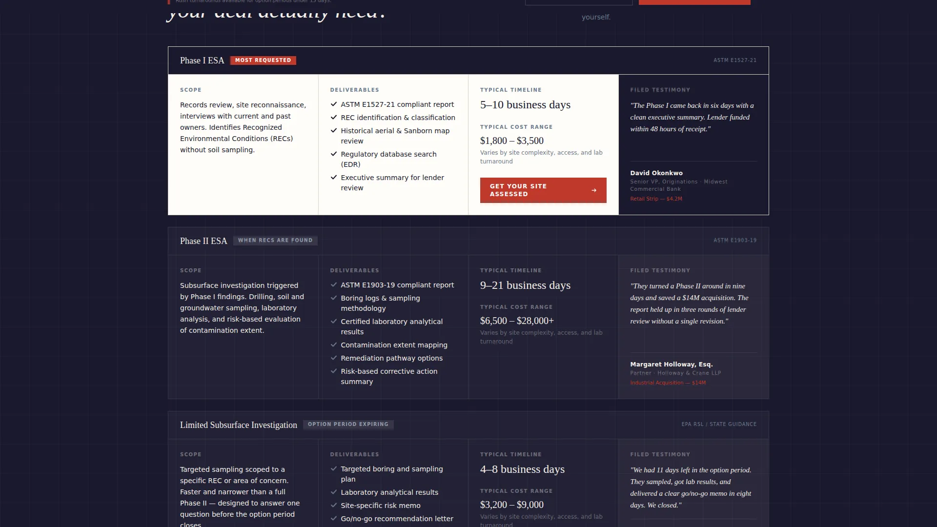
- A three-service comparison table with rows covering scope, timeline, deliverables, and typical cost range
- A fixed bottom call-to-action bar that appears after 60 percent of the page has been scrolled
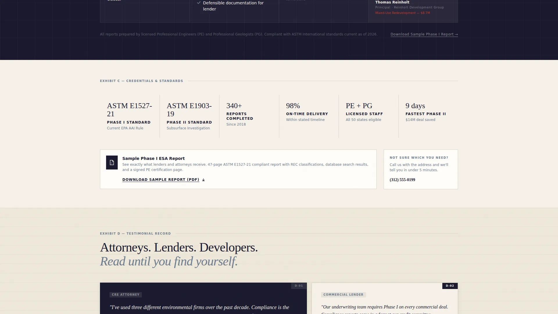
- A secondary call to action for downloading a sample Phase I report to capture early-stage leads
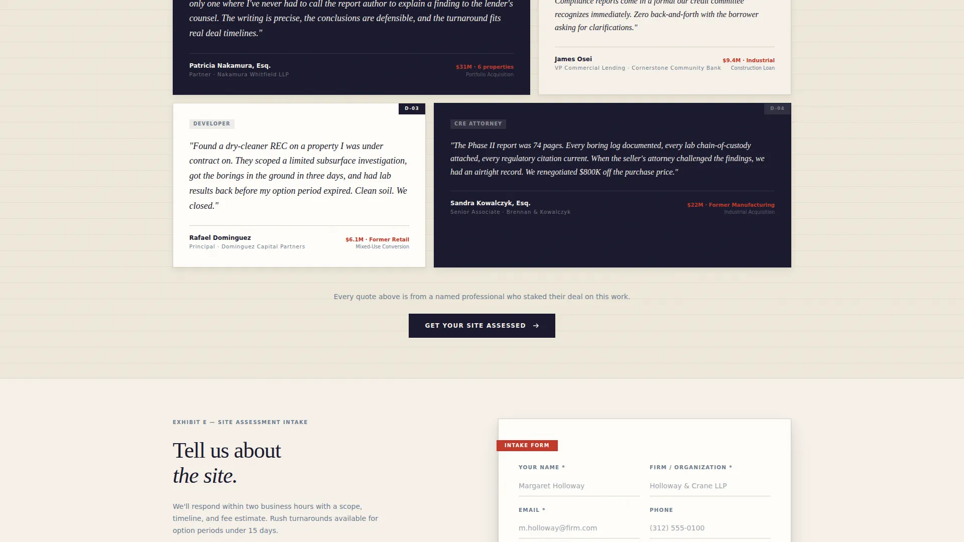
- A testimonial mosaic where attorney, lender, and developer voices appear beside the service row most relevant to them
Feature list
This template is built around a specific set of components that serve the environmental consulting context directly.
Header Testimonial Card
The page opens with a single oversized quote from a real estate attorney, set in large serif type against a brief-paper cream background. The attorney's name, firm, and deal type appear below in small counsel-gray caps. A subtle card shadow gives the block physical weight, like an exhibit lifted from a file folder.
Three-Service Comparison Table
A structured table compares Phase I Environmental Site Assessment, Phase II Environmental Site Assessment, and Limited Subsurface Investigation side by side. Each row covers scope, timeline, deliverables, and typical cost range. The primary call to action, "Get Your Site Assessed," appears at the end of the most-requested service row.
Testimonial Mosaic Layout
Testimonials are placed beside the comparison rows they validate. An attorney quote sits next to a lender quote sits next to a developer quote. Every visitor finds their own professional context reflected in the page without having to search for it.
Fixed Bottom Call-to-Action Bar
After 60 percent scroll depth, a fixed bar appears at the bottom of the viewport repeating the primary call to action. This ensures visitors who read past the table still have a clear next step available without scrolling back up.
Secondary Lead Capture call to action
A second call to action, "Download Our Sample Phase I Report," is embedded in the page to capture visitors who are evaluating deliverable quality before committing. This provides a lower-commitment entry point alongside the primary intake path.
Legal Shield Visual Theme
The design uses a consistent Legal Shield theme throughout. Deep deposition black and brief-paper cream alternate as section backgrounds. Redline red appears only for risk callouts and urgent calls to action. Counsel-gray handles secondary text and table borders.
Page sections overview
| Section | Purpose |
|---|---|
| Header Testimonial Card | Opens with attorney social proof to establish immediate credibility |
| Comparison Table | Side-by-side breakdown of Phase I, Phase II, and Limited Subsurface services |
| Primary call to action Row | "Get Your Site Assessed" button placed at the most-requested service row |
| Testimonial Mosaic | Peer quotes from attorneys, lenders, and developers placed beside relevant rows |
| Secondary call to action Block | "Download Our Sample Phase I Report" for early-stage lead capture |
| Fixed Bottom Bar | Persistent call-to-action bar activating after 60 percent scroll |
Design & branding system
The visual identity follows a Legal Shield theme built on an Ink and Paper color palette. The result feels like a senior partner's desk at dawn: heavy bond paper, a fountain pen uncapped, and color-coded due diligence binders stacked nearby.
- Deep deposition black (#1A1A2E) and brief-paper cream (#F5F0E8) alternate as section backgrounds to create a rhythm of authority and clarity
- Redline red (#C0392B) appears sparingly, reserved only for risk callouts and urgent calls to action, so it reads like a stamp marked urgent every time it appears
- Counsel-gray (#6B7B8D) handles all secondary text and table borders, keeping the layout readable without competing with primary content
Mobile & speed optimization
The template is structured to remain readable and actionable on smaller screens. The comparison table and fixed bottom bar are both designed with mobile viewing in mind.
- The comparison table is built to reflow cleanly so service rows remain scannable on narrow viewports
- The fixed bottom call-to-action bar stays persistently visible on mobile after the scroll threshold is reached
- Section backgrounds alternate in high-contrast pairings to maintain legibility across screen sizes and lighting conditions
How this template helps you convert
This template is designed as a click-through page. Every layout decision moves a qualified visitor toward one of two actions: submitting the intake form or downloading the sample report.
- The header testimonial card does the hardest conversion work first. A senior attorney's words carry more weight with the target audience than any marketing headline, so the page earns trust before asking for anything.
- The comparison table removes the need for a discovery call to explain service differences. Visitors self-qualify by reading scope, timeline, and cost range, then click the call to action already knowing what they need.
- The testimonial mosaic ensures that no visitor feels like they are reading someone else's case study. Each professional role sees a peer voice validating the exact anxiety they arrived with.
Other information about this template
This template is part of a Professional Services collection focused on Environmental Consulting and Environmental Site Assessment use cases. It is matched to firms that operate at the intersection of compliance work and real estate transaction timelines.
- The template style is a comparison table landing page, designed to present multiple service tiers clearly without requiring additional pages
- The creative direction follows a Testimonial Mosaic approach, meaning social proof is distributed throughout the page rather than grouped in one section
- The header concept is a Testimonial Card, an intentional choice to lead with peer validation rather than product claims or hero imagery
- The landing page direction is click-through, optimized to move visitors to a detailed intake form on a separate page rather than converting directly on this page
- The color system is Ink and Paper, a palette chosen to communicate precision, credibility, and legal-adjacent authority without relying on imagery
- This template is suited for firms whose deliverables must be defensible under scrutiny, such as those preparing reports for ASTM standard compliance processes or lender review
Theme
Legal Shield
Creative direction
Testimonial Mosaic
Color system
Ink & Paper
Style
Comparison Table
Direction
Click-Through
Page Sections
Header Testimonial Card
Three-service Comparison Table
Testimonial Mosaic Layout
Fixed Bottom Call-to-action Bar
Secondary Lead Capture Call to Action
Legal Shield Visual Theme
Related questions
What types of clients is this landing page template designed for?
Does the template include the comparison table content or just the layout?
Where do the calls to action lead?
Can I adapt this template if my firm offers fewer than three service tiers?
Is this template suitable for firms that also handle remediation work?



