Easter Business Pricing Website Template
Escape is a single-page Easter travel landing page built for upgrade-focused travel companies. It pairs a countdown timer header, side-by-side destination galleries, and scroll-triggered detail panels to show couples exactly what they could have for a small price difference. Every section pushes one clear action: upgrade before Easter weekend.
by Rocket studio
Quick summary
Escape is a vibrant Easter travel landing page designed to turn hesitant bookers into eager upgraders. It opens with a live countdown to Easter Friday, walks visitors through a destination-by-destination comparison of standard versus premium packages, and closes every detail panel with a single, low-friction upgrade prompt. The page is built around one persuasive idea: show the gap, never the total.
Who this template is for
This template is built for travel companies that sell short Easter getaway packages and want to increase revenue through on-page upsells rather than new bookings. It speaks directly to couples who have already secured a basic deal and are considering a boutique upgrade.
- Travel brands offering four-day Easter packages to sun-drenched destinations
- Tour operators focused on upselling add-ons such as sea-view suites, private drivers, or chef breakfasts
- Small travel businesses that want a high-impact seasonal landing page without building from scratch
What problem this template solves
Most travel pages ask visitors to make a big decision all at once. That approach loses the couple who is already half-sold but needs one more nudge. This template reframes the ask entirely, showing only the price difference between what they booked and what they could have.
- Removes sticker shock by displaying cost deltas rather than full package prices
- Bridges the gap between a standard booking and a premium experience through visual comparison
- Captures late-night upgrade intent before the long weekend arrives and the window closes
What you get with this template
The template delivers a complete, section-led single-page layout built around the upgrade journey. Every component serves the moment when a couple realizes their Easter could be better.
- A full-width countdown timer header with a mosaic thumbnail grid and animated gradient background
- Scroll-triggered side-by-side gallery cards comparing standard and premium tiers for each destination
- Expandable detail panels with itinerary upgrades, golden-hour photography, and per-night price deltas
- A pinned "Upgrade My Easter" call-to-action button on every panel, opening a slim booking drawer
- A full comparison table accessible via a secondary "Compare All Tiers" call-to-action
Feature list
This template packs several purpose-built components into a single scroll flow. Each one earns its place by moving a visitor one step closer to the upgrade.
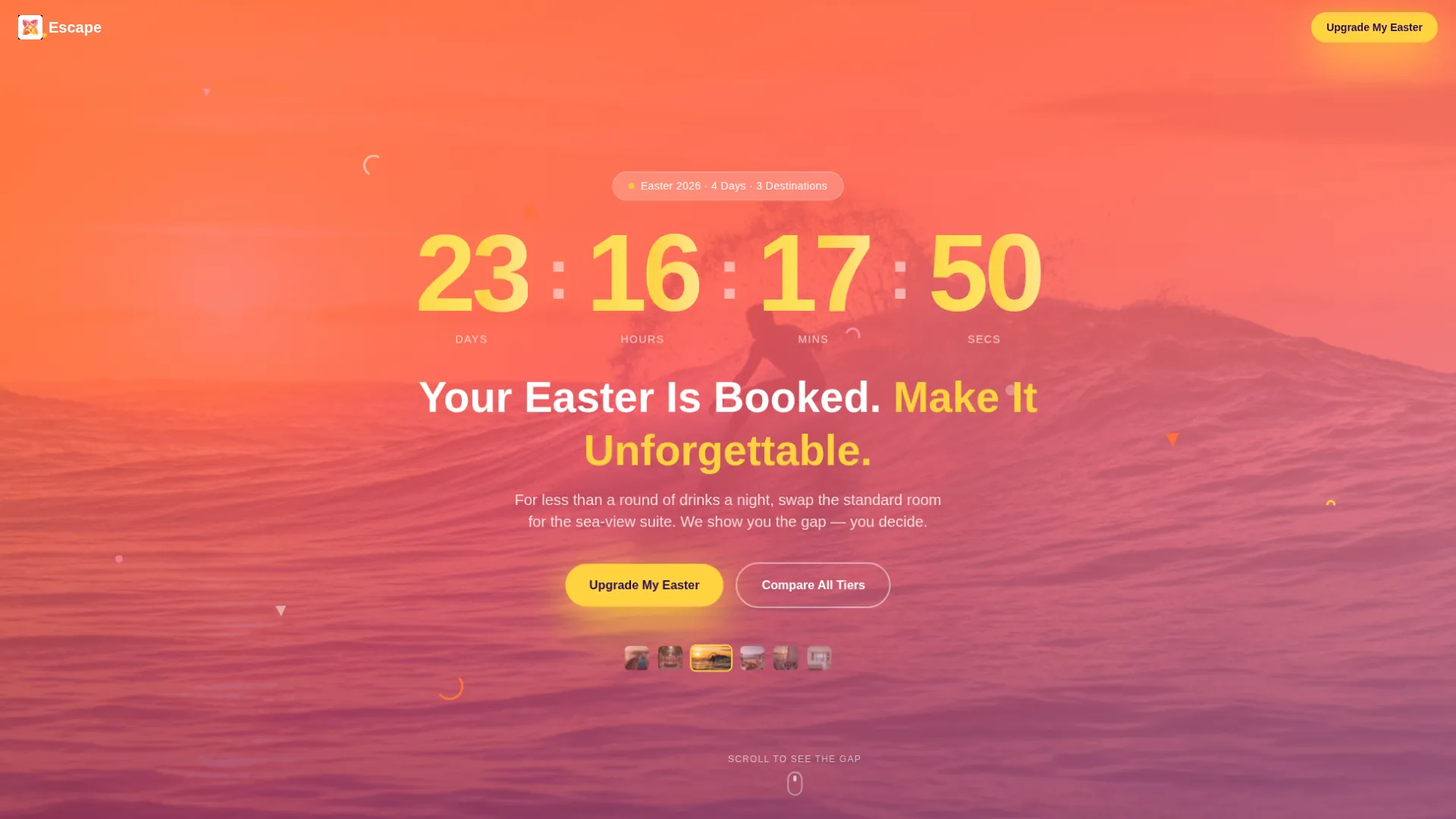
Live Easter Countdown Timer
A full-width header counts down the days, hours, and minutes to Easter Friday using oversized lemon-curd numerals on a pulsing tangerine-to-grapefruit gradient. A mosaic grid of destination thumbnails cycles behind the clock, rotating between Santorini terraces, hammam ceilings, and surfer action shots every few seconds.
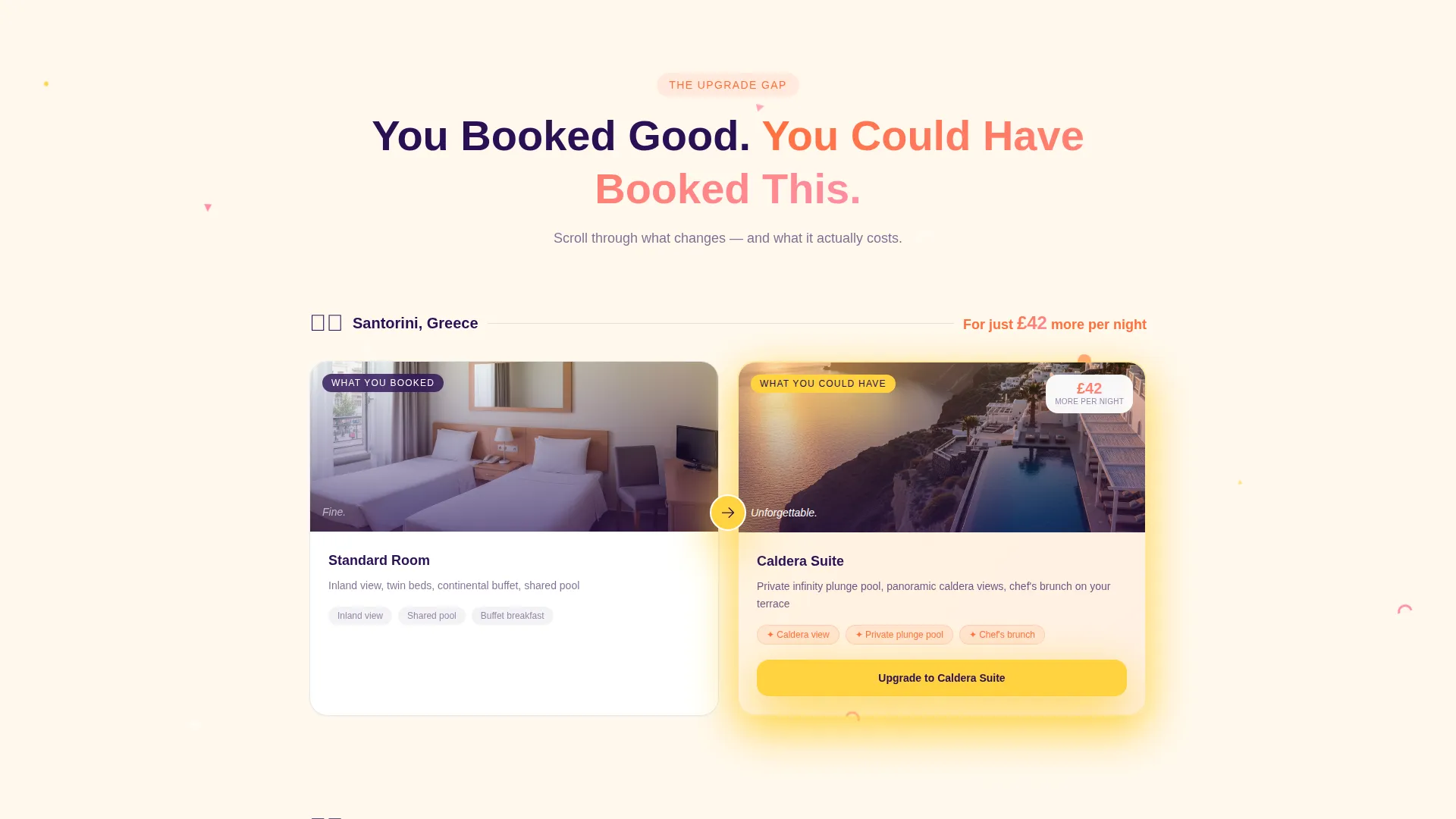
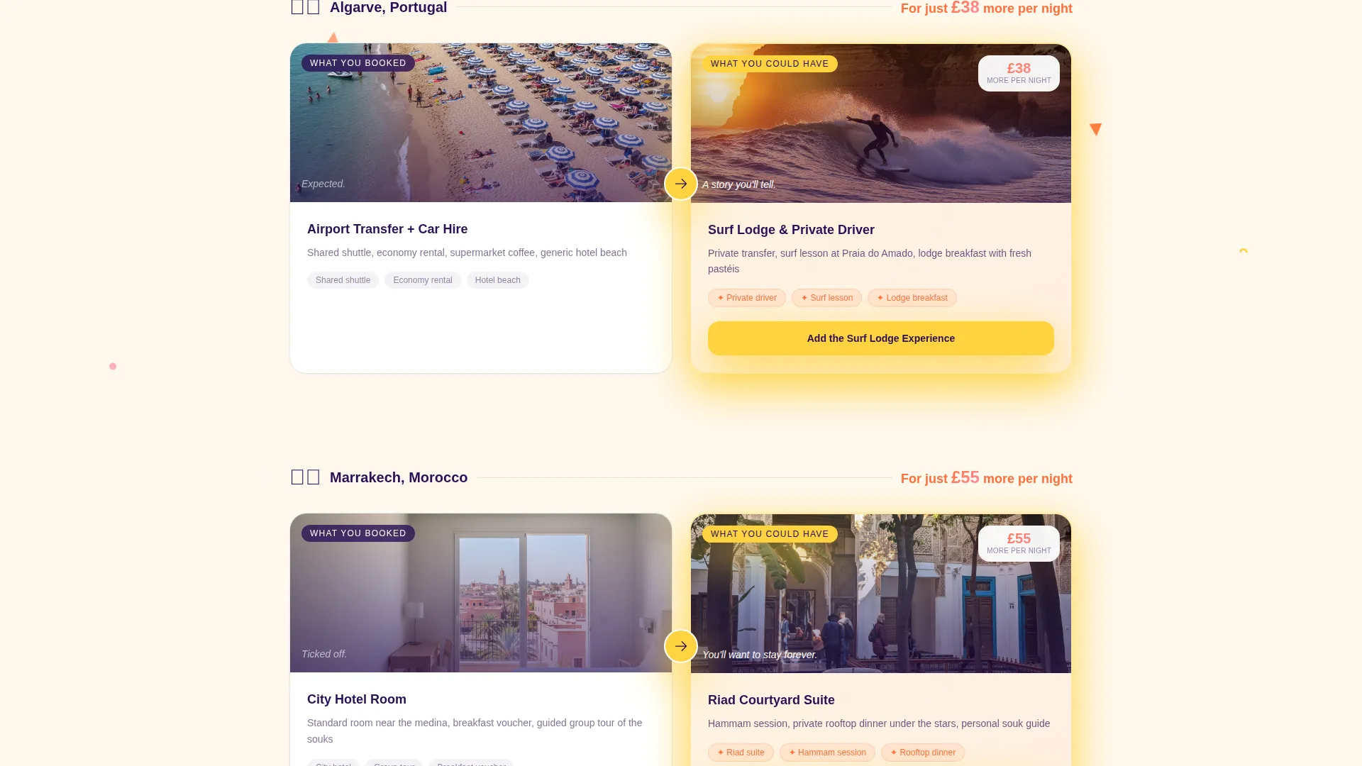
Scroll-Triggered Comparison Gallery
Each destination is introduced as a side-by-side gallery card. The left side shows the standard booking and the right reveals the premium upgrade. Cards animate into view as the visitor scrolls, building anticipation section by section.
Expandable Destination Detail Panels
Clicking or tapping a gallery card expands it into a full detail panel. The panel shows itinerary upgrades, curated golden-hour photography, and a single price delta. The geometric confetti decoration intensifies with each panel, reinforcing the sense of unwrapping something special.
Pinned Upgrade Drawer
The primary call-to-action button is pinned to the bottom of every detail panel. Clicking it opens a slim drawer that displays the visitor's existing booking pulled from a reference code entered on arrival, the chosen upgrade tier, and the precise price difference.
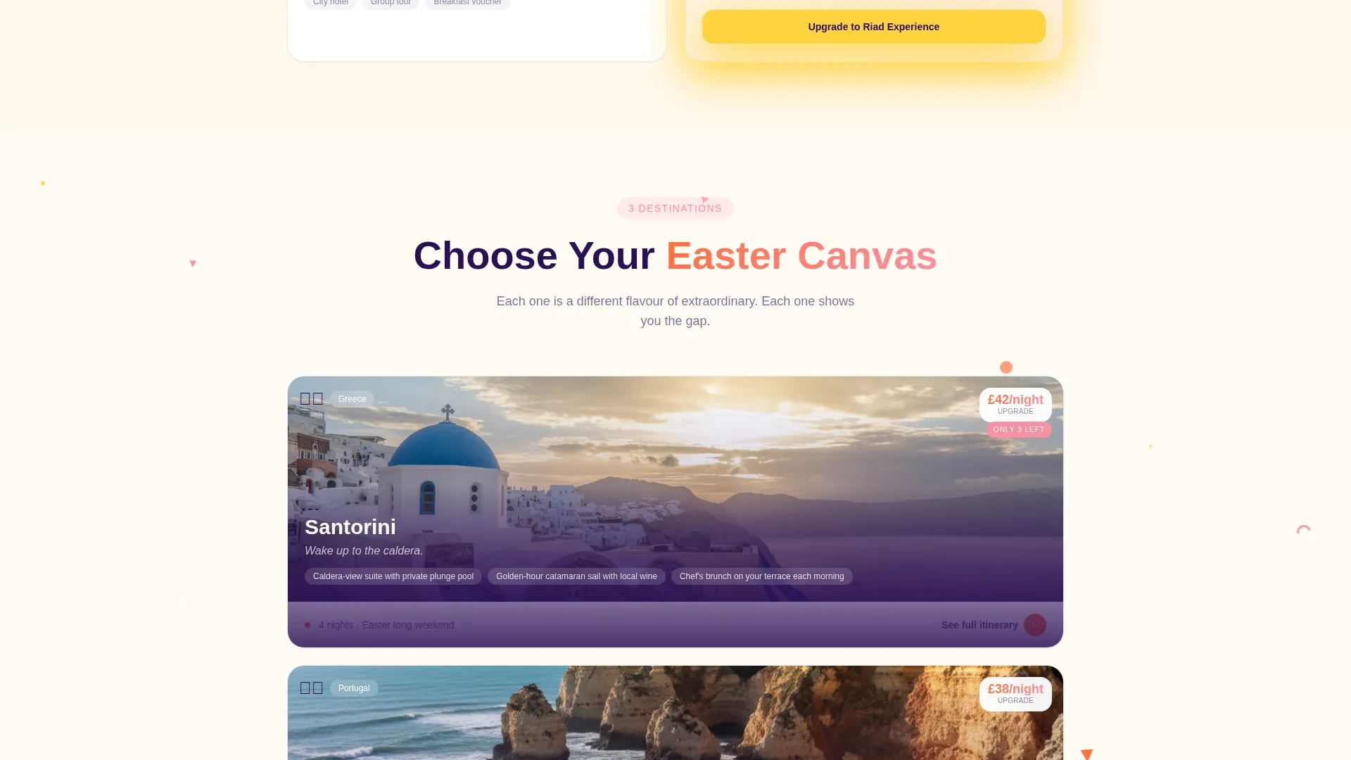
Full-Tier Comparison Table
A secondary call-to-action scrolls the visitor to a complete comparison table covering all destinations and upgrade tiers side by side. This gives detail-oriented buyers the full picture without cluttering the main scroll flow.
Playful Geometric Confetti System
Triangles, arcs, and confetti dots frame every gallery card like torn wrapping paper. The density and energy of the geometric decoration increases as the visitor scrolls deeper, visually signaling progression and building toward the upgrade moment.
Page sections overview
| Section | Purpose |
|---|---|
| Countdown Timer Header | Anchors urgency and sets the holiday mood |
| Destination Gallery Cards | Introduces each location with scroll-triggered reveal |
| Comparison Detail Panels | Shows upgrade specifics and price delta per destination |
| Upgrade Booking Drawer | Captures the upgrade action with minimal friction |
| Full Comparison Table | Supports thorough buyers comparing all tiers |
Design & branding system
The visual identity follows a Playful Geometric theme paired with a Citrus Burst color system. The palette channels a fruit market in southern Spain: bright, warm, and impossible to scroll past.
- Core colors: tangerine zest (#FF6F3C), lemon curd (#FFD23F), pink grapefruit (#FF8FA4), and deep açaí (#2B1055) for text and anchoring elements
- Section rhythm: tangerine and lemon alternate as accent backgrounds over clean white, while açaí grounds all headlines and navigation
- Geometric motifs: triangles, arcs, and confetti dots decorate gallery cards and intensify progressively as the visitor scrolls
Mobile & speed optimization
The page is designed to perform well on small screens where late-night browsing decisions are made. Every layout choice accounts for thumb-friendly navigation and compact viewport sizes.
- Gallery card pairs stack vertically on mobile so comparisons remain clear without side-by-side scrolling
- The pinned call-to-action button stays accessible at the bottom of each panel regardless of screen size
- The countdown timer and mosaic thumbnail grid scale responsively to fill the header without overflow
How this template helps you convert
This template is engineered around a single persuasive principle: make the upgrade feel small and the reward feel enormous. Every layout decision supports that goal.
- The countdown timer creates genuine urgency by showing exactly how much time remains before Easter Friday, pushing the visitor to decide now rather than later.
- Scroll-triggered gallery comparisons build desire progressively, letting each destination raise the stakes before the visitor reaches the booking drawer.
- Showing only the per-night price delta, rather than the full package cost, lowers the perceived risk of upgrading and keeps the focus on the experience gained.
Other information about this template
This template sits at the intersection of seasonal retail and travel commerce, making it well suited for Easter-specific campaign pages that need to convert within a narrow time window.
- The reference-code entry point at page arrival allows the drawer to reflect each visitor's actual booking, making the upgrade prompt feel personal rather than generic
- The Playful Geometric theme and Citrus Burst palette are designed to feel festive and premium simultaneously, matching the tone of boutique travel without looking childish
- The template is built as a single-page layout, making it straightforward to deploy as a standalone campaign URL alongside an existing travel website
- The Bento Grid template style organizes destination content into modular card blocks, keeping the layout flexible if the number of featured destinations changes
- The Seasonal/Moment creative direction means the page has a clear shelf life: it is designed to drive urgency in the days leading up to Easter and is best used as a time-limited campaign asset
Theme
Playful Geometric
Creative direction
Seasonal/Moment
Color system
Dopamine Pop
Style
Bento Grid
Direction
Direct Sales
Page Sections
Live Easter Countdown Timer
Scroll-triggered Comparison Gallery
Expandable Destination Detail Panels
Pinned Upgrade Booking Drawer
Full-tier Comparison Table
Playful Geometric Confetti System
Related questions
How does the booking drawer know which package the visitor already has?
Can I feature more than three destinations on this page?
Does the countdown timer update automatically?
Is this template suitable for a travel brand not focused on Easter?
What happens when a visitor clicks Compare All Tiers?


