Serene Alpine Wellness Landing Page Template
Refuge is a neo-retro Alpine wellness retreat landing page template built for luxury spa hotels and sanctuary experiences in the Swiss mountains. It pairs a Northern Lights color system with a masonry gallery layout and a multi-step booking flow. The design creates a sensory journey that guides guests from first scroll to confirmed stay, delivering depth, restraint, and quiet confidence.
by Rocket studio
Quick summary
Refuge is a single-page template crafted for Alpine wellness hotels and spa retreats. It uses a masonry layout, a Northern Lights color system, and a cinematic vertical hero to create an atmosphere of earned stillness. Every section works to build trust before the booking moment arrives, providing a seamless, sensory-led path from first impression to confirmed room reservation.
Who this template is for
This template is built for hospitality professionals who need a landing page that sells through feeling rather than hard copy. It suits spa directors, retreat founders, and hotel owners who want guests to sense the place before they arrive.
- Luxury Alpine spa hotels and wellness sanctuaries seeking high-intent bookings
- Independent retreat operators offering structured programs such as digital-silence, thermal, or movement protocols
- Hospitality designers and agencies delivering a polished project for a premium wellness brand
What problem this template solves
Marketing a wellness retreat online is hard when your product is, fundamentally, the absence of noise. Most hotel templates shout. This one whispers. It gives guests the experience of arriving before they book.
- Standard templates push generic calls to action and crowd the room with competing messages, undermining the sense of calm a spa brand needs to convey
- Booking flows on most hotel pages feel transactional, not personal, which creates friction for guests making high-consideration, high-spend decisions
- Wellness businesses struggle to translate the texture of their physical space into a digital identity that feels equally crafted and specific
What you get with this template
You get a fully structured landing page that guides visitors through a sensory progression, from a cinematic hero to a masonry gallery to a multi-step booking modal. Every section is purpose-built to create trust and move guests toward committing to their stay.
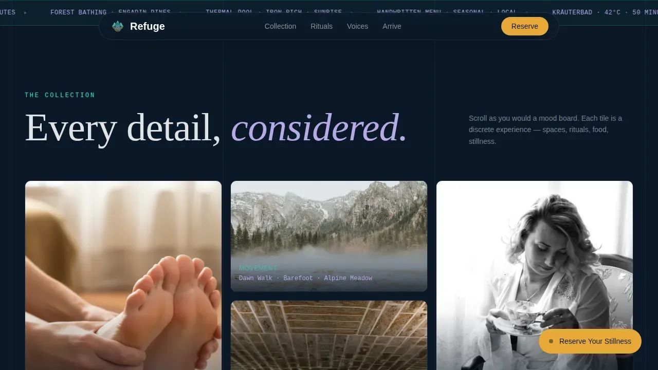
- A vertical portrait hero with a glassmorphic overlay card and headline typography drawn from 1960s Swiss poster design
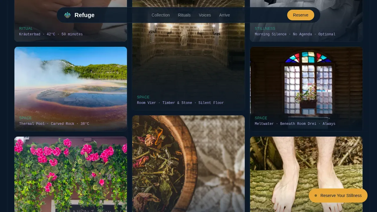
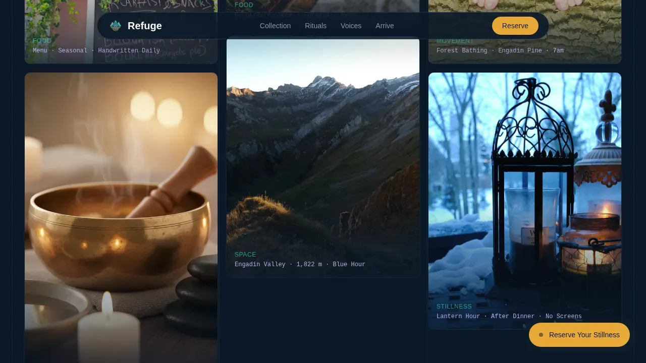
- A masonry gallery delivering a curated collection of varied-ratio tiles, each carrying lavender captions that read like museum placards
- A multi-step booking modal covering arrival dates, retreat type, room preference, and a personal arrival note field
Feature list
This template is built around six core capabilities, each grounded in the source brief and designed to work together as a coherent, high-converting landing page.
Cinematic Vertical Hero Section
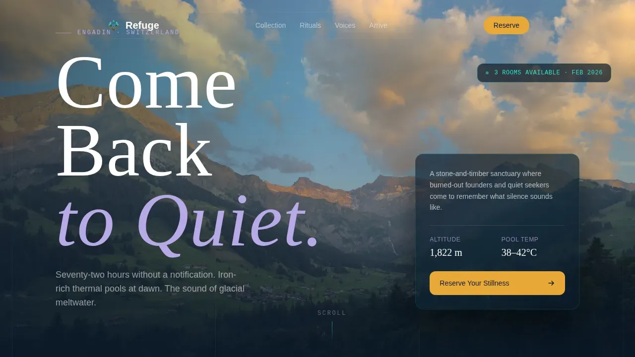
The hero uses a tall portrait composition: a single room-height frame showing a linen-robed figure at a floor-to-ceiling window, blue-hour light, and a timber bathhouse trailing steam outside. The serif headline "Come Back to Quiet" appears as a glass reflection overlay. The crop forces the visitor to scroll, creating immediate curiosity and a sense of arrival.
Masonry Gallery with Lavender Captions
The gallery section uses a Pinterest-style masonry layout where no two tiles share the same aspect ratio. Each tile carries a one-line glacial lavender caption formatted like a spa treatment card: "Kräuterbad · 42°C · 50 minutes." As visitors scroll, tiles shift from interiors and architecture to rituals, cuisine, and stillness, building a sensory argument tile by tile.
Multi-Step Booking Modal
The floating amber "Reserve Your Stillness" pill lives in the bottom-right corner and triggers a layered booking flow. Step one captures arrival and departure dates on a minimal calendar. Step two presents retreat type options. Step three shows room preference with thumbnail previews. Step four offers a single open text field for personal arrival notes. A secondary path lets visitors request a call for bespoke programs.
Rituals Specification Section
A dedicated rituals section lists each spa program as a spec row: treatment name, temperature, duration, and type. This provides the depth and specificity that guests in the premium hotel segment need before committing. It also gives the page a sense of living, detailed knowledge about the retreat rather than vague wellness claims.
Testimonials Block
A large blockquote card presents named, specific guest voices. Testimonials from past attendees highlight emotional and physical transformations, providing social proof that feels personal rather than generic. This section reinforces brand identity and builds the trust that turns a browsing visitor into a confirmed booking.
Northern Lights Color and Typography System
The design uses aurora teal, deep polar night, glacial lavender, and warm lantern amber across every section. Fraunces serif handles headlines; DM Sans handles body text. Amber is reserved exclusively for calls to action and hover states, creating a consistent visual identity that guides the eye naturally toward the booking moment.
Page sections overview
| Section | Purpose |
|---|---|
| Hero Portrait Frame | Opens the page with a cinematic vertical composition and the headline "Come Back to Quiet" |
| Masonry Gallery | Delivers a curated, sensory-progression tile layout with lavender spa captions |
| Rituals Spec Rows | Lists thermal, movement, and silence programs with precise temperatures and durations |
| Testimonials Block | Presents specific guest voices in a large blockquote card for social proof |
| Booking Modal Flow | Captures dates, retreat type, room choice, and a personal arrival note |
| Minimal Footer | Provides a clean horizontal footer with essential links and no visual clutter |
Design & branding system
The design language draws from 1960s Swiss travel poster artistry and merges it with contemporary spacing and a neo-retro color palette. The result is a visual identity that feels both timeless and unmistakably now. Architecture and nature work together throughout: stone-and-timber interiors meet glacial light, and the palette mirrors the sky shifting over a frozen Alpine lake.
- Color system: polar night (#0B1929) dominates backgrounds; aurora teal (#2DE2C6) washes across image overlays and dividers; glacial lavender (#B8A9E8) carries pull-quotes and secondary text; warm amber (#E8A838) marks every call to action
- Typography: Fraunces serif with generous letter-spacing for headlines, DM Sans for body text, providing a sense of depth and refinement across every room and section
- Motion and lighting: high-animation entrance sequences, masonry stagger on scroll, scroll-linked parallax, and GPU-accelerated transforms create a living, cinematic page experience
Mobile & speed optimization
The template is designed desktop-first, reflecting the device habits of its primary guests: founders and professionals arriving from Zürich or London, typically on laptops. Mobile responsiveness is built in so that guests who discover the retreat on their phone can still access the full booking flow and gallery experience without friction.
- Image lazy loading is included to keep initial load times lean, supporting the goal of a fast-loading page that begins delivering value in under two seconds
- GPU-accelerated transforms are used for all animations, keeping scroll performance smooth across devices and screen sizes
- The multi-step booking modal is designed for clean mobile interaction, ensuring the booking flow works on smaller screens without losing its sense of calm and order
How this template helps you convert
The conversion strategy in Refuge is built on restraint. The page never hard-sells. Instead, it creates an environment where the decision to book feels natural, even inevitable.
- The floating amber call-to-action pill remains visible throughout the entire scroll journey, providing persistent, low-pressure access to the booking modal at any point a visitor feels ready to reserve their room
- The masonry gallery builds a cumulative sensory case for the retreat, so that by the time a visitor reaches the booking modal, they are not being persuaded but are already imagining their stay
- The "Request a Call" secondary path captures high-intent visitors who want a bespoke multi-day program, providing an added conversion route for guests whose needs fall outside the standard retreat menu
Other information about this template
This template is a strong fit for any hospitality project where the guest experience begins the moment someone lands on the page. It draws on design principles used across some of the world's leading spa hotel markets, including destinations in Austria, Italy, and South Tyrol, where the collaboration between natural landscape and refined interiors defines the guest offer.
- The neo-retro visual direction is adaptable: the color system and typography can be adjusted to reflect local culture and brand identity, making it suitable for retreat projects in Switzerland, Austria, Spain, or any Alpine-adjacent island or mountain area
- The template supports the full brand journey from first view to confirmed booking, providing a ground-up framework for hotel and spa operators who need a credible, beautiful home on the web without starting from scratch
- Wellness operators in emerging markets such as South Tyrol or Austria will find the architecture of this template aligns naturally with the region's tradition of integrating living nature into spa amenities and hotel design
- The Refuge neo retro alpine wellness retreat landing page template is built to serve as both a standalone booking page and a launchpad for a broader digital presence, with room to grow as the retreat's programming and gardens expand over time
Theme
Neo-Retro
Creative direction
Curated Collection
Color system
Northern Lights
Style
Masonry/Pinterest
Direction
Booking/Scheduling
Page Sections
Cinematic Vertical Hero with Glass Overlay
Masonry Gallery with Spa Captions
Multi-step Booking Modal
Rituals Specification Section
Northern Lights Color and Type System
Testimonials and Social Proof Block
Related questions
Can I adapt this template for a spa hotel outside Switzerland?
Does the booking modal connect to an external calendar or reservation system?
What retreat types does the template present in the booking flow?
Is this template suitable for a solo retreat operator or only large hotel brands?
Can the color system and typography be customized to match an existing brand identity?