Depression Education Landing Page Template
Exhale is a depression patient education landing page designed to guide visitors from confusion and shame toward booking a first conversation with a mental health professional. It pairs warm, jargon-free clinical language with a calming visual system, a fixed anchor navigation, and a low-friction scheduling form built around compassion rather than paperwork.
by Rocket studio
Quick summary
Exhale is a single-page depression education template built for mental health practices and patient-facing platforms. It translates clinical knowledge into human language, uses a fixed left anchor navigation to walk visitors through honest questions they are already asking, and ends with a gentle, three-field booking form that removes every unnecessary barrier between a visitor and a first conversation.
Who this template is for
This template serves mental health professionals and patient education platforms that need to reach people at a vulnerable moment and guide them toward care without making them feel like a case file.
- Therapists and psychiatry practices looking to reduce the shame barrier before a first appointment
- Mental health organizations publishing depression education content for general audiences
- Loved ones or caregivers who are searching for resources to share with someone they care about
What problem this template solves
Most clinical web pages either overwhelm visitors with medical terminology or strip out so much context that the content feels hollow. Neither approach helps someone who is quietly struggling decide to reach out. This template addresses the specific barrier that sits between recognition and action: shame.
- Visitors feel seen before they are asked to do anything
- Clinical information is reframed in warm, accessible language so it informs without intimidating
- The booking path is designed for people who find phone calls difficult, removing friction at every step
What you get with this template
You get a fully structured, single-page depression education layout with five clearly defined content sections, a persistent booking interface, and a cohesive visual identity built around therapeutic calm.
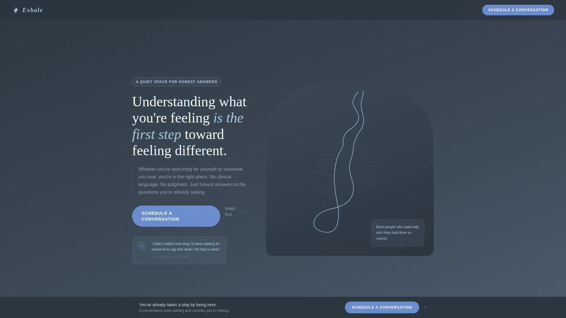
- Animated SVG line art hero with a breathing contour illustration and a primary "Schedule a Conversation" call to action
- A fixed left anchor navigation linking to four honest, visitor-voiced FAQ sections that build trust through accumulation
- A minimal three-field booking form and a secondary "Send This Page to Someone" share button for visitors acting on behalf of a loved one
Feature list
This template includes the following built-in capabilities derived directly from the design brief.
Animated SVG Line Art Hero
The header features a single continuous line drawing of a human profile rendered in dawn-sky blue against deep slate. A subtle CSS animation causes the interior contours to shift slowly, giving the illustration the quality of calm breathing. No stock photography is used anywhere on the page.
Fixed Left Anchor Navigation
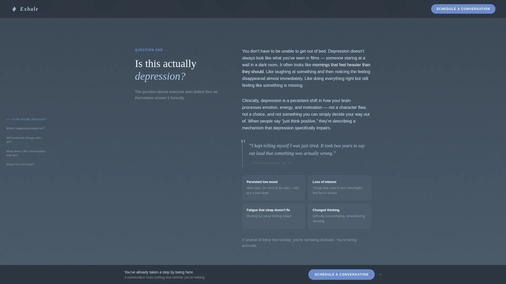
A fixed navigation panel sits on the left side of the screen throughout the entire scroll. Each link is phrased as a genuine visitor question, such as "Is this actually depression?" and "What if I am not ready?" Clicking any link scrolls directly to the corresponding content section.
Scroll-Triggered Section Transitions
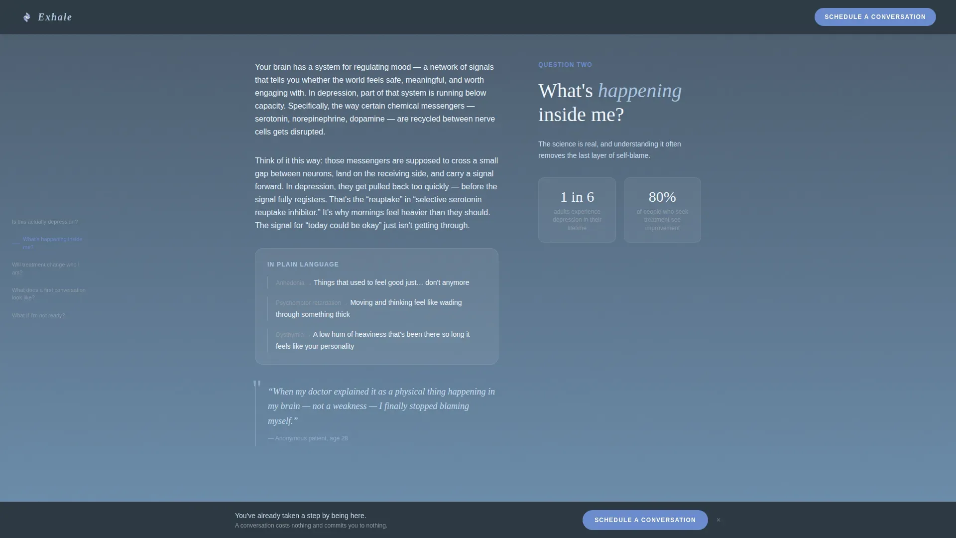
Each content section activates as the visitor scrolls into it. Section backgrounds shift progressively from deeper slate tones at the top toward lighter dawn-sky blue tones further down, so the visual experience mirrors a gradual shift from heaviness toward clarity.
Low-Friction Booking Form
The scheduling form asks for three things only: preferred contact method (call, text, or email), first name, and an optional free-text field labeled "Anything you'd like us to know beforehand." There are no insurance fields, no condition dropdowns, and no language that makes the visitor feel clinical.
Persistent Bottom Call-to-Action Bar
Once a visitor scrolls past the halfway point of the page, a soft periwinkle bottom bar slides into view. It carries the "Schedule a Conversation" button and stays visible as the visitor continues reading, offering a low-pressure path to the form at any moment.
Share Button for Loved Ones
A secondary action labeled "Send This Page to Someone" appears alongside the final booking section. It acknowledges that many visitors arrive on behalf of a partner, friend, or family member and gives them a quiet, dignified way to pass the resource along.
Page sections overview
| Section | Purpose |
|---|---|
| Hero with illustration | Introduce the page with animated line art and the primary booking call to action |
| Is this depression? | Validate symptoms using warm, shame-free language |
| What's happening inside? | Explain the neuroscience of depression without clinical jargon |
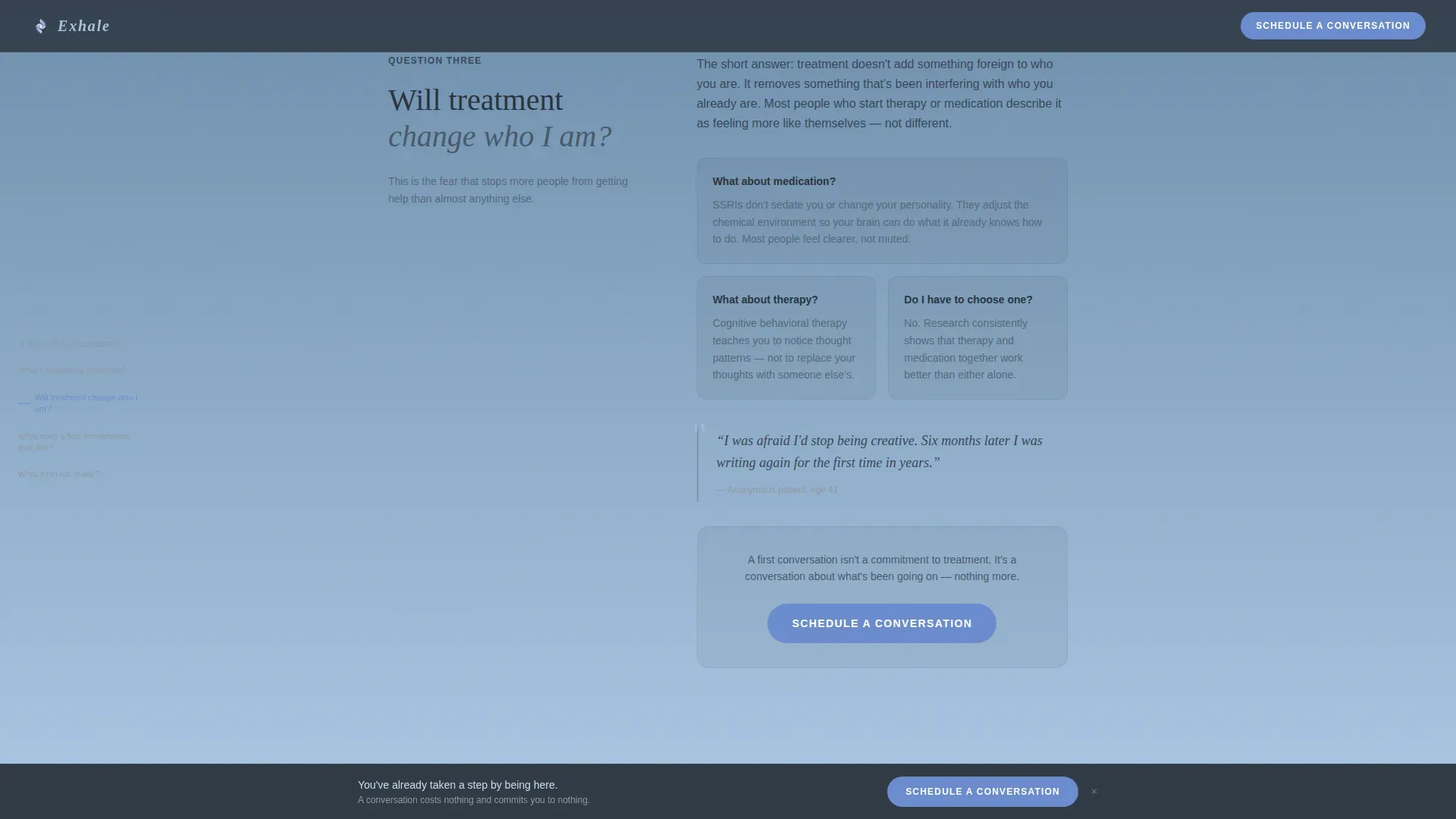
| Will treatment change me? | Address identity fears and introduce the first in-page booking prompt |
| What does a first conversation look like? | Walk through the process and present the final booking form and share button |
| Ultra-minimal footer | Close the page cleanly without adding cognitive load |
Design & branding system
The visual identity follows a Soft Gradient theme built on a Slate and Sky color system. Every color decision has a deliberate emotional role, and the palette was designed to feel like a gray morning slowly brightening from a window seat.
- Deep therapeutic slate (#3B4856) anchors headlines and grounding text; overcast gray (#8E99A4) fills secondary surfaces; dawn sky blue (#A8C4E0) washes across section backgrounds in horizontal gradients
- A single hopeful periwinkle (#6B8CCE) is reserved exclusively for interactive elements and the booking button, making every clickable element immediately recognizable
- Typography pairs Fraunces serif headlines with DM Sans body text, combining editorial warmth with clean readability
Mobile & speed optimization
This template was built with a mobile-first approach, recognizing that many visitors arrive late at night on a phone, in a quiet moment when they finally feel ready to search.
- CSS animations are preferred over heavy JavaScript, keeping the breathing SVG illustration and scroll transitions light on mobile hardware
- The fixed anchor navigation adapts to smaller screens so it remains usable without crowding the content area
- The three-field booking form is touch-friendly and intentionally short, reducing the effort needed to take the first step on any device
How this template helps you convert
The conversion path is built on the principle that trust must come before action. Every design and copy decision removes one more reason for a visitor to leave before reaching the form.
- The anchor navigation organizes the page around questions visitors are already thinking, so each section they read feels like a direct answer rather than a sales pitch, building enough confidence to keep scrolling
- The "Schedule a Conversation" button appears first after the third FAQ section, then again in the persistent bottom bar once the visitor reaches the halfway point, offering the booking path at the right emotional moment without applying pressure
- The three-field form, combined with the option to choose text or email over a phone call, removes the specific friction points that most commonly cause hesitant visitors to abandon a mental health booking flow
Other information about this template
This template is designed for a depression patient education platform context but can support any mental health practice or healthcare-adjacent organization that needs to communicate with empathy before asking visitors to commit to care.
- The template includes anonymized patient pull quotes positioned as social proof, lending warm clinical authority without identifying anyone
- The footer follows an ultra-minimal horizontal pattern, keeping the close of the page calm and uncluttered
- The page type is a single landing page, not a multi-page website, so all content and navigation exist within one scrollable experience
- The progressive background gradient, moving from darker slate at top to lighter sky tones below, is intentional: the page itself becomes a visual metaphor for emerging clarity as the visitor reads
Theme
Soft Gradient
Creative direction
FAQ-Driven
Color system
Slate & Sky
Style
Hub & Spoke (Anchor Nav)
Direction
Booking/Scheduling
Page Sections
Animated SVG Line Art Hero
Fixed Left Anchor Navigation
Scroll-triggered Section Transitions
Low-friction Booking Form
Persistent Bottom Call-to-action Bar
Share Button for Loved Ones
Related questions
Can this template be used for a therapy practice that covers more than depression?
Does the booking form connect to a live scheduling system?
Is the animated line art illustration included with the template?
Who is the secondary share button designed for?
Can the color palette be changed to match an existing brand?



