Medical Device Manufacturing Professional Website Template
Fabricate is a single-column landing page template built for medical device contract manufacturers. It guides high-intent buyers through a facility-style scroll experience, from prototype to production proof, using a Comparison/Versus layout, a before-and-after header, and two targeted conversion paths: a Transfer Assessment form and a gated Facility Dossier download.
by Rocket studio
Quick summary
Fabricate is a precision-crafted landing page template for medical device contract manufacturers. It combines a spatial, facility-tour scroll structure with a Comparison/Versus conversion architecture. Visitors move through visual process stations, review a side-by-side CMO comparison table, and reach a focused intake form, all in a single confident downward flow.
Who this template is for
This template is built for contract manufacturers who need to earn trust quickly with technically sophisticated buyers. The layout speaks directly to people who evaluate partners on regulatory depth, process transparency, and transfer speed.
- Medtech startups holding a 510(k) clearance and actively searching for a manufacturing partner
- Mid-size medical device companies that have outgrown their current contract manufacturer's capacity
- Engineering VPs and procurement leads at large original equipment manufacturers needing a secondary qualified source fast
What problem this template solves
Most contract manufacturer websites describe capabilities in text. Fabricate shows them visually, station by station, the way a facility tour would. Buyers in this space are technical, skeptical, and comparison-shopping. A generic page loses them before they reach the form.
- There is no credible "before and after" proof on most contract manufacturer sites, so the Case Study B/A header closes that gap immediately
- Buyers cannot self-qualify without a structured comparison, so the persistent CMO versus table does that work mid-page
- Two conversion paths serve both ready buyers and those still benchmarking, so no traffic segment is left without a next step
What you get with this template
The template delivers a complete, production-ready single-column landing page layout. Every section is purpose-built for the medical device manufacturing sales context. No filler sections and no generic hero copy.
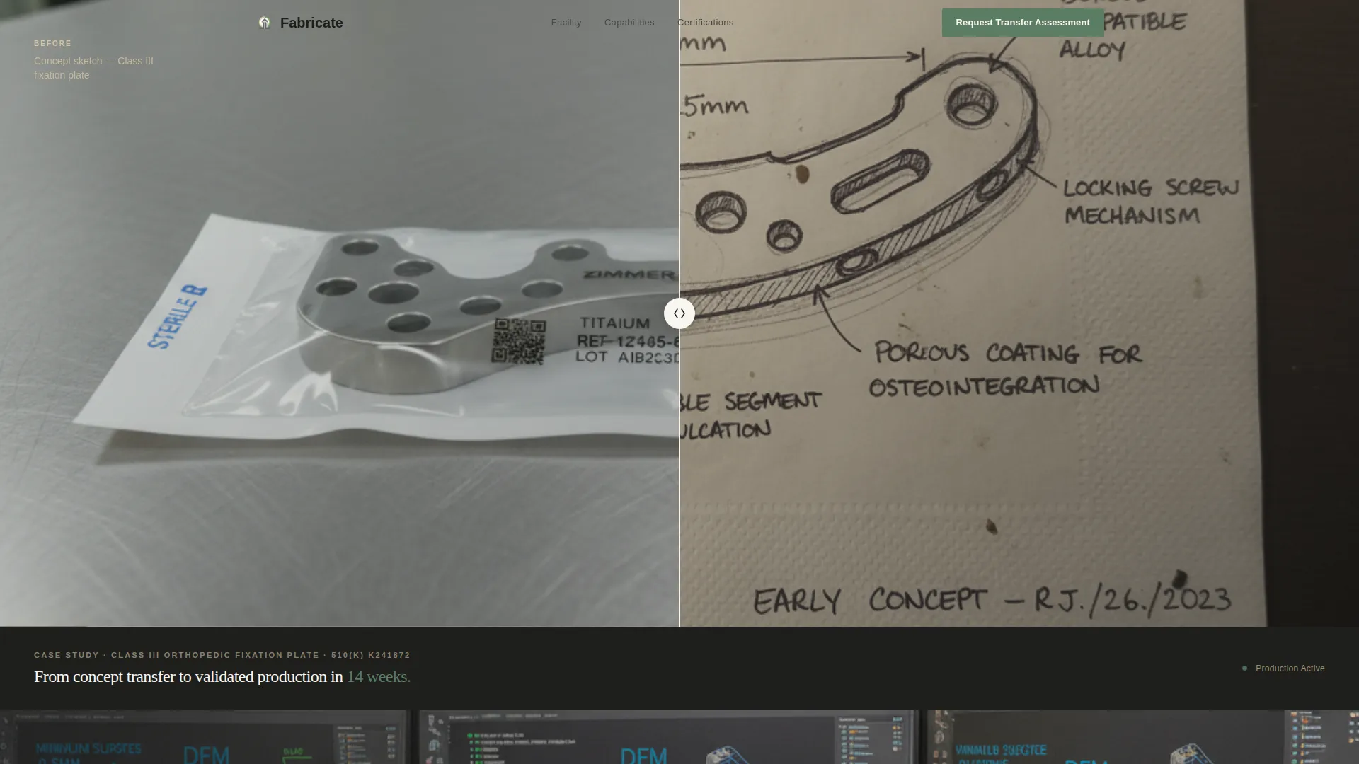
- A split-frame before-and-after header showing a hand-sketched prototype alongside a finished, sterile-packaged production unit
- A scrollable facility-tour body with full-width process photography sections, each carrying one metric and one sentence
- A mid-page Comparison/Versus table contrasting a visitor's current contract manufacturer against Fabricate across four key rows
- A primary "Request a Transfer Assessment" intake form with device classification, current production volume, and a free-text bottleneck field
- A secondary "Download Our Facility Dossier" email-gated path for buyers still in the benchmarking phase
Feature list
This section covers the core structural and functional elements built into the template layout.
Case Study Before-and-After Header
The header opens with a split-frame image: a hand-sketched napkin prototype of a Class III orthopedic fixation plate on the left, and the finished laser-marked, sterile-packaged production unit on the right. A thin vertical divider separates the two states. A single fade-in line below reads the device name, regulatory pathway, and a 14-week transfer-to-production timeline.
Facility-Tour Scroll Architecture
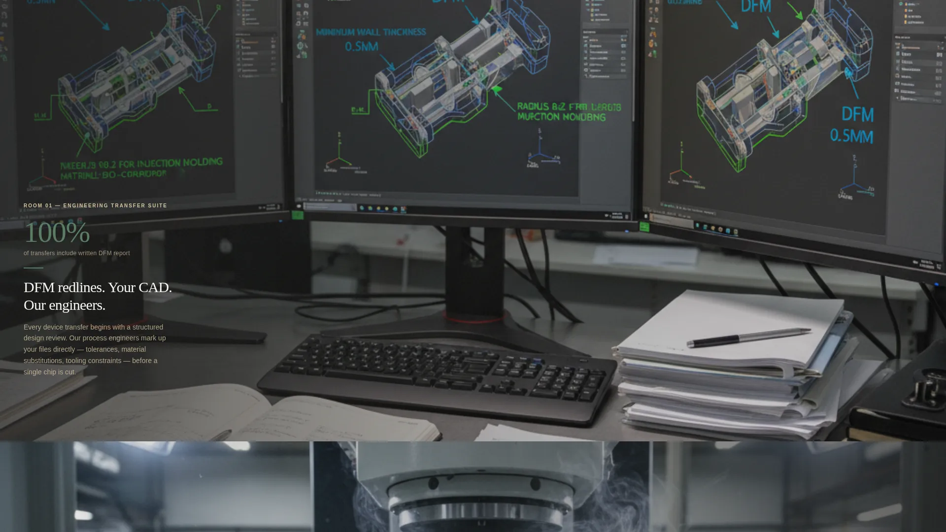
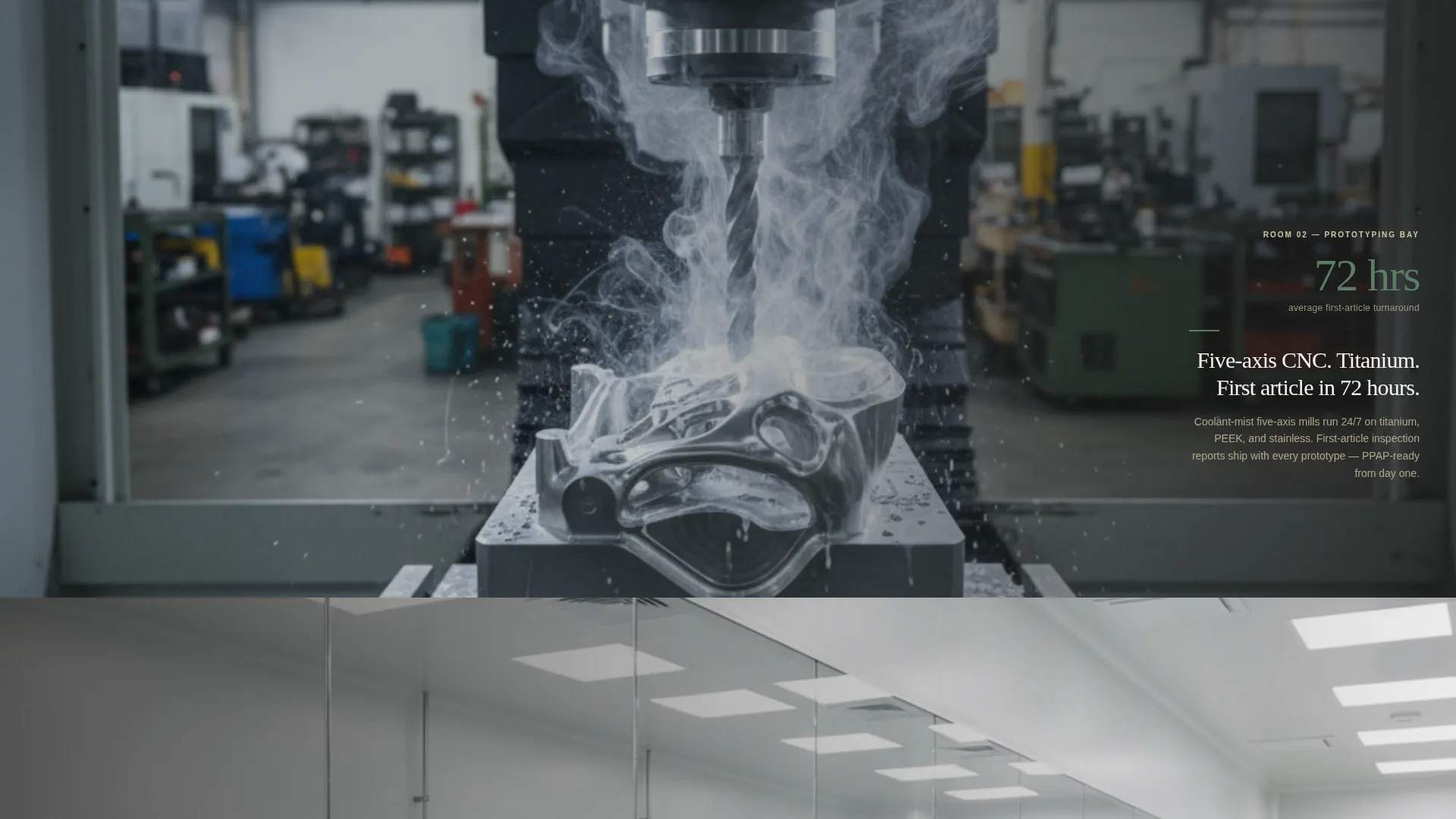
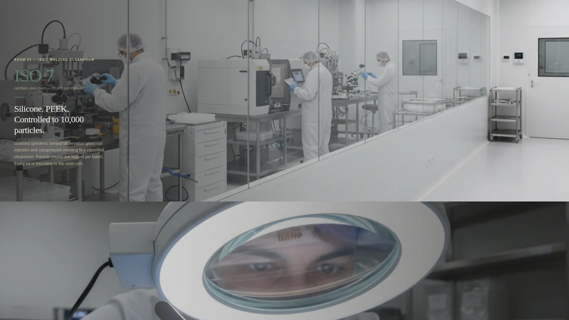
Each scroll section represents a distinct room in the production facility. The engineering transfer suite shows design-for-manufacturability redlines overlaid on customer CAD files. The prototyping bay features five-axis CNC close-ups. The ISO 7 molding cleanroom shows gowning visible through observation glass. The assembly and packaging line closes with final inspection under magnification. Every section is a full-width photograph with a translucent overlay carrying one metric and one sentence.
Animated Comparison Table
A persistent side-by-side table appears mid-page and animates in row by row on scroll. The four rows compare regulatory support depth, vertical integration breadth, average transfer timeline, and post-market change-order flexibility. Each row lands on a quantified difference, giving buyers a direct data point for internal justification.
Dual Conversion Path Layout
The template supports two distinct buyer journeys in one page. Ready buyers reach the "Request a Transfer Assessment" short form. Benchmarking buyers access the "Download Our Facility Dossier" behind an email gate. Both paths are available without competing for the same visual space.
Transfer Assessment Intake Form
The primary conversion form asks three focused questions: device classification via a Class I, II, or III dropdown; current production volume; and the single biggest bottleneck with the visitor's existing manufacturer, captured in a 140-character free-text field. The form is short enough to complete in under two minutes.
Warm Stone Color System and Typography
The design uses a four-color palette: quarried limestone, surgical-grade titanium, sterile field white, and a regulatory-green accent. The green is reserved for compliance badges, call-to-action buttons, and status indicators. The overall feel is warm enough to build trust and clean enough to signal precision manufacturing standards.
Page sections overview
| Section | Purpose |
|---|---|
| Before-and-After Header | Opens with split prototype-to-production proof and a 14-week timeline claim |
| Fade-In Tagline | Anchors device name, regulatory pathway, and transfer timeline below the header image |
| Engineering Transfer Suite | Shows design-for-manufacturability redlines overlaid on customer CAD files |
| Prototyping Bay | Displays five-axis CNC close-ups with titanium machining process imagery |
| ISO 7 Cleanroom | Shows molding cleanroom with gowning visible through observation glass |
| Assembly and Packaging Line | Closes the tour with final inspection under magnification imagery |
| CMO Comparison Table | Side-by-side animated rows comparing current contract manufacturer to Fabricate |
| Transfer Assessment Form | Primary intake form for device classification, volume, and bottleneck input |
| Facility Dossier Gate | Email-gated secondary path for buyers still benchmarking partners |
Design & branding system
The visual identity follows a Service Utility theme built around a Warm Stone color system. The palette is drawn from physical materials found in precision manufacturing environments, giving the page a grounded, credible quality.
- Quarried limestone (#D5C4A1), surgical-grade titanium (#6B6E70), and sterile field white (#F7F5F0) form the primary neutral palette
- Regulatory green (#5A7D64) appears exclusively on compliance badges, call-to-action buttons, and status indicators to signal action and credibility
- The spatial and architectural creative direction treats each scroll section as a room in a real facility, with full-width photography and translucent overlays replacing traditional content blocks
Mobile & speed optimization
The single-column flow keeps the layout structurally simple for all screen sizes. The spatial scroll architecture adapts well to vertical mobile viewing without losing its room-to-room narrative logic.
- Full-width photography sections stack cleanly on narrow screens, preserving the facility-tour visual rhythm
- The short-form conversion elements, including the dropdown, volume field, and free-text input, are formatted for easy mobile interaction
How this template helps you convert
The conversion strategy is built into the page structure, not added at the end. Buyers see operational proof before they are asked for any commitment.
- The facility-tour scroll builds credibility section by section, so by the time the comparison table appears, the visitor already trusts what they are reading
- The animated CMO comparison table gives buyers a structured, quantified reason to act, reducing the internal justification effort required before reaching out
- The dual conversion paths ensure that both decision-ready buyers and early-stage evaluators have a clear, low-friction next step available to them
Other information about this template
This template is categorized under Manufacturing and Industrial, specifically within the Medical Device Manufacturing subcategory. It is designed for the medical device contract manufacturer niche.
- The template style is Single Column Flow, keeping the visitor's attention focused on a single descending narrative without sidebar distractions
- The header concept is Case Study B/A, which is a proven format for demonstrating real transformation rather than describing it
- The landing page direction is Comparison/Versus, a structure suited for buyers who are actively evaluating multiple vendors
- The creative direction is Spatial and Architectural, treating the scroll as a physical walkthrough rather than a list of services
- The theme is Service Utility, which prioritizes functional clarity and process transparency over decorative design choices
- This template suits any contract manufacturer operating under ISO 13485 quality management standards or similar regulated frameworks, where demonstrating process rigor is as important as stating capabilities
Theme
Service Utility
Creative direction
Spatial & Architectural
Color system
Warm Stone
Style
Single Column Flow
Direction
Comparison/Versus
Page Sections
Case Study Before-and-after Header
Facility-tour Scroll Architecture
Animated CMO Comparison Table
Dual Conversion Path Layout
Transfer Assessment Intake Form
Warm Stone Visual Identity System
Related questions
Who is this landing page template designed for?
Can I use this template if my company handles both Class II and Class III devices?
What does the Facility Dossier download section do?
How does the animated comparison table work in the layout?
Is the page structure suitable for a manufacturer with multiple process capabilities?