Custom Engagement Ring Landing Page Template
Facet is a modular card-grid landing page built for custom engagement ring studios. It guides couples through a layered unboxing experience, presenting base designs, stone options, and personal details as progressive reveals. An upsell-focused layout, differential pricing, and a final comparison card make it easy for visitors to upgrade their design and move confidently toward checkout.
by Rocket studio
Quick summary
Facet is a single-page, card-grid landing page template designed for custom jewelers who craft one-of-a-kind engagement rings. The layout uses a playful geometric visual identity, a layered scroll experience that mimics unboxing, and a smart upsell structure that moves curious couples from browsing to a fully personalized ring decision.
Who this template is for
This template is built for independent jewelers and boutique ring studios that specialise in custom and bespoke engagement ring design. It speaks directly to couples who already know what they want and just need the right space to make it real.
- Custom jewelers offering geometric, non-traditional, or fully bespoke ring builds
- Boutique studios whose clients arrive ready to design rather than browse a case
- Makers who want their digital presence to feel as personal and considered as their craft
What problem this template solves
Most jewelry landing pages feel like a department store: cold grids, identical solitaires, and pricing that stops people cold. Couples shopping for something truly custom need a page that matches the intimacy of the process. Facet solves the gap between an inspiring studio visit and a disappointing online experience.
- Removes sticker shock by presenting pricing as gentle upgrades, not totals
- Replaces passive browsing with an active, curiosity-rewarding design journey
- Gives jewelers a layout that feels as crafted and intentional as the rings themselves
What you get with this template
Facet delivers a fully structured, single-page layout built around modular card clusters. Every section is ready to receive your ring designs, stone options, and personal details without starting from scratch.
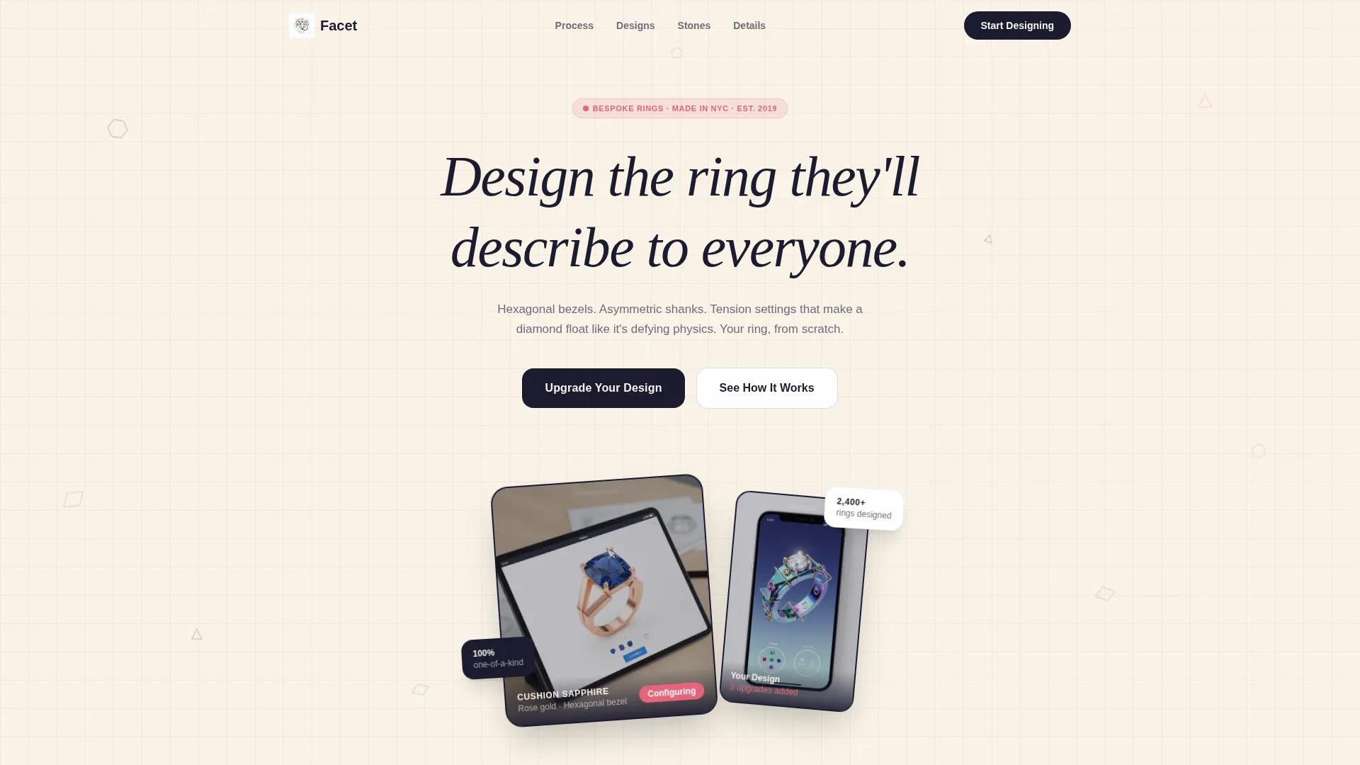
- A device mockup header with a typewriter headline and floating geometric accents
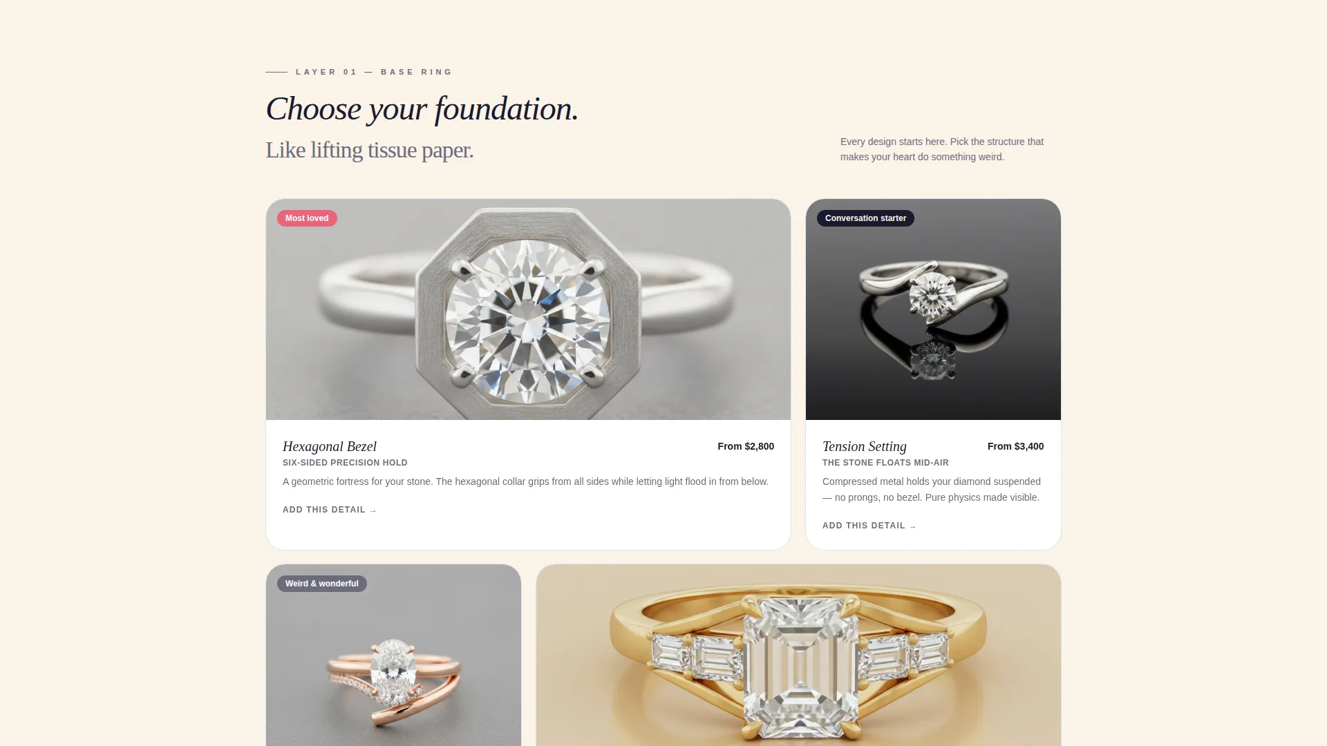
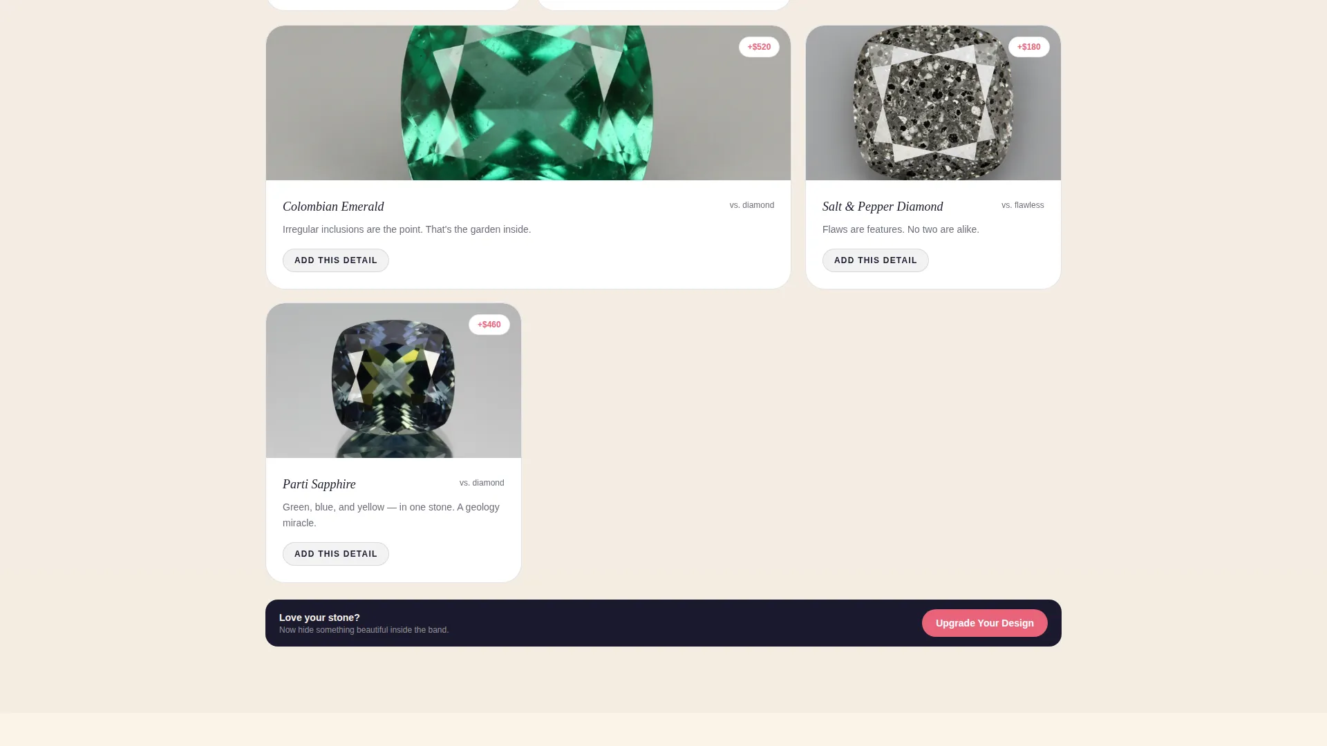
- Layered card-grid rows that reveal base rings, stone choices, engravings, and hidden details in scroll order
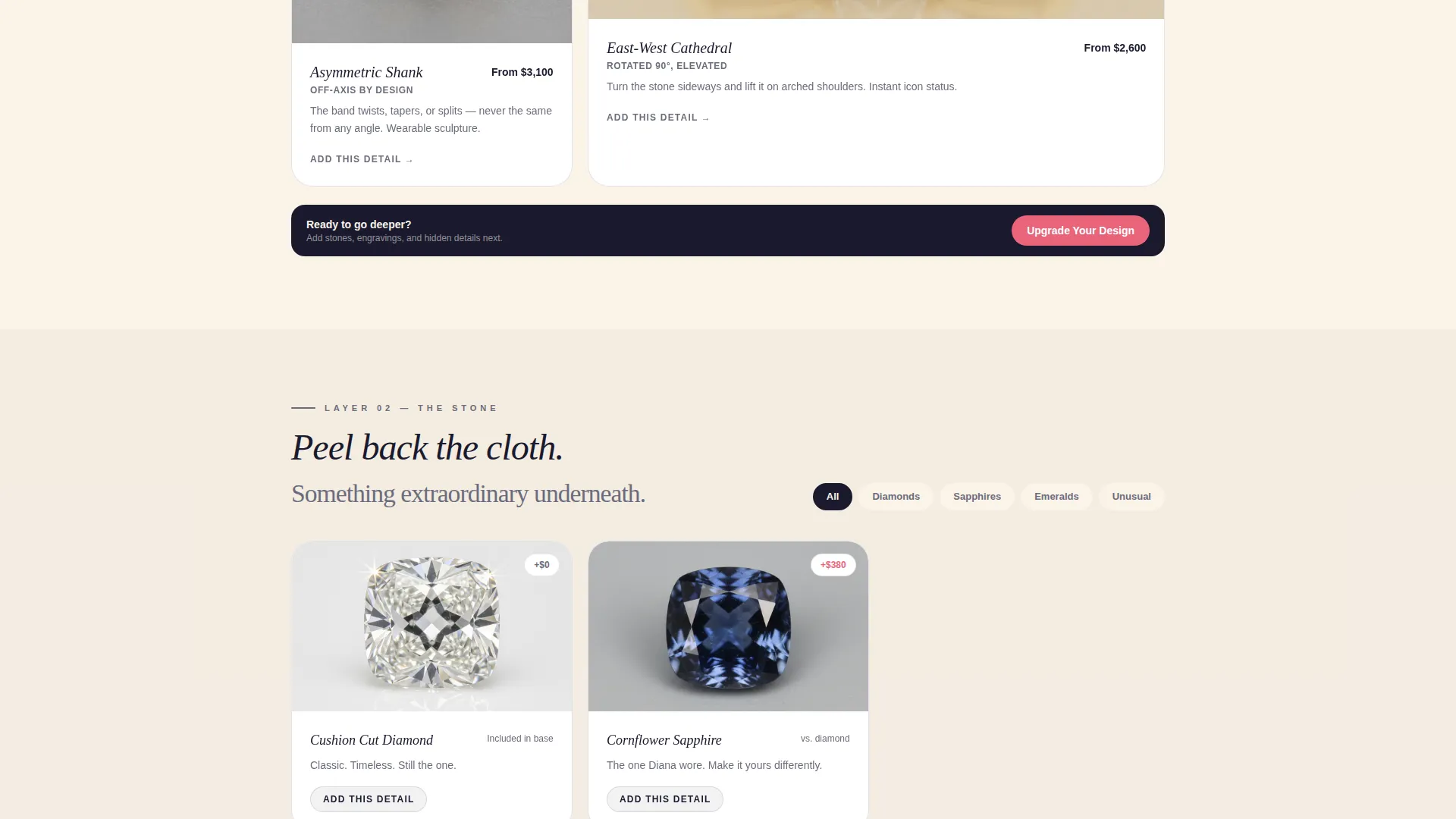
- An upsell card system with differential pricing labels, two distinct call-to-action buttons per cluster, and a side-by-side comparison card at the close
Feature list
This template includes a focused set of purposeful components, each tied directly to the custom ring buying journey.
Animated Device Mockup Header
An iPhone and an iPad float at slight angles against the warm cotton background. Their screens show a ring configurator mid-design. Tiny triangles, hexagons, and parallelograms drift slowly around the devices like frozen confetti, creating immediate visual intrigue without cluttering the page.
Typewriter Headline Animation
The headline types itself letter by letter: "Design the ring they'll describe to everyone." This single animated moment sets the tone for the whole page, drawing the reader in before they read a single product detail.
Layered Unboxing Scroll Experience
Each card row is structured as a deeper reveal. Base ring designs appear first, then stone options, then engraving previews, hidden gemstone placements, and custom box embossing. The scroll sequence rewards curiosity the same way a physical unboxing rewards patience.
Upsell Card Grid with Differential Pricing
Every card cluster includes an "Upgrade Your Design" call-to-action pinned at the bottom. Individual feature cards carry an "Add This Detail" button. Pricing displays as a soft differential, for example "+$180 for hidden birthstone", which reduces the psychological friction of seeing a large total.
Side-by-Side Comparison Card
The final section places the visitor's current selection alongside the fully upgraded version. A single "See Your Final Ring" button leads to a summary view where one-click add-ons remain available, keeping the path to checkout clear and low-pressure.
Page sections overview
| Section | Purpose |
|---|---|
| Animated header mockup | Introduce the brand and configurator with visual delight |
| Typewriter headline block | Hook the visitor with a memorable, personal headline |
| Base ring card row | Present foundational ring designs as the first layer of reveal |
| Stone options row | Unveil stone choices as the second unboxing layer |
| Engraving preview cards | Show personalisation possibilities deeper in the scroll |
| Hidden detail modules | Reveal inside-band gems and custom box embossing |
| Upsell card clusters | Present tasteful escalations with differential pricing |
| Comparison card section | Show current selection versus. fully upgraded version |
| Final checkout call to action | Direct visitors to a one-click summary and add-on screen |
Design & branding system
The visual identity follows a Playful Geometric theme, using an Ink and Paper color palette that feels like flipping through a jeweler's personal sketchbook. Hand-drawn circles and precise angles share the same cream page, keeping the aesthetic intimate and inventive rather than sterile.
- Core palette: sketch-black (#1A1A2E), warm cotton stock (#FAF3E8), and graphite pencil gray (#6C6C7D) for all structural and body elements
- Eraser-pink (#E8637A) reserved exclusively for interactive states and price highlights, creating a surprise pop of personality
- Floating geometric shapes (triangles, hexagons, parallelograms) used as ambient decorative elements throughout the layout
Mobile & speed optimization
The modular card-grid layout is structured to adapt cleanly across screen sizes. Each card cluster stacks naturally on smaller viewports, keeping the unboxing reveal sequence intact whether a visitor is on a phone or a desktop.
- Card modules are designed to reflow gracefully from a multi-column grid to a single-column stack on mobile
- Differential pricing labels and call-to-action buttons remain prominent and tappable at every breakpoint
- The device mockup header scales proportionally so the ring configurator preview stays readable on smaller screens
How this template helps you convert
Facet is built around the psychology of progressive commitment. Visitors arrive already interested, and the layout is designed to deepen that interest at every scroll point rather than overwhelm them with choices all at once.
- The layered reveal structure keeps visitors engaged scroll by scroll, with each new card cluster offering a natural reason to keep going rather than bounce.
- Differential pricing removes the intimidation of a large total, letting couples say yes to individual upgrades without feeling the full weight of the final number until they reach the comparison card.
- The side-by-side comparison card closes the journey with clarity: the visitor sees exactly what they have chosen and what the upgrade delivers, making the "See Your Final Ring" button feel like a natural next step rather than a sales push.
Other information about this template
Facet is a strong fit for any custom jewelry studio that wants a digital presence that reflects the care and craft behind its work. It is especially useful for makers who rely on word-of-mouth and social referrals, since the page's visual personality is designed to be screenshot-worthy and shareable.
- The template is category-matched to Retail and E-Commerce, specifically the Niche and Artisan Products subcategory, making it a natural fit for boutique and craft-led stores
- The Playful Geometric theme and Ink and Paper color system are distinct enough to stand out in a market where most jewelry pages default to white space and serif fonts
- The unboxing scroll metaphor translates well to social media storytelling, giving studios a visual narrative they can reference across channels
- The modular card structure means individual sections can be reordered or replaced to reflect a studio's specific product offering without rebuilding the layout from scratch
Theme
Neo-Retro
Creative direction
Curated Collection
Color system
Sunset Gradient
Style
Bento Grid
Direction
Click-Through
Page Sections
Animated Device Mockup Header
Typewriter Headline Animation
Layered Unboxing Scroll Structure
Upsell Card Grid with Differential Pricing
Side-by-side Comparison Card
Playful Geometric Visual Identity
Related questions
Is this template designed for a single product or a full ring collection?
Can I adjust the pricing labels to match my own upgrade costs?
How does the upsell flow work for visitors who arrive from a specific ring page?
Does the page support a mobile browsing experience?
What makes this template different from a standard jewelry store page?



