Luxury Barbershop Landing Page Template
Fade is a luxury barbershop landing page built for premium grooming businesses ready to move beyond basic booking pages. It pairs editorial-quality gallery tiles with timed upgrade panels, so every visitor sees both your craft and your scarcity. The result is a single-page experience that earns the upsell before the client even picks up the phone.
by Rocket studio
Quick summary
Fade is a single-page luxury barbershop landing page template designed to convert returning clients into upgrade buyers. A full-bleed hero, an expandable service gallery, and countdown-timer upgrade tiles work together to create urgency without feeling pushy. The page feels unhurried and indulgent, matching the ritual quality of the barbershop itself.
Who this template is for
This template is built for barbershops that charge a premium and want their online presence to reflect that. It suits owners who already have a loyal clientele and want a smarter way to surface limited-time service upgrades.
- Premium or luxury barbershops targeting professional male clients in their thirties and forties
- Independent barbers or small shops moving away from generic booking tools toward a curated destination feel
- Barbershop owners who want to run monthly upgrade promotions without rebuilding their page each time
What problem this template solves
Most barbershop pages describe services with a plain list and a phone number. That approach undersells the experience and leaves upsell revenue on the table. Fade is structured specifically to fix this.
- Clients arrive and immediately feel the quality before they read a single word, thanks to the immersive hero image and warm editorial photography
- Returning clients miss upgrade opportunities because those offers are buried or never shown at all
- New visitors lack a clear reason to choose a premium shop over a cheaper alternative without a page that communicates craft and intention
What you get with this template
Fade delivers a complete, single-page gallery and detail layout built around one goal: turning a regular cut appointment into an upgraded ritual booking. Everything from the hero to the final call to action is structured to move visitors forward.
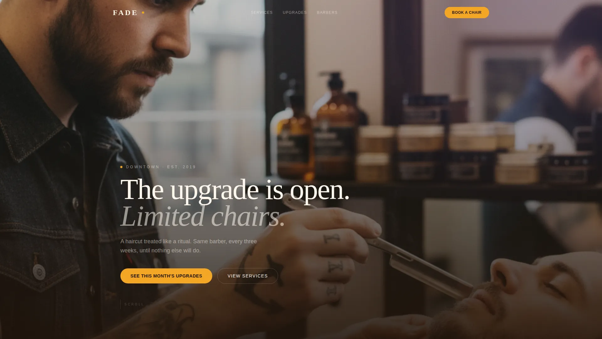
- A full-bleed hero section with editorial overlay text designed to create immediate atmosphere and urgency
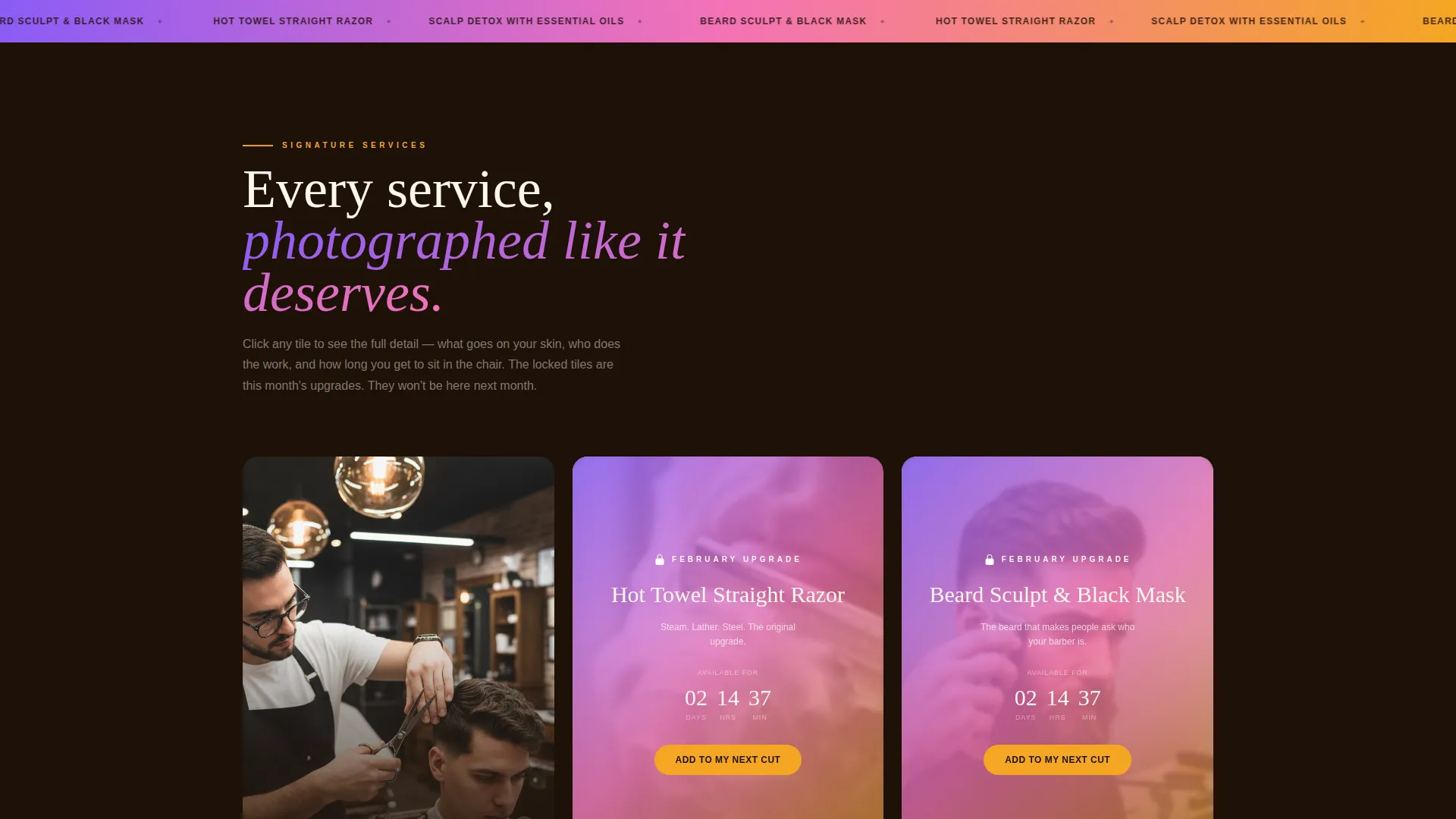
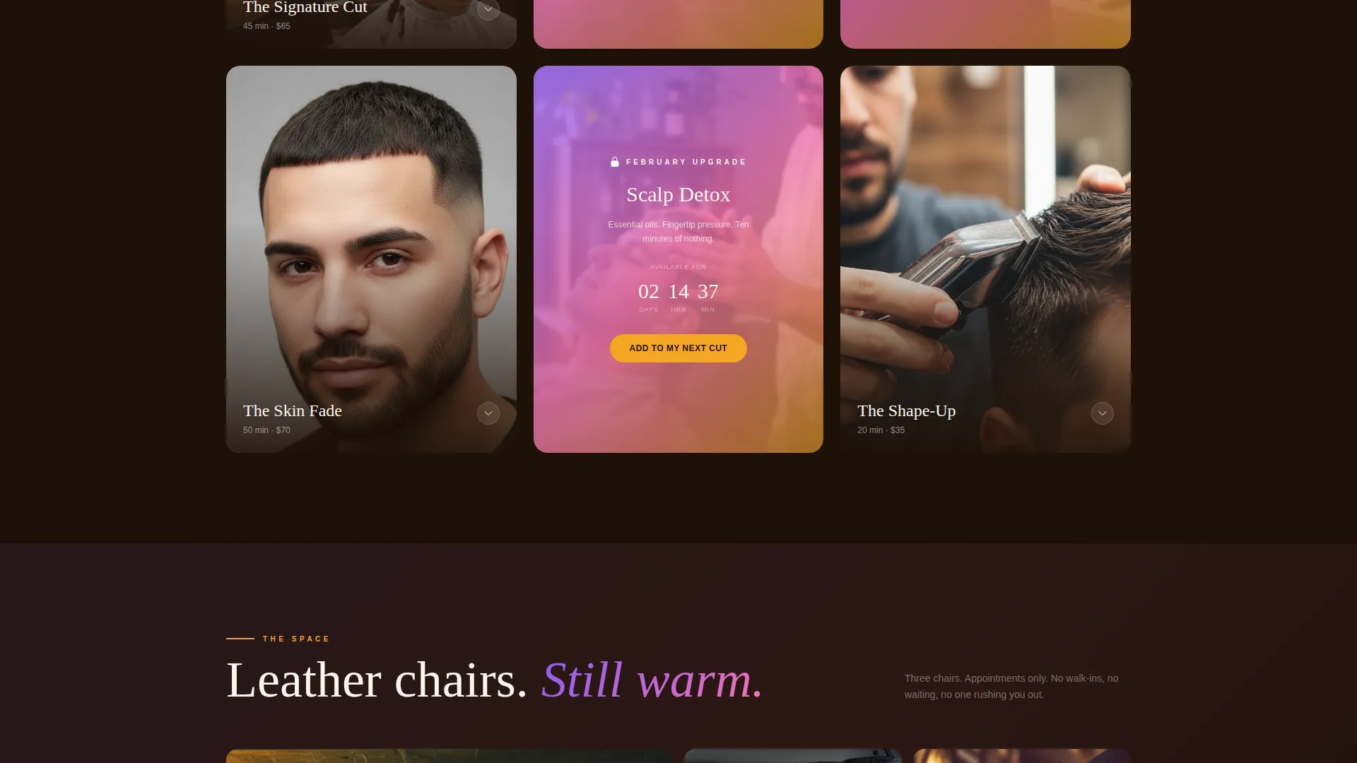
- An expandable service gallery with locked upgrade tiles, countdown timers, and detail panels showing ingredients, duration, and barber information
- Two conversion paths: one for returning clients to add an upgrade to their next appointment, and one for new visitors to book the full ritual through a short inquiry form
Feature list
This section covers the core functional components built into the Fade template.
Full-Bleed Hero with Urgency Copy
The header fills the screen edge to edge with a high-impact barbershop photograph. Knockout white type sits low and left with a short phrase that frames scarcity before the visitor scrolls at all. The image is designed for shallow depth-of-field photography, creating a cinematic entry point.
Expandable Gallery Tiles with Detail Panels
Each service appears as an editorial-style photo tile. On click, the tile expands to reveal a full detail panel with the service name, ingredients or product details, session duration, and the barber who performs it. This format positions each service as a considered, craft-led offering.
Locked Upgrade Tiles with Countdown Timers
Every third gallery tile is reserved for a limited-time upgrade package. These tiles display a gradient overlay and a live countdown timer. The locked state creates visual contrast that draws the eye and signals exclusivity without extra copy.
Dual Conversion Call-to-Action System
Returning clients see an "Add to My Next Cut" button on every upgrade detail panel. New visitors are offered a "Book the Full Ritual" path that opens a short form. The form asks for preferred barber, preferred day, and which upgrade package caught their attention.
Progressive Scroll Intensity
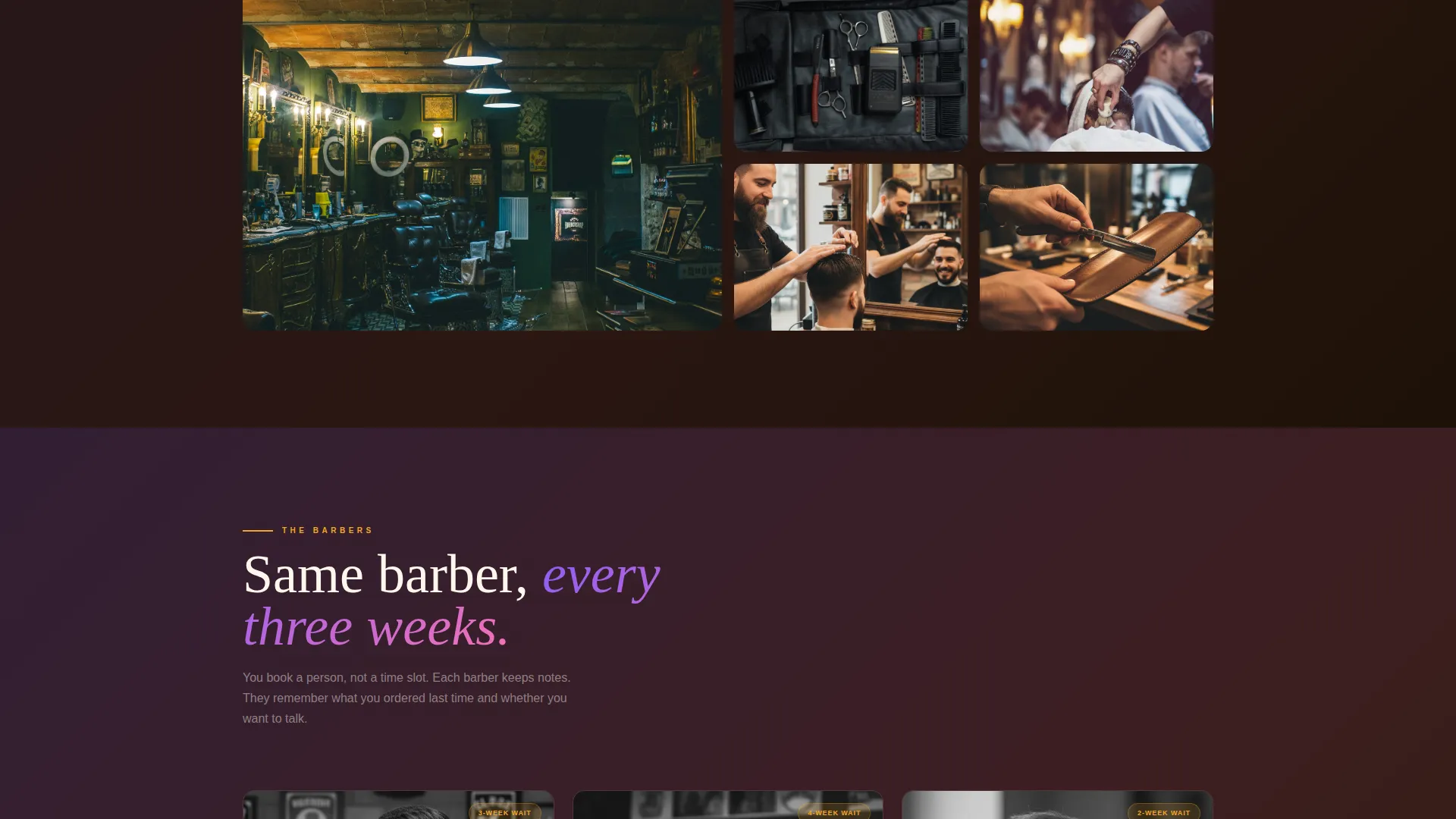
As the visitor scrolls deeper into the page, the gradient washes behind section headings become richer, the photography becomes tighter and more intimate, and the language shifts from service descriptions to sensory, feeling-led copy. This creates a natural momentum that deepens engagement.
Short Inquiry Form for New Clients
The new-visitor booking path uses a minimal form with three fields. Keeping the form short reduces friction and makes the first step feel easy, which is especially important for clients who are considering a premium shop for the first time.
Page sections overview
| Section | Purpose |
|---|---|
| Full-Bleed Hero | Sets atmosphere and frames scarcity with a single line of copy |
| Service Gallery Grid | Displays signature services as editorial photo tiles |
| Expanded Detail Panels | Reveals ingredients, duration, and barber per service on click |
| Locked Upgrade Tiles | Highlights limited-time packages with gradient overlays and timers |
| Countdown Timer Blocks | Reinforces time-limited availability for upgrade packages |
| Upgrade Detail Panel | Drives the "Add to My Next Cut" action for returning clients |
| New Visitor Booking Form | Captures preferred barber, day, and package interest |
| Sensory Copy Section | Shifts language from description to felt experience as scroll deepens |
Design & branding system
The visual identity uses a Soft Gradient theme built on a Dopamine Pop color system. The palette balances warmth and electricity, making the page feel like a curated downtown destination rather than a traditional grooming shop.
- Deep espresso (#1E1108) anchors backgrounds, warm chalk cream (#FFF7ED) handles body text, and molten amber (#F5A623) activates hover states and accent lines throughout
- Electric violet (#8B5CF6) bleeds into warm rose (#F472B6) across gradient washes behind section headings, producing the signature neon-in-a-mirror effect
- The card grid layout uses modular tiles that are visually consistent but allow the locked upgrade tiles to stand out through the gradient overlay treatment
Mobile & speed optimization
The template is structured with a mobile-first card grid layout that keeps the gallery readable and tappable on smaller screens. The modular tile system scales naturally without sacrificing the editorial quality of the photography.
- Expandable detail panels are designed to open in a focused overlay view, keeping the experience clean on both desktop and mobile displays
- Countdown timers and call to action buttons are sized and spaced for comfortable thumb interaction on touch devices
- The full-bleed hero and gradient section washes are built to maintain visual impact at all common screen widths
How this template helps you convert
The page is designed around a layered conversion strategy that combines aspiration with urgency. Every scroll action is an opportunity to deepen intent and move the visitor closer to a booking.
- The locked upgrade tiles and countdown timers create genuine scarcity signals that motivate action without relying on aggressive sales language, letting the craft and photography carry the trust.
- The dual-path call-to-action system meets both returning and new clients exactly where they are, so no visitor lands on a dead end regardless of whether they already have an appointment.
- The progressive scroll intensity builds emotional investment as the visitor moves down the page, making the final booking step feel like a natural conclusion rather than a hard sell.
Other information about this template
Fade was built under a Limited Time creative direction, meaning scarcity and urgency are structural features of the layout rather than add-ons. The template style follows a Card Grid (Modular) system, which makes it straightforward to add, remove, or reorder service tiles as your menu evolves. The landing page direction is Marketplace/Multi, supporting environments where multiple offering types need clear visual hierarchy on a single page.
- The template sits within the Retail and E-Commerce category under the Luxury Business subcategory, making it a natural fit for high-end personal care and grooming brands
- The Intersection Match Score for this template is 9 out of 10, reflecting a strong alignment between the luxury barbershop use case and the Dopamine Pop color system with Soft Gradient theme
- The header concept is designed around a Device Mockup format, which means the hero photography and overlay elements are optimized to display correctly across screen previews and device frame presentations
Theme
Soft Gradient
Creative direction
Limited Time
Color system
Dopamine Pop
Style
Card Grid (Modular)
Direction
Marketplace/Multi
Page Sections
Full-bleed Hero with Urgency Copy
Expandable Gallery with Detail Panels
Locked Upgrade Tiles with Countdown Timers
Dual-path Conversion System
Progressive Scroll Intensity
Related questions
Can I use this template without running strict limited-time promotions?
How does the dual call-to-action system handle new versus returning clients?
Does this template work for a solo barber or only multi-chair shops?
Can I reorder or replace the gallery tiles with my own service photography?
What photography style works best with this template?



