24-Hour Barbershop Landing Page Template
Fade is a bold landing page template built for a 24-hour barbershop that never closes. It pairs a Neo-Retro obsidian and gold visual identity with a masonry before/after transformation grid, an animated app mockup header, and a five-step "Find Your Cut" quiz that guides every visitor toward a personalized booking.
by Rocket studio
Quick summary
Fade delivers a single-page barbershop experience designed around round-the-clock availability. The obsidian and gold palette sets an instantly recognizable late-night mood. A floating phone mockup opens the page, a masonry grid of client transformations keeps visitors scrolling, and a guided style quiz converts curiosity into a confirmed booking.
Who this template is for
This template speaks directly to barbershop owners who operate outside standard hours and need a landing page that reflects that energy. It works equally well for new shops building their first web presence and established shops refreshing a dated site.
- Owners of 24-hour or late-night barbershops who need a page that communicates "we're open right now"
- Barbers targeting shift workers, night-shift professionals, and last-minute clients who cannot book during daytime hours
- Shop operators who want a polished, app-forward look without hiring a designer from scratch
What problem this template solves
Most barbershop pages look like they close at six. They show stock photos, a phone number, and a "book now" button that leads nowhere interesting. Fade solves the trust gap that comes with unconventional hours. It shows proof of craft, proves the shop is alive at any hour, and gives first-time visitors a guided path to a cut they will actually want.
- Visitors arriving at 2 AM have no social proof and no easy way to book; this template addresses both directly
- Generic booking pages do not communicate the atmosphere or skill level of the shop; the before/after grid does that immediately
- First-time clients often do not know what style to request; the five-step quiz removes that friction entirely
What you get with this template
You get a fully structured single-page layout built around three core experiences: an app-preview header that signals modern convenience, a masonry transformation gallery that builds trust, and a conversion-focused style quiz that personalizes the booking path. Every section is ready to populate with your own photos, copy, and booking links.
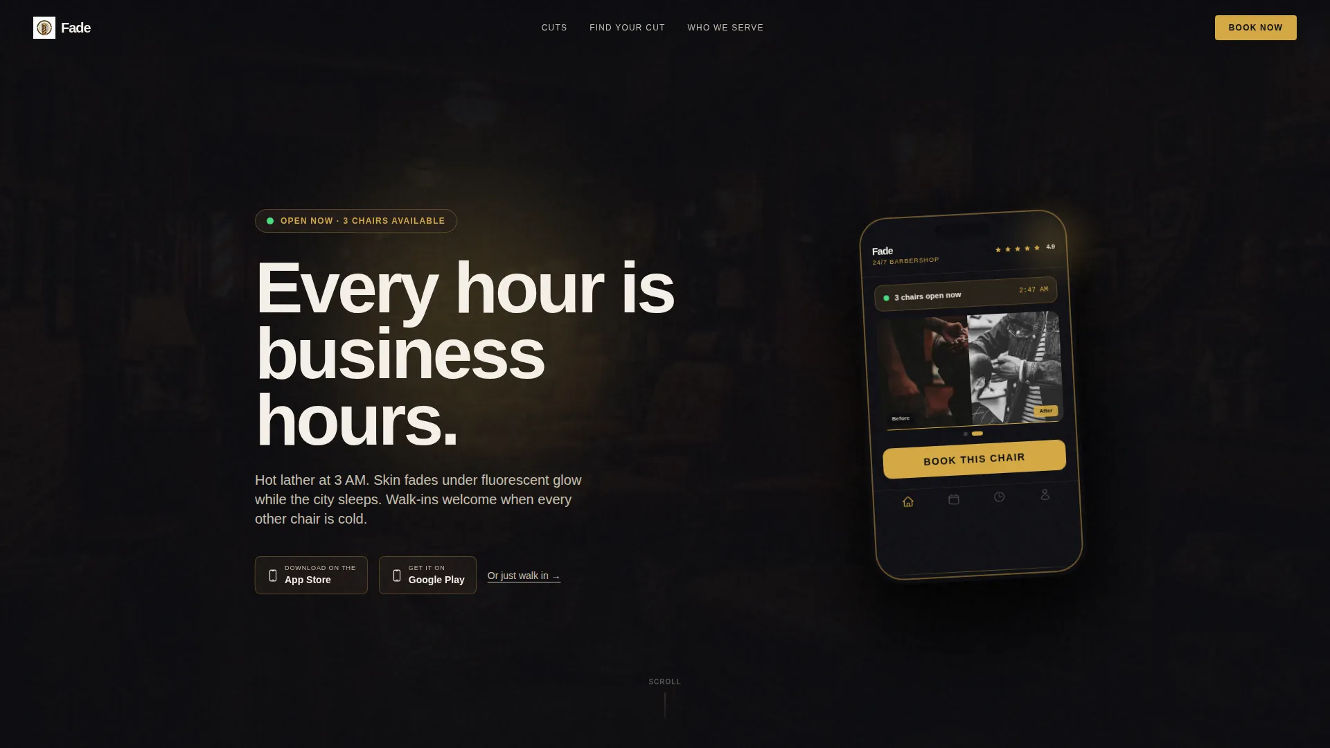
- Animated app mockup header with a live-queue display concept, star ratings, and a before/after thumbnail carousel
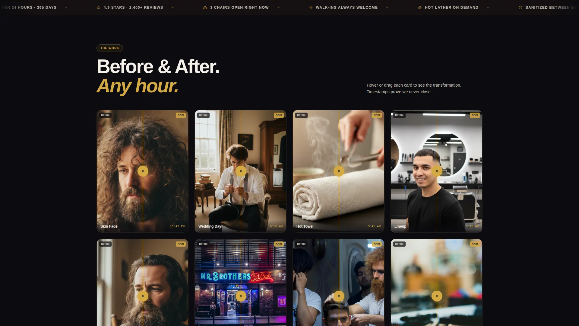
- Masonry grid of staggered before/after client cards with hover or tap reveal, timestamped to reinforce 24-hour operation
- Five-step "Find Your Cut" visual quiz leading to a personalized style recommendation and a pre-filled booking prompt
Feature list
This template is built around four stand-out capabilities drawn directly from the creative brief.
Floating App Mockup Header
The header centers a tilted phone mockup on a deep obsidian background. The screen displays a live queue count, star ratings, and an auto-swiping before/after carousel. A typewriter headline reads "Every hour is business hours." Below the phone sit App Store and Google Play badge placeholders alongside a "Or just walk in" text link for returning clients.
Masonry Before/After Grid
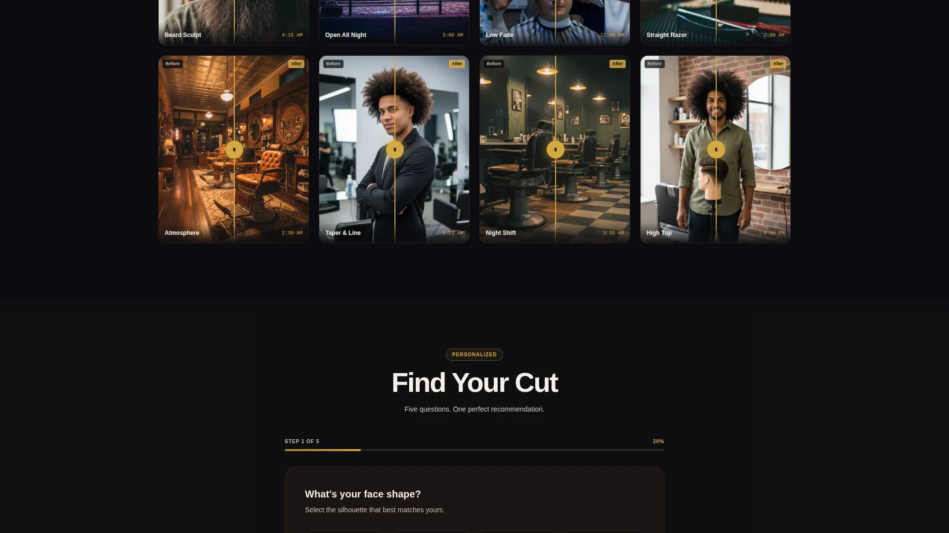
The main content section is a Pinterest-style masonry wall of client transformation cards. Each card uses a split-image layout that reveals the before state on hover or tap. Cards are staggered at varied sizes to feel like Polaroids on a mirror. Visible timestamps (11:42 PM, 4:15 AM, 6:30 AM) reinforce around-the-clock availability. Deeper rows shift from haircuts to shop atmosphere shots.
Five-Step Style Quiz
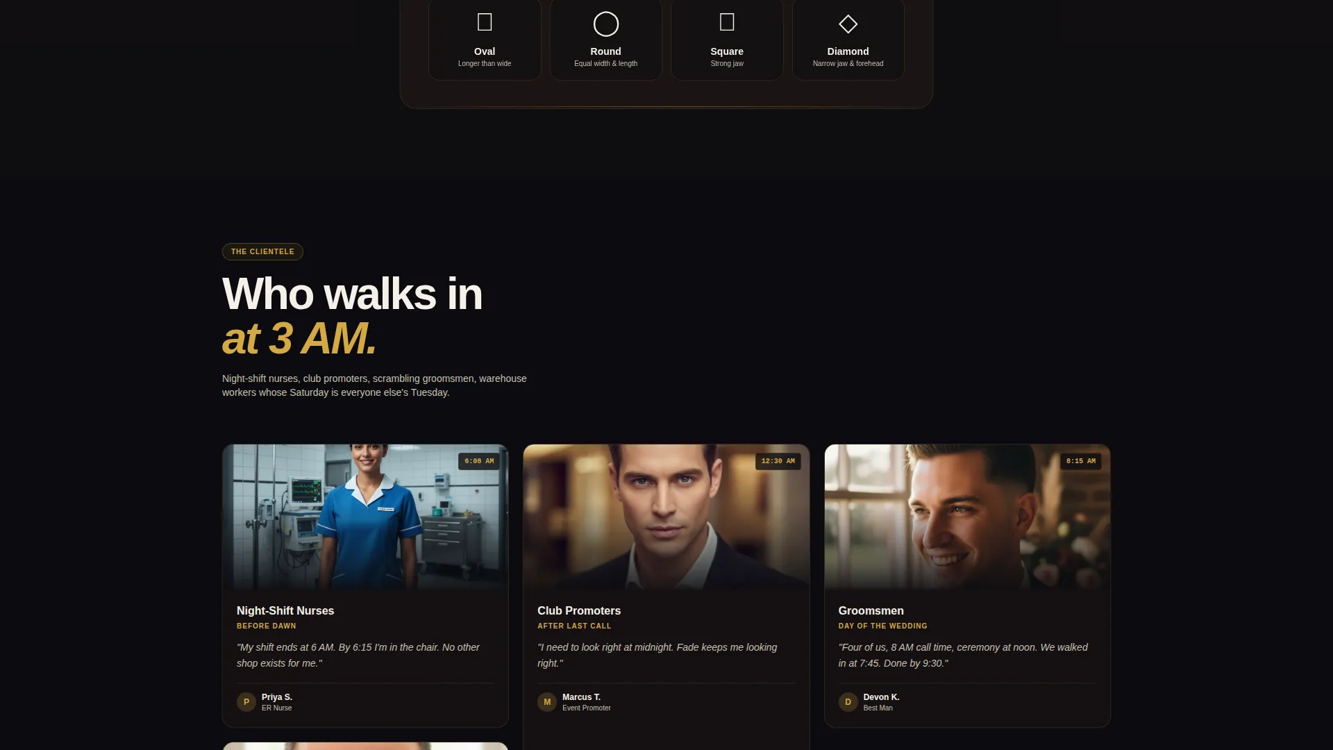
The primary call to action launches a guided quiz covering face shape, hair texture, maintenance commitment, style reference, and preferred time slot. Results deliver a named cut recommendation, a reference photo, and a "Book This Cut Now" button pre-filled with the visitor's ideal time window. A "Skip, Book Any Chair" link keeps regulars moving fast.
Neo-Retro Obsidian and Gold Identity
The color system uses deep obsidian black, worn leather brown, straight-razor gold, and hot-towel white. The result feels like a vintage straight razor in a velvet-lined case: old-school craft lit by modern neon. Every component, from card borders to button states, draws from this four-tone palette.
Atmosphere Section Transition
As visitors scroll past the transformation cards, the grid shifts from cut results to shop environment photography. Leather chairs, steaming towels, and a neon OPEN sign against a dark street pull the visitor further into the world of the shop. This section deepens brand trust without requiring additional copy.
Page sections overview
| Section | Purpose |
|---|---|
| App Mockup Header | Opens the page with a live-queue phone preview and typed headline |
| Typewriter Headline | Communicates 24-hour availability in an animated, memorable line |
| App Download Badges | Provides booking app entry points and a walk-in fallback link |
| Before/After Grid | Builds trust through timestamped client transformation cards |
| Atmosphere Row | Transitions from results to shop environment storytelling |
| Find Your Cut Quiz | Guides new visitors through a five-step personalized style selector |
| Cut Recommendation | Delivers a named style, reference photo, and pre-filled booking prompt |
| Skip to Booking | Gives returning clients a direct path to any available chair |
Design & branding system
The visual identity is built on a tight four-color system that feels intentional and premium at every scroll depth. Typography leans toward clean, modern letterforms that contrast against the dark background without competing with the gold accents. The overall effect is a barbershop that feels both deeply traditional and sharply current.
- Color palette: obsidian black (#0B0B0F), worn leather brown (#2A1F1A), straight-razor gold (#D4A843), and hot-towel white (#F5F0E8)
- Motion details include a tilted phone catching a gold light reflection, an auto-swiping carousel, and a typewriter headline effect
- Card styling mimics staggered Polaroid photos, reinforcing the handcrafted, personal feel of a real barbershop
Mobile & speed optimization
The masonry grid and quiz flow are both structured for touch interaction from the ground up. Hover states on transformation cards translate to tap reveals on mobile, so the before/after experience works equally well on a phone screen. This matters especially for the late-night audience, who are most likely arriving on mobile at unconventional hours.
- Touch-optimized card reveals let mobile visitors swipe or tap through before/after states without friction
- The quiz is built as a step-by-step visual selector, keeping each screen focused and easy to complete on a small display
- The app mockup header is sized and positioned to remain impactful on smaller viewports without breaking layout
How this template helps you convert
The conversion architecture is layered deliberately. Each section of the page does one job and hands off cleanly to the next.
- The header establishes immediate credibility with a live queue count and app ratings, then gives the visitor two clear next steps: download the app or walk in.
- The masonry grid provides the social proof that 24-hour shops often lack, using timestamped cuts to prove the shop is active at every hour a visitor might be reading.
- The quiz converts passive browsers into committed bookers by making the recommendation feel personal, then pre-filling the booking prompt to remove the final point of friction.
Other information about this template
This template is part of the Retail and E-Commerce category with a 24-Hour Business subcategory focus. It is built for single-page deployment, making it straightforward to launch as a standalone shop page or layer into a broader site structure.
- The template style follows a masonry layout direction inspired by Pinterest-style grid arrangements
- The creative direction is Before/After Reveal, a format well suited to service businesses where visual transformation is the core proof point
- The header concept centers on an App Store preview experience, which is appropriate for barbershops that operate a companion booking application
- The Neo-Retro theme and obsidian and gold color system were selected to align with the premium craft positioning of the shop concept
Theme
Neo-Retro
Creative direction
Before/After Reveal
Color system
Lavender Dream
Style
Bento Grid
Direction
Marketplace/Multi
Page Sections
Floating App Mockup Header
Masonry Before/after Grid
Five-step Style Quiz
Neo-retro Color System
Atmosphere Scroll Transition
Related questions
Can I use this template if my barbershop is not open 24 hours?
How does the before/after card grid work?
What happens at the end of the Find Your Cut quiz?
Can returning clients skip the quiz?
Is the phone mockup in the header customizable?



