Barbershop Franchise Landing Page Template
Fade is a masonry-style barbershop franchise landing page built for owner-operators who mean business. The template pairs a rich obsidian-and-gold visual identity with front-loaded unit economics, a two-step territory claim form, and a curated tile grid that walks prospects from lifestyle aspiration straight through to franchise logistics.
by Rocket studio
Quick summary
Fade is a single-page franchise landing page template built for turnkey barbershop concepts. It leads with real revenue numbers inside a device mockup header, then unfolds a masonry tile grid that moves prospects from lifestyle inspiration to validated unit economics. A two-step "Claim Your Territory" form closes the loop.
Who this template is for
This template speaks directly to serious franchise buyers who are ready to commit capital and want a polished pitch that matches their ambition.
- Career-changers with roughly $150K or more in liquid capital who are evaluating franchise territory investments
- Former stylists or booth-renters who want to step up into full shop ownership without starting from scratch
- Multi-unit investors looking for a recession-resilient concept with clear, front-loaded unit economics
What problem this template solves
Most franchise landing pages bury the numbers and lead with vague promises. Prospects arrive skeptical and leave unconvinced. This template fixes that by putting real financial data in front of buyers before asking for anything in return.
- Franchise prospects need proof before commitment, and the template front-loads a device mockup showing real revenue figures and appointment counts
- Generic page layouts fail to communicate the lifestyle and culture of a barbershop brand, which this masonry grid solves tile by tile
- Long, intimidating inquiry forms drive drop-off, so the two-step territory form splits the ask into a comfortable, low-friction sequence
What you get with this template
You get a fully structured, single-page franchise landing page that handles both the emotional sell and the logical close. Every section is purpose-built to move a qualified buyer forward.
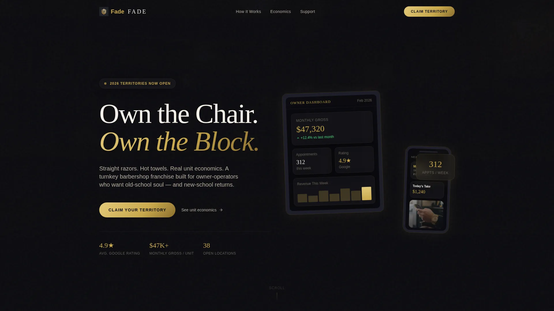
- A device mockup header with iPad and iPhone showing live-looking franchise dashboard data, a barber's hand in frame, and a cinematic headline
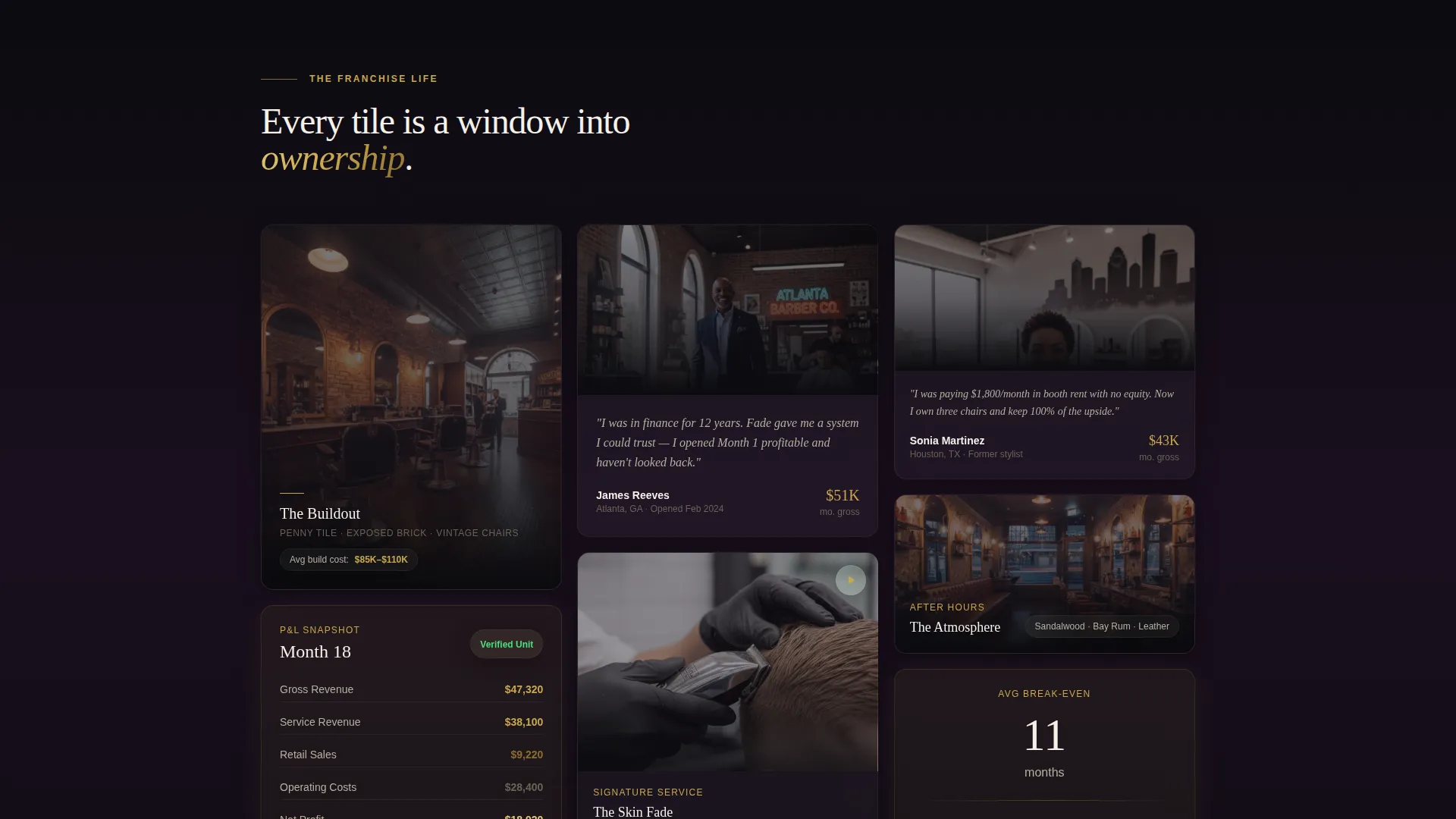
- A masonry tile grid with varied portrait and landscape tiles covering buildout photography, P&L snapshots, video loops, and franchisee quote cards
- A two-step territory claim form with a zip code field, an investment-range slider ($100K to $500K), and a follow-up question about barbering experience
Feature list
This template ships with focused, conversion-ready components drawn directly from the brief.
Device Mockup Hero Header
An iPad and iPhone float at a slight angle against an obsidian-to-charcoal gradient. The screens display franchise owner dashboard data including $47K monthly gross, a 4.9-star rating, and 312 weekly appointments. A barber's hand holds the phone in frame, grounding the aspirational headline in real performance.
Masonry Tile Grid
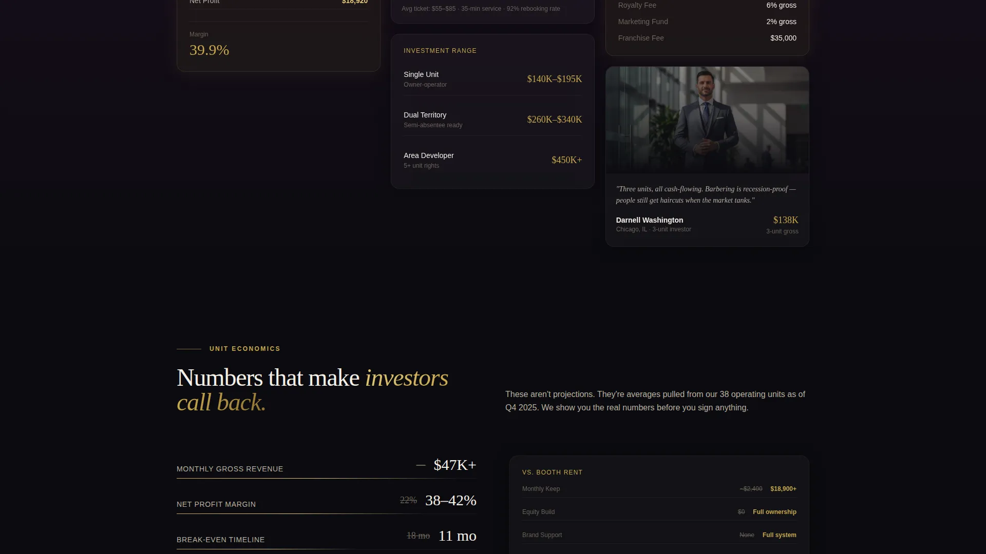
The curated grid below the header unfolds like a franchise lookbook. Tiles vary in height and width, mixing tall portrait layouts with wide financial panels. Each tile represents a different facet of ownership, from finished buildout photography to looping skin-fade video to franchisee quote cards with photo and monthly revenue.
Floating Territory call to action Button
After the third row of tiles, a floating "Claim Your Territory" button appears in brushed gold on obsidian. It stays accessible as the visitor continues scrolling, so the prompt to act is never more than a glance away.
Two-Step Territory Claim Form
The form separates the ask into two comfortable steps. Step one collects zip code and investment range via a slider. Step two asks for name, phone, and a single qualifying question about barbering experience, keeping friction low and lead quality high.
Gradient Section Transitions
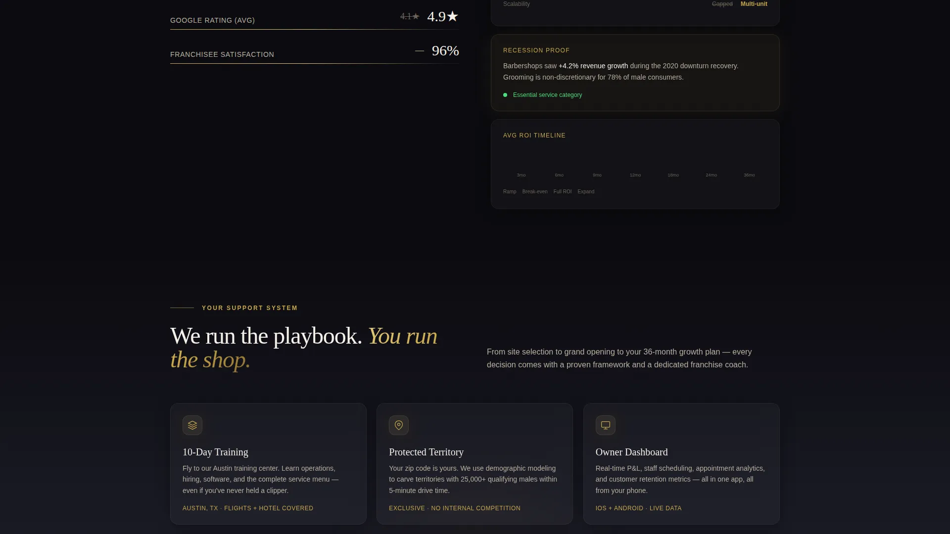
Soft color transitions bleed from obsidian to deep plum between content rows. These shifts visually signal a move from lifestyle content to financial data to support infrastructure, giving the page a natural narrative rhythm without needing extra copy.
Full-Width Closing call to action Section
A second "Claim Your Territory" placement appears as a full-width section at the bottom of the page. This anchors the close after the visitor has absorbed all the lifestyle, financial, and operational content the masonry grid delivers.
Page sections overview
| Section | Purpose |
|---|---|
| Hero Device Mockup | Opens with franchise dashboard data and cinematic headline to establish immediate credibility |
| Masonry Tile Grid | Delivers lifestyle, financial, and testimonial content in a curated, scroll-rewarding layout |
| Floating call to action Button | Prompts territory claim after third tile row without interrupting the browsing flow |
| Buildout Tile | Shows penny tile floors and exposed brick to communicate the quality of a finished shop |
| P&L Snapshot Tile | Displays blurred competitor comparisons alongside real unit economics for contrast |
| Skin Fade Video Tile | Runs a 15-second looping clip of a barber executing a seamless fade to anchor craft credibility |
| Franchisee Quote Card | Pairs a franchisee photo with their monthly revenue figure for peer validation |
| Gradient Divider Rows | Signals content shifts from aspiration to validation to logistics using obsidian-to-plum bleeds |
| Full-Width call to action Section | Closes the page with a final territory claim prompt after all proof content has landed |
| Two-Step Inquiry Form | Captures zip code, investment range, contact details, and a barbering-experience qualifier |
Design & branding system
The visual identity is built on a Soft Gradient theme using an Obsidian and Gold color system. Every palette choice reinforces the feeling of a high-end barbershop after hours.
- Core colors are deep obsidian black (#0B0B0F), brushed gold (#C9A84C), charcoal smoke (#1E1E2A) as the tile canvas, and warm ivory (#F5F0E8) for body text
- Accent transitions to deep plum (#1A0F1E) appear between content rows, creating visual breathing room and narrative momentum
- Gold is reserved for headlines, hover states, and call to action buttons, ensuring it reads as a signal of action rather than decoration
Mobile & speed optimization
The masonry layout is designed to reflow gracefully across screen sizes, keeping the tile grid readable and the call to action accessible on any device.
- Tile proportions adapt so portrait and landscape panels remain visually balanced on smaller screens without losing the lookbook rhythm
- The floating call to action button is sized for thumb-friendly tapping and remains visible during scroll on mobile viewports
- The two-step form flow is well-suited to mobile input, with each step focused on one clear task at a time
How this template helps you convert
This template is designed to earn the inquiry before it asks for one. The layout sequences proof and aspiration together so the visitor arrives at the form already convinced.
- The hero header leads with a real-looking franchise dashboard, putting monthly gross revenue and appointment volume in front of buyers in the first three seconds of the visit, before a single word of pitch copy appears.
- The masonry tile grid layers emotional and financial proof row by row, moving from lifestyle imagery to P&L data to franchisee testimonials, so skepticism is addressed progressively rather than all at once.
- The two-step form reduces commitment anxiety by splitting a potentially intimidating inquiry into two small, logical steps, starting with geography and budget before asking for personal contact details.
Other information about this template
This template is built for franchise concepts where the brand experience is as important as the business case. A few additional details worth noting:
- The masonry grid creative direction follows a Curated Collection approach, where each tile is treated as an editorial asset rather than a content block
- The page type is a single-page landing page with a Click-Through direction, meaning every design decision pushes toward one primary conversion action
- The template is designed to support franchise territory sales campaigns where qualified buyers self-select based on investment range and geography
- The header concept uses a Device Mockup framing rather than a traditional hero image, which is particularly effective for franchise concepts that want to lead with operational proof
- This template suits any premium service franchise that wants to attract owner-operators and multi-unit investors through a single, high-impact landing page
Theme
Neo-Retro
Creative direction
Comparison Journey
Color system
Ink & Paper
Style
Overlap/Layered
Direction
Click-Through
Page Sections
Device Mockup Hero Header
Masonry Tile Grid Layout
Floating Territory Call to Action Button
Two-step Territory Claim Form
Gradient Section Transitions
Full-width Closing Call to Action Section
Related questions
Can I update the revenue numbers shown in the device mockup header?
Does the two-step form automatically send leads to a contact system?
Can I swap out the tile content in the masonry grid?
Is this template designed for a single territory or a multi-market rollout?
Can the Obsidian and Gold color palette be changed to fit a different brand?



