Urgent Virtual Barbershop Landing Page Template
Fade is a Neo-Retro landing page template built for a virtual barbershop offering live video consultations. It combines a real-time countdown timer, a before-and-after gallery grid, disappearing barber slots, and a single "Claim Your Cut" call to action. The design turns urgency into style, pushing every visitor toward booking before the half-price window closes.
by Rocket studio
Quick summary
Fade is a single-page landing page template designed for a virtual barbershop that connects clients with master barbers through live video sessions. It leads with a ticking countdown, pulls visitors through a clickable gallery of real results, and closes with disappearing booking slots. Every element is built to make waiting feel costly.
Who this template is for
This template is built for virtual barbershop owners who need a high-pressure promotional page that converts first-time visitors into booked sessions. It works especially well when running a limited-time offer tied to a specific deadline.
- Virtual barbershop operators running a half-price launch or flash promotion
- Independent barbers offering remote coaching for self-cuts, beard sculpts, and lineup maintenance
- Entrepreneurs building a digital grooming service for remote workers, military personnel, or parents learning to cut at home
What problem this template solves
Most virtual service pages look static. They explain what is offered but never make the visitor feel the cost of waiting. Fade solves this by making scarcity visible at every scroll depth, so hesitation becomes the real risk.
- Visitors leave without booking because they feel no urgency to act right now
- A half-price offer gets buried in body text instead of dominating the screen
- Available session slots disappear without anyone noticing, so last-minute demand goes untapped
What you get with this template
Fade delivers a fully structured, single-page promotional layout with every section pre-designed around urgency and conversion. The visual direction is production-ready, and the section flow is deliberate from the first pixel to the final call to action.
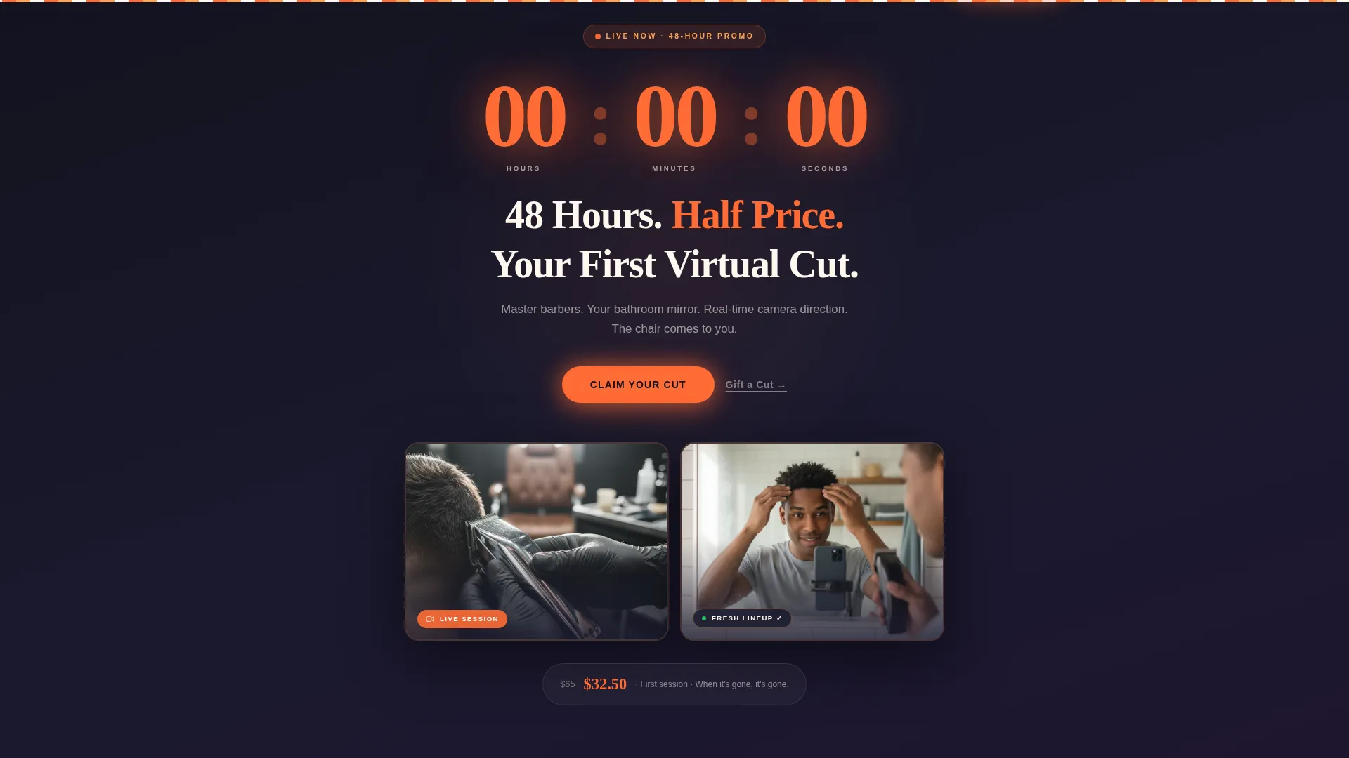
- A countdown timer header with a split composition showing a live session from both sides of the screen
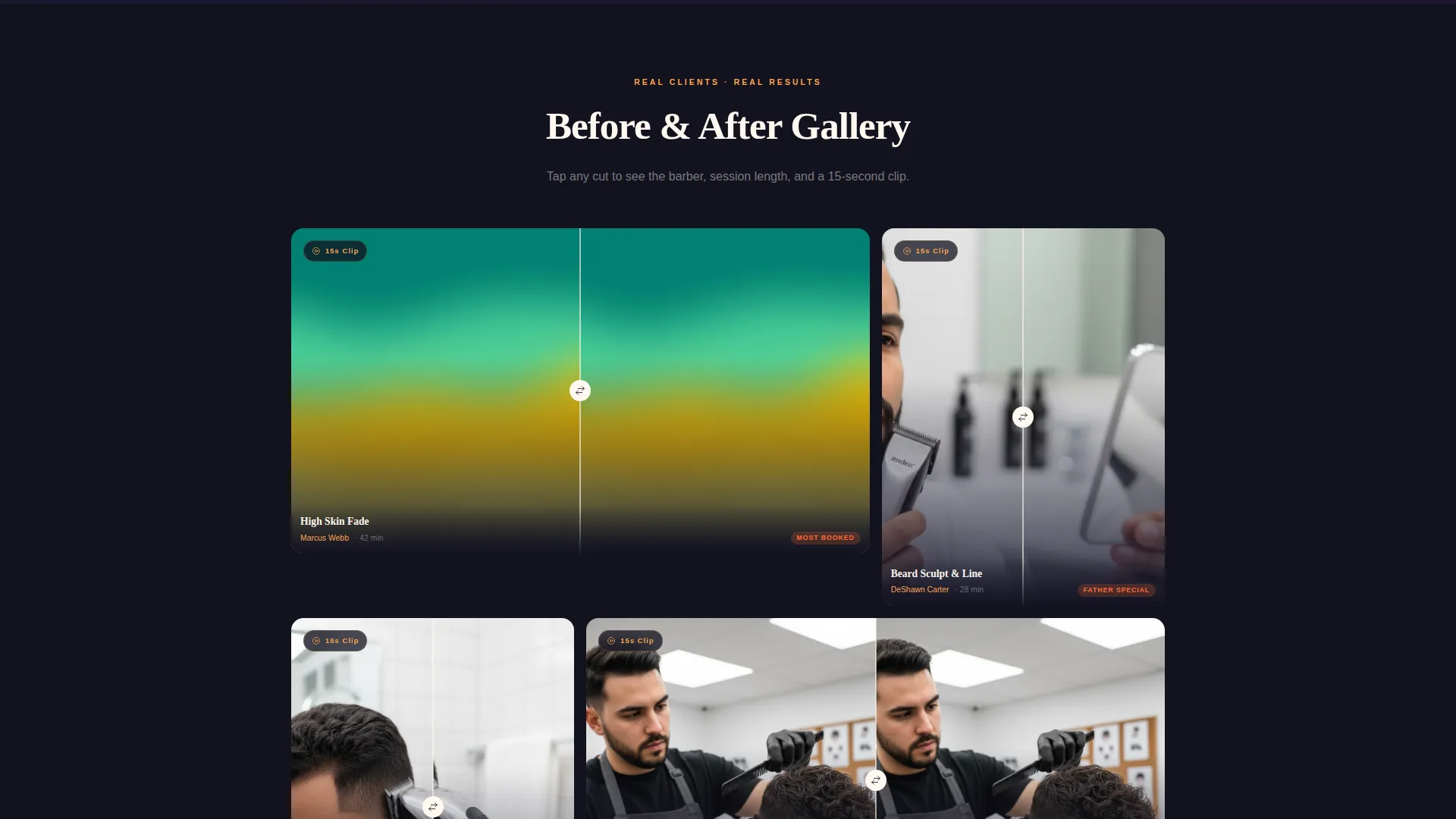
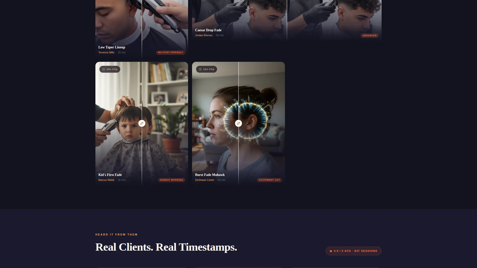
- A clickable before-and-after gallery grid where each tile opens a detail panel with cut name, barber name, session duration, and a looped 15-second clip
- A sticky bar that keeps the countdown and primary call to action visible throughout the entire scroll
Feature list
Fade includes purpose-built components that work together to create a pressured, polished booking experience. Each feature below is drawn directly from the template design.
Synced Countdown Timer Header
The header opens with massive blood-orange digits counting down against a midnight background. The timer is synced and unapologetic. When it expires, the offer is gone. A split composition flanks the clock: clippers mid-fade through a phone screen on one side, a client at home with a fresh lineup on the other.
Clickable Gallery Grid
The before-and-after photo grid loads as visitors scroll past the header. Each tile is clickable and opens a detail panel. The panel shows the cut name, session duration, barber name, and a 15-second looped clip from the live session, giving visitors proof before they commit.
Sticky Urgency Bar
As the visitor scrolls deeper, the countdown reappears in a compact sticky bar fixed to the top of the viewport. The primary call to action travels with it, so the booking entry point is always one tap away regardless of scroll position.
Disappearing Barber Slots
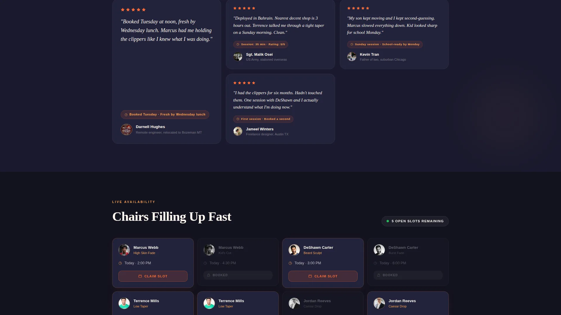
The final section renders available barber appointment slots as a live seating-style grid. Booked slots gray out in real time, like a concert seating map filling up. Open chairs become visually scarce, making the decision feel immediate.
Timestamped Testimonial Cards
Client testimonials appear as cards carrying real timestamps. A line like "Booked Tuesday, fresh by Wednesday lunch" communicates speed and reliability without requiring a long paragraph. The format reinforces how quickly the service delivers.
Click-Through Call to Action Flow
There is no form on this page. The primary "Claim Your Cut" button in blood orange appears below the countdown, inside the sticky bar, and above the slot grid. Each click lands the visitor directly in a calendar picker pre-loaded with the promotional rate. A secondary "Gift a Cut" text link sits beneath the primary button for visitors shopping for someone else.
Page sections overview
| Section | Purpose |
|---|---|
| Countdown Timer Header | Opens with ticking clock, split live-session visual, and headline |
| Before-and-After Gallery | Displays client results in a clickable modular card grid |
| Detail Panel Overlay | Reveals cut name, barber, duration, and looped session clip |
| Sticky Urgency Bar | Keeps countdown and primary call to action visible throughout scroll |
| Testimonial Cards | Builds trust with timestamped real-client quotes |
| Disappearing Slot Grid | Shows available barber slots graying out in real time |
| Final call to action Section | Anchors "Claim Your Cut" above the closing slot schedule |
Design & branding system
The template uses a Neo-Retro visual identity built around the Citrus Burst color system. The palette feels like a vintage barber pole reimagined under a neon sign at night: warm, deliberate, and full of energy.
- Barbershop midnight (#1A1A2E) anchors backgrounds and primary type; blood orange neon (#FF6B35) fires across countdown digits and call-to-action buttons; electric tangerine (#FFA552) washes over hover states and section dividers; cream lather white (#FFF8F0) holds open space so the page breathes
- The Neo-Retro theme pairs bold block typography with warm neon accents, giving the layout a barbershop intimacy without feeling dated
- Visual rhythm alternates between dark midnight fields and cream breathing room, keeping long scroll sessions readable and never crowded
Mobile & speed optimization
The layout is structured for a clean single-column experience on smaller screens. The sticky urgency bar and countdown timer are both central to the mobile experience, keeping the core offer visible at all times.
- The card grid adapts to a vertical stack on mobile so before-and-after tiles remain fully tappable without horizontal scrolling
- The sticky bar collapses to a lean strip on smaller viewports, showing the countdown and the primary call-to-action button without crowding the screen
- The detail panel overlay is touch-friendly, opening inline on tap rather than requiring a hover state
How this template helps you convert
Fade is built around one principle: make the cost of waiting feel heavier than the cost of booking. Every design decision serves that goal.
- The countdown timer in the header creates an immediate deadline. The headline "48 Hours. Half Price. Your First Virtual Cut." tells the visitor exactly what they stand to lose if they scroll away without acting.
- The disappearing slot grid adds a second layer of scarcity. Visitors see real chairs filling up, which shifts the fear from price to availability and accelerates the decision.
- The sticky bar ensures the "Claim Your Cut" button is never more than a glance away. Combined with the "Gift a Cut" secondary link, the template captures both self-purchase and gift-purchase intent without adding a form or a second page.
Other information about this template
Fade is categorized under Retail and E-Commerce, specifically within the Virtual Business subcategory. It fits niche use cases where a skilled service provider needs to sell time-limited digital sessions to a distributed audience.
- The template style is Card Grid (Modular), making individual gallery tiles easy to swap or reorder without disrupting the overall layout
- The creative direction is built around Limited Time urgency, which means the design works best when tied to a real promotional window with a hard end date
- The landing page direction is Click-Through, meaning no lead form is present; the entire page funnels visitors into an external calendar or booking tool
- The header concept draws from an App Store Preview composition, using side-by-side screen visuals to simulate the live session experience before the visitor books
- The page is purpose-built for audiences who are geographically separated from their usual barber: remote workers who relocated, deployed military personnel, and parents learning to cut hair at home
Theme
Neo-Retro
Creative direction
Limited Time
Color system
Citrus Burst
Style
Card Grid (Modular)
Direction
Direct Sales
Page Sections
Synced Countdown Timer Header
Clickable Before-and-after Gallery
Sticky Urgency Bar
Disappearing Slot Grid
Timestamped Testimonial Cards
Click-through Call to Action Flow
Related questions
Can I change the countdown timer end date?
Does this template include a booking form?
Can I replace the gallery photos with my own before-and-after images?
Is the sticky urgency bar visible on mobile devices?
Who is this landing page template best suited for?



