Payroll & Benefits Platform Booking Website Template
A split-screen landing page built for global payroll and employer of record services. Designed with a Family First warmth, it guides startup founders, HR directors, and CFOs toward booking a demo through emotionally resonant employee testimonials, clean typography, and a focused click-through flow. No forms, no friction, just a clear path to "yes."
by Rocket studio
Quick summary
This is a single-page, click-through landing page for a global payroll and employer of record service. It pairs a commanding centered headline with a scrolling testimonial mosaic, building emotional trust through real employee stories. Every design choice, from the soft mist palette to the terracotta call-to-action button, moves a qualified visitor toward booking a demo with confidence.
Who this template is for
This template speaks directly to the people carrying the weight of a global workforce. It is built for leaders who need clarity, not more complexity.
- Startup founders hiring their first international employees across multiple countries
- HR directors managing contractors and full-time staff across a dozen or more time zones
- CFOs who have realized their global payroll is held together by spreadsheets and need a better path forward
What problem this template solves
Running payroll across borders is genuinely hard. Entity setup, tax compliance, statutory benefits, and currency differences create a pile of problems that grows with every new hire in a new country. Most payroll product pages bury visitors in feature lists and pricing grids. This template takes a different approach.
- It replaces feature overload with human proof, employee stories that show compliance and payment working quietly in the background
- It removes on-page form friction entirely, directing every click to a dedicated scheduling page where the conversation starts warm
- It gives founders and HR teams a page they can feel, not just read, earning the demo booking through emotional conviction rather than pressure
What you get with this template
You get a fully structured, single-page layout ready to represent a global payroll or employer of record offering. Every section is intentional and prompt-grounded.
- A giant centered headline block with a subline showing country count, currency count, and on-time payment volume
- A scrolling testimonial mosaic built around employee stories, with split-screen pairing of quotes and softly animated payslip or contract details
- Three strategically placed "See How We Pay Your Team" call-to-action buttons, each timed to a natural moment of conviction in the visitor's scroll
Feature list
This template is built around deliberate design and structural choices. Every feature below comes directly from the source brief.
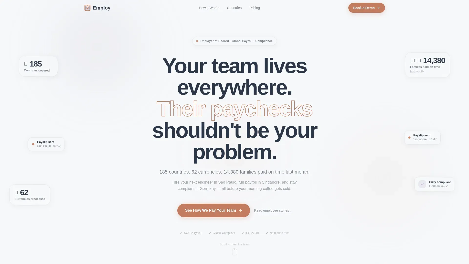
Giant Centered Headline Block
The page opens with an enormous, quietly confident headline set in a humanist sans-serif typeface. A single supporting subline beneath it communicates scale, countries covered, currencies processed, and families paid on time. Whitespace does the heavy lifting, signaling that this service has everything under control.
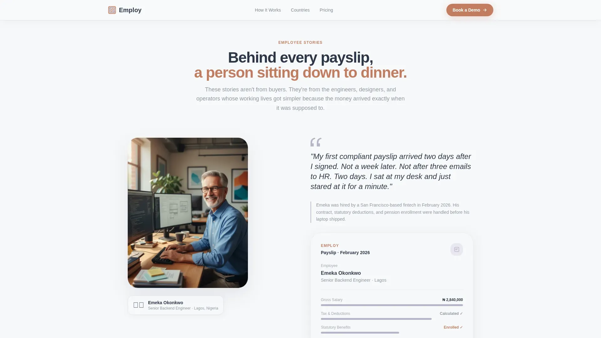
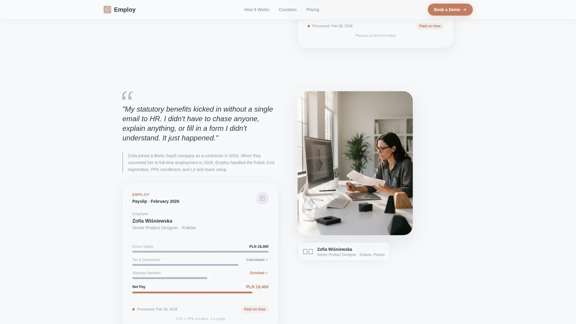
Split-Screen Testimonial Mosaic
Each testimonial is a 50/50 split: an employee photo and quote on one side, a softly animated payslip or contract detail on the other. Stories build an emotional geography of real people in real cities. The mosaic grows as the visitor scrolls, making the proof feel documentary rather than promotional.
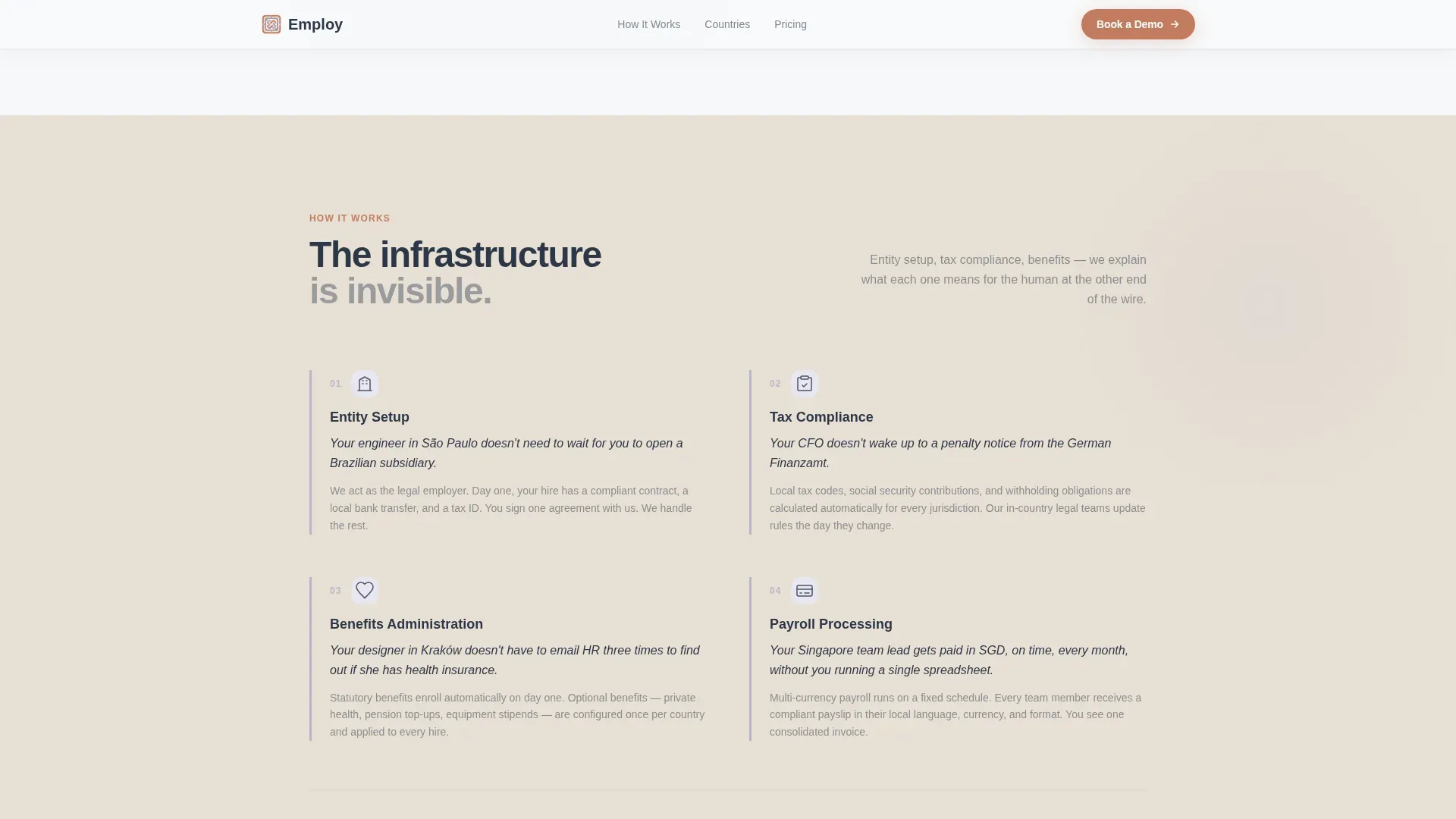
Interstitial Mechanic Explainers
Short content blocks appear between testimonials to explain how the service works, entity setup, tax compliance, and benefits administration. Each explainer is framed around what it means for the human at the other end of the payment, not just the process itself.
Three-Point Call-to-Action Placement
The primary call-to-action button appears three times: beneath the header, midway through the mosaic after the strongest testimonial, and again at the bottom above a no-commitment reassurance line. This placement is timed to match rising visitor conviction rather than interrupting it.
Soft Mist Color System
The color system uses morning fog white as the dominant background, warm linen on alternating sections, heathered lavender on cards and hover states, and soft terracotta reserved exclusively for call-to-action buttons and interactive elements. The palette communicates warmth and reliability at a glance.
No-Form Click-Through Architecture
There is no form on this page. Every call-to-action button carries the visitor to a dedicated demo scheduling page. This reduces on-page friction and ensures that when someone clicks, they are already leaning in.
Page sections overview
| Section | Purpose |
|---|---|
| Centered Headline Block | Opens with scale and emotional confidence |
| Stats Subline Row | Shows country, currency, and payment volume |
| Terracotta call to action Button | First invitation to book a demo |
| Employee Story One | Builds first human proof point |
| Mechanic Explainer Block | Explains entity setup in human terms |
| Employee Story Two | Deepens emotional geography and trust |
| Midpage call to action Button | Captures conviction at peak engagement |
| Mechanic Explainer Block | Covers tax compliance and benefits |
| Employee Story Three | Closes the mosaic with a final story |
| Bottom call to action Section | Final call with no-commitment reassurance line |
Design & branding system
The visual identity follows a Family First theme built on the Soft Mist color system. The palette feels like a Sunday kitchen, warm, unhurried, and human. Typography stays in a humanist sans-serif family throughout.
- Fog white (#F7F8FA) as the primary background, linen (#E8E0D5) warming alternating section blocks, and lavender (#B8B5C9) tinting cards and hover states
- Slate blue (#4A5568) carries all body text, keeping readability grounded and calm
- Soft terracotta (#C27D5F) appears only on call-to-action buttons and interactive elements, acting as the single point of visual warmth and direction
Mobile & speed optimization
The split-screen layout is designed with stacked adaptability in mind. On smaller screens, the 50/50 split collapses into a single-column flow without losing the documentary feel of each testimonial pair.
- Employee photos and quotes restack above their corresponding payslip or contract detail on mobile
- Interstitial explainer blocks remain readable and scannable at any viewport width
- The three call-to-action placements retain their position relative to content anchors, keeping the click-through flow intact on every device
How this template helps you convert
The entire page is engineered around one outcome: a visitor who arrives uncertain leaves ready to book a demo. It earns that click through structure, not pressure.
- The headline and stats subline establish immediate credibility, giving the visitor a reason to keep scrolling before they have read a single feature claim
- The testimonial mosaic builds layered proof through real employee stories, so the visitor feels the service working rather than just reading about it
- The three call-to-action placements catch visitors at different stages of conviction, ensuring no motivated visitor has to search for the next step
Other information about this template
This template is a strong fit for any global payroll or employer of record brand looking to replace a generic product page with something that earns trust at an emotional level. It is ready to carry the visual and structural identity described in the source brief without modification to its core architecture.
- The page is a click-through landing page, meaning all conversion happens on a downstream scheduling page, not here
- The Family First theme and Soft Mist palette are fully embedded in the design system, making brand consistency straightforward to maintain
- This template suits services operating across multiple countries, handling payroll in multiple currencies, and managing statutory compliance in various jurisdictions
Theme
Family First
Creative direction
Testimonial Mosaic
Color system
Soft Mist
Style
Split Screen (50/50)
Direction
Click-Through
Page Sections
Giant Centered Headline Block
Split-screen Testimonial Mosaic
Interstitial Mechanic Explainers
Three-point Call to Action Placement
No-form Click-through Architecture
Soft Mist Color System
Related questions
Does this template include a contact form or sign-up form?
Can I update the employee testimonials with my own content?
How many times does the call-to-action button appear?
Is this template suitable for a service that operates across multiple countries?
Can the color system be adjusted to match a different brand palette?


