Family-Owned Business Expert Professional Website Template
Familygym is a warm, scroll-reveal landing page built for family-owned fitness studios that compete on community, not contracts. A sunset-toned photo wall, progressive comparison sections, and a single click-through call to action work together to turn curious visitors into confident walk-ins, no forms, no friction, just an emotional yes.
by Rocket studio
Quick summary
Familygym is a single-page, scroll-reveal landing page template designed for intimate, community-driven fitness studios. It uses a sunset gradient palette, a real-member photo mosaic header, and a progressive comparison journey to highlight what sets a family gym apart from big-box alternatives. Every section builds trust and nudges visitors toward one action: booking a free visit.
Who this template is for
This template is built for small, people-first fitness businesses where the owner is on the floor every day and members know each other by name. It speaks directly to the kind of gym that earns loyalty through warmth, not marketing spend.
- Family-owned fitness studios and neighborhood strength gyms looking to attract parents, couples, and empty nesters
- Gym owners who want to compete against big-box chains without matching their budget
- Fitness coaches and small studio operators who need a polished online presence that feels personal and honest
What problem this template solves
Most small gyms lose potential members online before those people ever walk through the door. A generic website with stock photos and vague pricing cannot convey the lived-in warmth that makes a community gym worth the switch.
- Visitors cannot feel the culture of a small gym from a flat, impersonal webpage
- Big-box gyms win by default online because smaller studios lack a clear, visual contrast to offer
- First-time visitors hesitate because there is no low-pressure way to say yes before committing
What you get with this template
You get a fully structured, single-page layout built around emotional storytelling and a clear click-through goal. Every section is purpose-built to close the gap between curiosity and commitment.
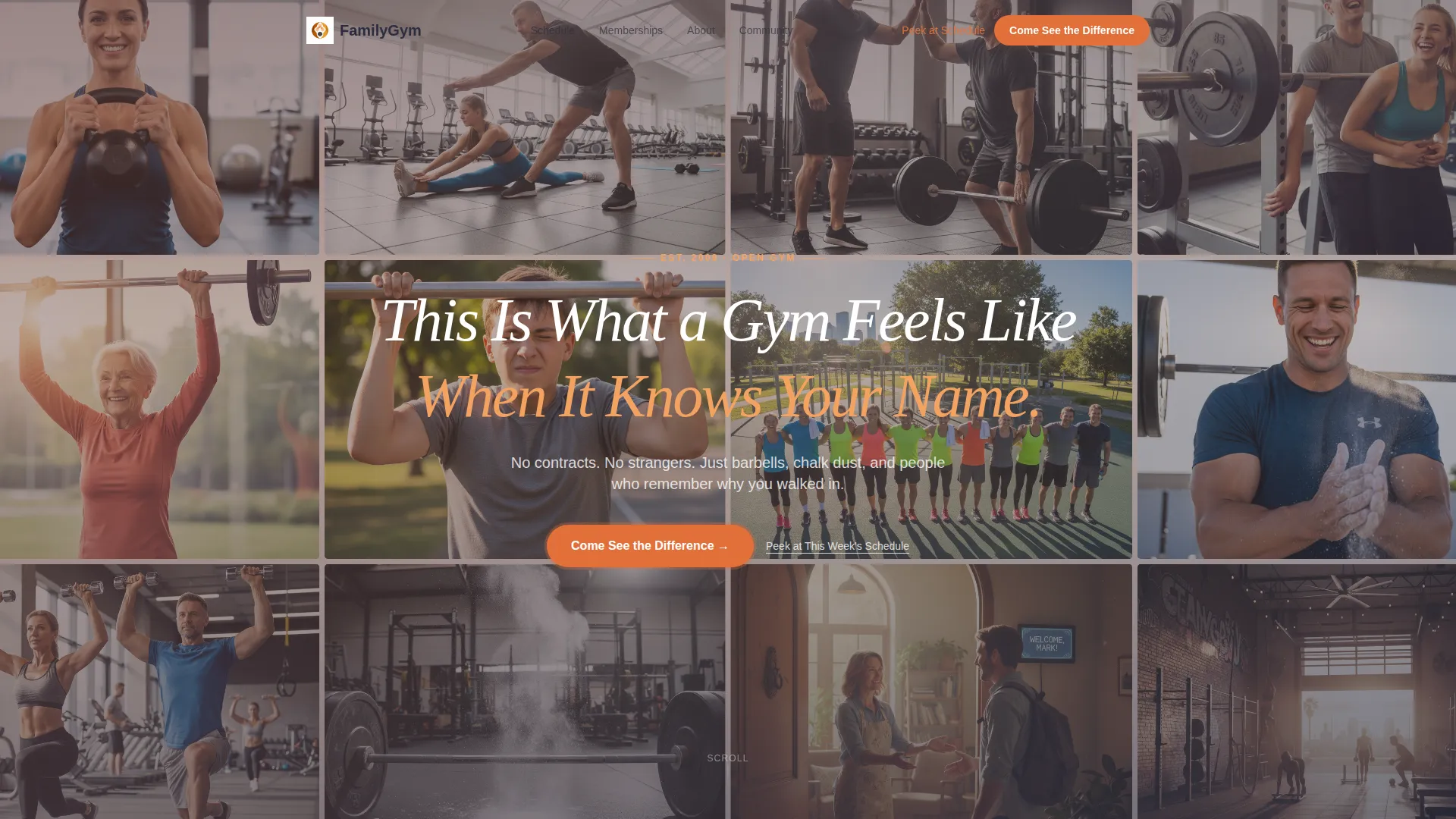
- A UGC-style photo wall header with parallax scroll and a handwritten-style headline overlay
- A multi-section comparison journey that places big-box gym tropes against your studio's real strengths
- A repeated primary call-to-action button and a secondary low-commitment text link, both pointing toward a free-visit booking page
Feature list
This template delivers a focused set of visual and structural features. Each one is drawn directly from the brief and serves the single goal of earning an emotional click before any data entry.
Scroll-Reveal Progressive Layout
The page unfolds section by section as visitors scroll. Each reveal adds a new comparison point, building the case for the family studio experience gradually and deliberately.
UGC Photo Wall Header
The header is a mosaic grid of real-member-style snapshots arranged in an asymmetric layout. A parallax drift effect activates on scroll, and a handwritten-style headline fades in over the center of the grid.
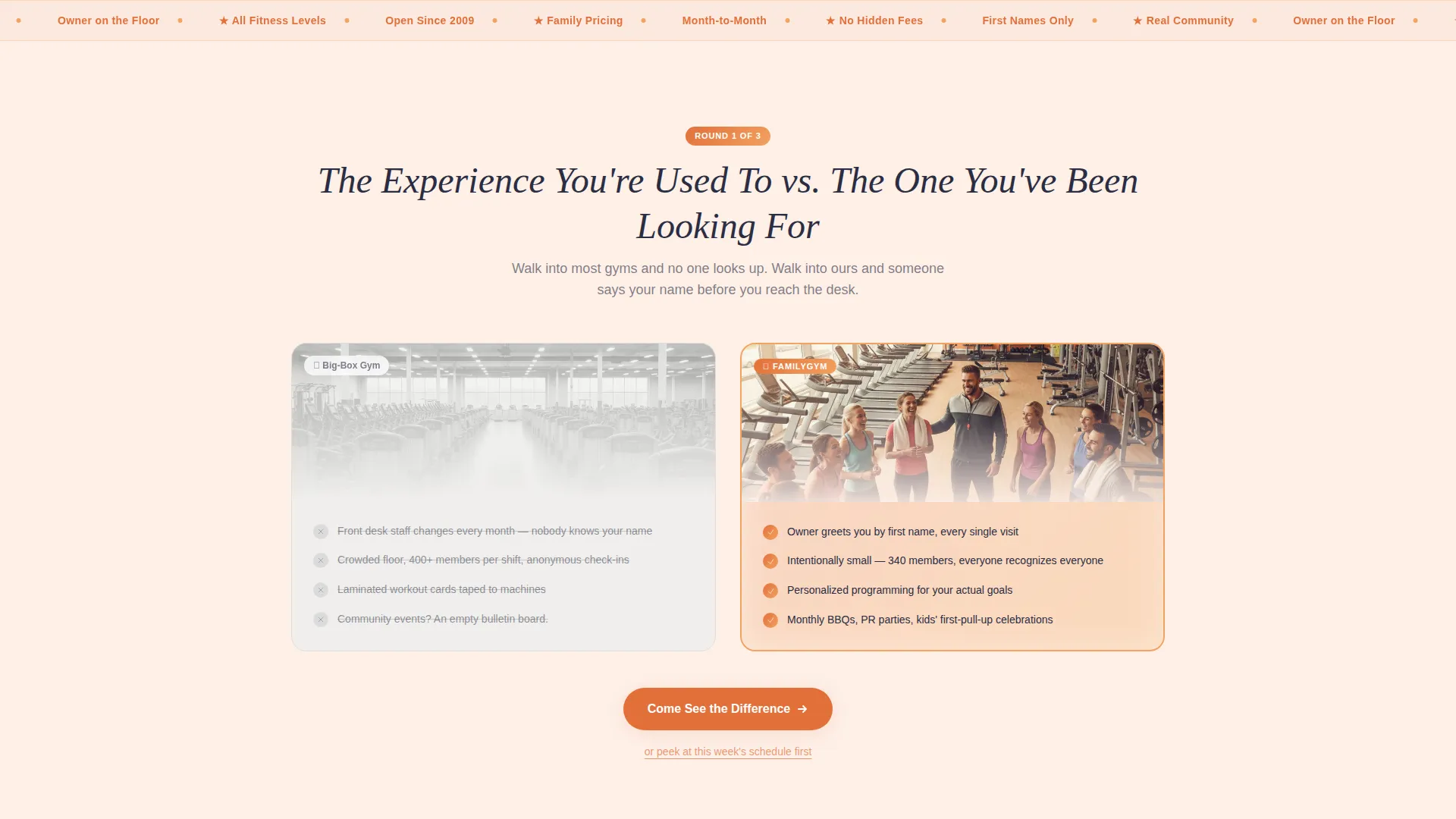
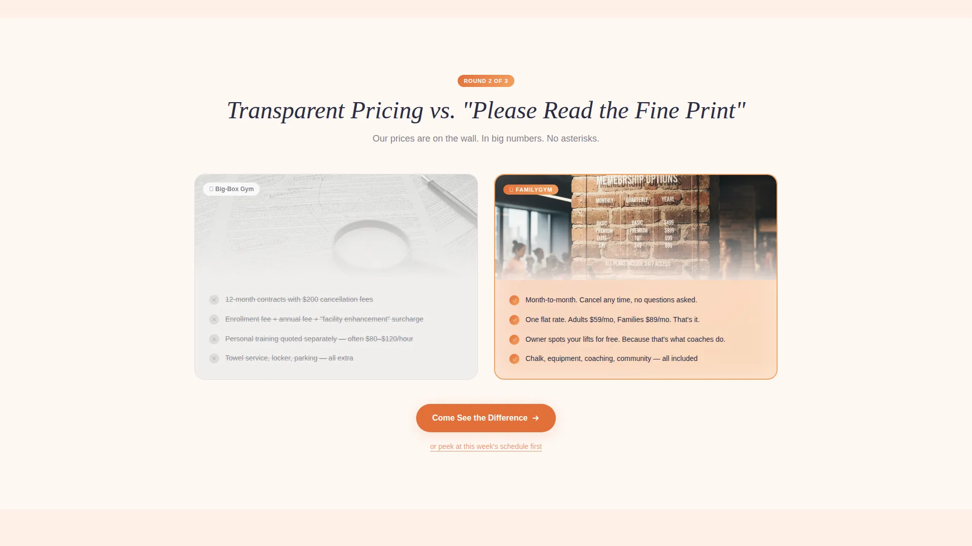
Side-by-Side Comparison Sections
Each scroll section pairs a big-box gym reality on the left against the family studio equivalent on the right. Topics progress from pricing transparency to community events to personalized programming, sharpening the contrast with every step.
Sunset Gradient Color System
The background transitions from warm peach at the top to clean white toward the bottom. Amber and gold accent buttons and progress indicators, while twilight charcoal anchors all body text for clear readability.
Repeated Click-Through Call to Action
The primary button, "Come See the Difference," appears after the header and repeats after every comparison section. A secondary text link, "Peek at This Week's Schedule," offers a gentler entry point for undecided visitors.
Handwritten-Style Typography Accent
The headline treatment uses a script-influenced style to reinforce the personal, hand-crafted feel of the brand. It signals authenticity without sacrificing readability in the supporting copy.
Page sections overview
| Section | Purpose |
|---|---|
| Photo Wall Header | Opens with a real-member mosaic and a parallax headline to set the emotional tone |
| First call to action Block | Places the primary booking button immediately below the header |
| Comparison: Pricing | Contrasts transparent month-to-month pricing against big-box hidden fees |
| Comparison: Community | Shows real events and personal greetings against empty bulletin boards |
| Comparison: Programming | Highlights personalized coaching against laminated machine cards |
| Secondary call to action Block | Repeats the primary button and adds the low-commitment schedule link |
| Final call to action Anchor | Closes the page with a warm reinforcing prompt and the booking button |
Design & branding system
The visual identity is built around a Sunset Gradient palette that feels like late-afternoon light pouring through warehouse windows. Every color choice serves both warmth and legibility.
- Core palette: deep amber (#E2703A), warm gold (#F4A261), soft peach (#FAD4C0), and twilight charcoal (#2B2D42) for text and structural anchors
- Backgrounds ease from peach at the top to white at the bottom, keeping the scroll feel organic and light
- Buttons and progress accents use amber and gold, while charcoal text holds contrast across all background stages
Mobile & speed optimization
The layout is structured for clean rendering across screen sizes. Scroll-reveal behavior and the photo grid are designed to translate well from desktop to mobile without losing visual impact.
- The photo mosaic adapts to narrower viewports, maintaining the layered feel without overcrowding small screens
- Comparison sections stack vertically on mobile so the left-right contrast reads as a top-bottom sequence
- The repeated call-to-action button stays prominent and tappable at every scroll breakpoint
How this template helps you convert
This template is built around a single conversion goal: get the visitor to click through to a free-visit booking page. Every structural and visual decision supports that outcome.
- The photo wall header creates an immediate emotional connection before a single word is read, making the studio feel real and welcoming from the first second
- The progressive comparison journey removes objections one by one, so by the time the visitor reaches the final call-to-action block, the decision feels like it was already made mid-scroll
- The secondary schedule link catches visitors who are not quite ready to commit, giving them a no-pressure next step that keeps them in the funnel without pushing too hard
Other information about this template
This template fits naturally within the Directory and Discovery theme family, where the goal is to help a visitor orient quickly and feel confident about a local choice. The overlap and layered template style used here creates visual depth without relying on complex interactions.
- The landing page direction is click-through, meaning no embedded forms appear on the page itself, all data entry happens on the destination booking page
- The template suits fitness studios, neighborhood strength gyms, CrossFit-style boxes, and similar family-owned wellness businesses
- It is designed as a standalone landing page, not a multi-page website, keeping the visitor journey focused and the message undiluted

Theme
Directory & Discovery
Creative direction
Flash Deal
Color system
Ink & Paper
Style
Overlap/Layered
Direction
Click-Through
Page Sections
Scroll-reveal Progressive Layout
UGC Photo Wall Header
Side-by-side Comparison Sections
Sunset Gradient Color System
Repeated Click-through Call to Action
Handwritten-style Headline Accent
Related questions
Can I update the photos with pictures of my actual members?
Does this template include a booking form or sign-up flow?
Can I change the colors to match my gym's existing brand?
Is this template suitable for a gym that offers classes and personal training?
How many call-to-action buttons appear in the layout?


