Bold Veteran-Owned Clothing Store Landing Page
Fatigues is a bold, single-page landing page template built for veteran-owned clothing brands. It pairs a UGC photo wall header with a modular card grid to showcase military-inspired streetwear. The Neo-Retro Obsidian and Gold visual system gives every section a ceremonial weight. Every card drives a product click, building desire and trust before the visitor reaches the catalog.
by Rocket studio
Quick summary
Fatigues is a click-through landing page template designed for veteran-owned clothing stores. It opens with a raw UGC photo mosaic, moves through a story-driven modular card grid, and closes every section with a clear product call to action. The design feels like a surplus store reimagined by a Brooklyn creative: worn, confident, and built with intention.
Who this template is for
This template speaks directly to brands where the clothes carry meaning beyond fabric and fit. It is built for founders who served and want their storefront to reflect that without explaining it.
- Veteran-owned clothing brands selling military-inspired streetwear online
- Military spouses and community-adjacent brands building collections with cultural edge
- Civilian-founded labels that want an authentic, story-led retail presence
What problem this template solves
Most retail landing page templates feel generic. They were built for anyone, which means they feel like no one. A veteran-owned clothing brand needs a page that earns trust without a pitch, lets the product photography do the talking, and gets out of the way when it is time to click.
- Generic templates flatten brand identity and bury the story behind the product
- Cluttered layouts distract visitors before they reach a product card
- Weak calls to action lose buyers who were already close to committed
What you get with this template
You get a fully structured, single-page layout that guides visitors from first impression to product click without friction. Every section has a defined job, and nothing is included that does not serve that job.
- A UGC photo wall header with space for real customer images and a center looping video tile
- A modular card grid with flip-on-hover interaction revealing the story behind each product
- A sticky bottom bar and full-width quote banners that reinforce trust between scroll sections
Feature list
This landing page template includes a focused set of built-in features. Each one serves the core goal: move a curious visitor toward a confident product click.
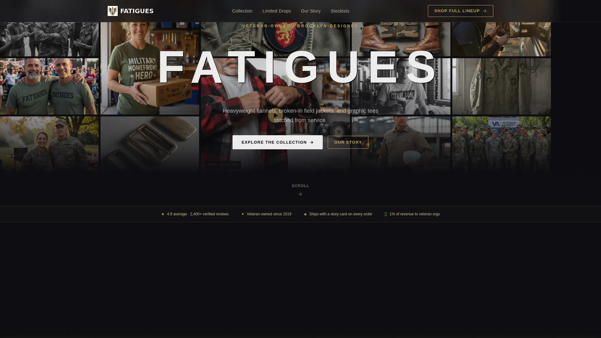
UGC Photo Wall Header
The header is a slightly irregular mosaic of customer photos shot on phones, some in black and white and some in full color. One center tile holds a short looping video. The brand wordmark sits over the mosaic in chalk white with a distressed stencil effect, like lettering on the side of a footlocker.
Modular Card Grid Layout
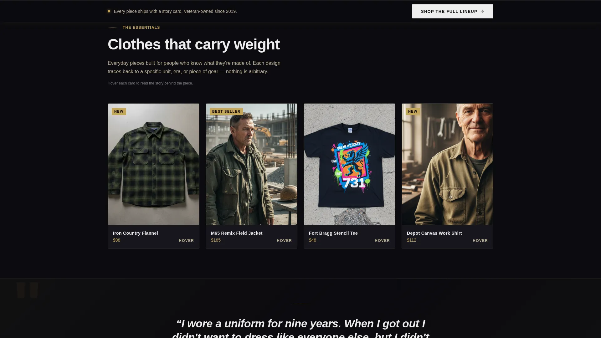
Product cards are arranged in a responsive modular grid. Each card shows a flat-lay or worn-in-the-field product photo. On hover, the card flips to reveal the story behind the design: the unit that inspired it, the graphic reference, and why that specific fabric was chosen.
Scroll-Guided Collection Flow
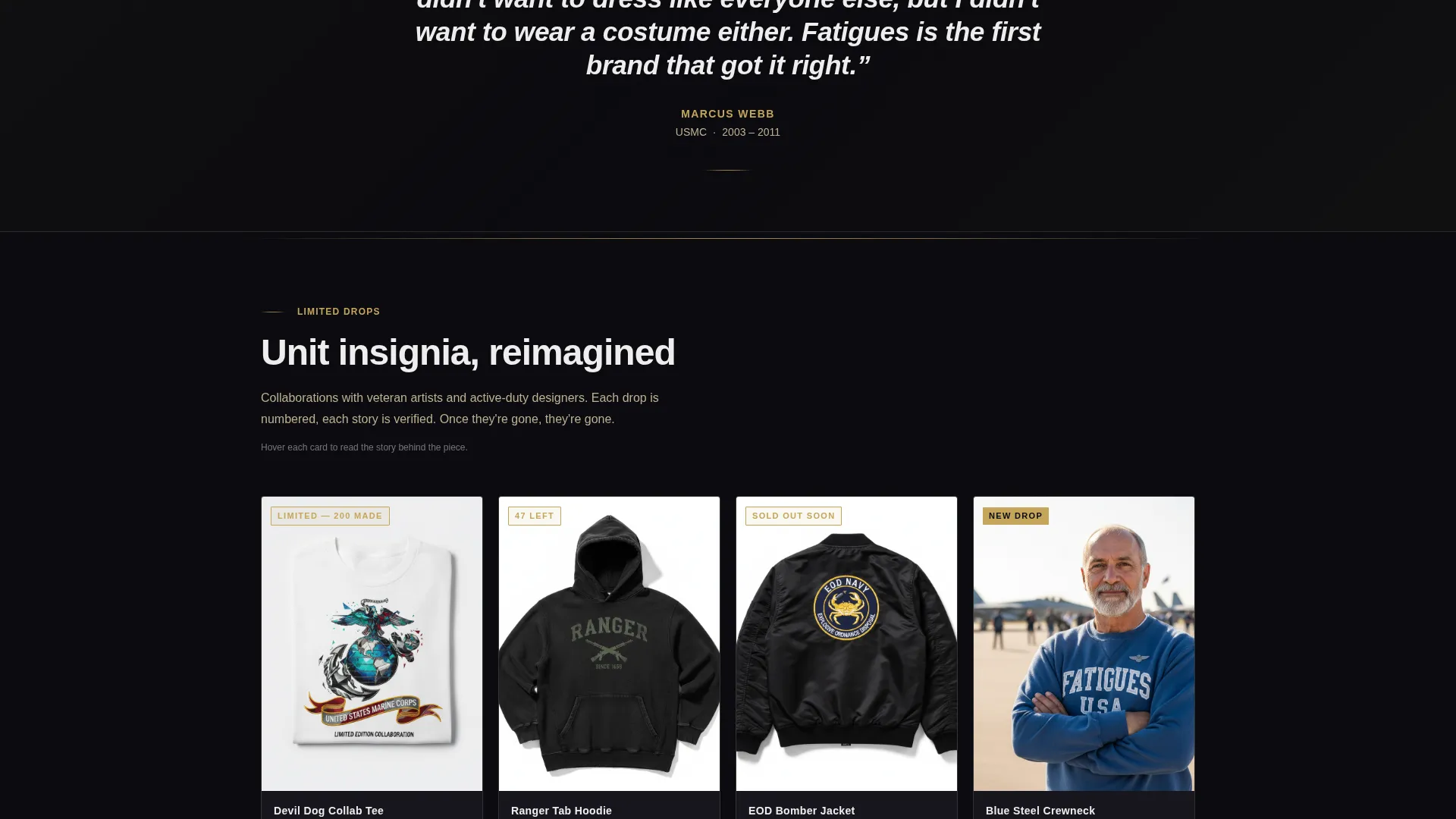
The grid is ordered with intention. Everyday essentials sit at the top of the page. Limited-edition collaborations appear further down, building scarcity and purchase intent as the visitor scrolls deeper into the collection.
Full-Width Quote Banners
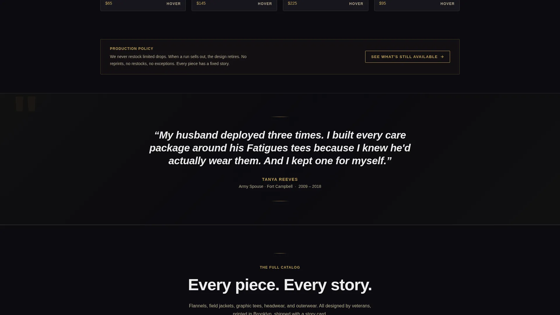
Between card sections, the template places full-width banners featuring one-line testimonials from verified veteran buyers. Each banner includes the buyer's name, branch, and years served, giving social proof a specific, human face.
Sticky Bottom Bar
After the visitor passes the second scroll section, a sticky bottom bar appears at the base of the screen. It carries a single call to action linking to the complete product catalog, keeping the next step visible without interrupting the browsing flow.
Card-Level Click-Through calls to action
Every product card includes a primary call to action reading "See the Details" styled in tarnished brass text on a black background. There is no cart and no form on this page. The sole purpose of each card is to earn the click to the product detail page.
Page sections overview
| Section | Purpose |
|---|---|
| UGC Photo Header | Opens with real customer imagery and brand wordmark |
| Brand Wordmark Overlay | Anchors identity over the photo mosaic |
| Looping Video Tile | Shows a vet trying on a jacket in a truck mirror |
| Essentials Card Grid | Displays everyday products with flip-story interaction |
| Quote Banner Row | Delivers verified veteran buyer testimonials |
| Limited Edition Grid | Builds scarcity with deeper-scroll collaboration drops |
| Sticky Bottom Bar | Keeps catalog link visible after second scroll section |
Design & branding system
The visual identity follows a Neo-Retro theme. Every color choice was made to feel earned rather than decorated. The palette reads like a challenge coin on a matte black bar top: ceremonial weight meets after-hours cool.
- Dominant background in deep black (#0B0B0F), tarnished brass (#C5A55A) for accents and hover states, worn khaki (#BFB093) for secondary text and card borders, and chalk white (#EDEDED) for primary type
- Distressed stencil wordmark treatment referencing footlocker lettering and barracks-tight folding precision
- Photography direction favors concrete flat-lays, field-worn lifestyle shots, and unfiltered UGC over studio polish
Mobile & speed optimization
The modular grid layout is built to reflow cleanly on smaller screens. Card interactions and the sticky bottom bar remain functional across device sizes without requiring a separate mobile design.
- Card grid stacks vertically on mobile so each product photo gets full visual attention
- The sticky bottom bar stays anchored at the bottom of the screen on all screen sizes
- The UGC photo mosaic scales down proportionally, keeping the irregular polaroid-gap feel intact
How this template helps you convert
This template was built around one outcome: the product click. Every design and layout decision supports that goal without adding distractions.
- The flip-on-hover card mechanic delivers product story at the moment of peak interest, just as a visitor considers whether to click, giving them the context they need to commit.
- Full-width quote banners placed between scroll sections rebuild trust at exactly the point where a visitor might otherwise scroll away, keeping momentum toward the catalog.
- The sticky bottom bar ensures that the path to the full product lineup is always one tap away, so a visitor who is ready to shop never has to hunt for the next step.
Other information about this template
This template sits at the intersection of retail commerce and veteran-owned brand identity. It is designed to work as a standalone landing page that feeds traffic directly to a product catalog or individual product detail pages.
- The page carries no cart, no form, and no checkout flow; it is purpose-built as a click-through gateway
- The Neo-Retro theme and Obsidian and Gold color system are fully reflected in every section, from card borders to call to action button styling
- The template style draws from a Gallery and Detail approach, letting photography lead and copy support
- It is suited for seasonal drops, capsule collection launches, and always-on brand discovery pages
Theme
Neo-Retro
Creative direction
Curated Collection
Color system
Sunset Gradient
Style
Gallery + Detail
Direction
Quiz/Assessment
Page Sections
UGC Photo Wall Header
Flip-on-hover Product Cards
Scroll-guided Collection Order
Full-width Testimonial Banners
Sticky Bottom Bar Call to Action
Card-level Click-through Buttons
Related questions
Does this template include a shopping cart or checkout?
Can I use my own customer photos in the header mosaic?
How does the card flip interaction work?
Is this template suited for a limited-edition drop launch?
Can this template work for a clothing brand that is not veteran-owned?



