Executive Cleaning B2B Landing Page Template
Faxina is a B2B-focused landing page template built for professional cleaning operations serving São Paulo's corporate property market. It uses an Editorial Magazine visual style, an Expert Panel content structure, and a zigzag section layout to position a cleaning service as a managed-service infrastructure. The primary call to action targets property managers, coworking operators, and Airbnb portfolio firms.
by Rocket studio
Quick summary
Faxina is a single-page B2B landing page template for executive cleaning services operating in São Paulo. It combines an Editorial Magazine aesthetic with an Expert Panel narrative structure. The layout guides corporate prospects from a trust-building testimonial header through three expert-led zigzag sections to a partnership proposal form and a gated PDF case study download.
Who this template is for
This template is built for cleaning businesses that sell to other businesses, not individual households. It suits operations with a defined service territory, a structured team, and clients who expect accountability.
- Property management companies handling multi-unit residential or commercial portfolios
- Coworking space operators and Airbnb management firms needing reliable turnover cleans
- Post-construction cleaning teams targeting Faria Lima, Paulista, and Vila Olímpia corridors in São Paulo
What problem this template solves
Corporate cleaning clients do not respond to generic service pages with stock photography and a phone number. They need operational evidence before they pick up the phone. This template closes that trust gap before the first conversation even happens.
- Prospects arrive without context and leave before engaging, because the page feels like a consumer product rather than a managed service
- B2B buyers need to see systems, team structure, and peer validation, not just a price list
- There is no low-commitment entry point for hesitant prospects who are not yet ready for a sales call
What you get with this template
You get a fully structured landing page layout that builds credibility across every scroll depth. The design and copy architecture work together to move a corporate decision-maker from initial skepticism to a qualified inquiry.
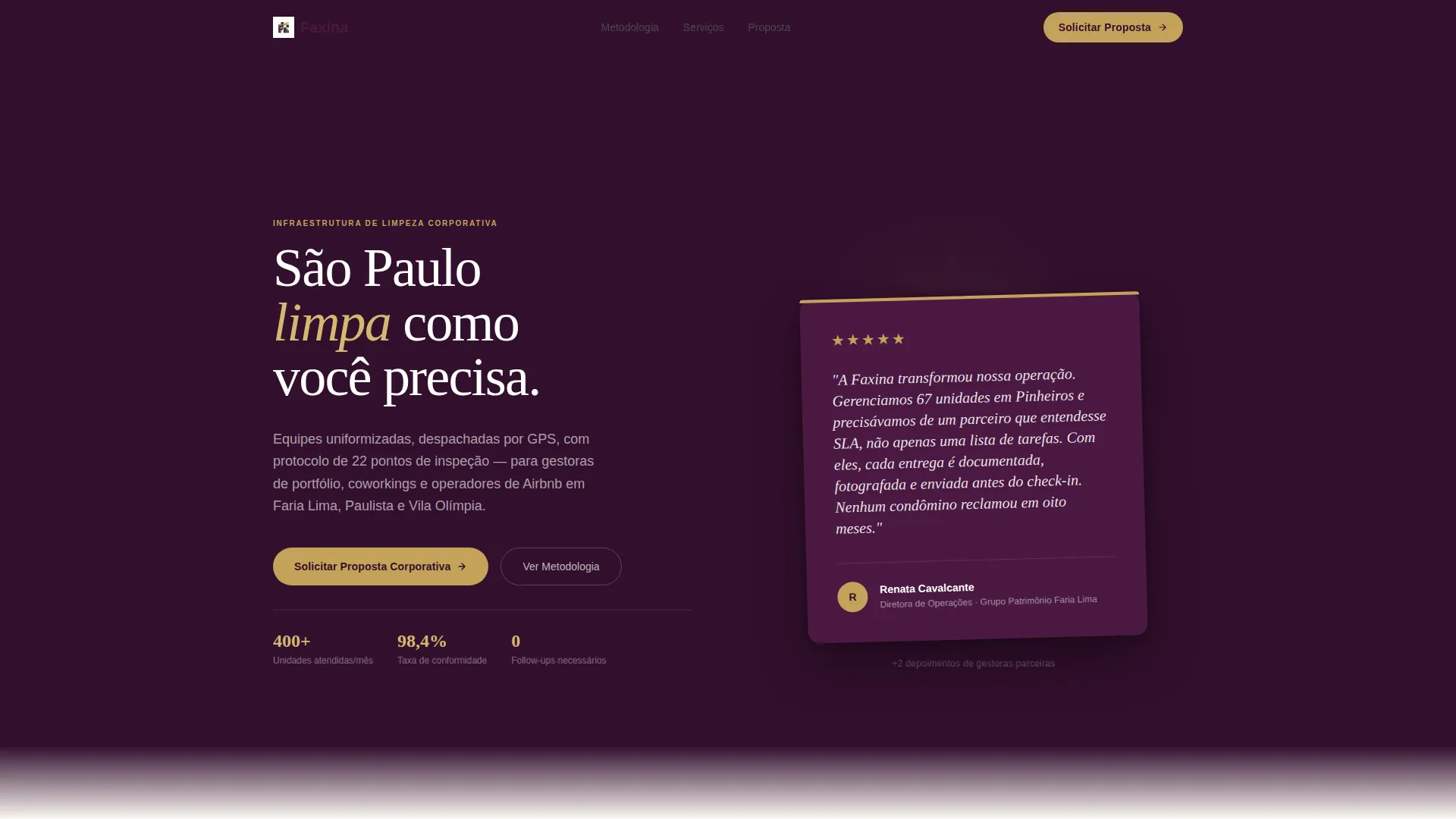
- A testimonial card header featuring an oversized peer-validation quote set against deep plum
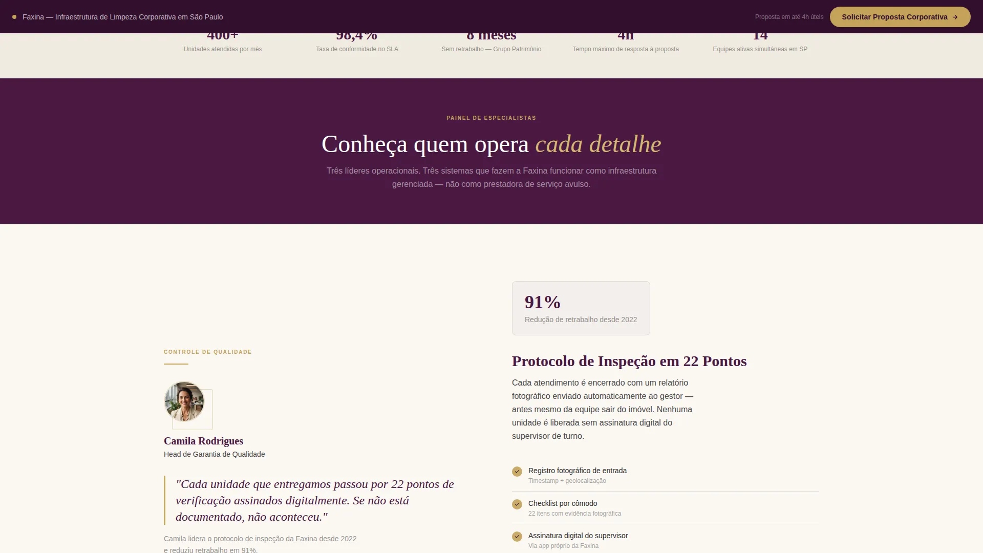
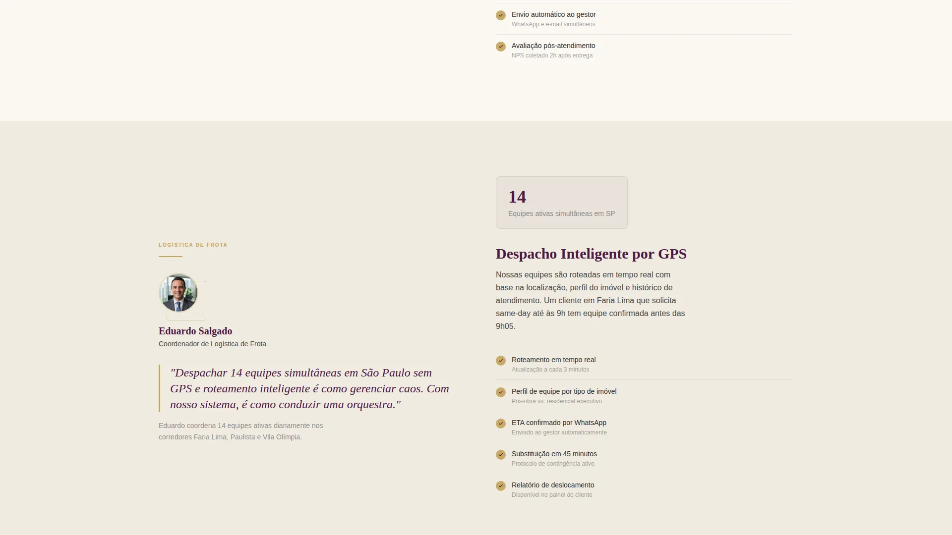
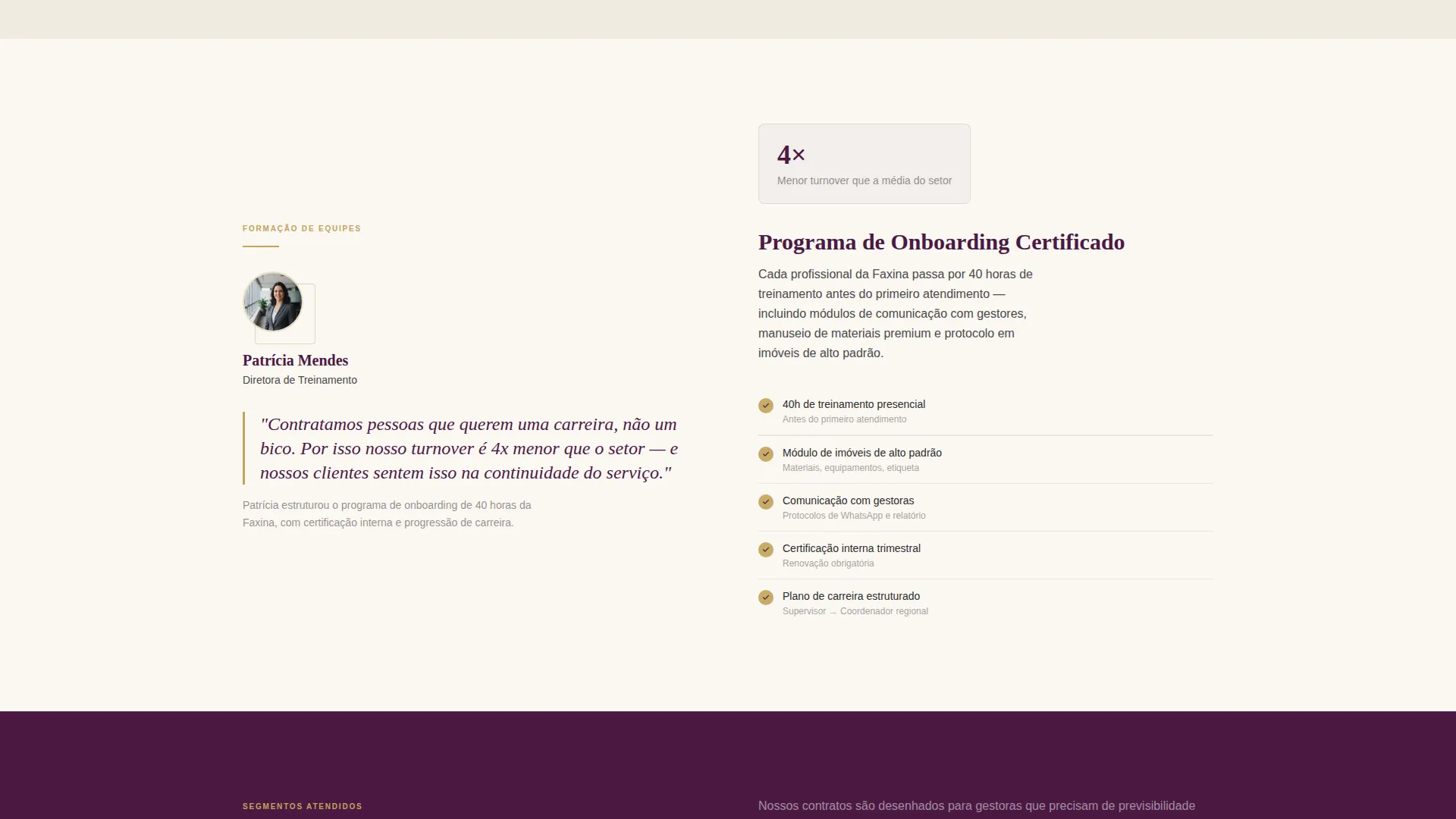
- Three zigzag expert panel sections profiling operational leaders and the systems they run
- A dual-conversion zone with a corporate proposal form and a gated PDF case study download
Feature list
This template delivers a tightly designed set of components, each serving a specific purpose in the B2B sales flow.
Stacked Testimonial Card Header
The header opens with a single oversized quote card set against deep plum, typeset in elegant serif. It is attributed to a named property director at a recognizable São Paulo real estate group, complete with a company logo and a five-star rating. Two additional cards peek behind the primary card, creating a layered desk-tray effect that implies multiple satisfied partners without overwhelming the viewer.
Zigzag Expert Panel Layout
Three alternating sections each feature a different operational leader: Head of Quality Assurance, Fleet Logistics Coordinator, and Training Director. Left-side panels show the person's title and a pull-quote in plum serif. Right-side panels detail the system they run, covering inspection checklists, GPS-dispatched teams, and onboarding protocols.
Dual Conversion Zone
After the third expert panel, the page presents a primary corporate proposal form and a secondary gated PDF case study. The form captures company name, number of properties or units managed, cleaning frequency needed, and a corporate email field. Personal email addresses are gently flagged to keep leads qualified.
Sticky Bottom Call-to-Action Bar
A persistent bar at the bottom of the viewport repeats the primary call to action throughout the scroll journey. It ensures the proposal request button is always visible without interrupting the reading flow of the expert panel sections above it.
Plum Executive Color System
The palette uses deep plum for headlines and section dividers, warm charcoal for body text, brushed linen white as the background, and burnished gold reserved exclusively for calls to action and pull-quote borders. Every color has a defined role, preventing visual noise and reinforcing the luxury trade-journal feel.
No-Photography Editorial Direction
The template uses zero stock photography. There are no mops, buckets, or before-and-after images. Visual weight comes entirely from typography, color blocking, and the testimonial card design, keeping the page aligned with the tone of a high-end hospitality trade publication.
Page sections overview
| Section | Purpose |
|---|---|
| Testimonial Card Header | Opens with peer validation from a named property director to establish credibility immediately |
| Expert Panel One | Head of Quality Assurance presents inspection checklists and quality systems |
| Expert Panel Two | Fleet Logistics Coordinator details GPS-dispatched team deployment |
| Expert Panel Three | Training Director explains onboarding protocols and service standards |
| Corporate Proposal Form | Primary conversion point capturing company details and cleaning frequency needs |
| PDF Case Study Gate | Secondary entry point for hesitant prospects using the same email capture |
| Sticky call to action Bar | Persistent proposal request button visible throughout the entire page scroll |
Design & branding system
The visual identity follows an Editorial Magazine theme built around the Plum Executive color system. Every design decision reinforces the impression of a luxury trade publication rather than a consumer service website.
- Deep plum (#4A1942) anchors headlines and section dividers; burnished gold (#C4A35A) is used only for calls to action and pull-quote borders
- Brushed linen white (#FAF7F2) provides generous background breathing room; warm charcoal (#2D2D2D) keeps body text readable without feeling heavy
- Elegant serif typography, angled card shadows, and a no-photography rule sustain the magazine-cover aesthetic from header to footer
Mobile & speed optimization
The zigzag layout and card-stacking effects are designed to reflow cleanly on smaller screens without losing the editorial hierarchy. The sticky bottom bar is particularly effective on mobile, where it keeps the call to action within thumb reach at all times.
- Alternating left-right panels stack vertically on mobile while preserving the expert-per-section narrative order
- The testimonial card stack collapses to a single featured card on small viewports to avoid visual clutter
- Form fields are sized and spaced for comfortable touch input, with the corporate email flag logic remaining active on all screen sizes
How this template helps you convert
The page is built around a progressive trust architecture. Each section adds a new layer of credibility before asking for a commitment.
- The testimonial card header delivers immediate peer validation, so the visitor feels a colleague has already vouched for the service before reading a single company claim.
- The expert panel series replaces vague service promises with named operational leaders and specific systems, giving corporate buyers the evidence they need to justify an internal decision.
- The dual conversion zone meets prospects at two readiness levels: those ready for a proposal call and those who need one more piece of evidence before committing.
Other information about this template
This template was designed specifically for the São Paulo B2B cleaning services market, with Faria Lima, Paulista, and Vila Olímpia named as the primary service corridors. The layout and copy architecture reflect the expectations of corporate property decision-makers in that context.
- The template style follows a Comparison Table and Editorial Magazine intersection, making it well suited for services that need to differentiate themselves from lower-tier competitors
- The Lead Generation direction is reinforced by both the primary proposal form and the gated case study, giving the page two distinct conversion paths within a single scroll
- The creative direction draws from a Testimonial Mosaic approach concentrated into the header, then transitions into the Expert Panel series for the body of the page
- The template is built as a standalone landing page and does not require a multi-page site structure to deliver its full conversion flow
Theme
Editorial Magazine
Creative direction
Testimonial Mosaic
Color system
Arctic White
Style
Comparison Table
Direction
Lead Generation
Page Sections
Stacked Testimonial Card Header
Zigzag Expert Panel Sections
Dual Conversion Zone
Sticky Bottom Call-to-action Bar
Plum Executive Color System
No-photography Editorial Design
Related questions
Who is the ideal business for this template?
Can I adapt the expert panels for a smaller team?
What does the gated PDF case study section do?
Does the form filter out personal email addresses?
Is this template only suitable for São Paulo-based services?



