Editorial Dog Daycare Partnership Landing Page Template
Fetch is an editorial-style comparison table landing page built for dog daycare businesses targeting B2B partners. It presents partnership tiers with pull-quote testimonials, a gated PDF secondary path, and a sticky estimate request form. The Plum Executive color system and magazine-grade typography make a sophisticated first impression on property managers, HR directors, and veterinary clinic owners.
by Rocket studio
Quick summary
Fetch is a single-page B2B landing page template designed for dog daycare operators pursuing corporate and property partnerships. It combines editorial magazine aesthetics with structured comparison tables, testimonial mosaics, and a dual-call to action conversion flow. The design signals professionalism without sacrificing warmth, making it ideal for pitching to decision-makers who value both data and story.
Who this template is for
This template is built for dog daycare businesses that are ready to move beyond walk-in customers and pursue institutional partnerships. It speaks directly to operators who need a polished, persuasive page that earns trust before asking for a commitment.
- Dog daycare owners pitching to apartment complexes or multifamily property managers
- Operators building referral programs with veterinary clinics
- Daycare businesses offering white-label or embedded amenity services to corporate campuses
What problem this template solves
Most dog daycare websites are built for pet owners, not business partners. When an HR director or property manager lands on a typical daycare page, they find cute photos and booking links, not ROI proof or partnership structures. Fetch closes that gap.
- Decision-makers need occupancy data, revenue-share projections, and tier comparisons, not just pricing
- B2B prospects require a secondary path for leads not ready to commit, such as a downloadable one-pager
- The page must establish credibility before it asks for any information
What you get with this template
Fetch delivers a fully structured, single-page layout organized around comparison logic and editorial storytelling. Every section is designed to move a skeptical business partner from curiosity to a submitted estimate request.
- A giant centered headline section, a three-tier comparison table with mosaic testimonials woven between rows, and a sticky bottom call-to-action bar
- A primary estimate request form collecting company name, business type, estimated dog volume, and work email
- A secondary gated PDF path capturing just name and email for leads who need more time
Feature list
This template includes a focused set of components built specifically for partnership-oriented conversion. Each one is grounded in the editorial visual direction and the B2B audience it serves.
Giant Headline Hero Section
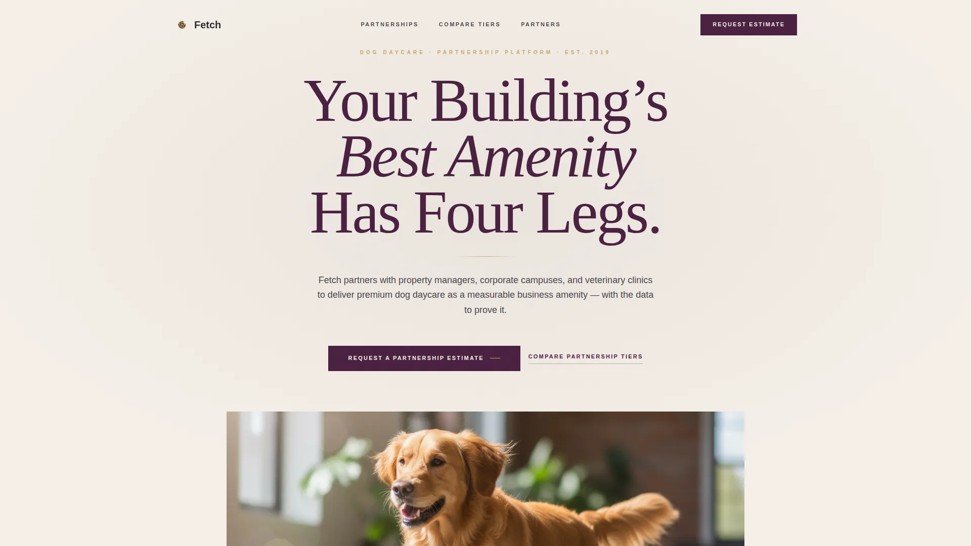
An enormous centered serif headline set in deep plum against muted cream stock opens the page. A thin brushed-gold rule sits beneath the headline, and a single editorial-quality photograph of a golden retriever on polished concrete fills the visual field. The composition uses shallow depth of field and generous white space to signal brand confidence.
Three-Tier Partnership Comparison Table
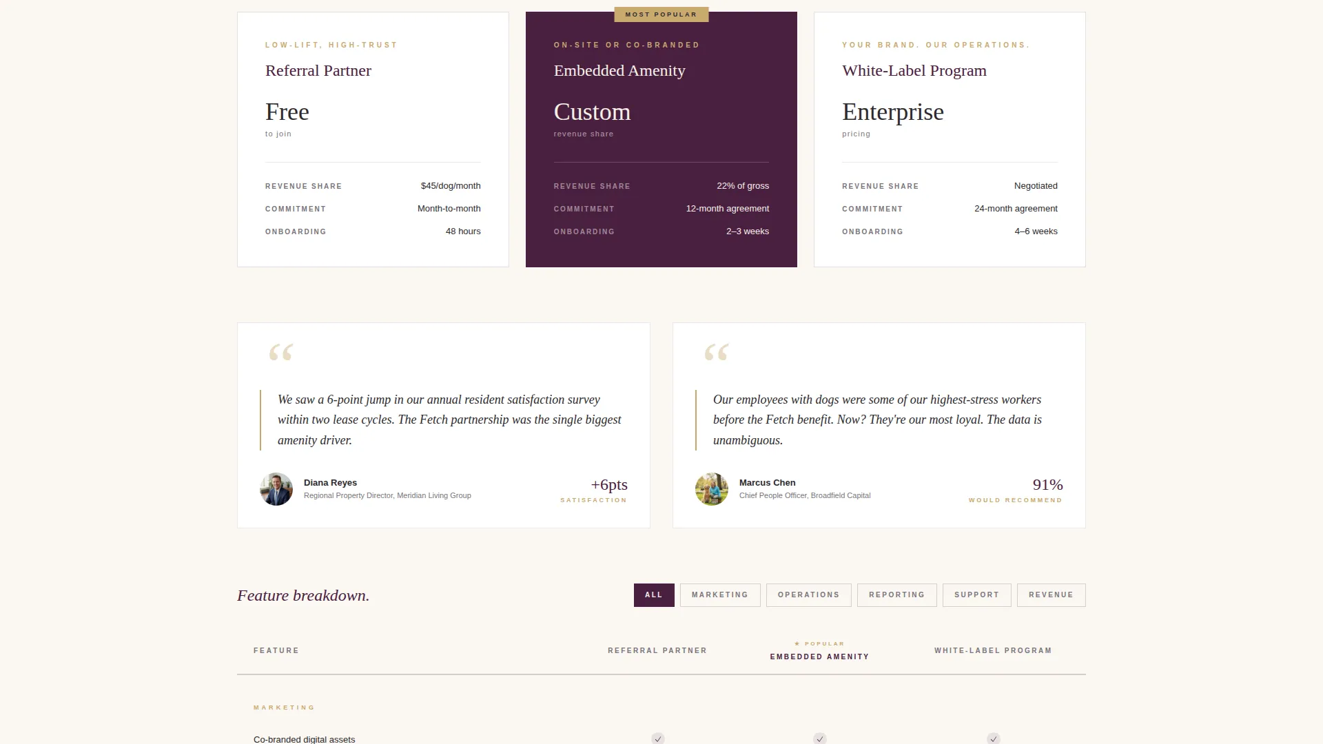
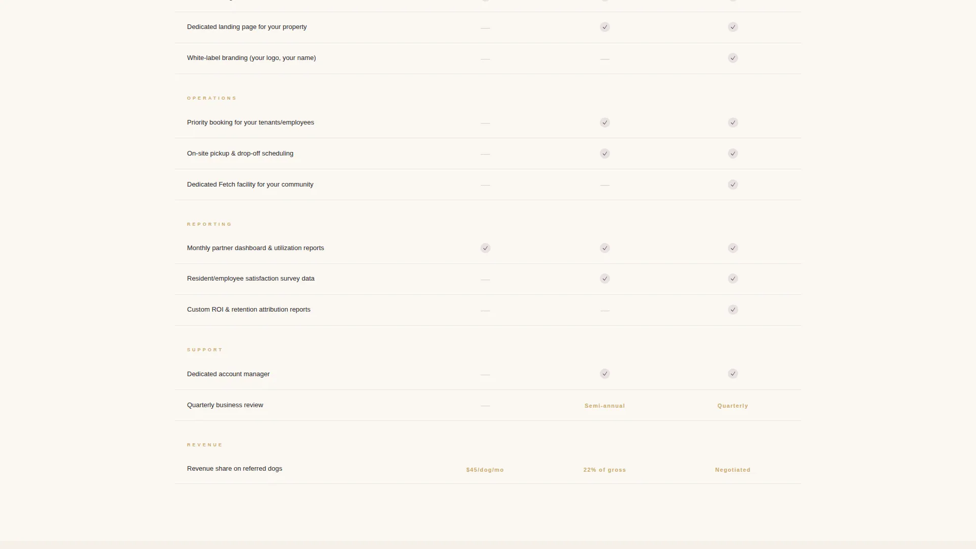
The core of the page presents three partnership tiers side by side: Referral Partner, Embedded Amenity, and White-Label Program. Each tier is displayed in a clean editorial grid, with column lines in brushed gold and row data written in warm charcoal editorial ink. The table makes it easy for prospects to self-select the right engagement level.
Testimonial Mosaic Between Table Rows
Pull-quote testimonials from property managers, HR directors, and veterinary clinic owners are woven directly into the comparison table structure. Each mosaic block features real names, roles, and specific numbers such as occupancy lifts and satisfaction score increases. This rhythm of data followed by proof keeps readers engaged through the full comparison.
Dual-Path Conversion Flow
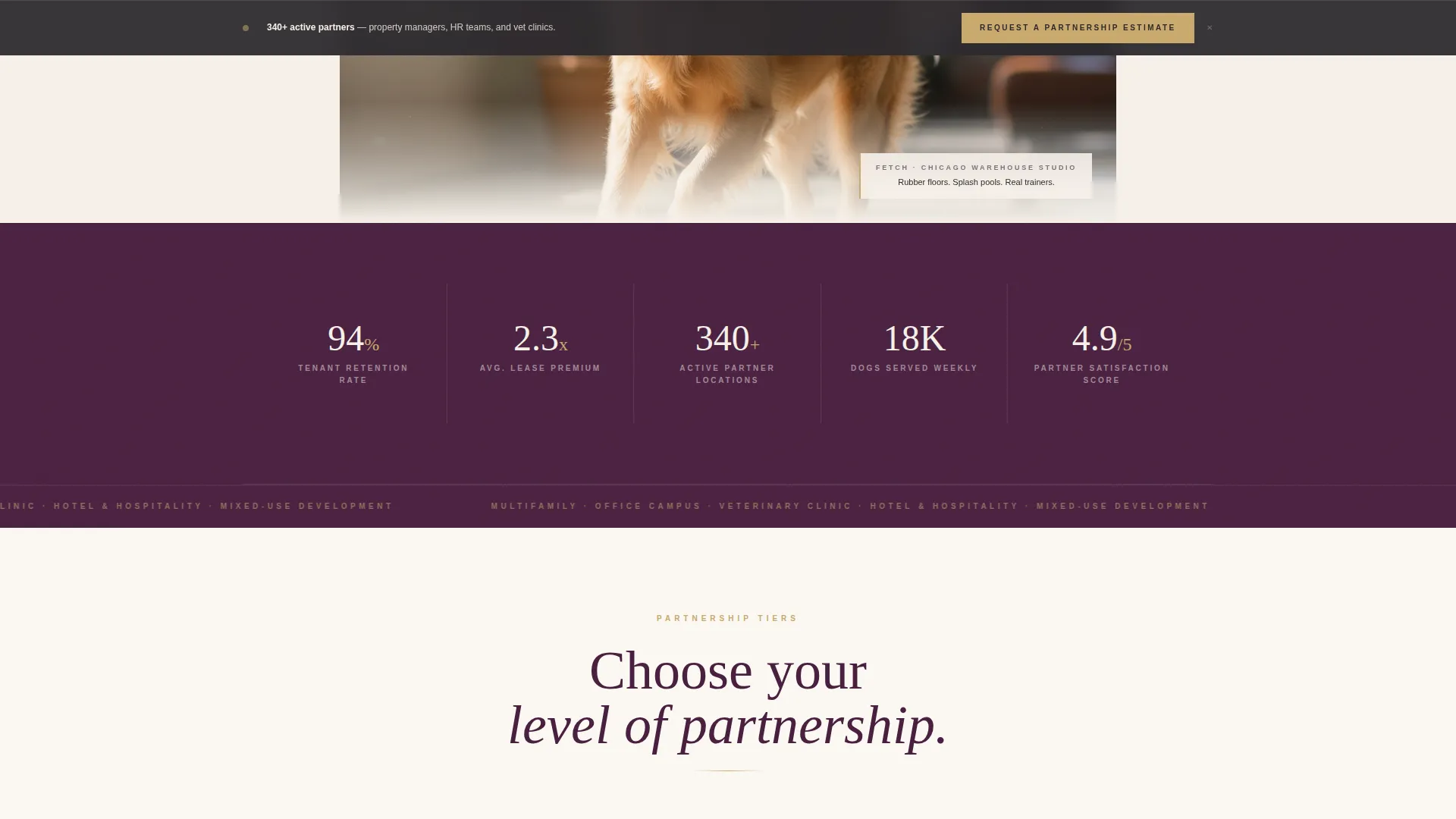
The primary call to action, "Request a Partnership Estimate," appears after the first testimonial mosaic and repeats as a sticky bottom bar throughout the scroll. A secondary path offers a gated PDF one-pager for leads not ready to submit a full estimate request. Both paths are designed to capture contact information at different commitment levels.
Partnership Estimate Request Form
The inline form collects four fields: company name, property or business type via dropdown, estimated dog volume per week, and a work email address. The dropdown includes multifamily, office campus, veterinary clinic, hotel, and other. This targeted field set qualifies leads without friction.
Sticky Bottom Call-to-Action Bar
A persistent bottom bar keeps the primary call to action visible at every scroll depth. It reinforces the "Request a Partnership Estimate" message without interrupting the reading experience. This ensures the conversion entry point is never more than one click away.
Page sections overview
| Section | Purpose |
|---|---|
| Giant Headline Hero | Opens with editorial authority and a single compelling image |
| Gold Rule Divider | Signals section transitions with a thin brushed-gold accent line |
| First Testimonial Mosaic | Builds credibility before the first data table appears |
| Comparison Table Block | Presents the three partnership tiers side by side |
| Inline Pull-Quote Rows | Breaks table structure with real partner quotes and metrics |
| Primary Estimate Form | Collects qualified lead information at peak intent |
| Gated PDF Secondary Path | Captures early-stage leads with a lighter commitment |
| Sticky call to action Bar | Keeps the primary action visible throughout the scroll |
Design & branding system
The Plum Executive color system gives Fetch a visual identity that feels like a luxury editorial publication rather than a service directory. Every color decision reinforces the message that this is a serious business conversation.
- Deep plum (#4A2040) for headline type and dominant backgrounds, warm charcoal (#2D2A2E) for body copy, muted cream stock (#F5F0E8) for page background, and brushed gold (#C9A96E) for accent lines, pull-quote marks, and hover states
- Oversized serif typography at the headline level and a clean editorial grid for body sections create a strong typographic hierarchy
- The overall palette and layout feel like a velvet-covered hardback on a mahogany desk, rich in tone but never loud or cluttered
Mobile & speed optimization
The layout is structured to maintain its editorial clarity at every screen size. The comparison tables, testimonial mosaics, and form sections are each designed with a clean grid that adapts without losing readability.
- Comparison table columns stack vertically on smaller screens so tier data remains scannable
- The sticky bottom call-to-action bar remains accessible at all scroll depths on both desktop and mobile viewports
- Large serif headlines scale proportionally so the typographic impact of the hero section carries through on any device
How this template helps you convert
Fetch is built around a deliberate sequence: earn trust first, then ask for information. Every section placement is intentional and designed to reduce hesitation in a B2B audience.
- The testimonial mosaic appears before the primary form, so prospects see occupancy lifts, satisfaction scores, and revenue-share context before they are asked to submit anything.
- The dual-path structure lets hesitant leads download a one-pager with just a name and email, keeping them in the funnel without requiring a full commitment upfront.
- The sticky call-to-action bar ensures the estimate request entry point is persistent, so a prospect who finishes reading can convert immediately without scrolling back.
Other information about this template
Fetch sits at the intersection of professional services marketing and a niche that rarely gets B2B-grade design treatment. A few additional details help round out the full picture of what this template covers.
- The template is categorized under Professional Services and Dog Daycare Marketing, making it relevant for operators building structured partnership programs
- The editorial magazine theme is a deliberate contrast to typical pet-industry visual styles, which tend toward playful iconography rather than typographic authority
- The comparison table format is particularly well suited to the dog daycare free estimate landing page use case, where multiple stakeholders need to evaluate different engagement levels before committing
Theme
Editorial Magazine
Creative direction
Testimonial Mosaic
Color system
Plum Executive
Style
Comparison Table
Direction
Partnership/B2B
Page Sections
Giant Headline Hero Section
Three-tier Partnership Comparison Table
Testimonial Mosaic Sections
Dual-path Conversion Flow
Partnership Estimate Request Form
Sticky Bottom Call-to-action Bar
Related questions
Who is the target audience for this landing page template?
What partnership tiers does the comparison table present?
What fields does the estimate request form collect?
Is there a conversion path for leads not ready to submit an estimate?
Can the editorial design be adapted to a different brand identity?



