Pet Store Facebook Ads Partnership Landing Page
Fetch is a high-converting landing page template built for neighborhood pet stores running Facebook ads partnership programs. It leads with real partner proof, then walks prospects through a side-by-side comparison of three ad packages. The layout pairs testimonial cards with structured comparison tables to make the partnership case before a brand rep ever reaches the application form.
by Rocket studio
Quick summary
Fetch is a single-page partnership landing page for independent pet stores. It opens with an oversized testimonial card, then moves through a staggered mosaic of partner quotes and comparison tables covering three ad packages. Every design decision points toward one outcome: getting brand reps and distributors to apply for shelf space or download the media kit.
Who this template is for
This template is built for pet store owners and marketing leads who want to attract paying brand partners. It speaks directly to the people on the other side of that conversation: the brand reps, regional distributors, and direct-to-consumer supplement companies looking for in-store placement and co-branded advertising reach.
- Pet store operators running Facebook ads partnership programs for brands seeking shelf or endcap placement
- Regional distributors and pet brand reps evaluating co-branded campaign opportunities at the zip-code level
- Direct-to-consumer pet supplement companies researching retail partnerships before committing ad budget
What problem this template solves
Most pet store partnership pages describe their services and then ask brands to trust them. That order is backwards. Prospective partners arrive skeptical, short on time, and holding a spreadsheet of competing options. They need proof before they need a pitch.
- Brand reps have no quick way to compare package tiers, so they leave before reaching the application
- Without front-loaded partner results, a pitch page reads like every other vendor deck
- A buried or single call-to-action means research-mode visitors disappear without leaving contact details
What you get with this template
You get a fully structured, single-page layout ready to represent your pet store partnership program. The page is organized so that social proof, package comparison, and conversion actions work together in a deliberate sequence.
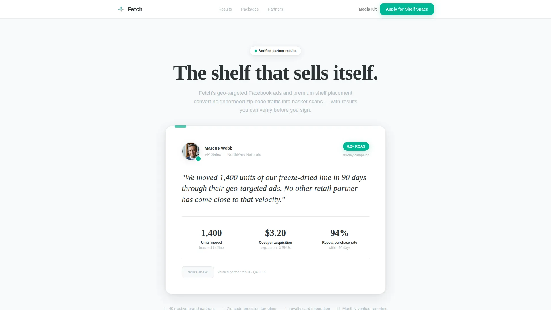
- An anchor testimonial card section featuring a quote, partner logo, headshot, and a return on ad spend metric badge
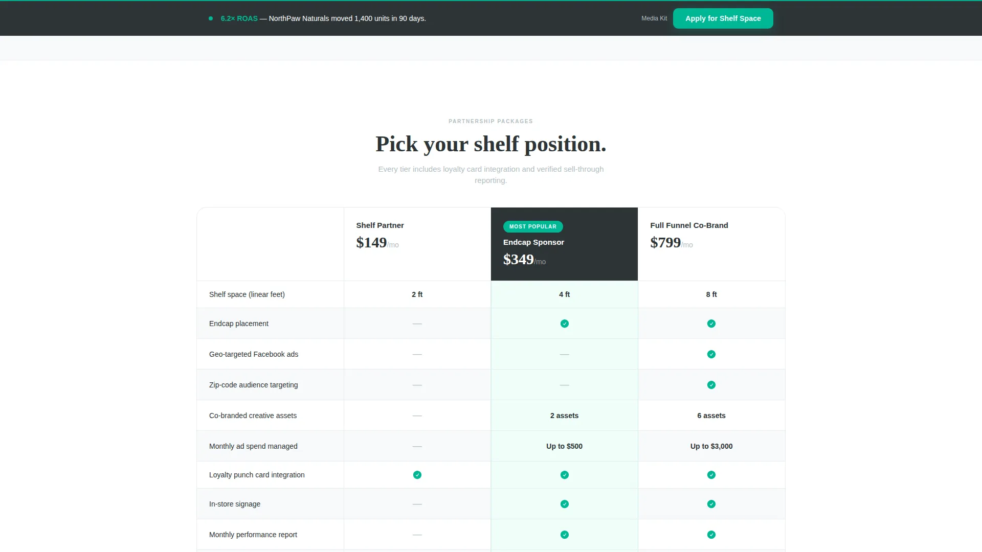
- Three-column comparison tables for Shelf Partner, Endcap Sponsor, and Full Funnel Co-Brand packages with teal checkmarks and gray dashes
- A dual-path conversion setup: a primary "Apply for Shelf Space" form and a secondary "Download Our Media Kit" email gate
Feature list
This template is built around components that earn partner trust and reduce friction at every decision point.
Anchor Testimonial Card Header
The page opens with one oversized card carrying a real partner quote, a logo, a headshot, and a return on ad spend badge. The card floats on frost white with a subtle drop shadow, designed to feel like a physical index card pinned to a corkboard. No hero image, no stock photography. The proof is the first impression.
Staggered Testimonial Mosaic
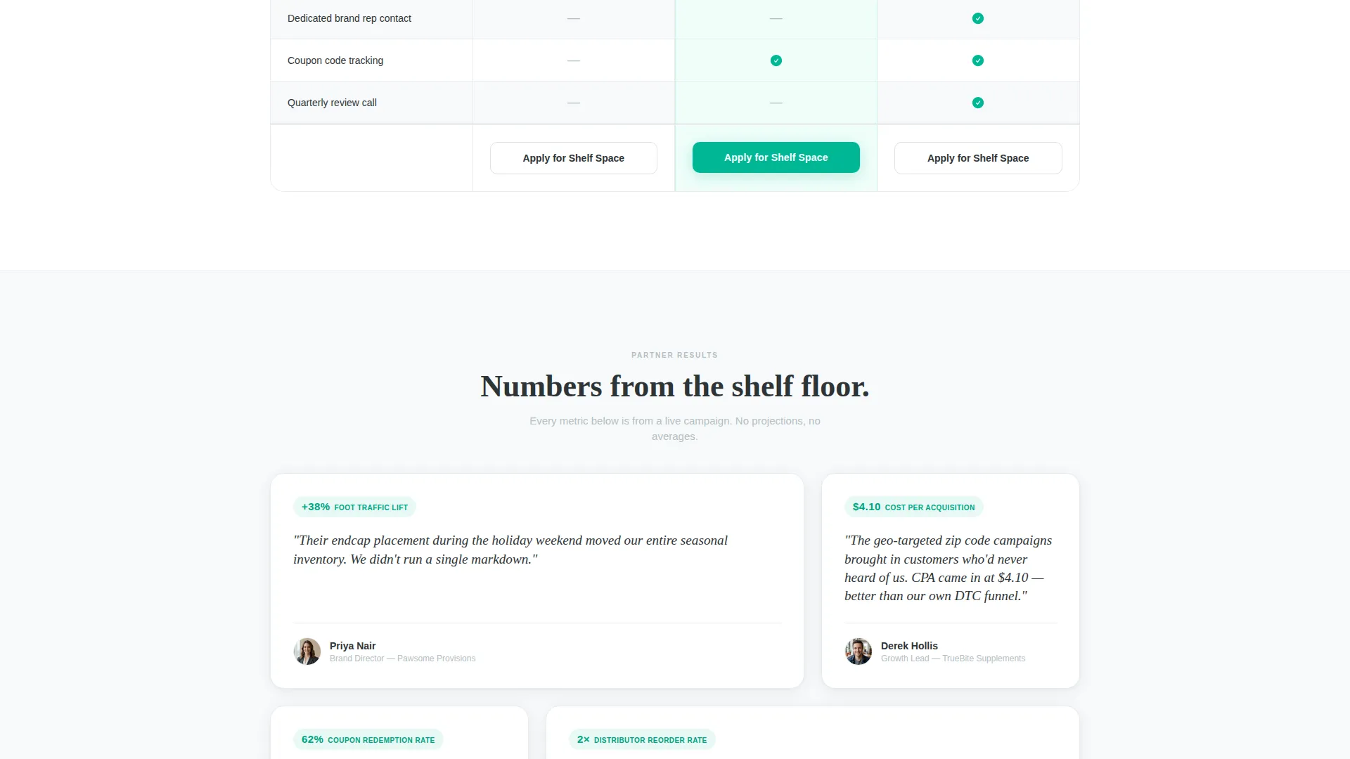
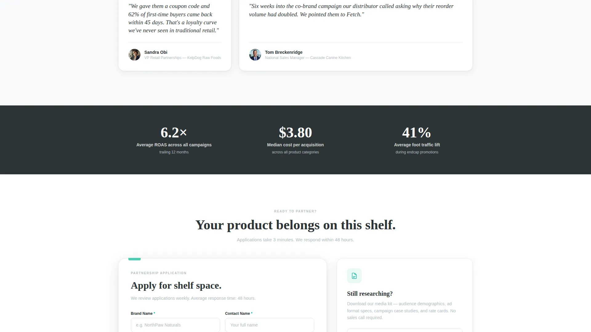
After the anchor card, the page cascades into a staggered grid layout. Testimonial cards appear between comparison tables at alternating widths. Each card carries a different performance metric: cost per acquisition, foot traffic lift percentage, or coupon code redemption rate. The rhythm is proof, then offer, then proof again.
Side-by-Side Package Comparison Tables
Three comparison columns lay out the Shelf Partner, Endcap Sponsor, and Full Funnel Co-Brand tiers in parallel. Each row uses teal checkmarks for included features and gray dashes for excluded ones. Value density reads instantly without a single word of explanation.
Sticky Application Bar
After the second scroll, a sticky bar anchors the primary call-to-action to the bottom of the viewport. The "Apply for Shelf Space" prompt stays visible as prospects move through the evidence sections, reducing the distance between decision and action.
Dual Conversion Paths
The template supports two partner entry points. Brands ready to commit reach an application form capturing brand name, product category, retail distribution count, and monthly ad budget range via dropdown. Brands still in research mode can download the media kit by submitting only an email address.
Metric-Forward Social Proof Blocks
Every testimonial card is structured to highlight a specific, quantified result. The anchor card references 1,400 units moved in 90 days and a 6.2x return on ad spend. Subsequent cards carry their own metrics. The page builds its case through accumulated evidence rather than descriptive claims.
Page sections overview
| Section | Purpose |
|---|---|
| Anchor Testimonial Card | Opens with real partner proof and a return on ad spend badge |
| Package Comparison Tables | Breaks down three partnership tiers side by side |
| Testimonial Mosaic Grid | Interlocks metric-specific partner cards between offer sections |
| Sticky Application Bar | Keeps the primary call-to-action visible after the second scroll |
| Apply for Shelf Space Form | Captures brand name, category, distribution count, and ad budget |
| Media Kit Email Gate | Converts research-mode visitors with a single email field |
Design & branding system
The visual identity follows a Service Utility theme. The palette is built around an Arctic White color system that communicates trust and cleanliness without decoration. Every color has a specific job, and nothing competes for attention with the proof and the offer.
- Background in clinical frost white (#F8FAFB) with charcoal kibble (#2D3436) for body text and soft paw-pad gray (#B2BEC3) for supporting elements
- Veterinary teal (#00B894) used exclusively on calls-to-action, teal checkmarks inside comparison cells, and metric callouts so the eye lands exactly where it should
- No hero imagery or stock photography; the layout relies on card components, drop shadows, and typographic hierarchy to create depth and structure
Mobile & speed optimization
The page layout is designed to work cleanly at every viewport size. The staggered mosaic and multi-column comparison tables are structured to reflow without losing readability on smaller screens.
- Comparison tables and testimonial cards are built to stack vertically on mobile so the value hierarchy remains intact
- The sticky application bar adapts to the mobile viewport, keeping the primary call-to-action reachable without scrolling back to the top
- The dual-path conversion setup keeps both form options accessible regardless of device or screen width
How this template helps you convert
The page is engineered around a single insight: brand partners commit faster when they see peer results before they see a sales pitch. Every structural decision reinforces that logic.
- Front-loading the anchor testimonial card with a quantified result (1,400 units, 6.2x return on ad spend) establishes credibility in the first viewport before any service description appears.
- Alternating proof and offer blocks throughout the scroll means every comparison table is preceded by a real partner metric, so the package details land in a context of demonstrated value.
- The sticky bar and dual conversion paths remove the distance between conviction and action, giving both ready-to-apply brands and still-researching brands a frictionless next step.
Other information about this template
This template sits at the intersection of pet store marketing and professional services design. It is built specifically for the partnership and business-to-business side of a retail pet store operation, not for consumer-facing promotions or loyalty programs.
- The page style follows a click-through landing page direction, meaning the goal is to move qualified prospects into a form or a media kit download rather than complete a transaction on the page itself
- The template supports a neighborhood pet store context selling Facebook ads partnership programs to pet brand reps, distributors, and direct-to-consumer supplement companies
- Ad package tiers (Shelf Partner, Endcap Sponsor, Full Funnel Co-Brand) are pre-structured in the comparison tables and can be relabeled to match your actual program naming
Theme
Executive Suite
Creative direction
Expert Panel
Color system
Ink & Paper
Style
Split Screen (50/50)
Direction
Click-Through
Page Sections
Anchor Testimonial Card Header
Staggered Testimonial Mosaic
Side-by-side Comparison Tables
Sticky Application Bar
Dual Conversion Path Design
Metric-forward Social Proof Blocks
Related questions
Who is the primary audience for this landing page?
Can I update the testimonial quotes and partner metrics shown on the page?
What does the application form capture from prospective partners?
What is the media kit download path for?
Is this template suitable for a consumer-facing pet store promotion page?



