Fibre - Editorial Carpetcleaning Landing Page Template
Fibre is an editorial-style landing page template built for Bangalore commercial carpet cleaning services targeting facility managers, housekeeping heads, and property management firms. It pairs an oversized serif headline, a monochrome logo wall, and a zigzag claim-and-evidence layout to build B2B trust fast, ending with a structured facility assessment form designed to qualify professional leads.
by Rocket studio
Quick summary
Fibre delivers a sharp, magazine-quality single-page layout for a Bangalore carpet cleaning business operating at commercial scale. The design moves like an investigative feature, stacking authority through bold editorial claims, proof panels, and client logos before asking for contact details. The result is a landing page that feels credible before the visitor reaches the form.
Who this template is for
This template is built for commercial carpet cleaning operators in Bangalore who serve large-format professional properties. It speaks directly to buyers who manage budget, vendor relationships, and service schedules at scale.
- Facility managers overseeing tech park campuses in Whitefield with 200,000 or more square feet of broadloom
- Housekeeping heads at five-star MG Road hotels who cannot afford a banquet hall offline for more than four hours
- Property management firms turning over furnished flats in Indiranagar between tenants
What problem this template solves
Most commercial cleaning service pages look residential. They lead with pricing, skip the scale signals, and fail to earn trust from procurement-minded buyers. Fibre solves this mismatch directly.
- Facility managers need proof of capability before they share a work email, and this template stacks that proof before the form ever appears
- Hotel housekeeping heads need to see that downtime risk is understood, and the zigzag layout surfaces that urgency section by section
- Generic service pages treat square footage as a footnote, while this template leads with it as the primary credential
What you get with this template
You get a fully structured single-page layout built around the editorial magazine theme and the Ink and Paper color system. Every section is pre-positioned for B2B conversion, from the oversized header through to the anchored contact form.
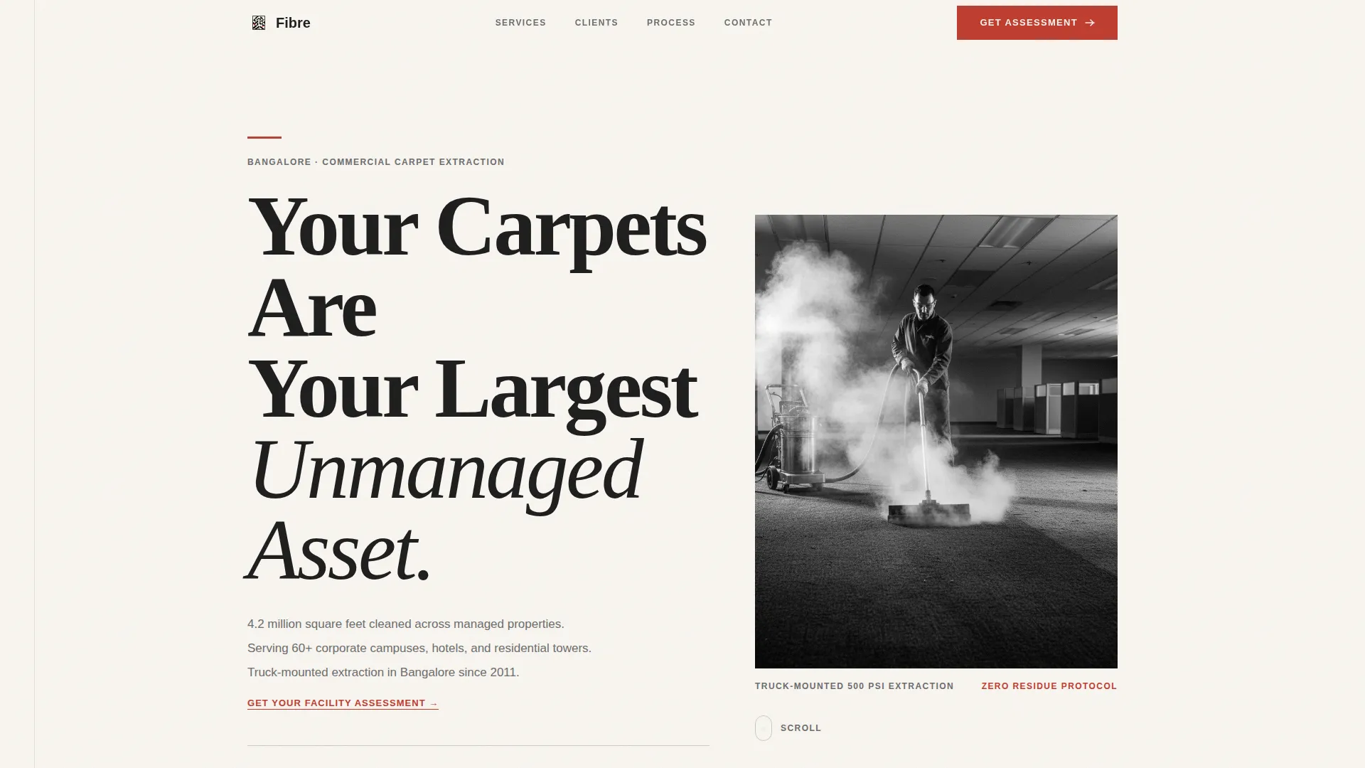
- A giant flush-left headline header with a high-contrast black-and-white photograph, a thin red rule accent, and a caption gray subhead carrying three proof-point lines
- A full-width monochrome logo wall band below the fold, followed by alternating zigzag sections pairing editorial claims with before-and-after photographs, case study stats, and oversized italicised facility manager quotes
- A bottom-anchored lead form asking for property name, carpeted area range, number of properties managed, and a work email, plus a secondary gated PDF download path for comparison-phase visitors
Feature list
This section covers the core built-in capabilities delivered by this template.
Giant Flush-Left Editorial Header
The header opens with serif type at approximately 120 pixels, set flush-left on newsprint white. A thin press-proof red rule sits above the headline. A three-line caption gray subhead carries square footage cleaned, client properties served, and years of Bangalore operation. A knee-height, black-and-white extraction photograph anchors the right side.
Full-Width Monochrome Logo Wall
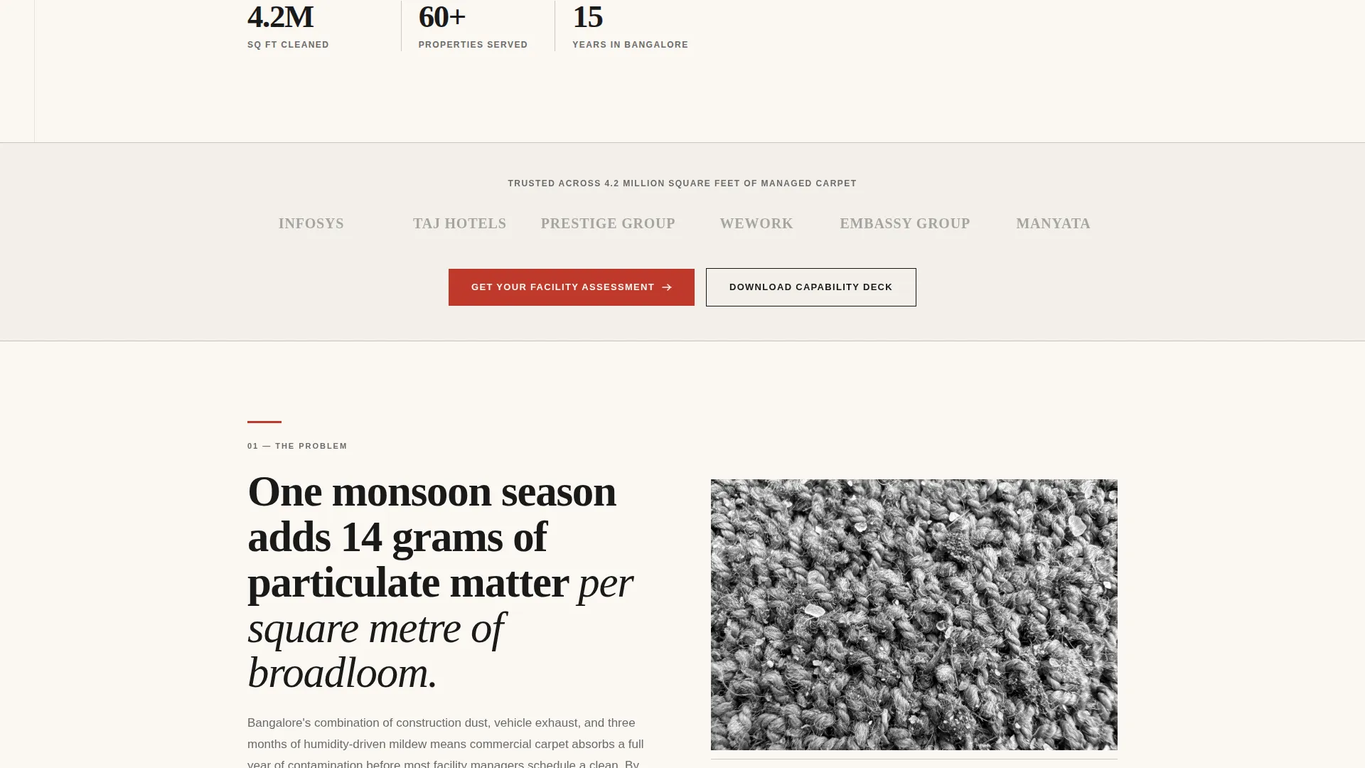
A faint gray band immediately below the fold displays monochrome client logos edge to edge. A single caption line reads "Trusted across 4.2 million square feet of managed carpet." This panel fires the authority signal before the visitor reads a single sales claim.
Zigzag Claim-and-Evidence Sections
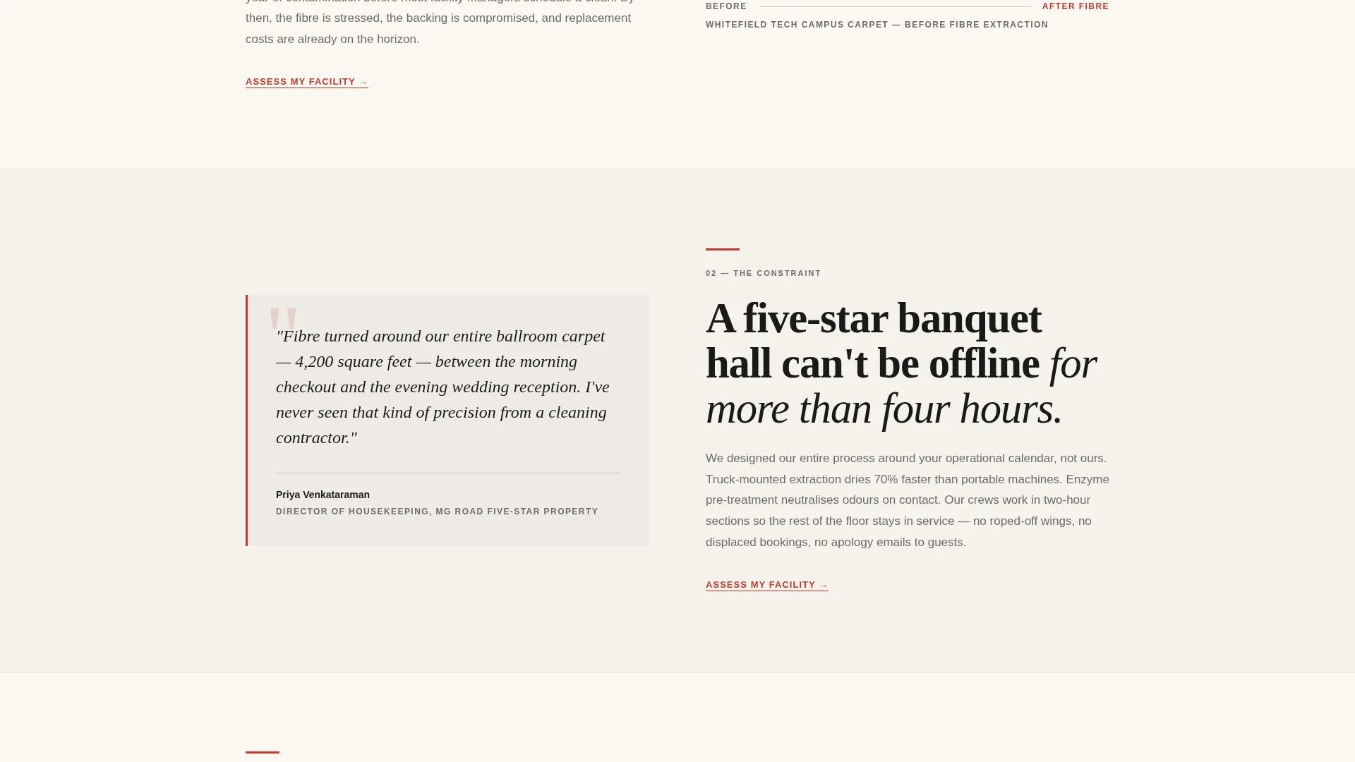
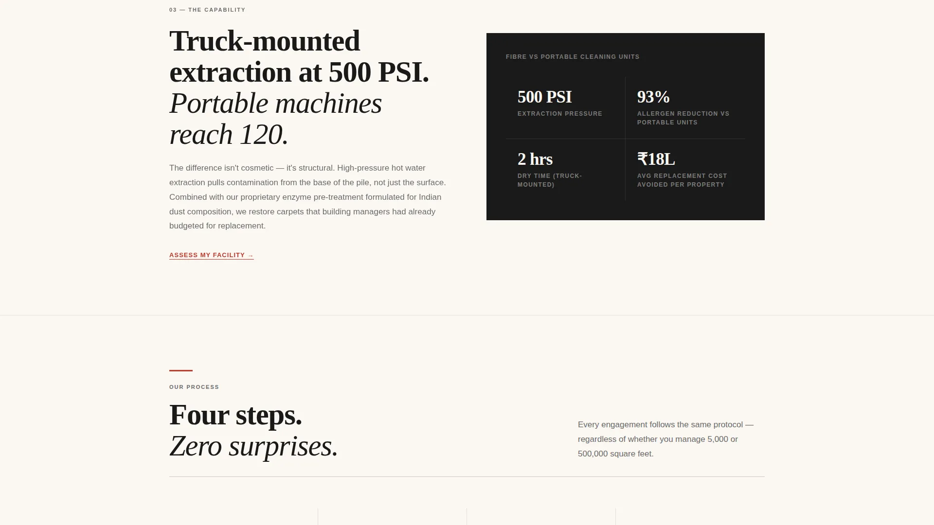
Each alternating section places a bold editorial statement on one side and a proof element on the other. Proof elements include before-and-after macro photographs, case study statistics, and facility manager quotes in oversized italics. The rhythm escalates from problem to capability to scale, section by section.
Three-Placement Primary Call to Action
The primary call to action, "Get Your Facility Assessment," appears three times: as a red-text link in the header subhead, as a full red button after the logo wall, and as the anchor for the bottom form. Repetition is intentional and follows the scroll path of a B2B buyer reading for evidence.
Structured B2B Lead Capture Form
The bottom form leads with property name, not a personal name. Fields progress through carpeted area in square feet as a dropdown, number of properties managed, and work email. This ordering signals a professional engagement from the first field and qualifies the lead before submission.
Gated Capability Deck Download
A secondary conversion path offers a downloadable capability deck as a portable document format file for visitors still in the vendor comparison phase. This path captures buyers who need internal sign-off before committing to a facility assessment.
Page sections overview
| Section | Purpose |
|---|---|
| Giant Headline Header | Opens with authority using oversized serif type, red rule, subhead stats, and a black-and-white extraction photograph |
| Logo Wall Band | Builds immediate third-party credibility with monochrome client logos and a total square footage caption |
| Post-Logo call to action Button | Converts early-intent visitors with a full red "Get Your Facility Assessment" button after the authority band |
| Zigzag Claim Panels | Alternates bold editorial claims with photographic and statistical proof across escalating problem-to-scale sections |
| Quote Pull Sections | Surfaces oversized italicised facility manager quotes as social proof within the alternating layout |
| Capability Deck Offer | Presents the secondary gated PDF download for comparison-phase visitors not yet ready for a form submission |
| Anchored Lead Form | Closes the page with a property-first form capturing area, portfolio size, and work email for qualified B2B leads |
Design & branding system
The design language follows an Editorial Magazine theme built on the Ink and Paper color system. Every visual decision reinforces the feeling of a freshly typeset broadsheet, authoritative, clean, and deliberately sparse.
- Color palette: deep editorial black (#1A1A1A) for headlines and dividers, warm newsprint white (#FAF7F2) for generous background margins, mid-tone caption gray (#6B6B6B) for body text and secondary labels, and press-proof red (#C0392B) used exclusively for calls to action and pull-quote rules
- Typography: large-format serif type dominates headlines; the type itself functions as the primary visual hero rather than decorative photography
- Photography style: all images are black-and-white, shot from knee height for a ground-level operational feel, with no color introduced anywhere in the image layer
Mobile & speed optimization
The editorial grid and generous whitespace that define this template translate well to narrower viewports. The layout priorities remain intact at every screen width.
- The flush-left headline stack collapses cleanly to a single-column view without losing hierarchy, and the oversized type remains legible at mobile scale
- Zigzag alternating sections reflow to stacked vertical panels on smaller screens, preserving the claim-then-evidence reading order
- The bottom lead form uses a straightforward vertical field stack that keeps the property-first field order intact on all devices
How this template helps you convert
The conversion architecture is built around trust sequencing. A B2B buyer sees credibility evidence before they are ever asked to act.
- The logo wall appears before any call to action, so visitors recognise familiar client names and feel confident engaging with a vendor their peers already use
- The zigzag layout moves the reader through a structured argument, from industry problem to service capability to proven scale, so by the time the form appears the visitor has self-qualified
- The property-name-first form field reframes the interaction as a professional facility inquiry rather than a personal contact request, reducing friction for procurement-minded buyers
Other information about this template
This template is purpose-built for the Bangalore commercial services market and reflects the operational realities of that specific environment, monsoon particulate load, high-turnover furnished flat cycles, and the four-hour offline window constraint common to five-star hospitality properties.
- The template style is Zigzag and Alternating, the header concept is Giant Headline Left, and the creative direction follows a Logo Wall Authority approach
- The landing page direction is Partnership and B2B, making it suitable for operators pitching multi-property contracts rather than one-off residential bookings
- The Ink and Paper color system and Editorial Magazine theme are consistent across all sections, so no visual rebranding is needed between header and form
- The secondary capability deck download path makes this template suitable for longer sales cycles where a facility head needs a leave-behind document for internal review
Theme
Editorial Magazine
Creative direction
Logo Wall Authority
Color system
Ink & Paper
Style
Zigzag/Alternating
Direction
Partnership/B2B
Page Sections
Giant Flush-left Editorial Header
Full-width Monochrome Logo Wall
Zigzag Claim-and-evidence Layout
Three-placement Primary Call to Action
Structured B2B Lead Capture Form
Gated Capability Deck Download
Related questions
Who is the primary audience for this template?
What does the lead form collect and why is it structured that way?
Does the template include a secondary conversion path?
How does the zigzag section layout support B2B trust-building?
Is this template specific to Bangalore carpet cleaning businesses?



