Commercial Carpet Cleaning Landing Page Template
Fibre is a single-page landing page template built for commercial carpet cleaning companies serving Delhi's corporate and hospitality sectors. It uses a comparison table layout structured around real procurement questions, a Cloud Canvas color system, and a credential-first header to help facility managers evaluate and contact a vendor with confidence.
by Rocket studio
Quick summary
Fibre is a precision-built landing page template for commercial carpet cleaning services operating across the National Capital Region. It leads with verified credentials, guides visitors through FAQ-anchored comparison tables, and closes with two conversion paths: a facility audit request and an Annual Maintenance Contract rate card download. Every section is designed for procurement-stage decision makers.
Who this template is for
This template is built for carpet cleaning businesses that serve corporate and hospitality clients in high-density commercial corridors. It speaks directly to buyers who evaluate vendors on process, compliance, and logistics rather than on aesthetics.
- Facility managers overseeing Annual Maintenance Contract renewals across large office parks
- Housekeeping directors at hotels and five-star properties who need vendor reliability documentation
- Procurement heads at co-working chains and retail facilities comparing multiple service providers
What problem this template solves
Commercial facility buyers do not respond to generic service pages. They arrive mid-evaluation with a list of operational questions and no tolerance for vague branding. This template replaces the brochure format with a structured, scorecard-style scroll that meets buyers where they already are in their decision process.
- No clear way to communicate certifications, SOPs, and compliance credentials on a single page
- Comparison data scattered across PDF decks instead of visible on the page during vendor review
- Multiple lead types arrive at different stages, requiring separate conversion paths without a second page
What you get with this template
The template delivers a complete, single-page structure designed for B2B service conversion. Every component is mapped to a specific procurement touchpoint so nothing feels decorative.
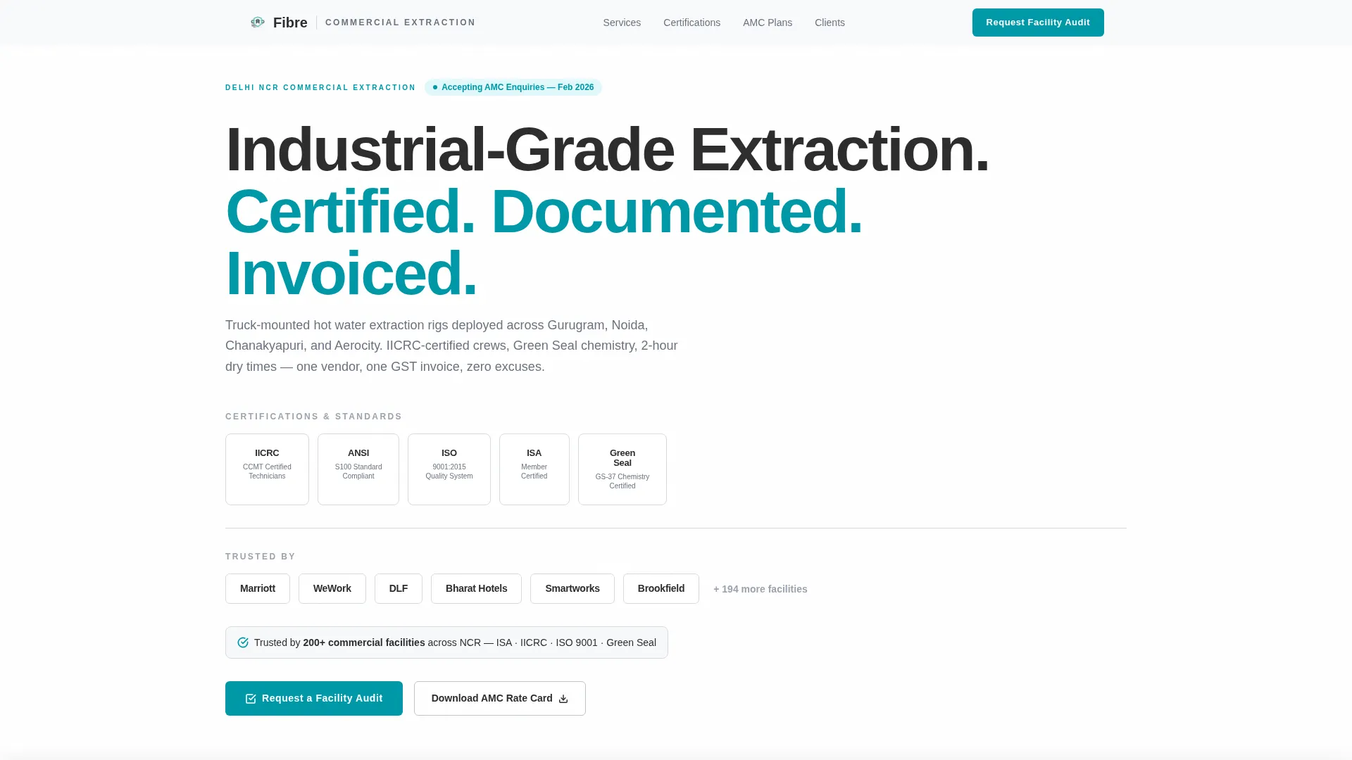
- A credential-forward header lockup with award badges and client trust markers
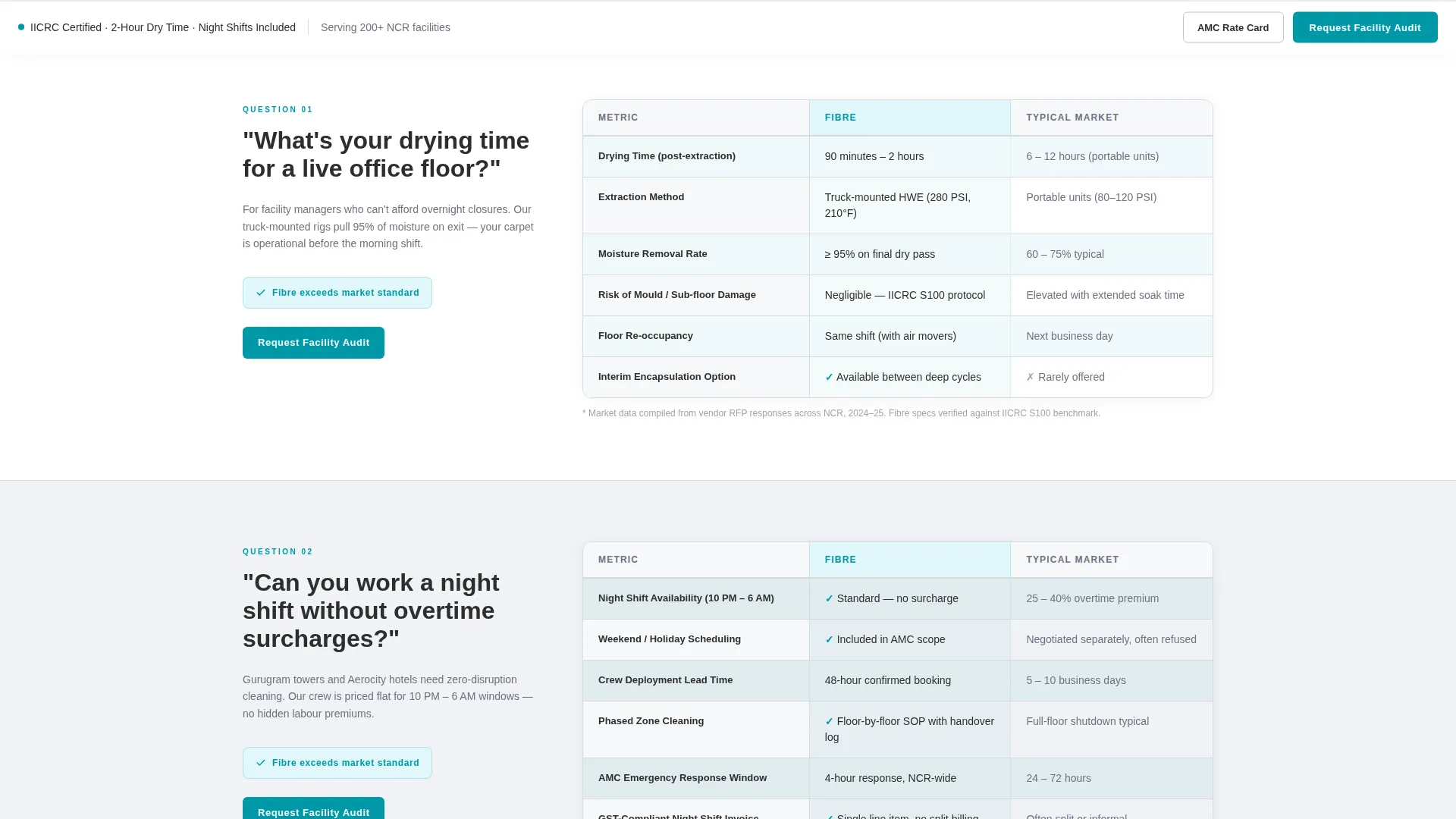
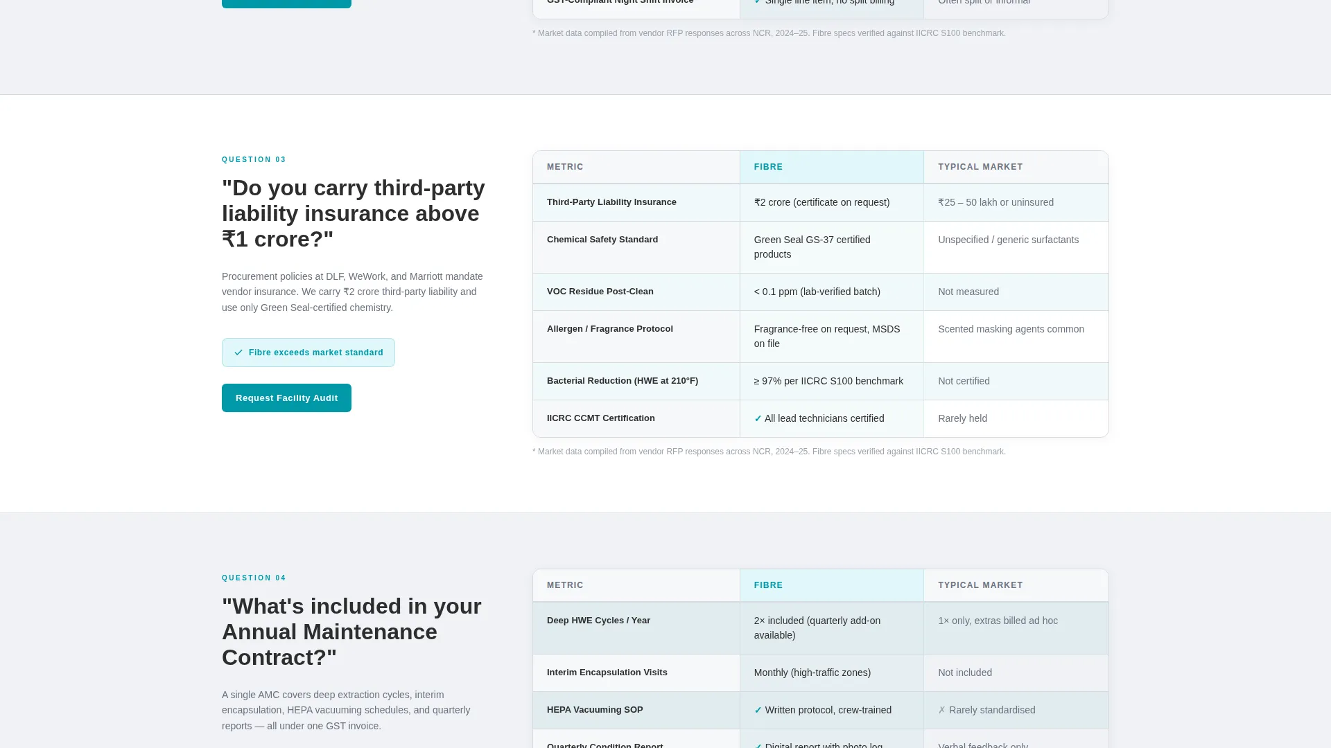
- FAQ-anchored sections that each unfold into a side-by-side comparison table
- A sticky bottom bar with a primary call to action and a secondary gated download path
Feature list
This template packages several deliberate design and structural decisions into one ready-to-use layout.
Credential Header with Badge Lockup
The header is a horizontal band of award badges rendered in monochrome charcoal. Certifications, compliance marks, and client logos sit in a clean arrangement against white. A single line of micro-copy anchors the section: "Trusted by 200+ commercial facilities across NCR." No hero image is used because the credentials carry the visual weight.
FAQ-Driven Comparison Table Sections
Each major section opens with a real procurement question that facility managers ask during vendor evaluation. The question anchors a comparison table that contrasts the service's specifications against typical market standards. Data points include drying hours, chemical safety ratings, crew-to-square-foot ratios, and Annual Maintenance Contract response windows.
Sticky Bottom Conversion Bar
The primary call to action, "Request a Facility Audit," is locked to the bottom of the viewport as the visitor scrolls. It reappears as a standalone block after every third comparison table, reinforcing the conversion opportunity without interrupting the reading flow.
Dual Lead Capture Paths
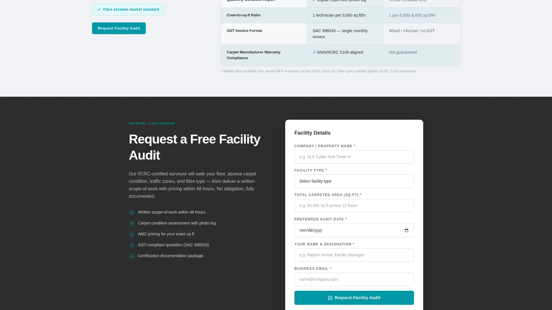
The template supports two distinct conversion paths in parallel. The primary path collects company name, facility type, total carpeted area in square feet, and a preferred audit date. The secondary path offers a downloadable Annual Maintenance Contract rate card gated behind a business email field, designed for leads not yet ready for a site visit.
Cloud Canvas Color System
The teal accent color appears only on calls to action, table highlights, and toggle states. Charcoal anchors headers and body text. Vapor gray separates rows and section backgrounds. White provides open breathing space. The restraint in the palette signals precision rather than decoration.
Page sections overview
| Section | Purpose |
|---|---|
| Award Badges Header | Establish credibility with certification and client trust marks |
| Procurement Question One | Anchor the first comparison table with a real vendor evaluation query |
| Comparison Table One | Display drying time and process specs against market standards |
| Audit call to action Block | Primary conversion prompt after the first table grouping |
| Procurement Question Two | Address night-shift and scheduling concerns for live office floors |
| Comparison Table Two | Show crew ratios, shift flexibility, and surcharge policies |
| Procurement Question Three | Cover liability insurance and compliance documentation |
| Comparison Table Three | Contrast insurance coverage and compliance marks with market norms |
| Audit call to action Block Two | Repeat primary call to action after the third table |
| Rate Card Download | Gated secondary lead capture for Annual Maintenance Contract pricing |
| Sticky Bottom Bar | Persistent audit request button locked to the scroll viewport |
Design & branding system
The Cloud Canvas color system uses four values applied with strict discipline. Each color serves a defined role so the layout never feels cluttered or visually competing.
- Boardroom charcoal (#2D2D2D) for all headers and body text, vapor gray (#D6DAE0) for row separation and section backgrounds, and fresh-extraction white (#F7F8FA) for open space
- A single decisive teal (#0097A7) reserved exclusively for calls to action, table highlights, and toggle states so decision points stand out instantly
- All badge and logo artwork in the header is rendered in monochrome charcoal so nothing competes with the credential content itself
Mobile & speed optimization
The template layout is structured to remain readable and functional across screen sizes without relying on heavy visual assets.
- The header uses no hero images or stock photography, which keeps the initial load experience clean and fast
- Comparison tables are designed to scroll horizontally on narrow viewports, preserving data legibility without collapsing content
- The sticky bottom bar is sized and positioned to remain usable on mobile screens without obscuring table content
How this template helps you convert
The entire page is structured as a procurement evaluation tool rather than a passive brochure. Each design decision reduces friction for a buyer who is already mid-process.
- The FAQ-anchored layout mirrors the mental checklist a facility manager carries into vendor review, so the page feels relevant from the first scroll rather than requiring the reader to search for relevant information.
- Two conversion paths address buyers at different stages simultaneously. The audit form captures decision-ready leads, while the rate card download captures evaluation-stage leads before they move to a competitor.
Other information about this template
This template was designed specifically for the Delhi National Capital Region commercial services market, with terminology, form fields, and trust signals calibrated for that buyer context.
- The form includes a facility type selector covering offices, hotels, co-working spaces, and retail, reflecting the primary client segments in the NCR commercial corridor
- GST-compliant invoicing is referenced as a trust signal detail within the page structure, which matters for procurement heads requiring vendor documentation
- The template style is a Comparison Table layout, and the creative direction is FAQ-Driven, both of which are well suited to high-consideration B2B service decisions
- The header concept uses Award Badges rather than photography, which is a deliberate choice for buyers who distrust stock imagery in professional service contexts
- The landing page direction is Partnership and B2B conversion, making it appropriate for vendors pursuing long-term Annual Maintenance Contract relationships rather than one-off residential bookings
Theme
Corporate Precision
Creative direction
FAQ-Driven
Color system
Cloud Canvas
Style
Comparison Table
Direction
Partnership/B2B
Page Sections
Credential-forward Badge Header
Faq-anchored Comparison Tables
Sticky Audit Request Bar
Dual-path Lead Capture
Cloud Canvas Color Discipline
Related questions
What type of business is this landing page template designed for?
Can I adapt the comparison tables to reflect my own service specifications?
What are the two lead capture paths included in this template?
Does the template include a persistent call-to-action element?
Is this template suitable for a service provider outside Delhi?



