Precision Carpetcleaning | Free Website Template | Rocket
Fibre is a single-page landing page template built for a Cape Town carpet cleaning service using truck-mounted extraction rigs. It pairs a bold typographic header, three escalating case study narratives, and side-by-side comparison tables to guide office managers, Airbnb hosts, and facilities teams toward one frictionless click: booking a free measure-up.
by Rocket studio
Quick summary
Fibre is a click-through landing page template for a precision carpet cleaning service in Cape Town. Three real-job case studies build trust through before-during-after storytelling, while embedded comparison tables make the case with data. The entire page funnels visitors toward a single action: clicking through to a booking calendar to schedule a free measure-up.
Who this template is for
This template suits service businesses that sell high-trust, results-driven work to time-pressured clients. It is purpose-built for the Cape Town carpet cleaning market but works equally well for any professional cleaning service that needs to convert sceptical, detail-oriented buyers.
- Office managers in commercial towers handling lease inspections and routine deep cleans
- Airbnb hosts and short-term rental operators with tight guest turnaround schedules
- Facilities teams at hotels, wine estates, and event venues preparing spaces for peak seasons
What problem this template solves
Potential clients rarely book a cleaning service on faith alone. They want proof that the method actually works and that the process will not disrupt their operations. A generic services page with a contact form does not answer those doubts. This template closes that trust gap before the visitor even sees a call to action.
- Visitors leave without proof of results, so they book nothing
- Standard contact forms add friction that kills high-intent traffic
- No side-by-side comparison means the service looks identical to cheaper alternatives
What you get with this template
You get a fully structured, single-page layout built around narrative proof and visual logic. Every section has a defined role, and the flow from headline to case study to comparison table to call to action is deliberate and tested.
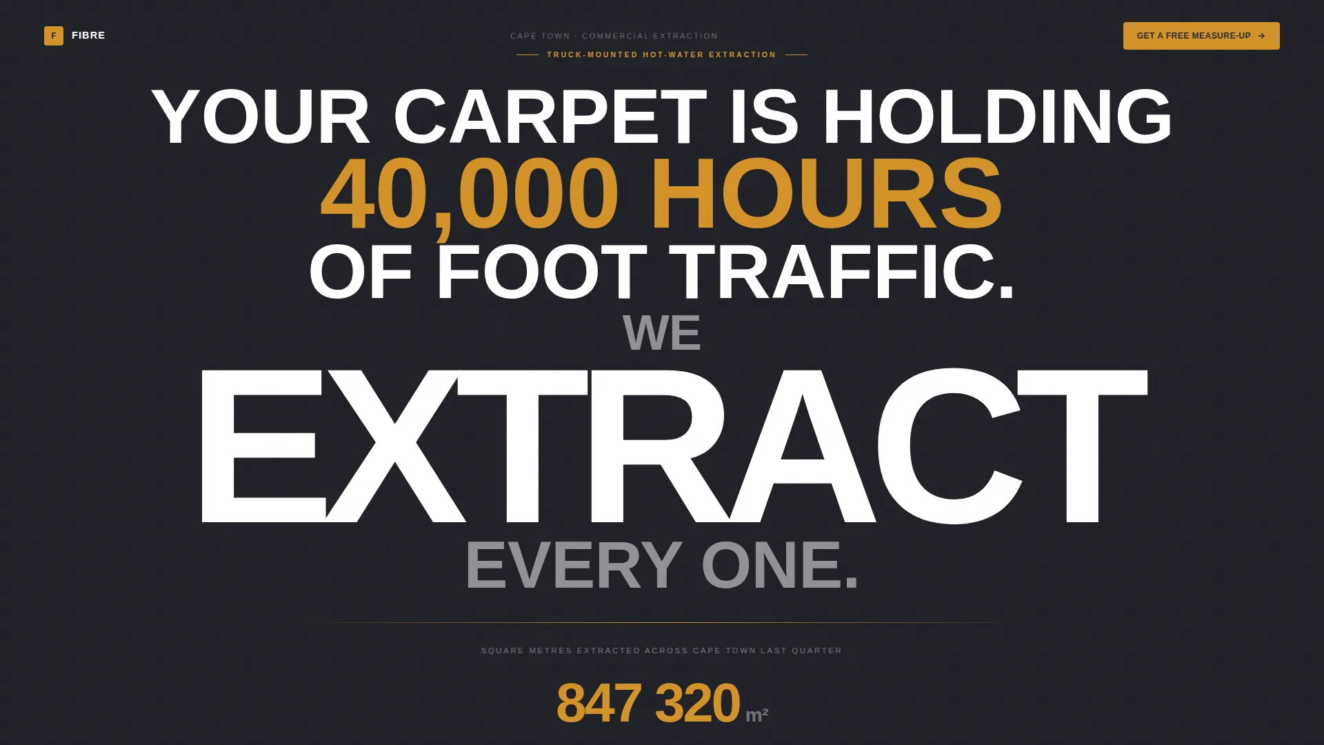
- A giant typographic header with a live-counting odometer subline showing square meterage cleaned
- Three escalating case study blocks in a before-during-after format, covering routine, rescue, and restoration jobs
- Embedded comparison tables after each case study, contrasting truck-mounted extraction against conventional cleaning methods
Feature list
This section covers the core built-in components included in the Fibre landing page template.
Giant Headline with Live Odometer
The header centres stark white condensed type on a deep graphite background. The word "EXTRACT" is scaled to span the full viewport width. Beneath it, a single amber subline displays a live-counting odometer showing the total square meterage cleaned in Cape Town last quarter, giving the hero instant credibility without a single image.
Three-Stage Case Study Narrative
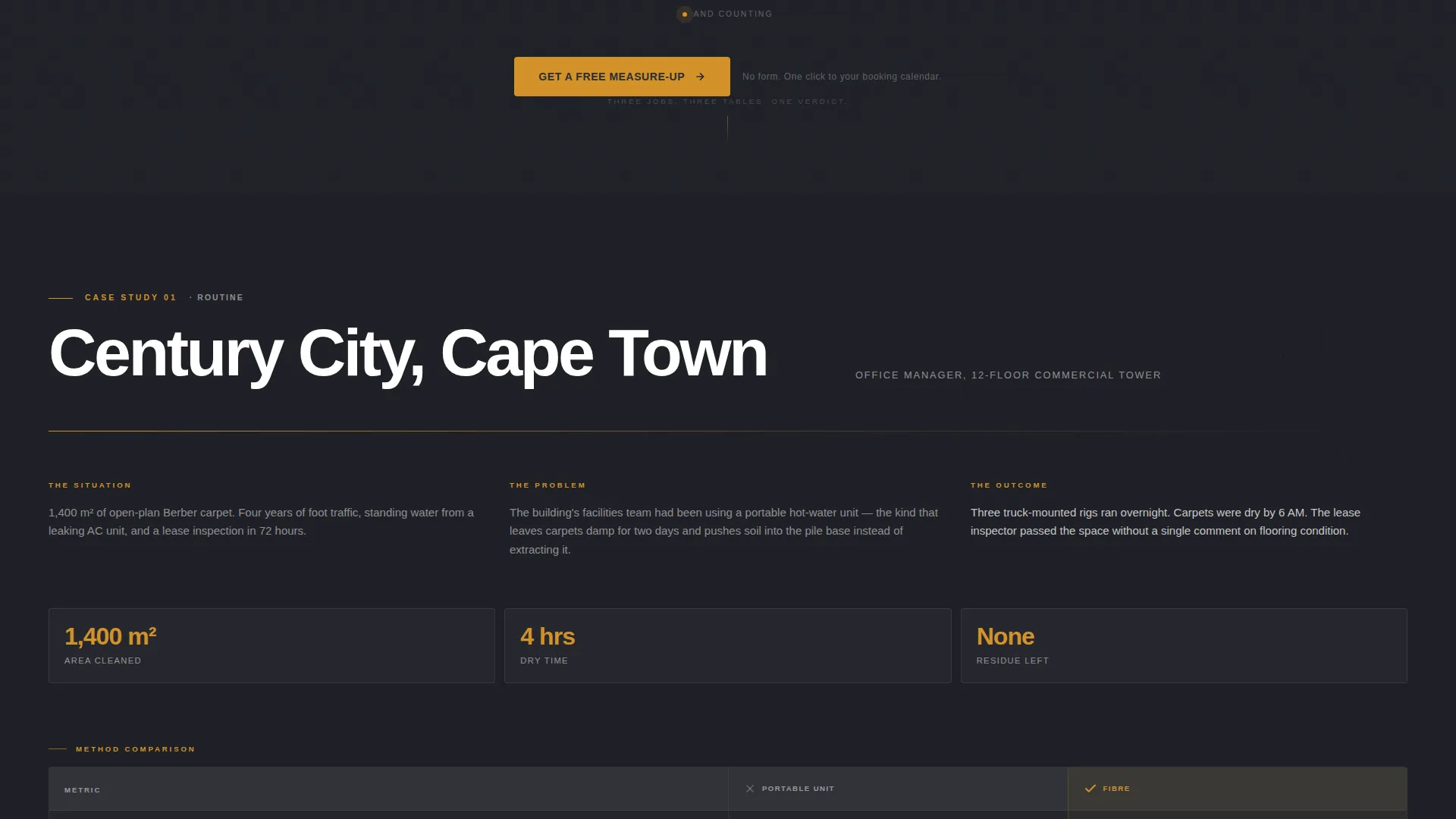
Three case study blocks escalate in difficulty: a Claremont open-plan office for routine cleaning, a Camps Bay holiday rental with red wine damage for rescue work, and a century-old Franschhoek hotel runner for restoration. Each is presented as a before-during-after story, building proof progressively as the visitor scrolls.
Embedded Comparison Tables
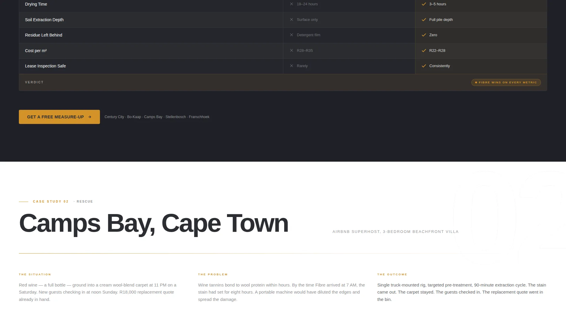
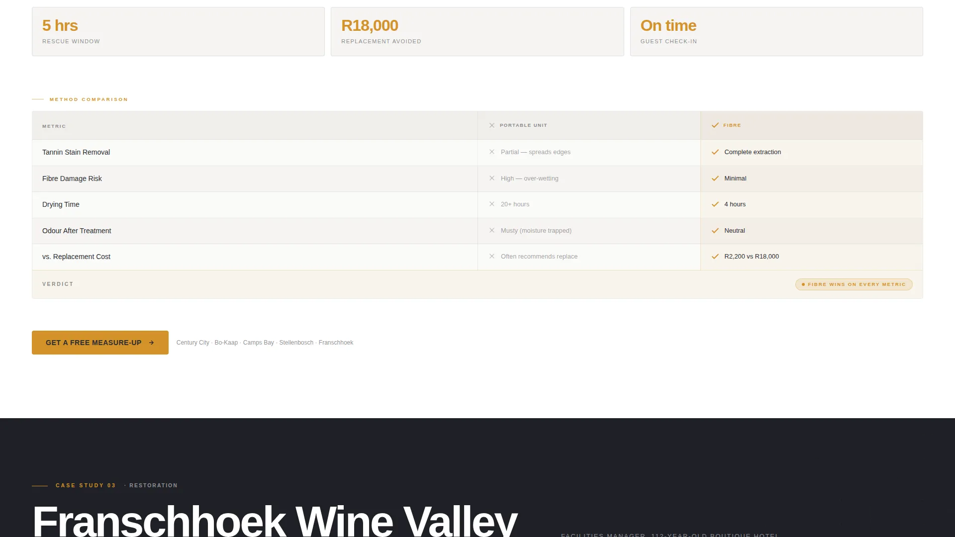
A comparison table sits between each case study. Columns cover drying time, fibre damage, residue left behind, and cost per square metre. Amber check marks and graphite crosses deliver the verdict visually before the visitor reads a single word, making the argument clear at a glance.
Frictionless Click-Through call to action
The primary call to action, "Get a Free Measure-Up," appears in amber on graphite below the header, after each case study, and as a fixed bottom bar on mobile. Each instance passes the visitor to a scheduling page with a date picker and suburb selector. There is no form on the landing page itself.
Corporate Precision Visual System
The Charcoal and Amber colour system runs consistently across every section. Deep graphite backgrounds anchor the layout, warm amber signals every action point, clean ash alternates table rows for readability, and crisp white surfaces card elements. Typography does all the visual heavy lifting in place of photography.
Page sections overview
| Section | Purpose |
|---|---|
| Giant Header Block | Establish authority through bold typography and live odometer data |
| Case Study One | Demonstrate routine office cleaning results in Claremont |
| Comparison Table One | Contrast methods on drying time, damage, residue, and cost |
| Case Study Two | Show red wine rescue for a Camps Bay holiday rental |
| Comparison Table Two | Reinforce extraction advantage after a damage-recovery scenario |
| Case Study Three | Present century-old runner restoration at a Franschhoek hotel |
| Comparison Table Three | Deliver final method verdict with visual amber and graphite markers |
| Fixed Mobile call to action Bar | Keep the booking action visible at all times on smaller screens |
Design & branding system
The template uses a Corporate Precision theme that communicates authority through restraint. Every colour choice is functional: graphite contains the eye, amber directs it, and white lifts individual cards off the background.
- Deep graphite (#2B2D33) for primary backgrounds, amber (#D4922A) for all action colours and table highlights, clean ash (#E8E6E1) for alternating table rows, and crisp white (#FFFFFF) for card surfaces
- Condensed sans-serif typography scaled to full viewport width in the hero, creating impact without requiring any imagery
- Amber check marks and graphite cross markers inside comparison tables deliver pass-fail verdicts at a visual level before text is read
Mobile & speed optimization
The template is structured to work cleanly on smaller screens where the target audience is most likely browsing between tasks. The fixed bottom call-to-action bar ensures the booking action is never out of reach.
- Fixed bottom bar pins the "Get a Free Measure-Up" button at the base of the screen on mobile at all times
- Viewport-spanning typography and single-column table layout adapt naturally to narrower screens
- No hero images or heavy media files in the header means the above-the-fold experience loads from pure type and colour
How this template helps you convert
Conversion here means one thing: getting a visitor to click through to the booking calendar. Every design and content decision supports that single outcome.
- The case studies build proof progressively, so by the third story the visitor already trusts the service before they reach the final call to action
- Comparison tables make the competitive advantage visual and immediate, removing the need for the visitor to weigh claims in their head
- The single-click, no-form flow reduces friction to its lowest possible point, passing all intent directly to the scheduling page
Other information about this template
This template was designed specifically for the Cape Town carpet cleaning market, with case study locations drawn from real commercial and hospitality zones across the city. It reflects the operational rhythm of local clients: overnight extraction jobs that leave spaces ready by morning, rapid turnarounds for short-term rentals, and seasonal deep cleans timed to the Cape winelands harvest calendar. The comparison table structure supports any professional cleaning operator looking to position truck-mounted hot-water extraction clearly against conventional portable or dry-cleaning alternatives.
- Suitable for commercial carpet cleaning operators, hospitality cleaning services, and estate or venue facilities teams
- The scheduling page integration point accepts a date picker and suburb selector, making the booking handoff smooth and locally relevant
- Template style is Comparison Table, creative direction is Case Study Narrative, and the landing-page direction is Click-Through, all within the Corporate Precision theme
Theme
Corporate Precision
Creative direction
Case Study Narrative
Color system
Charcoal & Amber
Style
Comparison Table
Direction
Click-Through
Page Sections
Giant Headline with Live Odometer
Three-stage Case Study Narrative
Embedded Comparison Tables
Frictionless Click-through Call to Action
Corporate Precision Colour System
Related questions
What type of page is the Fibre template?
Does the landing page include a contact form?
Can this template be used for a different cleaning service or city?
How many calls to action are included in the template?
What makes the comparison tables in this template effective?



