Financial Planner Reviews Website Template
Fiduciary is an editorial-style financial planner landing page built around client testimonials and transparent process storytelling. It guides high-net-worth prospects through a structured, trust-building scroll journey, from a hero testimonial card to a three-step lead capture form, using restrained luxury design and real client voices to earn every conversion.
by Rocket studio
Quick summary
Fiduciary is a single-page template for financial planners who need more than a brochure site. It opens with a client's words as the hero, walks visitors through the planning process section by section, and closes with a low-pressure lead form. The result feels less like a sales page and more like a quiet, well-reasoned conversation.
Who this template is for
This template is built for independent financial planners and advisory practices that work with clients at meaningful turning points. It suits advisors whose strongest asset is client trust, not brand recognition, and who want their website to reflect that.
- Fee-only financial planners seeking a polished online presence without a corporate feel
- Boutique advisory firms that rely on referrals and want a page that reinforces credibility
- Advisors working with clients facing life transitions such as retirement, liquidity events, or wealth inheritance
What problem this template solves
Most financial planner pages lead with credentials or generic promises. Visitors who arrive with real, complex problems, a recent business sale, an inherited portfolio, a divorce settlement, need to feel understood before they trust anyone with a form. This template solves the credibility gap by letting clients speak first.
- Replaces self-promotional copy with authentic client testimonials that do the convincing
- Demystifies the planning process so visitors understand exactly what happens before they commit
- Reduces friction at the conversion point with a progressive, three-step lead capture form
What you get with this template
You get a fully structured, editorial-style landing page with every section designed to move a cautious, high-value visitor toward a booking. Nothing here is decorative without purpose.
- A hero testimonial card section, four process-led content sections each anchored by a client quote, and a results section with anonymized net worth trajectories
- A three-step progressive disclosure form covering name and email, a planning context dropdown, and a calendar embed for booking a 30-minute introductory call
- A persistent bottom bar call to action that activates after the second scroll section, keeping the primary conversion always within reach
Feature list
This template is built around one idea: proof before pitch. Every feature serves that principle.
Hero Testimonial Card
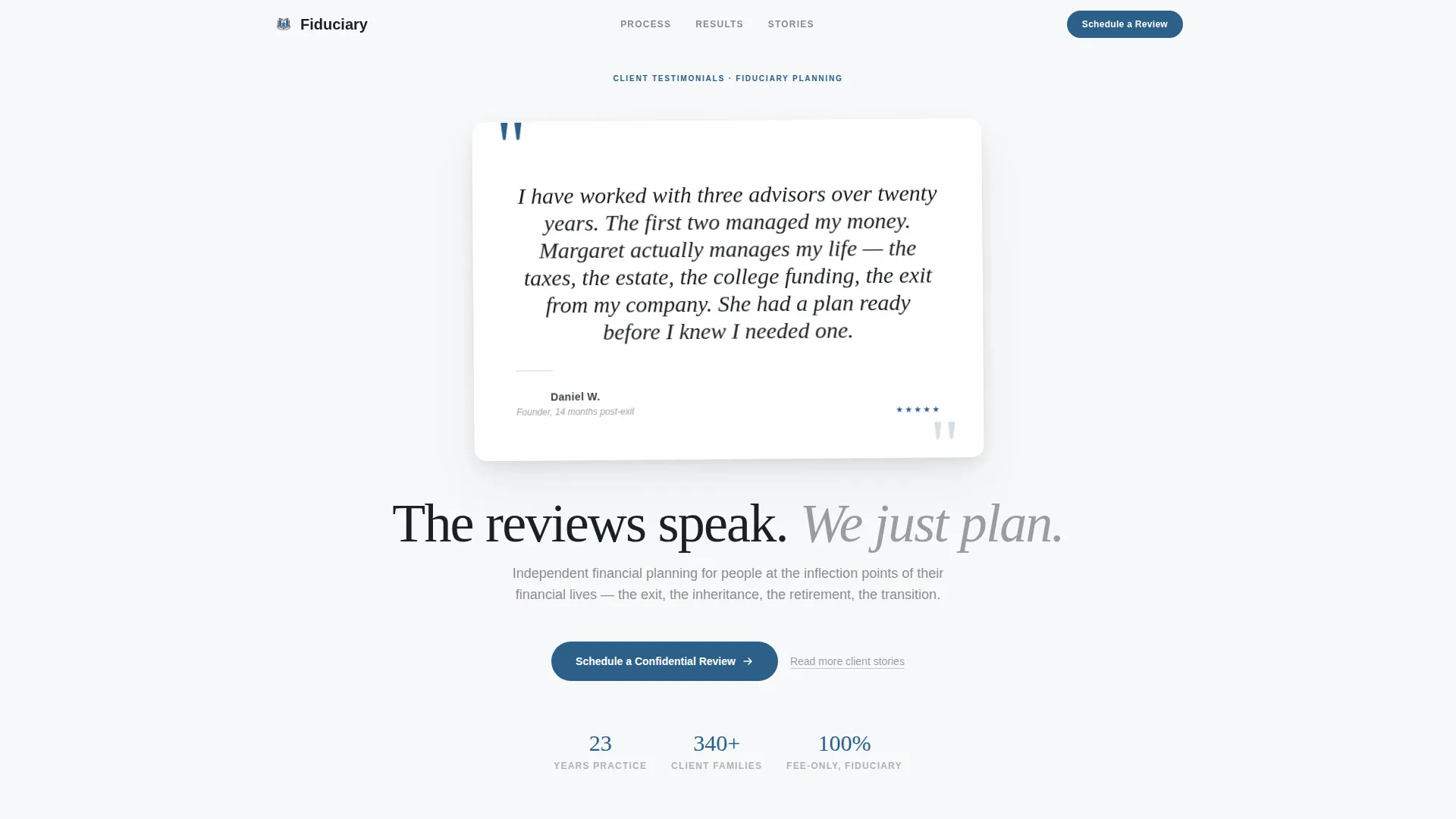
The page opens with a single oversized client testimonial rendered as a physical card. It floats against a cloud-white background, casts a faint realistic shadow, and carries a five-star indicator styled so subtly it reads as texture rather than promotion. No advisor headshot, no stock photography. The client's words carry the full visual weight of the header.
Transparent Process Sections
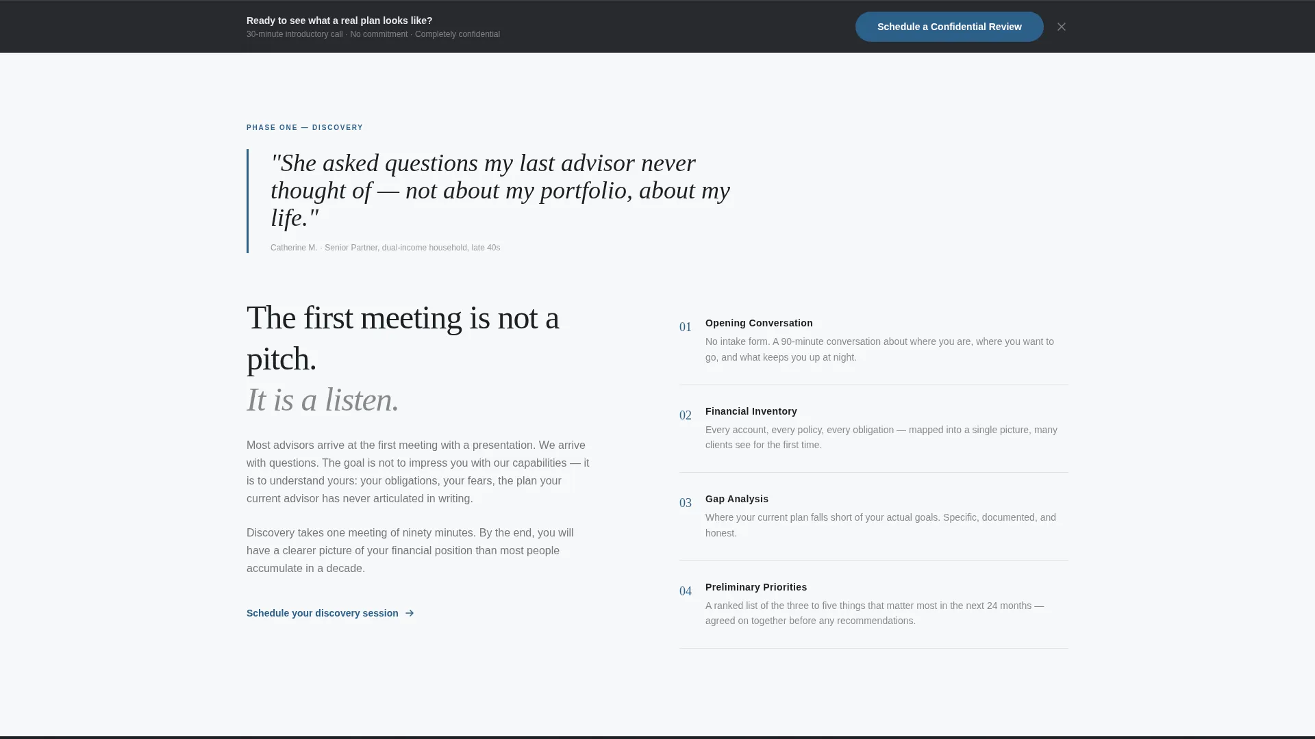
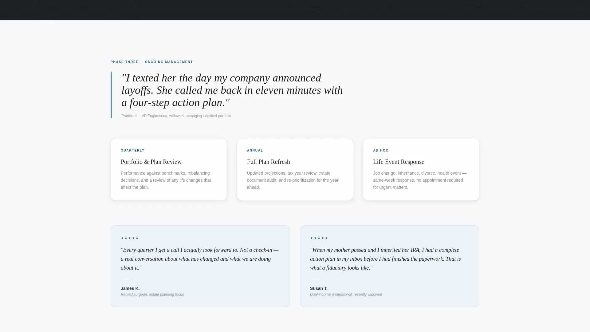
Four sequential content sections walk visitors through the planning relationship in order: Discovery, The Plan, Ongoing Management, and Results. Each section opens with a client quote specific to that phase, then delivers editorial content explaining what actually happens. This structure demystifies the engagement before the visitor is asked to commit.
Progressive Disclosure Lead Form
The lead capture form unfolds across three steps to reduce drop-off. Step one asks only for a first name and email. Step two presents a single dropdown asking what is prompting the visit. Step three offers a calendar embed for booking a 30-minute introductory call. The ask grows only after trust has been established.
Persistent Bottom Bar call to action
After the visitor passes the second scroll section, a fixed bottom bar activates with the primary call to action: "Schedule a Confidential Review." The bar stays available throughout the rest of the page without interrupting the reading experience.
Secondary Conversion Path
A "Read More Client Stories" text link appears as an understated alternative for visitors not yet ready to book. It funnels undecided visitors deeper into social proof before returning them to the primary call to action, giving the page two conversion speeds rather than one.
Redacted Sample Financial Roadmap
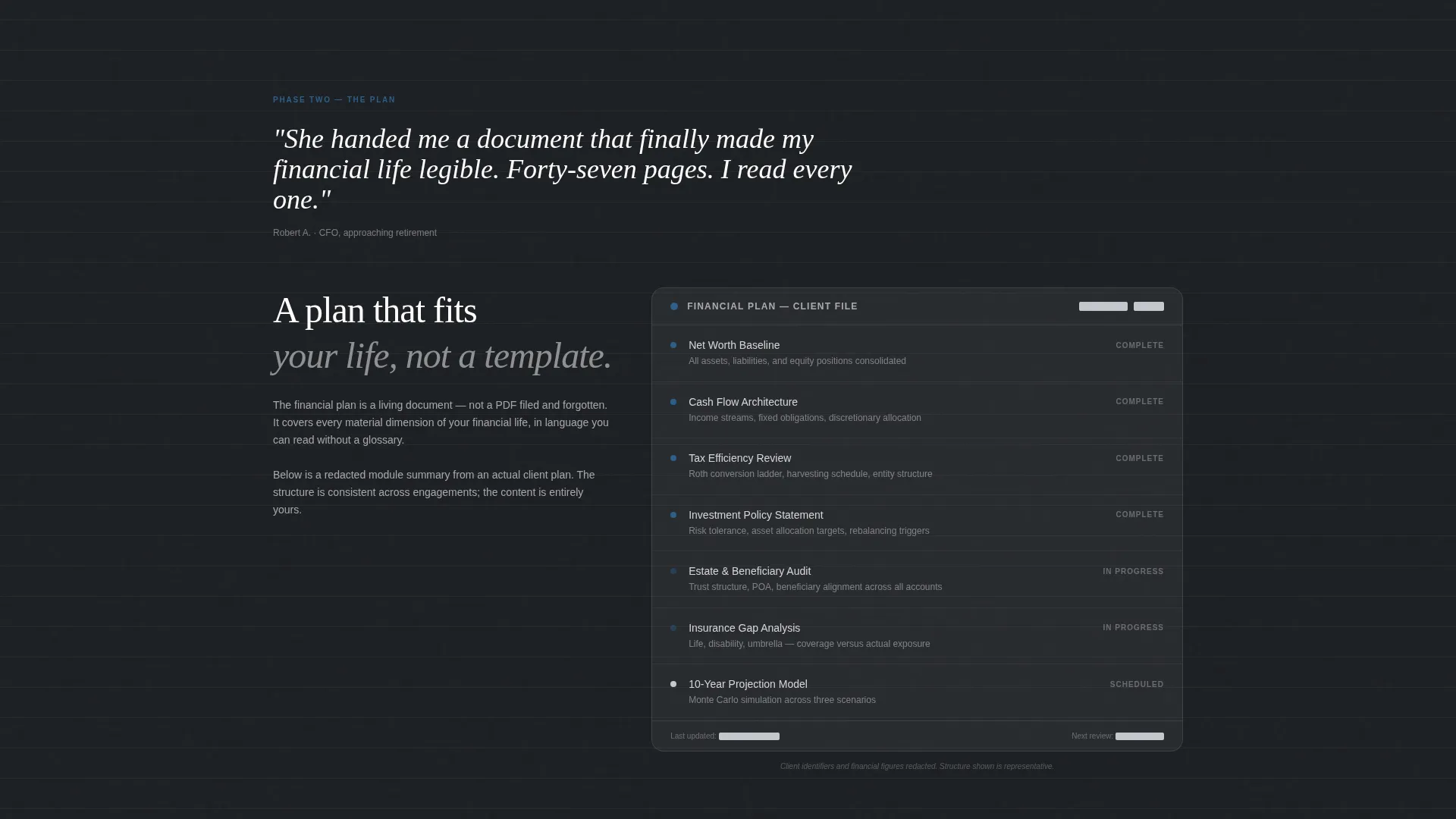
The Plan section includes a visually structured, redacted sample financial roadmap. It contains enough real layout and labeling to feel credible without revealing any actual client data. Visitors see what a plan looks like before they agree to build one.
Page sections overview
| Section | Purpose |
|---|---|
| Hero Testimonial Card | Opens with a client quote as the primary visual anchor |
| Primary call to action Button | Prompts immediate scheduling beneath the hero card |
| Discovery Section | Shows what the first planning meeting covers |
| The Plan Section | Displays a redacted sample financial roadmap |
| Ongoing Management Section | Addresses responsiveness and quarterly reviews |
| Results Section | Presents anonymized before-and-after net worth trajectories |
| Persistent Bottom Bar | Keeps the scheduling call to action accessible after scroll depth two |
| Three-Step Lead Form | Captures lead details through progressive disclosure steps |
| Secondary Text Link | Offers a softer path for visitors not yet ready to book |
Design & branding system
The visual identity follows an Executive Suite theme built on the Cloud Canvas color system. Every color choice reinforces authority without ornamentation. The palette was designed to feel like a well-composed broadsheet laid on a marble lobby desk, every element earning its space.
- Soft cumulus white (#F7F8FA) for open backgrounds, charcoal suit gray (#3B3F45) for body text and structural dividers, and muted silver (#C4C8CE) for secondary surfaces and pull-quote borders
- Deep lapis (#2C5F8A) used exclusively for hyperlinks, call to action buttons, and occasional data highlights, keeping the accent disciplined and meaningful
- Oversized serif pull-quotes alternate with editorial long-form text, creating a rhythm that mirrors a business magazine profile rather than a standard service page
Mobile & speed optimization
The layout is structured to remain legible and conversion-ready at any screen width. The testimonial card, process sections, and lead form each adapt cleanly to narrower viewports without losing their visual hierarchy.
- The persistent bottom bar call to action remains accessible on mobile without obscuring content or interfering with scroll behavior
- The three-step form is touch-friendly by design, with each step presented as a focused single-question screen to reduce cognitive load on smaller displays
How this template helps you convert
The page is engineered around a simple principle: earn the click before you ask for it. By the time a visitor reaches the lead form, they have read six real testimonials and seen the entire planning process explained.
- Six client testimonials placed across the page build cumulative trust, so the scheduling request at the end feels like a natural next step rather than a cold ask
- The progressive disclosure form lowers the perceived commitment at each step, starting with just a name and email before introducing any deeper context questions
- Two conversion paths, the primary "Schedule a Confidential Review" button and the secondary "Read More Client Stories" link, capture both ready buyers and visitors who need more time
Other information about this template
This template sits within the Professional Services category and is specifically designed for the financial planner online presence subcategory. It is built for the niche of financial planner reviews and testimonials pages, where social proof and process clarity are the primary conversion drivers.
- The Editorial/Magazine template style means content sections are treated like editorial spreads, with long-form copy, pull-quotes, and structured visual pacing rather than icon grids or feature lists
- The Transparent Process creative direction is the organizing principle: every section reveals a stage of the advisor-client relationship in sequence, so the visitor feels oriented rather than sold to
- This template is well-suited for advisors who want their online presence to attract clients navigating complex financial transitions, not just people searching for generic investment advice
Theme
Executive Suite
Creative direction
Transparent Process
Color system
Cloud Canvas
Style
Editorial/Magazine
Direction
Lead Generation
Page Sections
Hero Testimonial Card Header
Four-stage Process Storytelling
Three-step Progressive Lead Form
Persistent Scroll-activated Call to Action Bar
Redacted Sample Financial Roadmap
Dual Conversion Path Design
Related questions
Can I replace the placeholder testimonials with my own client quotes?
Does this template work for a solo advisor or only for a larger firm?
What is the purpose of the three-step lead form?
Can I use this template before I have collected client testimonials?
Is the redacted financial roadmap section editable?



