Kids Online Safety & Tech Education Website Template
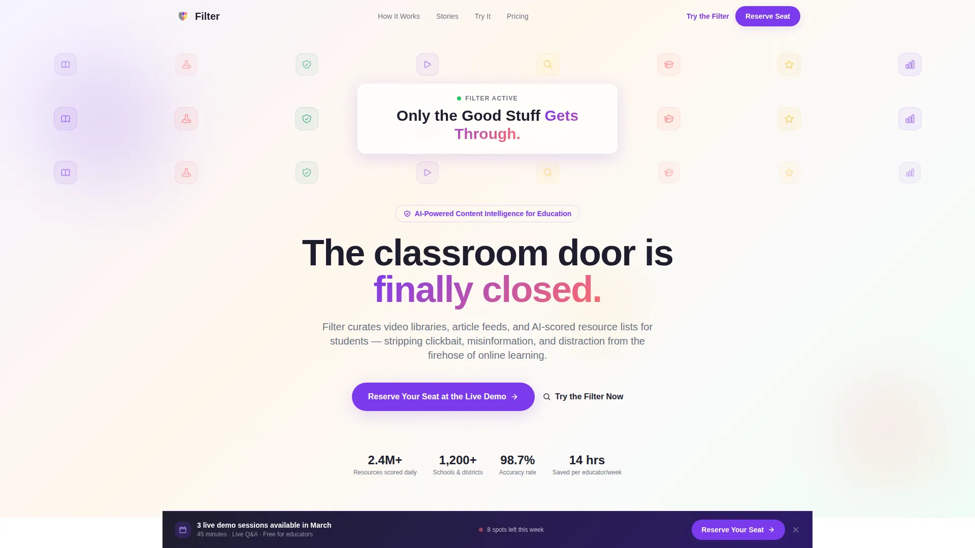
Filter is a masonry-style educational content landing page template built for EdTech platforms that curate learning resources. It visualizes the journey from content chaos to clarity using animated icon grids, scroll-linked card reorganization, and an interactive dashboard. The primary call to action drives demo event registrations from homeschool parents, district IT administrators, and college students.
by Rocket studio
Quick summary
Filter is a single-page landing page template designed for educational content filtering platforms. It uses a masonry layout, a Dopamine Pop color system, and a Hero's Journey narrative structure to move visitors from awareness to demo registration. The page blends high animation, real filtering scenarios, and educator social proof into one focused conversion experience.
Who this template is for
This template speaks directly to the people who sit at the center of online learning decisions. It serves both individual users managing their own study environments and institutional buyers evaluating tools for large-scale deployment.
- Homeschool parents who build daily curricula and need a trusted resource curation system
- District IT administrators who evaluate and deploy content tools across schools or entire districts
- College students overwhelmed by open tabs and unreliable sources who need guided, focused learning paths
What problem this template solves
The modern online learning environment is saturated. Students encounter clickbait, misinformation, paywalled duplicates, and reading-level mismatches before they ever reach useful content. A generic keyword-blocking tool does not solve this. The real problem is the absence of active quality curation, and that is what this template is designed to communicate.
- Visitors arrive without context, so the page must show the chaos before it shows the solution
- Decision-makers need scenario-level proof, not just feature lists, to trust a filtering platform
- Multiple audience types (parents, administrators, students) need to see themselves in the same page
What you get with this template
This template delivers a fully structured, section-led landing page ready for an educational content filtering product. Every section has a defined narrative role and a specific visual treatment pulled from the source brief.
- A Hero section with an animated icon grid, a masonry chaos-to-clarity transformation, and a typed headline reveal
- Five core scroll sections including a Chaos Wall, Filtering Trials, Testimonials, an Interactive Dashboard, and a linear single-row footer
- A sticky bottom bar call to action, a three-field event registration form, and a URL sandbox scorer with a conversion modal
Feature list
This template includes a focused set of interactive and visual features. Each one serves the conversion goal of moving visitors toward demo registration.
Animated Icon Grid Header
A tessellated mosaic of education symbols fills the header. Icons pulse once in Dopamine Pop accent colors before settling into graphite. Junk-content icons dissolve and are replaced by verified-knowledge icons as the headline types itself into the center gap.
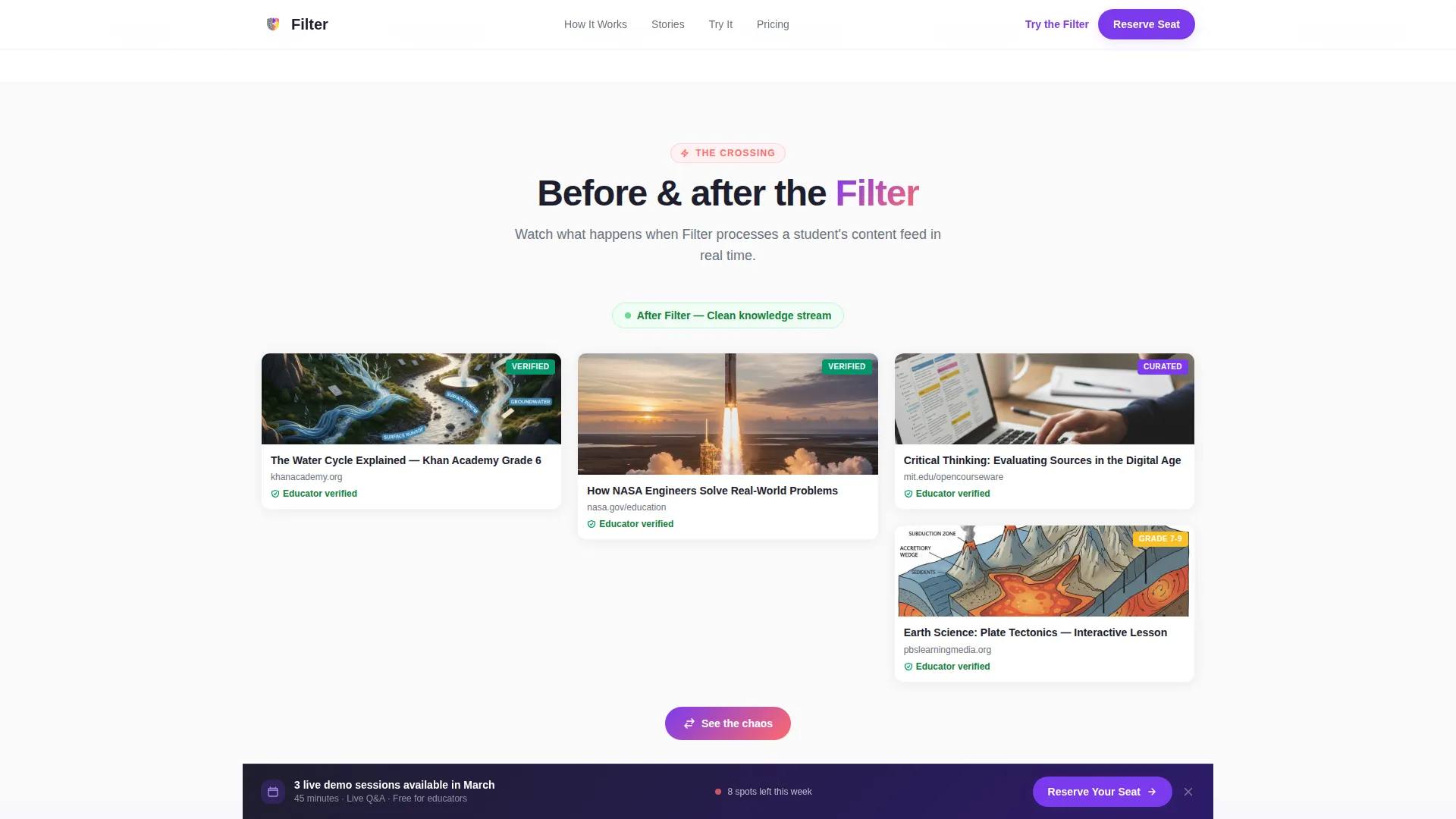
Masonry Chaos-to-Clarity Wall
The Chaos Wall section renders a masonry grid of cluttered, garish fake content thumbnails. On scroll, bad cards fall away and good cards snap into clean alignment, making the filtering value proposition immediately visible without a word of explanation.
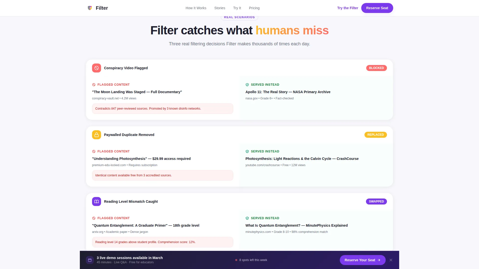
Filtering Trials Scenario Cards
Three real-world filtering scenarios appear as individual cards: a conspiracy video flagged, a paywalled duplicate removed, and a reading-level mismatch caught. Each card gives decision-makers concrete proof of how the platform handles specific content problems.
Masonry Educator Testimonials
Educator testimonial cards are arranged in masonry clusters. Each card carries a name, role, and institution. This section acts as the mentor stage in the Hero's Journey narrative, building trust before the final conversion push.
Interactive Draggable Dashboard
The reward section renders a personalized content dashboard as a draggable masonry board. Visitors can rearrange cards directly on the page. This hands-on interaction converts passive interest into active engagement before the registration prompt appears.
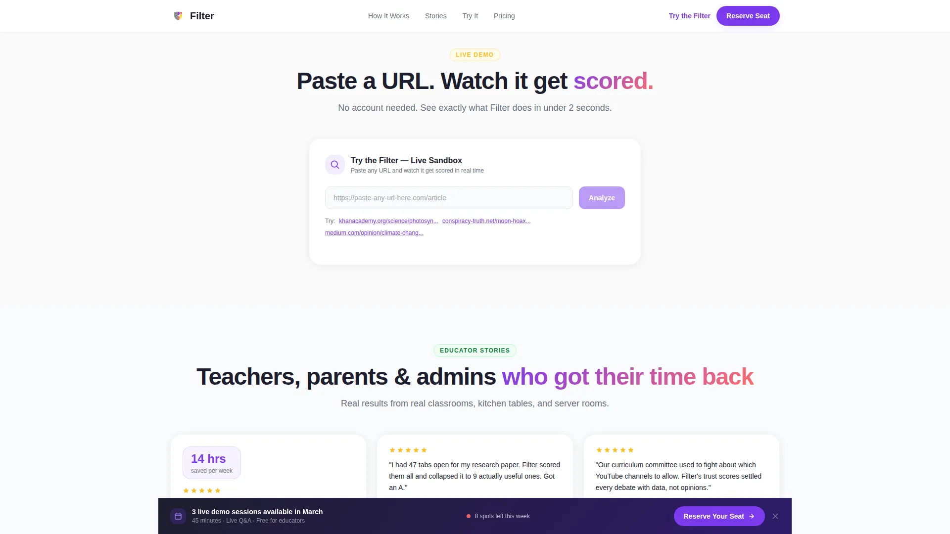
Sticky Registration Bar with Sandbox
A sticky bottom bar activates after the testimonials section and anchors the primary call to action. A secondary path lets visitors paste any URL into a sandbox scorer and watch it get evaluated in real time. When sandbox limits are reached, a modal prompts full demo registration.
Page sections overview
| Section | Purpose |
|---|---|
| Hero Icon Grid | Introduce the product with animated education symbols and a typed headline reveal |
| Chaos Wall | Show content overload transforming into curated clarity through masonry card reorganization |
| Filtering Trials | Demonstrate real filtering scenarios with specific flagged-content examples |
| Educator Testimonials | Build trust with masonry-clustered testimonial cards from real educators |
| Interactive Dashboard | Let visitors rearrange a live masonry content board as a hands-on product preview |
| Demo Registration Form | Capture leads with a role selector, email field, and visual calendar date picker |
| URL Sandbox Scorer | Allow visitors to test a URL and trigger a conversion modal when sandbox limits are reached |
| Single-Row Footer | Close the page with a clean linear footer pattern |
Design & branding system
The visual identity follows an Educational Guide theme expressed through the Dopamine Pop color system. The palette feels vivid and optimistic without being childish, designed to signal clarity and energy at the same time. Typography uses Plus Jakarta Sans for headings and DM Sans for body text, keeping the page readable and modern.
- Colors: electric violet (#7C3AED) as the primary, reward-center coral (#FF6B6B) and highlighter yellow (#FBBF24) as accents, whiteboard white (#FAFAFA) for backgrounds, and deep pencil graphite (#1E1E2E) for body text
- Iconography: thick geometric line art education symbols rendered in a tessellated mosaic pattern with scroll-triggered pulse animations
- Layout: masonry and Pinterest-style card grids throughout, giving the page a dynamic, layered visual rhythm consistent with the content curation theme
Mobile & speed optimization
The template is built desktop-first, reflecting the reality that district IT administrators and curriculum decision-makers typically evaluate tools on desktop screens. The layout remains fully responsive so homeschool parents and students can explore it from any device.
- Animations use Intersection Observer triggers and GPU-accelerated transforms to keep scroll-linked effects smooth
- Masonry card reorganization and the draggable dashboard are designed to perform without blocking the main thread
- The sticky call-to-action bar and sandbox scorer remain accessible and functional across screen sizes
How this template helps you convert
The entire page is structured as a conversion funnel, not just a feature showcase. Every scroll segment escalates the narrative stakes and brings the visitor closer to registering for a live demo.
- The Chaos Wall and Filtering Trials sections create emotional recognition and product trust before any form appears, so visitors arrive at the registration bar already convinced.
- The URL sandbox scorer converts passive curiosity into active product interaction, and the conversion modal it triggers is the most contextually relevant moment to ask for a registration.
Other information about this template
This template is categorized under Kids and Family, with a specific focus on Kids Online Safety and Technology. It is designed for the educational content filter niche, where trust signals and demonstrated functionality matter more than surface-level marketing claims. The template supports a business-to-business-to-consumer (B2B2C) EdTech model, serving both institutional buyers and individual end users from a single page.
- The lp_direction is Event Registration, meaning all conversion paths lead to demo sign-ups, not free trials or direct purchases
- The creative direction follows a Hero's Journey narrative arc that moves visitors through seven distinct emotional stages across five page sections
- Secondary audience members such as curriculum designers and school board decision-makers will recognize the institutional-scale proof points embedded in the Filtering Trials and Testimonials sections
Theme
Educational Guide
Creative direction
Hero's Journey
Color system
Dopamine Pop
Style
Masonry/Pinterest
Direction
Event Registration
Page Sections
Animated Icon Grid Header
Masonry Chaos-to-clarity Wall
Filtering Trials Scenario Cards
Interactive Draggable Dashboard
Sticky Registration Bar
URL Sandbox Scorer with Conversion Modal
Related questions
Who is this landing page template designed for?
What is the primary conversion goal of this template?
What makes the URL sandbox scorer effective for conversion?
Is this a single-page template or a multi-page website?
Can this template serve both individual users and institutional buyers?