Nephrologist Reviews Website Template
Filtrate is a zigzag alternating nephrology landing page template built for clinical reference libraries. It presents peer-reviewed condition briefs and treatment algorithms across glomerular disease, electrolyte disorders, and transplant complications. The layout uses a checklist-and-audit scroll pattern to guide nephrologists, fellows, and rural practitioners toward the full searchable library with contextual, condition-specific calls to action.
by Rocket studio
Quick summary
Filtrate is a single-page clinical reference landing page designed for nephrology condition and treatment libraries. It pairs a biopsy-photo hero with alternating checklist and algorithm sections covering glomerular disease, electrolyte disorders, and transplant complications. Every scroll section ends with a contextualized call to action, guiding visitors from self-assessment moments to the full library without a single form field.
Who this template is for
This template is built for nephrology-focused digital products that need to demonstrate clinical depth before asking for a click. It works especially well for medical reference platforms, condition library tools, and subspecialty education resources.
- Attending nephrologists who cross-reference dialysis adequacy targets or staging criteria during rounds
- Nephrology fellows preparing for board examinations or reviewing rare tubulopathies late at night
- Rural clinic practitioners managing complex renal cases without on-site subspecialty support
What problem this template solves
Generic medical landing pages fail clinicians because they lead with marketing language instead of clinical substance. Nephrologists do not trust a platform until they see actual Glomerular Filtration Rate thresholds, real drug names, and structured staging criteria. Filtrate solves this trust gap directly.
- Visitors cannot assess library depth from a headline alone, so the checklist-and-audit layout surfaces real clinical questions at each scroll step
- Context-switching between a condition category and a sample algorithm card shows the format of the destination before the visitor commits to clicking
- Without condition-specific calls to action, click-through rates suffer because the next step feels generic rather than relevant
What you get with this template
Filtrate delivers a fully structured, single-page layout with every section pre-built and logically sequenced. The visual identity, typography, and interaction cues are all wired together inside one cohesive design system.
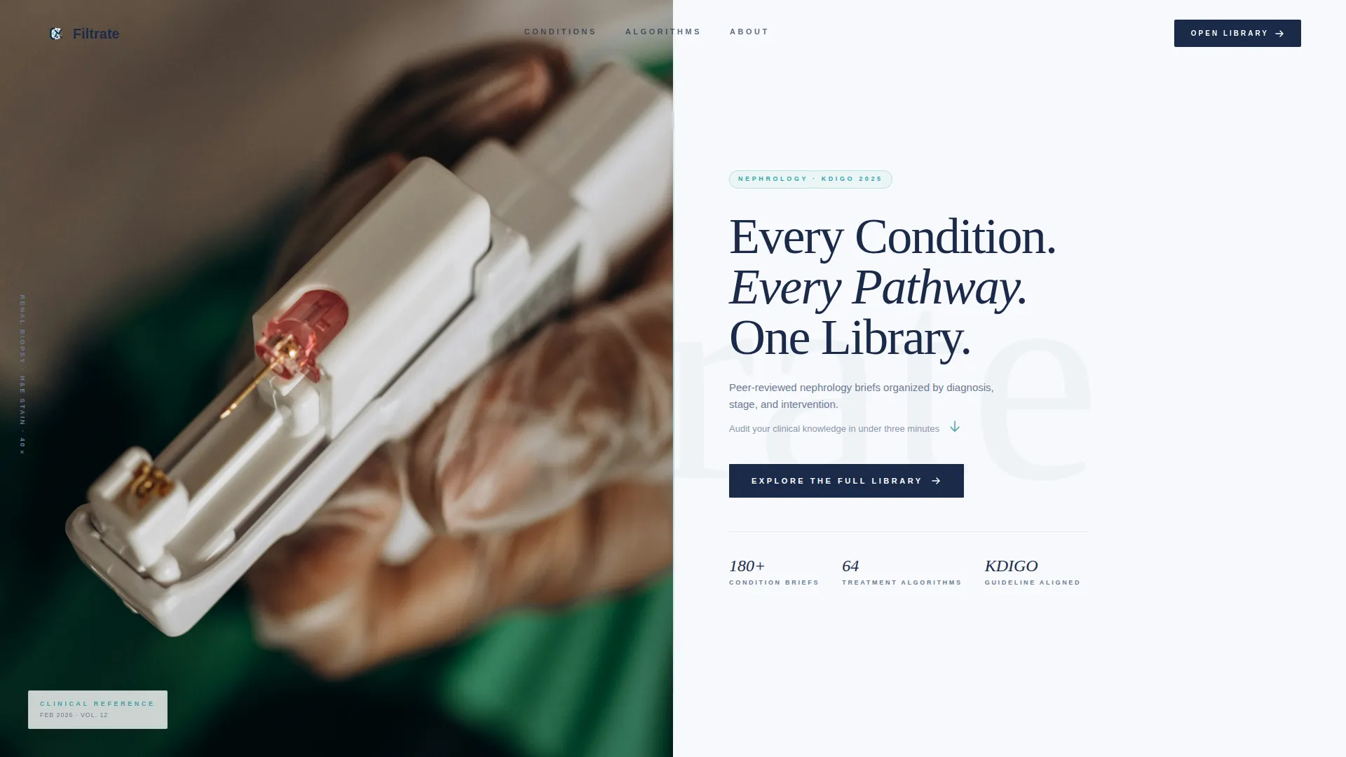
- A half-page photo and text hero with an editorial headline, single-line descriptor, and a teal arrow call to action
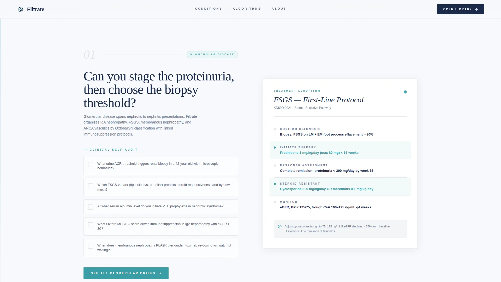
- Three zigzag alternating content sections, each pairing a condition-category checklist with a sample treatment algorithm card
- A final call to action block with condition count statistics and a repeating "Explore the Full Library" prompt, plus a linear single-row footer
Feature list
This section describes what the template is built to do. Every feature listed below comes directly from the design and layout brief.
Half-Page Photo and Text Hero
The header splits the viewport: the left side holds a softly lit renal biopsy slide photograph, and the right side presents the primary headline in deep cortex navy. A teal downward-arrow call to action and a secondary audit prompt sit directly beneath the headline, giving visitors an immediate reason to scroll.
Zigzag Alternating Section Layout
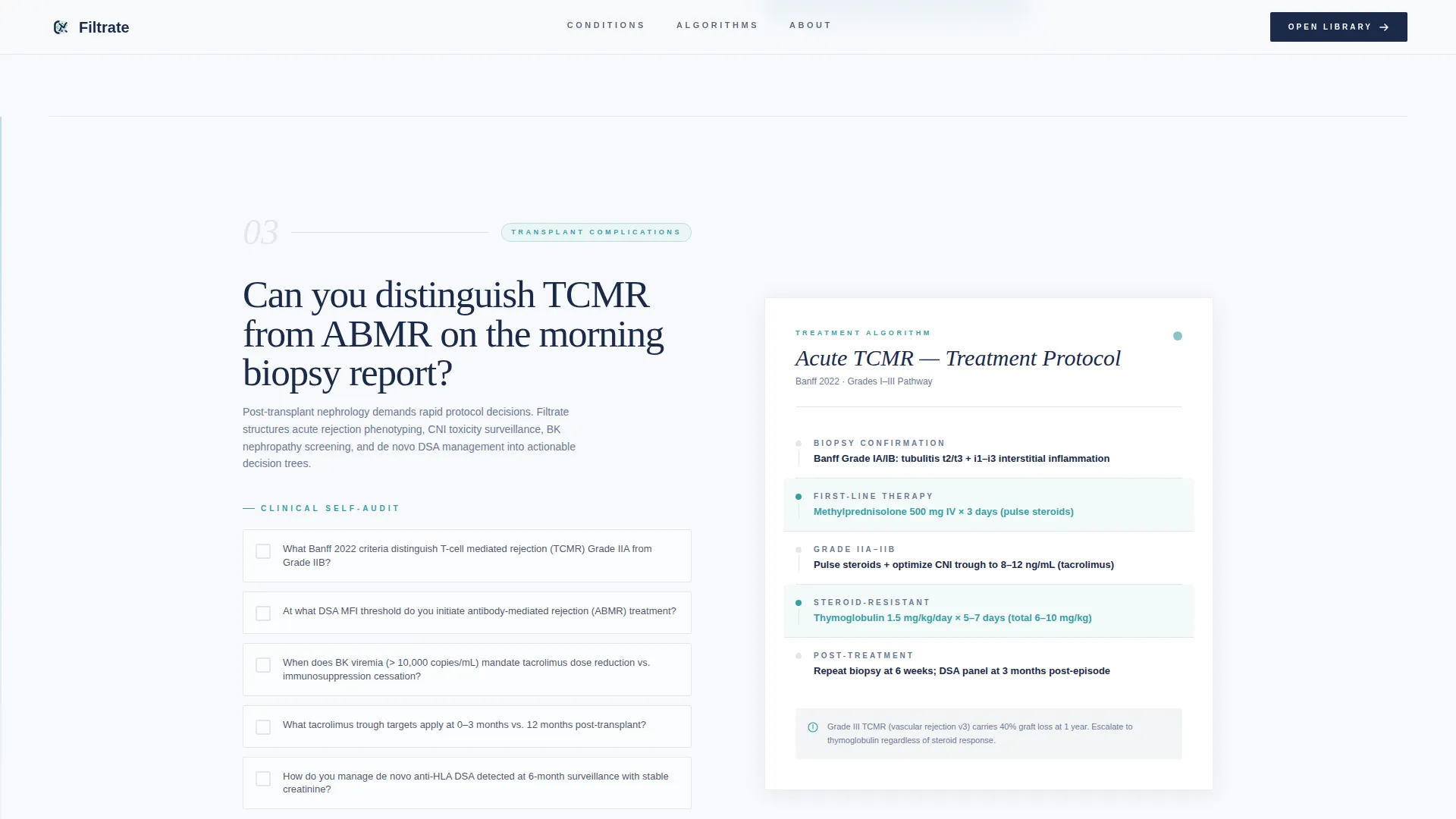
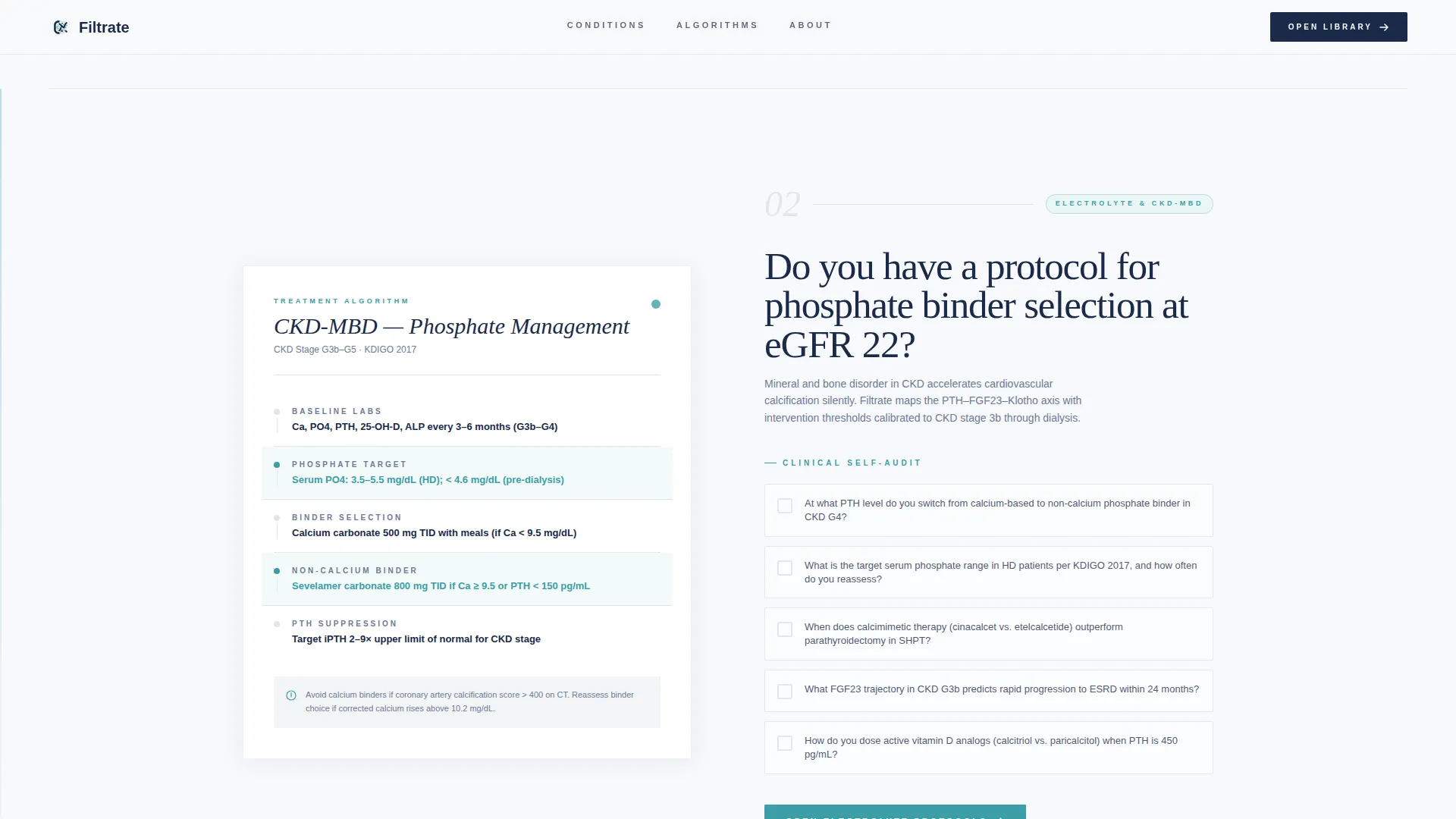
Three alternating content blocks cover Glomerular Disease, Electrolyte and Mineral Disorders, and Transplant Complications. Each block flips the left-right position of the checklist and algorithm card, escalating in clinical complexity from common chronic kidney disease staging to rare tubulopathies.
Checklist and Audit Interaction Pattern
Every left-aligned block presents a condition category with a visual checklist of five critical clinical questions. This turns passive reading into active self-assessment, so visitors naturally discover gaps in their own reference toolkit as they scroll.
Treatment Algorithm Cards
Each right-aligned block reveals a sample algorithm card showing dosing thresholds, monitoring intervals, and staging criteria. These cards signal the format and depth of the full library, building trust before the visitor ever clicks through.
Contextual Condition-Specific Calls to Action
The primary call to action, "Explore the Full Library," appears beneath the hero and repeats at the close of every zigzag pair. Each repetition is reframed to match the preceding section, for example "See All Glomerular Briefs" or "Open Transplant Protocols," so every click feels purposeful rather than generic.
GSAP Scroll Reveal Animations
The template uses scroll-triggered clip-path image reveals and staggered content animations via GSAP. Hover states on algorithm cards and teal accent threading across interactive elements reinforce the editorial clinical handbook feel throughout the page.
Page sections overview
| Section | Purpose |
|---|---|
| Hero header | Introduces the library with a biopsy photograph and editorial headline |
| Glomerular Disease block | Pairs a five-question checklist with a sample glomerular algorithm card |
| Electrolyte Disorders block | Flips the layout to lead with an algorithm card, then a checklist |
| Transplant Complications block | Returns to checklist-left format for transplant condition coverage |
| Final call to action | Repeats the library prompt with condition count statistics |
| Linear footer | Closes the page in a single-row pattern with essential links |
Design & branding system
The visual identity follows an Organic Flow theme built entirely around an Arctic White color system. The palette mimics the look of a histology cross-section slide: almost entirely white and translucent, with structure revealed by faint blue-gray tones and one vivid metabolic accent.
- Color palette: glacial white (#F7F9FC) as the base, pale nephron gray (#E2E6EC) for surface separation, deep renal cortex navy (#1B2A4A) for headings and text, and oxygenated-blood teal (#3A9EA5) for interactive elements and progress indicators
- Typography: DM Serif Display for headings gives the page its editorial clinical handbook authority, while Plus Jakarta Sans handles body text with clean legibility
- The teal accent threads through checklist highlights, arrow indicators, card hover states, and call-to-action buttons, creating a single vivid line of visual continuity across every section
Mobile & speed optimization
The template is designed desktop-first to match how attending physicians use workstations during rounds. A mobile fallback layout is included so fellows can review sections on a phone or tablet without losing the core checklist-and-algorithm structure.
- Desktop-first layout priorities keep the zigzag two-column format intact for full clinical context on larger screens
- Server Components handle static content sections, keeping the JavaScript footprint minimal while GSAP handles targeted animation only where the brief specifies it
- The mobile fallback stacks checklist and algorithm card blocks vertically, preserving the logical sequence and the contextual calls to action on smaller viewports
How this template helps you convert
Every structural decision in Filtrate is made to move a skeptical clinician from curiosity to a confident click. The page earns trust through demonstrated clinical depth rather than persuasion copy.
- The hero checklist teaser surfaces the first self-assessment moment above the fold, creating immediate engagement before the visitor has scrolled a single section
- Each zigzag section escalates clinical complexity and ends with a condition-specific call to action, so every click feels like a logical next step rather than a sales prompt
- The final block reinforces library scale with condition count statistics and a peer-review badge, giving the visitor concrete evidence of depth before they commit
Other information about this template
Filtrate references United States clinical standards throughout, including Kidney Disease: Improving Global Outcomes (KDIGO) and Kidney Disease Outcomes Quality Initiative (KDOQI) frameworks. These standards inform the staging criteria, dosing thresholds, and monitoring intervals shown in the sample algorithm cards.
- The page includes no form fields; every call to action leads directly to the full searchable library, keeping the click path frictionless
- Social proof elements include condition count statistics and a peer-review badge displayed in the final call-to-action block
- The footer uses Pattern 1, a linear single-row layout, keeping the close of the page as clean and uncluttered as the rest of the design
- Condition categories covered in the zigzag sections include Focal Segmental Glomerulosclerosis (FSGS), Chronic Kidney Disease and Mineral Bone Disorder (CKD-MBD), and transplant complication protocols
Theme
Organic Flow
Creative direction
Checklist & Audit
Color system
Arctic White
Style
Zigzag/Alternating
Direction
Click-Through
Page Sections
Half-page Photo and Text Hero
Zigzag Alternating Section Layout
Checklist and Audit Interaction Pattern
Treatment Algorithm Cards
Contextual Condition-specific Calls to Action
GSAP Scroll Reveal Animations
Related questions
Who is this landing page template designed for?
Does this template include a contact form or lead capture form?
How many content sections does this template include?
Can the condition categories and checklist questions be customized?
What animation style does this template use?



