Family Doctor Comparison Website Template
This landing page template helps families find a vetted primary care physician nearby, fast. It pairs a centered hero headline with a zip code input, a side-by-side doctor comparison table, and a sticky mobile call to action. Filters for insurance, language, and same-week availability do the heavy lifting so visitors can act the moment they land.
by Rocket studio
Quick summary
This single-page template is built for a family doctor provider directory. It opens with a radial-gradient hero, moves into a three-stat problem strip, then delivers a side-by-side comparison table showing real availability data. A trust strip and a final call-to-action section close the page. The goal is simple: give visitors proof that open appointments exist before they ever click away.
Who this template is for
This template suits anyone running a local healthcare directory or primary care network that wants to convert anxious searchers into booked appointments. It is designed with high-urgency visitors in mind, people who cannot afford to wait.
- New parents searching for a pediatrician late at night on a phone
- Employees navigating a new insurance plan after switching jobs
- Adults who need a new primary care physician because their longtime doctor retired
What problem this template solves
Finding a family doctor online is frustrating. Listings are outdated, wait times stretch weeks, and it is rarely clear which plans a practice accepts. This template confronts that frustration head-on before offering a clear path forward.
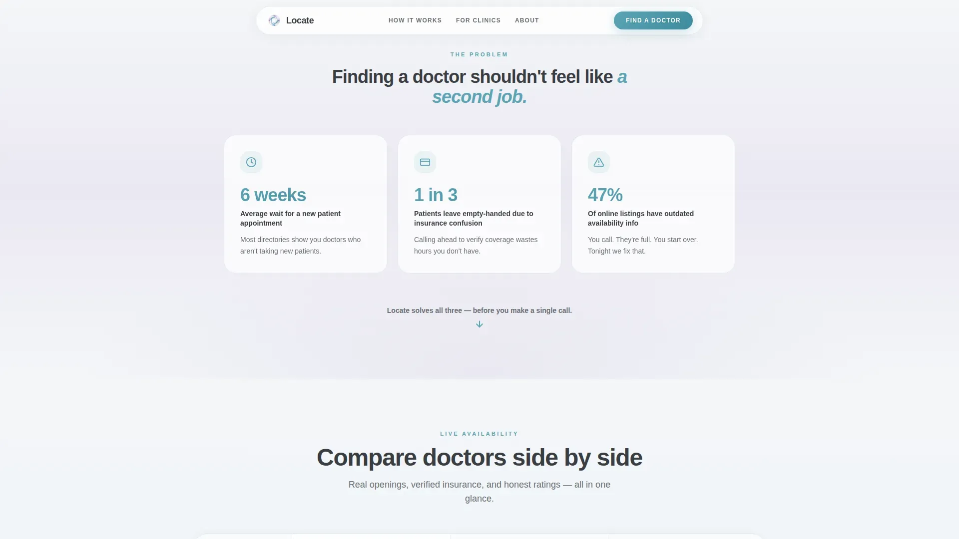
- Six-week wait times and stale directory listings erode trust immediately
- Insurance confusion leaves visitors unsure whether a doctor will even accept their plan
- Visitors abandon pages that show no proof of real, current availability
What you get with this template
You get a fully structured, single-page comparison layout that guides visitors from pain point to action without detours. Every section has a defined job, and the visual hierarchy keeps the path to the call to action obvious at every scroll depth.
- A zip code input field in the hero that activates results with just five digits
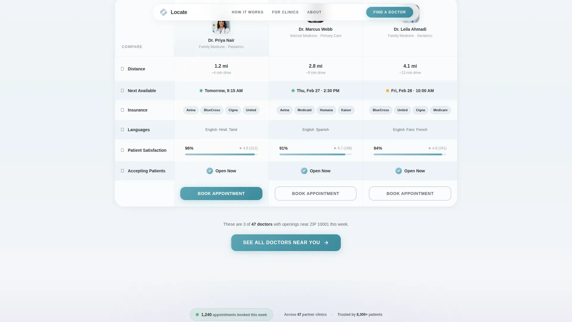
- A comparison table showing three to four doctor profiles side by side with teal progress bars and checkmarks
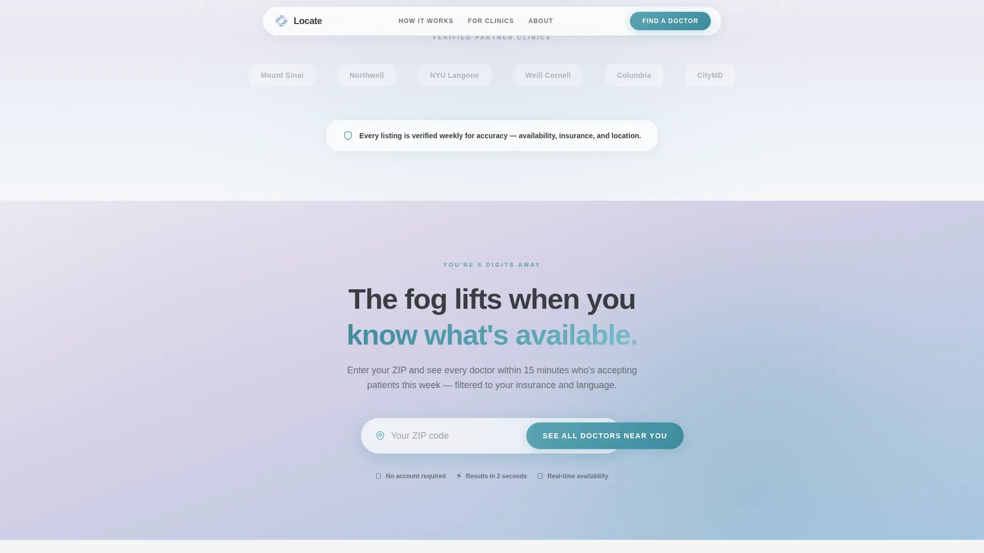
- A trust strip with partner clinic logos and a live appointments-booked counter
Feature list
This template ships with the following built-in capabilities, each contributing directly to the directory's core purpose.
Radial Gradient Hero with Zip Input
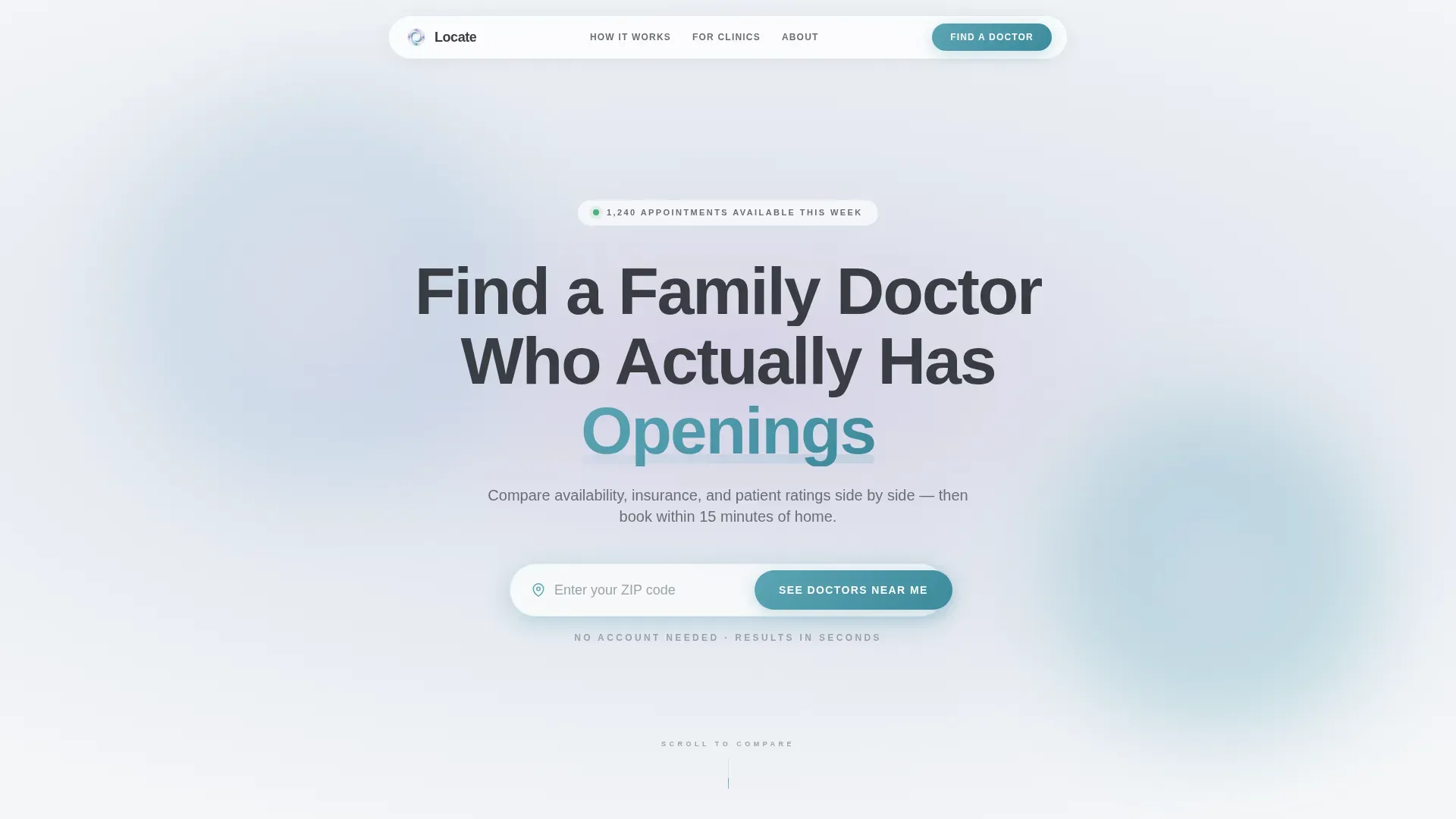
The hero section uses a soft radial bloom from lavender haze at the center to fog white at the edges. A large rounded headline sits above a one-line subhead and a five-digit zip code input field. No imagery is needed; typography and gradient carry the entire first impression.
Side-by-Side Doctor Comparison Table
Three to four sample doctor profiles sit in a horizontal table with rows covering distance, next available appointment, accepted insurance plans, languages spoken, and patient satisfaction scores. Teal progress bars and checkmarks make horizontal scanning effortless on both desktop and mobile.
Problem Strip with Three-Stat Acknowledgment
A dedicated strip between the hero and the table names the real frustrations: long wait times, insurance confusion, and outdated listings. It validates the visitor's experience before presenting the solution, which makes the comparison table feel earned rather than salesy.
Live Trust Strip
Below the comparison table, a row of partner clinic logos sits beside a real-time counter showing appointments booked this week. This grounds the directory in current activity and signals that the platform is live and in use.
Sticky Mobile Call to Action
The primary call to action, "See All Doctors Near You," pins to the bottom of the viewport on mobile devices. It also appears inline below the comparison table for desktop visitors. Both placements route to the full searchable directory.
Scroll-Reveal Animation System
The template uses entrance timeline animations, blob parallax effects, and scroll-triggered reveals powered by GSAP. Elements appear as the visitor moves down the page, keeping the experience dynamic without feeling distracting.
Page sections overview
| Section | Purpose |
|---|---|
| Hero with zip input | Opens with headline, subhead, and five-digit zip field to activate nearby results |
| Problem acknowledgment strip | Names three real frustrations to validate the visitor before the solution appears |
| Doctor comparison table | Shows three to four profiles side by side with availability, insurance, and ratings |
| Trust and social proof | Displays clinic logos and a live counter of appointments booked this week |
| Final call-to-action section | Repeats the zip input and teal button to capture visitors ready to act |
| Single-row footer | Closes the page with a minimal linear footer layout |
Design & branding system
The visual identity follows a Soft Gradient theme built on the Soft Mist color system. The palette layers cool, translucent tones that recede rather than compete, letting the content breathe and the calls to action stand out naturally.
- Colors: morning fog white (#F4F6F8), lavender haze (#D5D0E5), gentle sky (#A8C6DF), calm teal accent (#5BA4B5) for buttons and interactive elements, and warm charcoal (#3A3D42) for body text
- Typography: Plus Jakarta Sans, a rounded modern sans-serif that feels warm and approachable at large display sizes
- Backgrounds shift in subtle vertical gradients from fog white to lavender haze, and comparison table rows alternate between near-white and a faint blue wash for easy scanning
Mobile & speed optimization
The template is built mobile-first, with the late-night new parent on a phone as the primary use case. Every interaction is optimized for one-handed use and quick decisions under stress.
- The sticky call-to-action button pins to the bottom of the viewport on mobile so it is always reachable without scrolling back up
- CSS smooth scroll and GSAP-powered entrance animations keep motion fluid without relying on heavy resources
- The comparison table is designed to scan horizontally in seconds, with teal progress bars and checkmarks replacing long text descriptions on smaller screens
How this template helps you convert
The page is structured around a Problem-to-Solution arc that earns the click before asking for it. Visitors see proof of real availability before they ever reach a button.
- The zip code input field appears immediately in the hero, lowering the barrier to entry to just five digits and signaling that results are local and relevant.
- The comparison table shows live availability data upfront, open appointments, accepted plans, and satisfaction scores, so visitors feel informed rather than pressured when they click through.
- The trust strip with clinic logos and the live bookings counter provides the social proof needed to overcome last-moment hesitation, especially for high-stakes decisions like choosing a child's first doctor.
Other information about this template
This template is categorized under Health & Medical with a focus on the family doctor provider directory niche. It is built as a single landing page with a click-through direction, meaning every design decision points toward one outcome: getting the visitor to the full searchable directory.
- Template style: Comparison Table layout within a Soft Gradient visual theme
- Creative direction: Problem-to-Solution Arc, where the scroll journey mirrors the emotional shift from frustration to clarity
- Header concept: Giant Headline Centered on a soft radial gradient, with no imagery or illustration
- Localization: English language, United States zip codes, and United States insurance plan references
- Animation level: Medium-high, including blob parallax, entrance timelines, scroll reveals, and a magnetic call-to-action effect
- Footer pattern: Linear single-row layout for a clean, distraction-free close
Theme
Soft Gradient
Creative direction
Problem→Solution Arc
Color system
Soft Mist
Style
Comparison Table
Direction
Click-Through
Page Sections
Radial Gradient Hero with Zip Input
Side-by-side Doctor Comparison Table
Problem Strip with Three-stat Layout
Live Trust Strip
Sticky Mobile Call to Action
GSAP Scroll-reveal Animations
Related questions
Can I replace the sample doctor profiles with real listings?
Does the zip code input field connect to a live database?
Is this template suitable for a pediatric-only or specialty directory?
How does the live appointments counter work?



