Wildfire Preparedness Landing Page Template
Firebreak is a single-column landing page template built for wildfire preparedness consultancies targeting corporate, hospitality, and municipal clients. It leads with a bold guarantee badge, builds credibility through escalating case study narratives, and drives Partnership/B2B conversions via a vulnerability assessment request form and a gated PDF download. The design uses a disciplined slate and sky blue palette that projects calm authority.
by Rocket studio
Quick summary
Firebreak is a focused, single-column landing page template designed for wildfire preparedness consultancies. It opens with a stamped guarantee badge, walks prospects through real-scale case studies, and closes with two clear conversion paths. The visual system uses deep charcoal, brushed graphite, and high-altitude sky blue to project the composure of a firm that has already done the hard work.
Who this template is for
This template is built for specialized consultancies that deliver defensible-space plans, ember-resistant retrofits, and evacuation protocols to high-stakes clients. It speaks the language of risk management and regulatory compliance, not general safety advice.
- Risk managers at insurance carriers evaluating wildfire exposure across property portfolios
- Facilities directors at corporate campuses located near the wildland-urban interface (WUI)
- County emergency planners who need Community Wildfire Protection Plan (CWPP) compliant documentation before federal funding is released
What problem this template solves
Most wildfire preparedness services lead with dramatic fire imagery. That approach signals urgency but does not build institutional trust. Corporate and municipal buyers need evidence, not emotion, before they sign an engagement.
- Generic service pages fail to show methodology at scale, leaving risk managers without the proof they need to justify a vendor
- Without structured case studies, prospects cannot tell whether a consultancy has handled assets comparable in size and complexity to their own
- Consultancies lose qualified leads because their pages do not offer a low-friction first step for buyers who are researching, not yet ready to commit
What you get with this template
This template delivers a complete single-column landing page flow, structured to carry a skeptical institutional buyer from awareness to action in one uninterrupted scroll.
- A centered guarantee badge header that opens with a hard outcome claim, replacing fire imagery with documented proof
- Three escalating case study sections, each built on a risk profile, intervention, and outcome narrative, with single-stat interstitials between them
- A dual-conversion closing section featuring a vulnerability assessment request form and a gated PDF download field
Feature list
This template packages every element a wildfire preparedness consultancy needs to earn B2B trust and drive qualified partnership inquiries.
Guarantee Badge Header
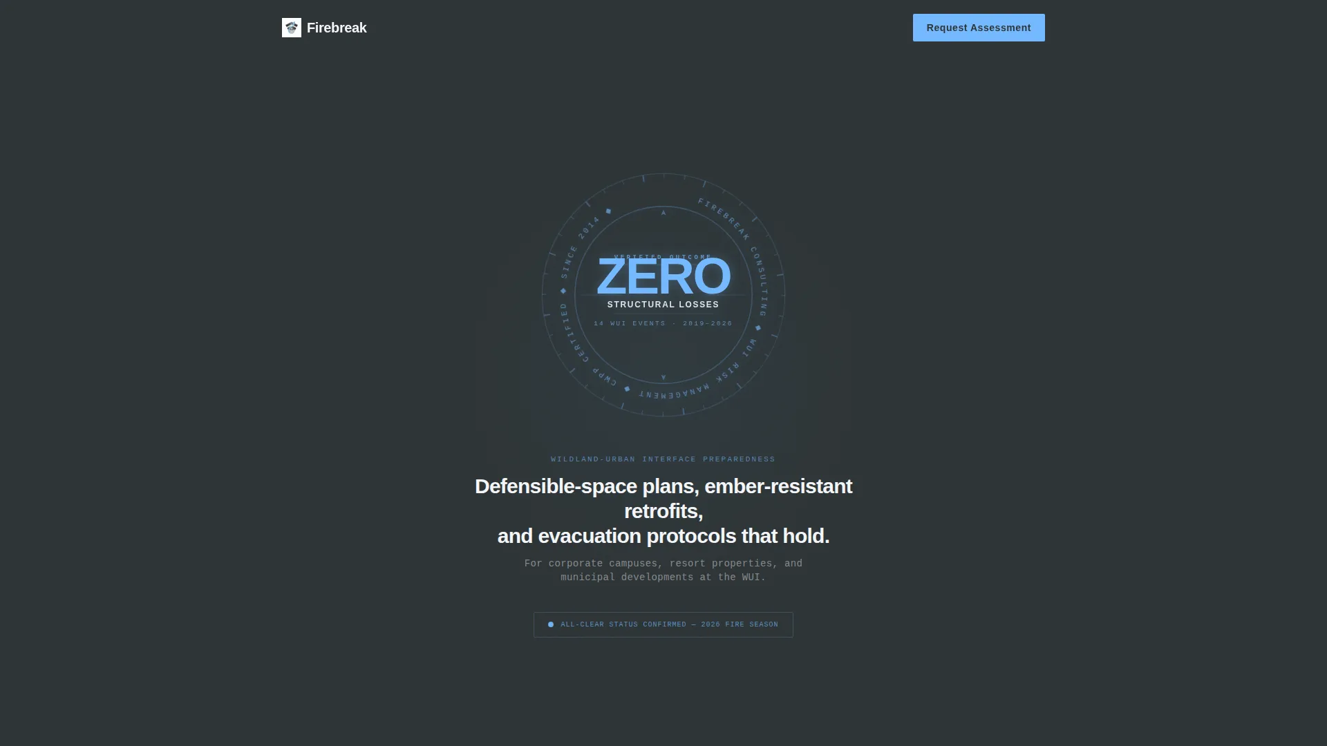
The opening section centers a large engineered seal element on a deep charcoal background. It reads a specific outcome claim in fine typographic detail, with a single white descriptor line below it. There is no photography and no fire imagery. The restraint communicates confidence in a way stock visuals cannot.
Escalating Case Study Narrative Flow
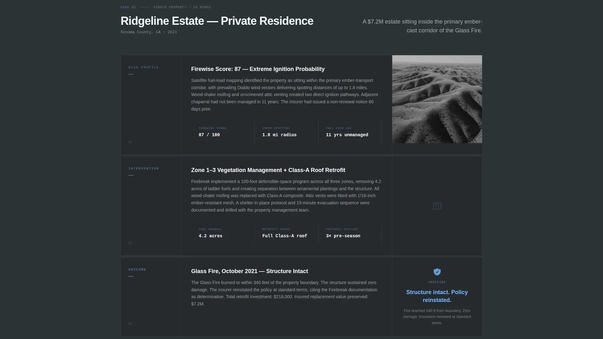
Three sequential case study sections each follow the same three-beat structure: risk profile, intervention, and outcome. The subjects scale from a single private estate to a sixty-unit homeowners association (HOA) to a full municipal district. This progression shows prospects that the methodology holds regardless of asset size.
Single-Stat Interstitials
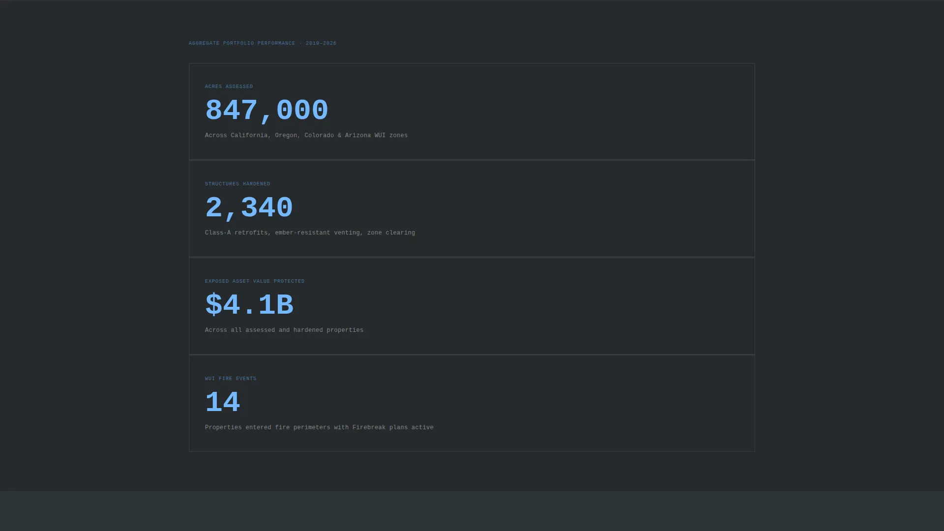
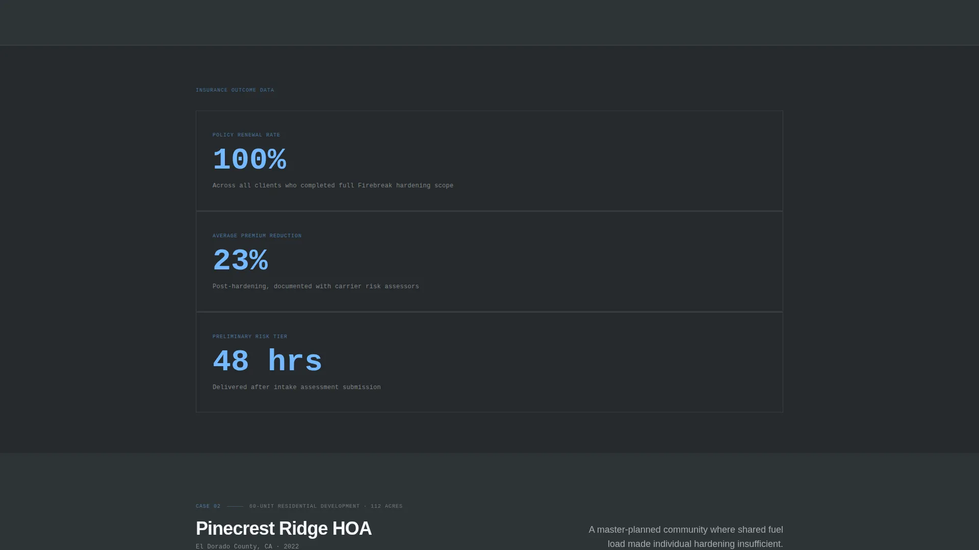
Between each case study, a full-width interstitial displays one hard number in sky blue text on a slate background. Examples include acres assessed, structures hardened, and total exposed asset value protected. These breaks give readers a moment to absorb scale before the next case builds on it.
Dual-Path Conversion Section
The primary call to action, "Request a Vulnerability Assessment," appears after the second case study and again in the closing section. The form captures organization name, property type via dropdown, approximate acreage, and a free-text field labeled "Primary Concern." A secondary path offers a downloadable PDF titled "Download Our WUI Risk Framework," gated behind a business email field.
Corporate Precision Color System
The palette uses deep charcoal slate as the primary background, brushed graphite for secondary panels, high-altitude sky blue as the sole accent on calls to action and data callouts, and controlled white for body text. Nothing in the design competes with the content. Every visual decision reinforces the calm authority of a firm that operates in high-stakes environments.
Property Type Dropdown Field
The assessment request form includes a dropdown for property type with five options: corporate campus, hospitality and resort, residential development, municipal and public, and insurance portfolio. This field helps the consultancy qualify leads immediately and routes each inquiry to the right engagement track.
Page sections overview
| Section | Purpose |
|---|---|
| Guarantee Badge Header | Opens with a documented outcome claim rendered as an engineered seal |
| Service Descriptor Line | Names the consultancy service in plain, direct language |
| Case Study One | Presents a single-estate engagement across risk, intervention, and outcome |
| Stat Interstitial One | Delivers one hard data point in sky blue on slate |
| Case Study Two | Scales the narrative to a sixty-unit HOA engagement |
| Primary call to action Form | Captures the vulnerability assessment request after the second case study |
| Stat Interstitial Two | Delivers a second hard data point to sustain momentum |
| Case Study Three | Scales the methodology to a full municipal district engagement |
| Stat Interstitial Three | Closes the evidence wall with a third cumulative data point |
| PDF Download Gate | Offers the WUI Risk Framework behind a business email field |
| Closing call to action Section | Anchors the vulnerability assessment form with a final conversion prompt |
Design & branding system
The visual system is built around what the brief calls Corporate Precision. Every design choice communicates measured confidence rather than urgency.
- Color palette: deep charcoal slate (#2D3436) for primary backgrounds, brushed graphite (#636E72) for secondary panels, high-altitude sky blue (#74B9FF) exclusively for calls to action and data callouts, and controlled white (#F5F6FA) for text and spacing
- Typography: fine typographic detailing inside the guarantee badge, plain white body text throughout, no decorative or warm-toned elements anywhere in the layout
- No photography or fire imagery appears anywhere on the page; the guarantee badge and stat interstitials carry all visual weight
Mobile & speed optimization
The single-column layout is inherently well-suited to mobile viewing. Every section stacks cleanly without requiring a horizontal grid to function.
- The full-width interstitial stat blocks and the badge header scale proportionally across screen sizes, preserving visual hierarchy on smaller displays
- The conversion forms, including the dropdown and the email gate, are designed for straightforward interaction on touch devices without pinching or horizontal scrolling
How this template helps you convert
This template is engineered to feel like due diligence rather than a sales pitch. By the time a reader reaches the form, the case for action is already built.
- The guarantee badge opens with a specific outcome claim that immediately separates the consultancy from competitors who lead with fear. Skeptical institutional buyers respond to proof, and the page delivers it before anything else is asked of them.
- The escalating case study structure mirrors the way risk managers evaluate vendors: does this firm have experience with assets like mine, at a scale I recognize? Each case study answers that question directly, and the stat interstitials give readers a shorthand summary they can carry into an internal meeting.
- The dual-conversion design captures buyers at two different stages of readiness. Prospects ready to engage submit the vulnerability assessment form. Prospects still researching download the WUI Risk Framework PDF and enter a nurture sequence. Neither path feels like a push.
Other information about this template
This template is built on a Business Continuity Planning intersection, meaning its structure and tone are calibrated for organizations that treat wildfire exposure as an operational risk, not just a property concern.
- The page is categorized under Safety and Emergency, subcategory Emergency Preparedness, which aligns it with institutional procurement and risk management decision processes
- The creative direction is Case Study Narrative, a format that transfers well to any consultancy or professional services firm that can document client outcomes with specificity
- The template style follows a single-column scroll flow, making it straightforward to adapt the case study sections to new client engagements as the consultancy's portfolio grows
- The header concept, the Guarantee Badge, is reusable across service verticals where a firm can point to a documented track record rather than aspirational brand messaging
Theme
Service Utility
Creative direction
Case Study Narrative
Color system
Charcoal & Amber
Style
Card Grid (Modular)
Direction
Partnership/B2B
Page Sections
Guarantee Badge Opening Header
Escalating Case Study Narrative
Single-stat Interstitial Blocks
Dual-path Conversion Design
Corporate Precision Color System
Related questions
Can I update the case studies with my own client outcomes?
What types of organizations is this landing page designed for?
Can the PDF download gate be removed or replaced?
Is the vulnerability assessment form connected to any specific tool?
Does the page work if I only have one or two case studies right now?