Reliable Handyman | Free Website Template | Rocket
Fixwright is a split-screen landing page template built for Denver handyman services targeting property managers and commercial landlords. It uses an editorial magazine layout with a Charcoal and Amber color system, case study narrative sections, and a B2B vendor onboarding form, all designed to turn maintenance credibility into signed vendor agreements.
by Rocket studio
Quick summary
Fixwright is a single-page, split-screen (50/50) landing page template for a Denver handyman service. It speaks directly to property managers, HOA boards, and commercial landlords. The editorial magazine design pairs documented proof, photos, datelines, testimonials, with a vendor onboarding form that converts qualified leads into ongoing maintenance partnerships.
Who this template is for
This template is built for handyman operators who already work at property-management scale and need a page that reflects that credibility. It suits crews running multiple concurrent jobs, not solo operators chasing one-off residential calls.
- Property-focused handyman businesses serving multifamily units, HOAs, or commercial landlords
- Small but professional crews ready to pitch themselves as a reliable vendor, not a day-labor option
- Denver-area trade service providers replacing informal referral pipelines with a proper B2B presentation
What problem this template solves
Property managers rarely hand vendor accounts to contractors they found online with no documented track record. A basic contact-form page does not close that trust gap. This template solves the credibility problem before the form ever appears.
- Maintenance backlogs pile up because managers cannot find one vendor who handles scope variety at scale
- Generic service pages fail to show documented proof, so managers stay skeptical and keep chasing alternatives
- The B2B sales cycle requires more than a phone number, it needs scope examples, client proof, and a clear onboarding path
What you get with this template
You get a fully structured landing page that leads with documented evidence and closes with a clean vendor intake form. Every layout decision supports the case that this crew is already operating at property-management scale.
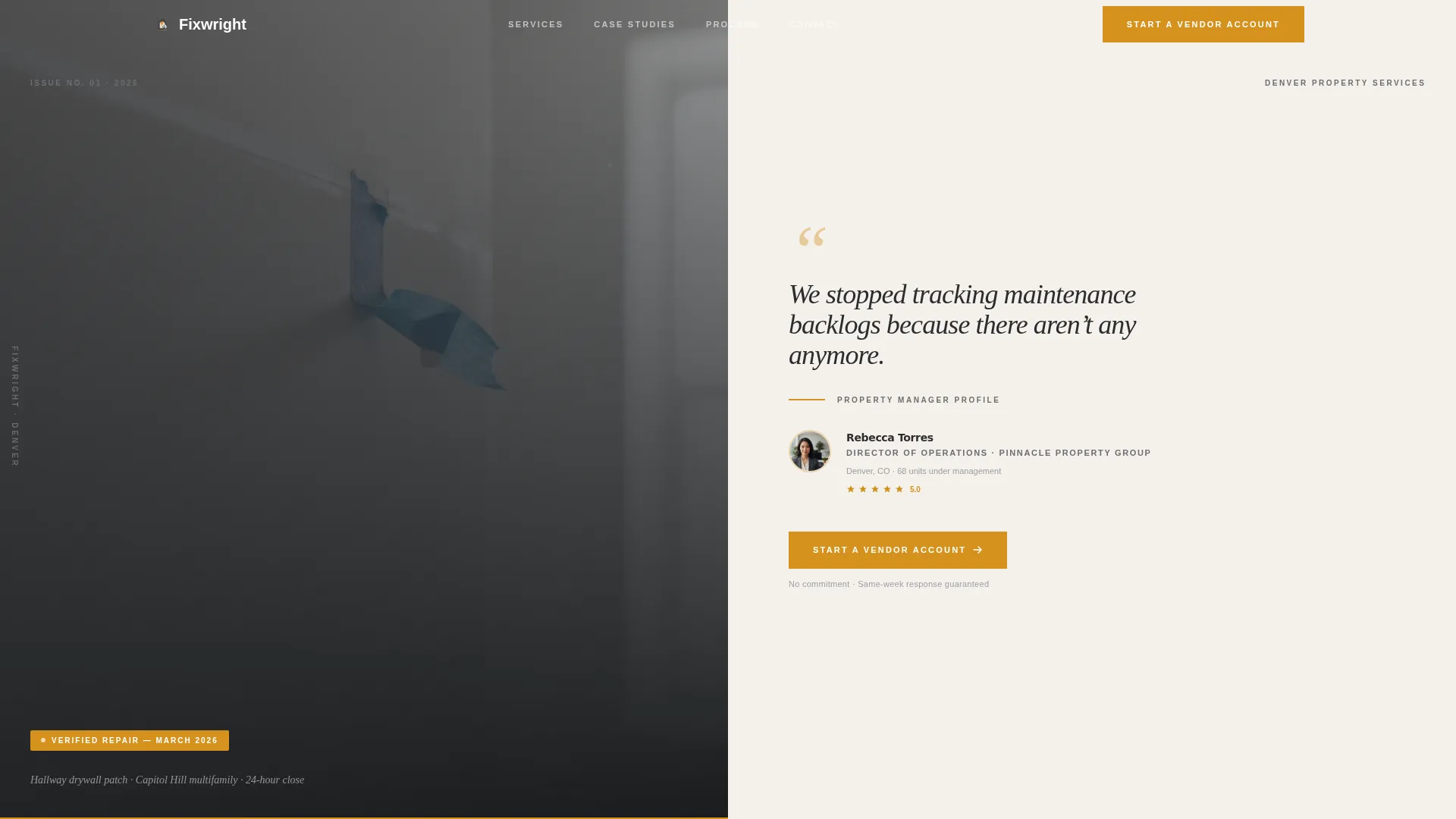
- A testimonial card header with a crisp repair photo and a named property manager pull-quote
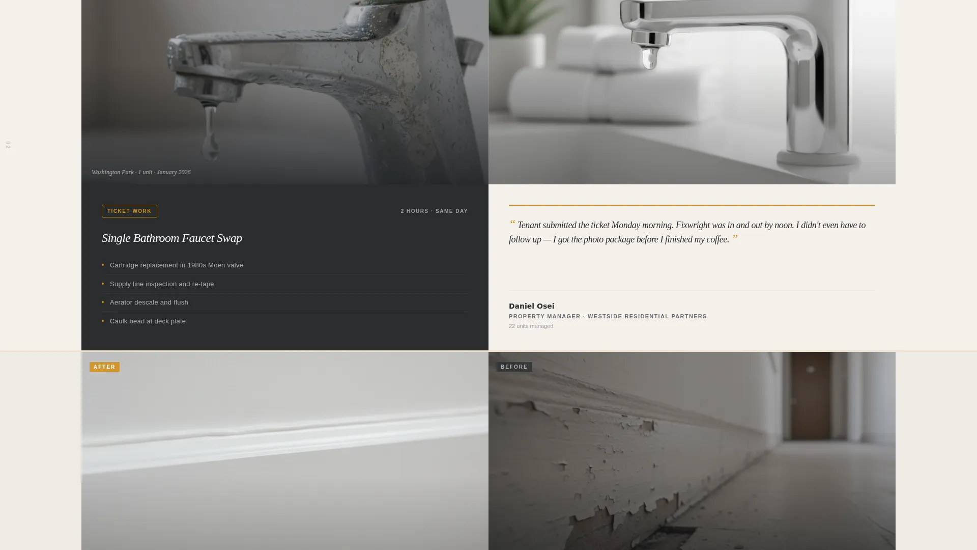
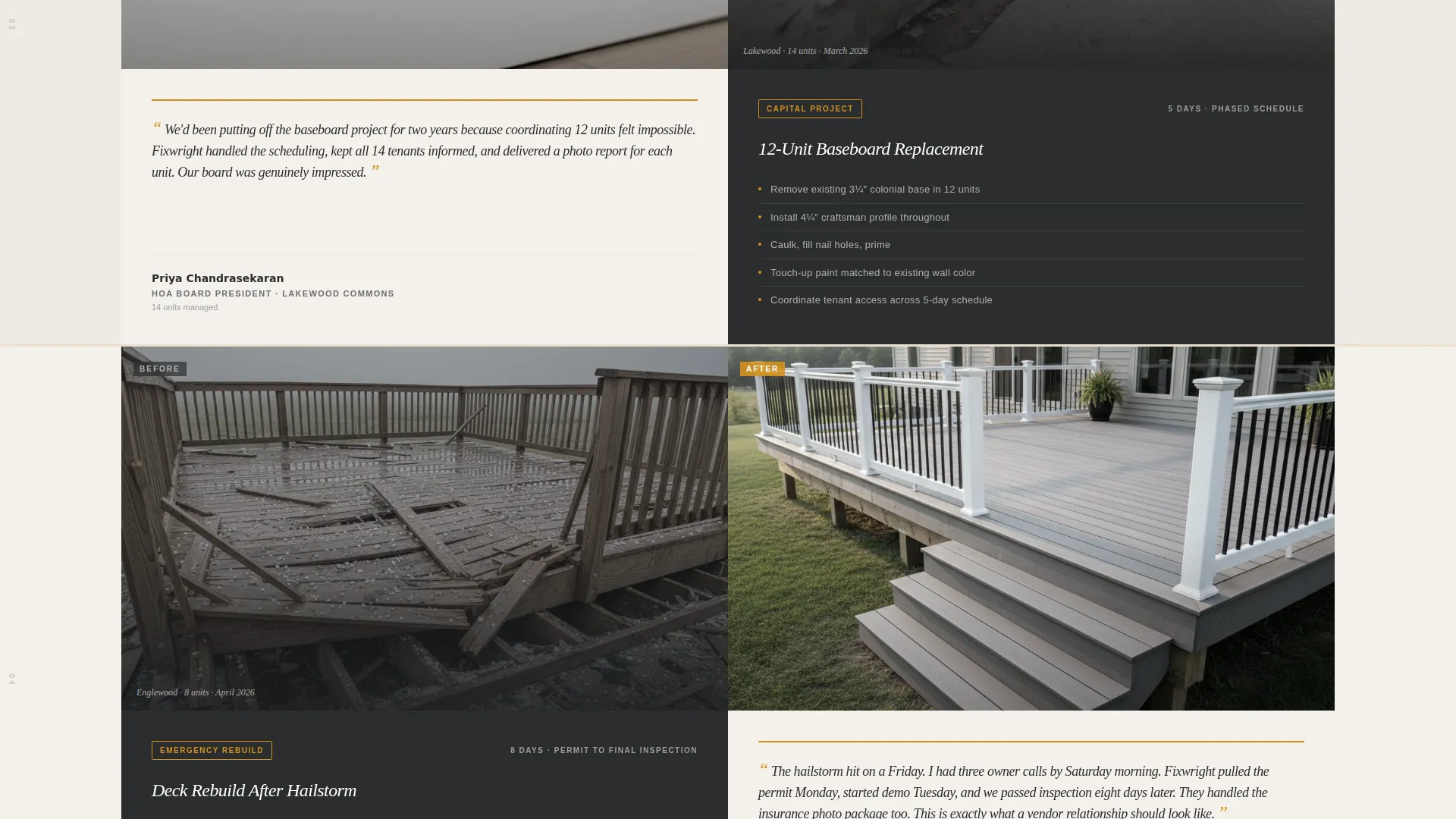
- Three escalating case study sections, each split 50/50 between before-and-after visuals and written proof
- A fixed vendor onboarding form with a portfolio-size dropdown and a free-text pain-capture field
Feature list
This template is built around a clear set of purposeful components. Each one earns its place by doing a specific job in the B2B conversion sequence.
Split-Screen Editorial Layout
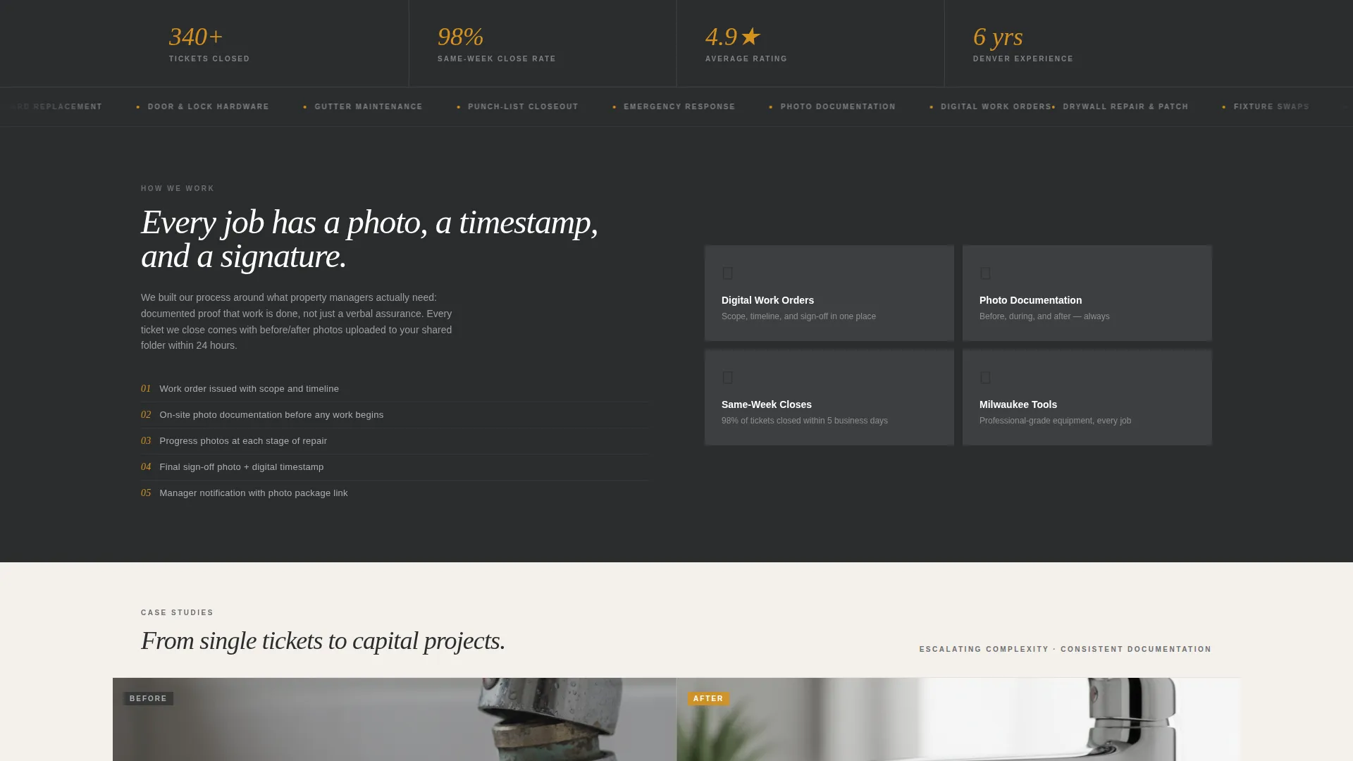
Every section divides the viewport into two equal panels. The left panel holds visual proof, repair photos, scope bullets, and datelines. The right panel holds written proof, testimonials, outcome summaries, and the onboarding form. Nothing is decorative unless it also informs.
Testimonial Card Header
The page opens with a close-cropped photo of a completed repair on the left and an oversized editorial pull-quote on the right. The quote carries a named property manager, a unit count, and a small star rating, formatted like a magazine sidebar profile, not a generic review widget.
Escalating Case Study Sections
Three self-contained case study blocks scroll in order of increasing complexity: a single faucet swap, a 12-unit baseboard replacement, then an emergency deck rebuild. Each block includes a before photo, scope bullet list, project timeline, after photo, and a one-paragraph manager testimonial. The sequence proves the crew scales from routine tickets to capital projects.
Editorial Detail System
Thin amber rule lines separate sections. Small italic datelines note location, unit count, and month. Running issue numbers appear in the margin like a print magazine. These details reinforce the "documented everything" narrative without adding copy clutter.
Fixed B2B Vendor Onboarding Form
After the second case study, a fixed right-panel form captures company name, portfolio size via dropdown (1-10, 11-50, 51-200, 200+ units), and a free-text field labeled "What's piling up?" The primary call to action reads "Start a Vendor Account", framing the interaction as onboarding, not inquiry.
Secondary Conversion Path
Below the main form, a plain-text link reads "Download Our Rate Card." This gives portfolio managers and HOA board members a lower-commitment next step when they need to present numbers before signing a vendor agreement.
Page sections overview
| Section | Purpose |
|---|---|
| Testimonial Card Header | Opens with repair photo and named pull-quote to establish credibility immediately |
| Case Study One | Documents a single faucet swap with scope, timeline, and manager testimonial |
| Case Study Two | Escalates to a 12-unit baseboard project, proving multi-unit capacity |
| Case Study Three | Caps the proof sequence with an emergency deck rebuild after a hailstorm |
| Vendor Onboarding Form | Captures company name, unit count, and immediate pain point via fixed right panel |
| Rate Card Link | Offers a secondary, low-commitment conversion path for board-approval situations |
Design & branding system
The visual identity follows an editorial magazine theme anchored in a Charcoal and Amber color system. The palette feels like a well-organized tool chest: each color has a clear function and nothing is placed purely for decoration.
- Deep workshop charcoal (#2B2D2F) anchors headers and left-panel backgrounds; warm amber (#D4911E) drives calls to action and pull-quote highlights
- Weathered drywall white (#F4F0EB) fills right-panel fields and body copy areas; tool-steel gray (#6B6E72) handles secondary text and divider rules
- Editorial serif typography carries the oversized pull-quote; the overall type system reinforces the "work order binder" confidence the brand voice requires
Mobile & speed optimization
The split-screen layout is structured to reflow cleanly on smaller viewports, so property managers reviewing vendor options on a phone or tablet still get the full proof sequence without broken panels or cut-off form fields.
- Each 50/50 panel stacks vertically on mobile, keeping photos above their paired text so the case study narrative stays readable
- The fixed vendor form adapts to a sticky bottom bar on narrow screens, keeping the primary call to action reachable throughout the scroll
- Lightweight editorial details, rule lines, datelines, margin numbers, do not add heavy assets, keeping the page visually rich without unnecessary load weight
How this template helps you convert
This template is engineered around one conversion goal: turning a skeptical property manager into a signed vendor account. Every layout choice supports that sequence.
- The testimonial card header front-loads the strongest social proof before a visitor reads a single service claim, establishing trust in the first scroll position.
- The escalating case study sequence answers the two biggest vendor-selection questions, "Can they handle my volume?" and "Do they document their work?", before the form appears.
- The dual conversion path (vendor account form plus rate card download) meets managers at different stages of the approval process, reducing drop-off from buyers who need board sign-off first.
Other information about this template
This template is specifically scoped for a Denver handyman service operating in the property-management market. A few additional details are worth knowing before you customize it.
- The page is single-page in structure, meaning all content lives in one scrollable flow rather than across multiple linked pages
- The "What's piling up?" free-text field is intentionally open-ended, designed to surface the specific maintenance backlog each manager is sitting on
- The rate card link sits below the main form as plain text, keeping visual hierarchy clean while offering a genuine alternative path for board-dependent buyers
- The editorial magazine theme is a deliberate contrast to typical trade-service websites, signaling that this crew operates with documentation discipline, not just tool competence
- The template is built for the Denver local services market but the layout and content structure transfer cleanly to any metro-area handyman business targeting property managers
Theme
Editorial Magazine
Creative direction
Case Study Narrative
Color system
Charcoal & Amber
Style
Split Screen (50/50)
Direction
Partnership/B2B
Page Sections
Split-screen Editorial Layout
Testimonial Card Header
Escalating Case Study Sections
Fixed B2B Vendor Onboarding Form
Editorial Detail System
Secondary Rate Card Conversion Path
Related questions
Who is the primary audience for this landing page template?
What does the vendor onboarding form collect?
Can I use this template if I am not based in Denver?
What is the secondary conversion option on this page?
How are the three case studies structured?



