Craft Wellness Tonic Landing Page Template
The Sip Botanical Sparkling Tonic landing page template is a full-width immersive direct sales page for artisan non-alcoholic beverage brands. Built around a Luxe Minimal desert aesthetic, it guides visitors from a hand-illustrated hero through an ingredient origin story, flavor selector, and visual box builder, earning every purchase before a price ever appears on screen.
by Rocket studio
Quick summary
This template is a single-page direct sales experience built for a botanically-infused sparkling tonic brand. It opens with a full-viewport custom illustration of the Sonoran Desert, then walks visitors through ingredient origins, four flavor SKUs, a neighborhood intimacy story, and a visual 6- or 12-pack box builder. Every scroll section narrows the world from wide mesa horizon to a hand reaching for a bottle on a corner-store shelf.
Who this template is for
This template is made for founders, small-batch producers, and specialty beverage brands who want their website to do more than list products. It suits brands whose story is as important as the drink itself, and who need a direct sales path that feels as intentional as the product in the bottle.
- Small-batch non-alcoholic beverage brands selling directly to consumers
- Wellness-focused product founders launching in specialty grocery or studio retail channels
- Direct-to-consumer artisan brands who want to build a community around a lifestyle, not just a product line
What problem this template solves
Most beverage brand landing pages show a product shot and a price. That approach skips the part where the visitor actually starts to care. Sober-curious shoppers, yoga studio buyers, and dinner party hosts do not just want a drink, they want something that feels considered. This template solves the trust gap by leading with story, place, and ingredient before it ever asks for a purchase.
- Buyers leave pages that feel mass-produced, even when the product is genuinely artisan
- A brand with no neighborhood context loses the warmth that makes a specialty product feel worth the price
- Without a low-commitment entry path, first-time visitors often abandon their cart before completing a purchase
What you get with this template
You get a complete, ready-to-adapt landing page structured to guide visitors from curiosity to checkout. The layout is mobile-first, illustration-led, and built around six distinct content zones that each carry the visitor deeper into the brand world. Every section has a defined role in the sales journey.
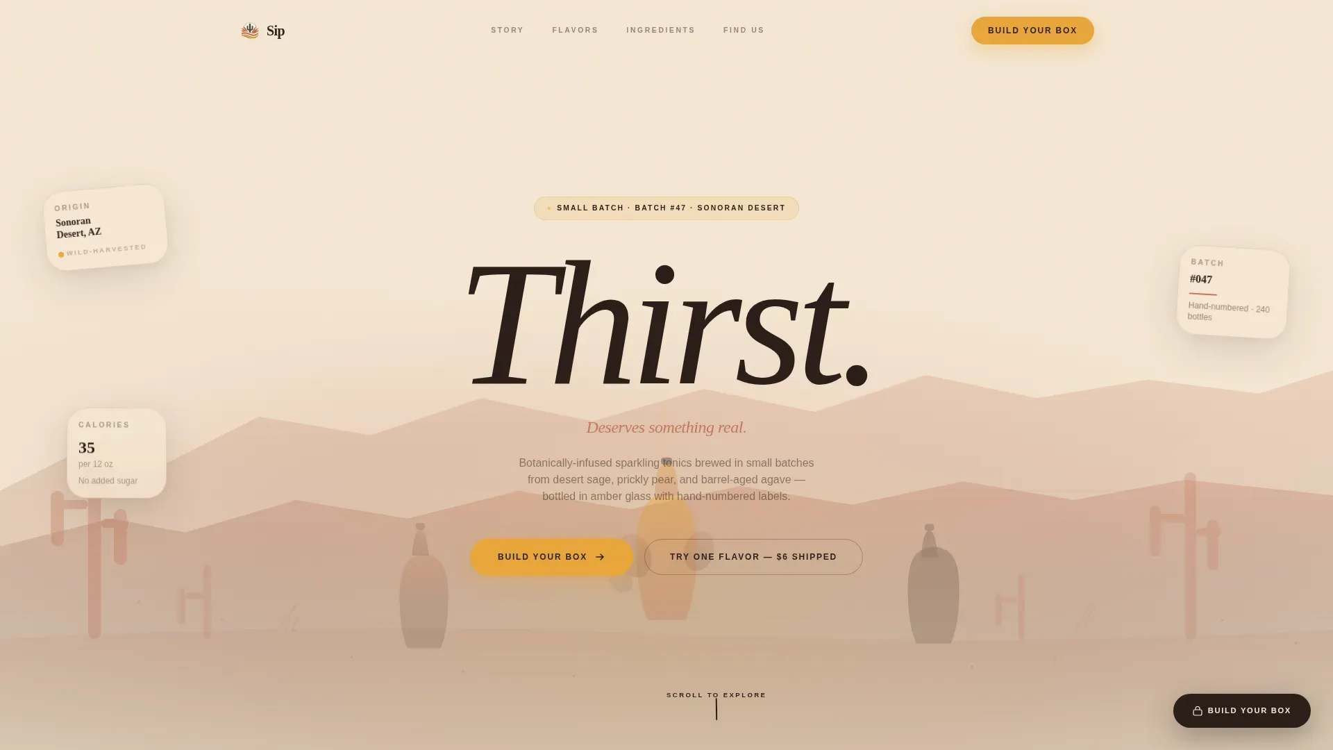
- A full-viewport SVG desert illustration hero with floating bottle elements and a centered handwritten headline
- A bento-grid ingredient origin section, a staggered asymmetric flavor card grid, a neighborhood story scene, and a visual box builder with drop micro-animations
- An ultra-minimal footer and a sticky "Build Your Box" call-to-action button anchored in deep saguaro shadow
Feature list
This template includes purpose-built components designed specifically for artisan direct-to-consumer beverage sales. Each feature reflects a deliberate choice about how health-focused, story-driven products earn trust and convert visitors.
Full-Viewport SVG Illustration Hero
The hero fills the screen edge to edge with a custom desert landscape rendered in ink lines and soft watercolor washes. Prickly pear fruits morph into bottle silhouettes. Sage brush curls into flavor vapor. The mesa horizon doubles as the navigation bar, and a single handwritten word floats center-screen. No photography is required to communicate where this drink comes from.
Scroll-Zoom Neighborhood Narrative
As visitors scroll, the illustration narrows from wide desert landscape into a specific corner-store scene. The journey moves from ingredient origin to a founder neighborhood story to a hand reaching for a bottle on a shelf next to a bowl of limes and a scratched countertop. This scroll-zoom process makes the brand feel genuinely local and handmade, not manufactured. Studies in consumer behavior confirm that showing products in warm, familiar life contexts helps people envision themselves using them.
Bento Grid Ingredient Origin Section
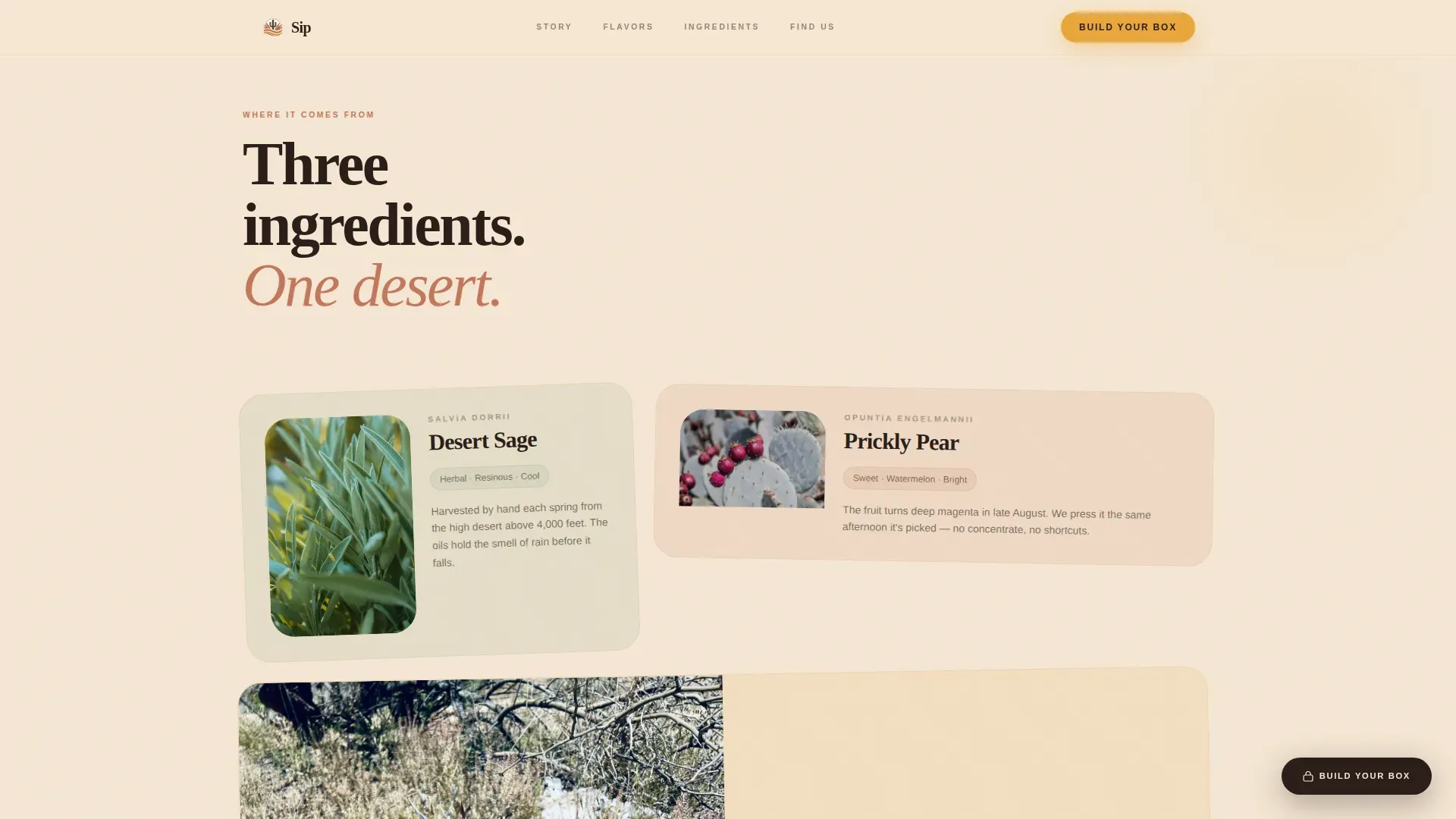
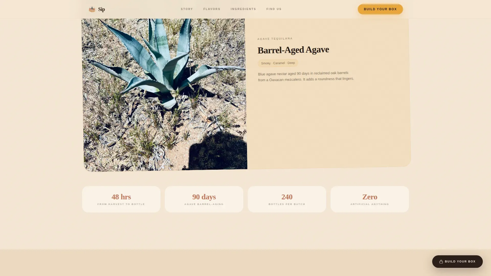
Three key ingredients, desert sage, prickly pear, and barrel-aged agave nectar, each get their own bento grid cell with origin copy. The layout lets visitors explore the science behind each botanical and understand what gives each sip its character. Health-focused beverages are increasingly incorporating functional ingredients, and this section communicates that story without relying on clinical language.
Staggered Asymmetric Flavor Card Grid
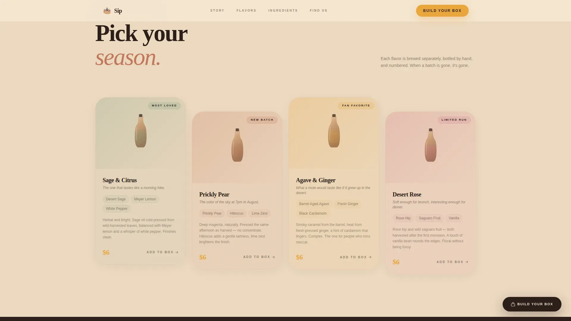
Four flavor SKUs are presented in an asymmetric card grid that creates visual energy without clutter. Each card describes the flavor experience and its tonic effects, framing benefits like calm focus or grounded energy rather than just listing ingredients. This approach reflects the broader wellness trend: consumers want to understand what a drink does for their body, not just what is in it.
Visual Box Builder with Micro-Animations
The box builder lets visitors tap illustrated bottles to fill a 6- or 12-pack. Each selection triggers a micro-animation of the bottle dropping into a crate. The experience makes the act of building an order feel tactile and satisfying, which helps reduce drop-off at the most critical moment in the purchase process. A secondary path, "Try One Flavor, $6 Shipped", gives commitment-shy visitors an easy first step without abandoning the cart.
Sticky Direct Sales Call to Action
A "Build Your Box" button stays anchored at the bottom of the screen once the flavor section loads. It uses the deep saguaro shadow color so it reads clearly against every section's warm palette. The sticky call to action ensures visitors always have access to the primary conversion path, no matter how far they have scrolled into the story.
Page sections overview
| Section | Purpose |
|---|---|
| Desert Hero Illustration | Opens the brand world with a full-viewport illustrated landscape and the handwritten word "Thirst" centered on screen |
| Ingredient Origin Bento | Tells the origin story of desert sage, prickly pear, and barrel-aged agave in a scannable grid layout |
| Flavor SKU Grid | Presents four flavor SKUs in a staggered asymmetric card layout with benefit-led descriptions |
| Neighborhood Story Scene | Narrows the scroll journey to a corner-store intimacy scene with a dual marquee running beneath |
| Visual Box Builder | Lets visitors build a 6- or 12-pack through an illustrated interactive selector with drop animations |
| Minimal Footer | Provides ultra-minimal brand close and navigation using a horizontal footer pattern |
Design & branding system
The visual identity follows a Luxe Minimal theme drawn entirely from the Sonoran Desert. Every color is pulled from the land itself, and every typographic choice reinforces the balance between warmth and restraint. The result is a brand that feels editorial without being cold.
- Sunset Mesa color system: sun-bleached sand (#F5E6D3) as the base, terracotta blush (#C2785C) for warmth, deep saguaro shadow (#2B1F1A) for contrast, and luminous amber (#E8A63B) reserved for buttons, price tags, and hover states
- Typography pairing: Fraunces serif display for headlines and Fraunces-to-DM Sans for body text, creating a rhythm between expressive editorial and clean readable prose
- Custom SVG illustration style using flowing ink lines and soft watercolor washes, with no product photography required in the initial hero
Mobile & speed optimization
This template is built mobile-first, reflecting the reality that most specialty beverage shoppers discover products while browsing in-store or on their phones. The layout prioritizes large tappable elements and a minimal checkout path so the experience never feels like a chore on a small screen.
- Mobile-first layout with large tappable buttons and minimized form fields throughout the box builder and flavor selector
- CSS scroll-behavior native animations and Intersection Observer reveals keep the scroll-zoom narrative smooth without heavy JavaScript dependencies
- SVG illustration parallax and dual marquee are implemented to maintain visual energy while staying within the performance envelope of a fast-loading page
How this template helps you convert
A high-converting direct sales landing page needs to earn trust before it asks for anything. This template structures the entire visitor journey around that principle, moving from emotion to credibility to action in a deliberate sequence.
- The hero section and scroll-zoom narrative build emotional resonance first, visitors feel the brand's world and gather a clear sense of its origin before a single price appears, which reduces the skepticism that causes early page exits.
- The flavor card grid and ingredient bento section address the key rational questions, what does it taste like, what does it do for my body, and where do these ingredients come from, so visitors arrive at the box builder already informed and ready to add items to their order.
- The sticky call to action combined with the low-commitment "Try One Flavor" secondary path captures both decisive buyers and hesitant first-timers, giving the page two conversion routes without diluting the primary message.
Other information about this template
This template belongs to the Food and Beverage category, specifically the non-alcoholic beverage brand niche. It is designed for direct sales and built to support the full lifecycle of a modern artisan beverage brand's online presence. Below are additional details that help round out the picture for anyone evaluating whether this template fits their plan.
- Your website is the only online platform you truly own and control. Unlike social platforms where algorithms decide who sees your content, a dedicated landing page keeps your brand narrative free from external interference. Securing a domain and email address that match your brand name are the first practical steps after choosing a template.
- Brand consistency across all platforms builds recognition and trust. Claiming social media handles that match your brand name, including your email domain, reinforces the same identity visitors see on your landing page. Gathering audience feedback on your brand name before you finalize packaging and digital assets can save significant rework later.
- A strong beverage brand name sets expectations for taste, quality, and price the moment someone reads it. The best names are short, phonetic, and scalable, allowing future expansion across a wider product line without a complete rebrand. Remember that your brand name is often the very first interaction a customer has with your product, so choosing it is the first defining act in your brand story.
- This template can support social proof elements such as hand-numbered batch callouts and a neighborhood retailer list. These kinds of trust signals, alongside a low-commitment entry offer, establish credibility and reduce buyer hesitation for first-time visitors.
- The template is built for the kind of brand that wants to gather a loyal community around shared values: wellness, intentional consumption, and a connection to the earth and the ingredients it produces. Tonic bars and artisan beverage brands that combine their product offering with events and community engagement find this template's intimacy-first structure especially well suited to their goals.
- For brands planning seasonal product drops or limited batch releases, the page structure can support urgency messaging. Limited-stock callouts and time-sensitive discounts can be added to the flavor grid or box builder section to encourage immediate action. Remember to check that any promotional copy aligns with your actual inventory and shipping commitments.
- The template pairs well with email list-building initiatives. Capturing visitor email addresses through a post-box-builder confirmation step or a low-commitment trial offer is a key channel for ongoing brand communication. Brand consistency across your landing page, email design, and any other platforms you use to reach buyers will reinforce recognition over time, whether visitors first find you in January, February, or any other month of the year.
- Facebook and other social platforms remain important discovery channels for specialty food and beverage brands. Your landing page should function as the destination those channels point toward, the hub where the full brand story lives, free from the limitations of a social post or a profile bio. Connecting your Facebook presence and email list to a single well-designed landing page gives you a more cohesive and controllable brand experience across all the platforms your audience uses.
- The science behind each ingredient in this template's content structure reflects a broader industry trend: health-focused beverage brands that explain the functional benefits of their ingredients, connecting body wellness outcomes to real botanical sources, build stronger trust with consumers who are reading labels and researching what they drink. Studies confirm that benefit-led copy outperforms ingredient-list copy for this audience.
- Reading through the full page experience, from the desert hero to the box builder, takes roughly two to three minutes, which is intentional. The scroll journey is calibrated so that by the time a visitor reaches the purchase step, they feel like they already know the brand. That journey is what earns the sale.
Theme
Luxe Minimal
Creative direction
Local & Neighborhood
Color system
Sunset Mesa
Style
Full-Width Immersive
Direction
Direct Sales
Page Sections
Full-viewport SVG Illustration Hero
Scroll-zoom Neighborhood Narrative
Bento Grid Ingredient Origin Section
Staggered Asymmetric Flavor Card Grid
Visual Box Builder with Drop Micro-animations
Sticky Direct Sales Call to Action
Related questions
Does this template require custom illustration work before launch?
Can I adjust the box builder for different pack sizes or pricing?
Is there a low-commitment purchase path for first-time buyers?
How does the template communicate shipping and return information?
Can I use this template if my brand also sells through specialty retailers?



