Norway Honeymoon Landing Page Template
Fjord is a dark, immersive single-column landing page built for a Norway honeymoon package. It guides newly married couples from first impression to booking consultation through slow, cinematic reveals. A sunset gradient palette, intimate macro photography, and unhurried whitespace create a page that feels less like a sales tool and more like an invitation.
by Rocket studio
Quick summary
Fjord is a single-column flow landing page for a Norway honeymoon package. It uses a dark immersive theme, a sunset gradient color system, and a curated collection creative direction to move couples from desire to a booking consultation click. Every scroll reveals one more reason to go, and none of it feels like a pitch.
Who this template is for
This template is built for honeymoon travel brands, boutique Norway tour operators, and luxury travel consultants who sell remote, high-end escapes. It speaks to an audience that has already dismissed the obvious destinations and wants something quieter, wilder, and more personal.
- Travel businesses offering curated Norway or Nordic honeymoon packages
- Luxury travel consultants presenting a single signature itinerary
- Boutique operators who sell experience over features and prefer story over spec
What problem this template solves
Most travel landing pages try to convince through volume, throwing bullet points, comparison tables, and countdown timers at couples who want to feel something first. Fjord solves the emotional gap between a dreamed trip and a booked one.
- Couples arrive already skeptical of generic honeymoon packages and need a page that earns trust through atmosphere, not pressure
- Travel brands struggle to communicate remoteness and exclusivity without resorting to clichés
- Standard templates cannot replicate the unhurried, intimate tone that high-end Norway travel demands
What you get with this template
You get a complete, ready-to-adapt single-column landing page structured around moment-by-moment itinerary reveals. The layout is designed so each section feels like the next frame of the same quiet film.
- A macro close-up hero section with an intimate two-hands photograph and a single headline
- Full-bleed itinerary reveal sections, each pairing a photograph with one sentence of copy
- A dual call-to-action system: a primary consultation button and a secondary email-capture path for couples still planning
Feature list
The template delivers a focused set of design and structural capabilities drawn directly from the source brief.
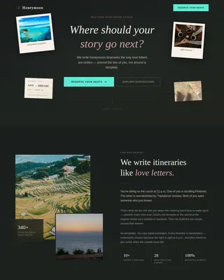
Macro Close-Up Hero Section
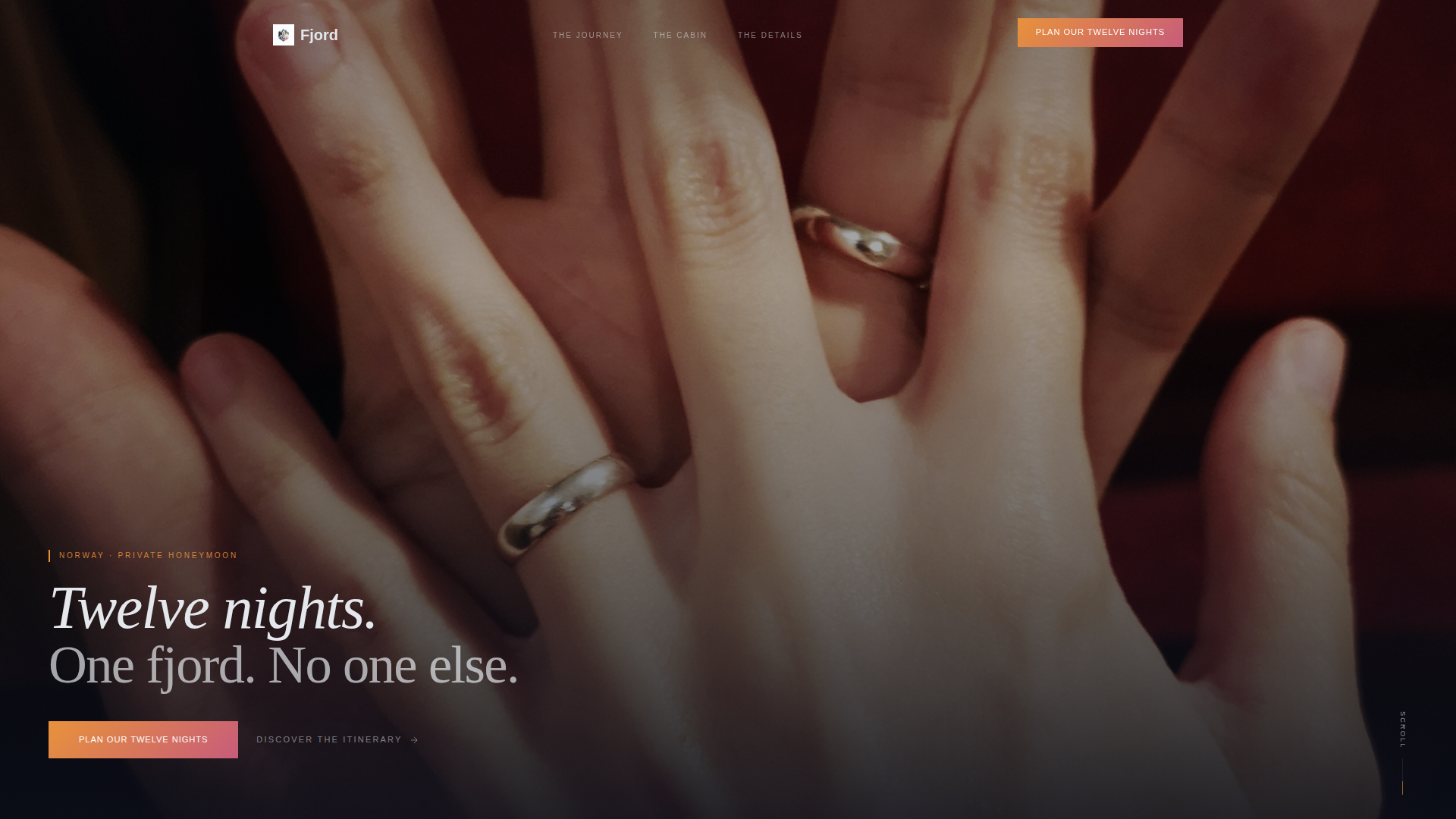
The header fills the viewport with an extreme close-up of two intertwined hands resting on weathered dock wood. Golden hour light catches the rings, and fjord water blurs softly beyond the fingertips. A single unhurried headline sits low in the frame: Twelve nights. One fjord. No one else.
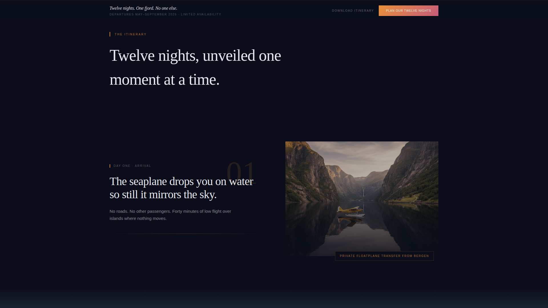
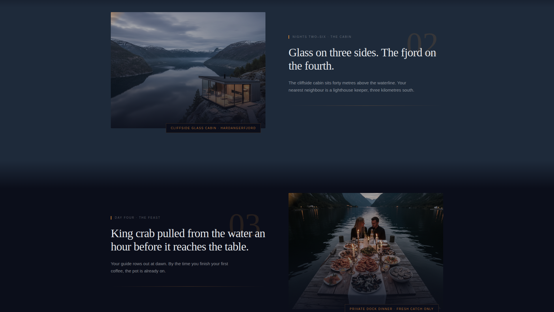
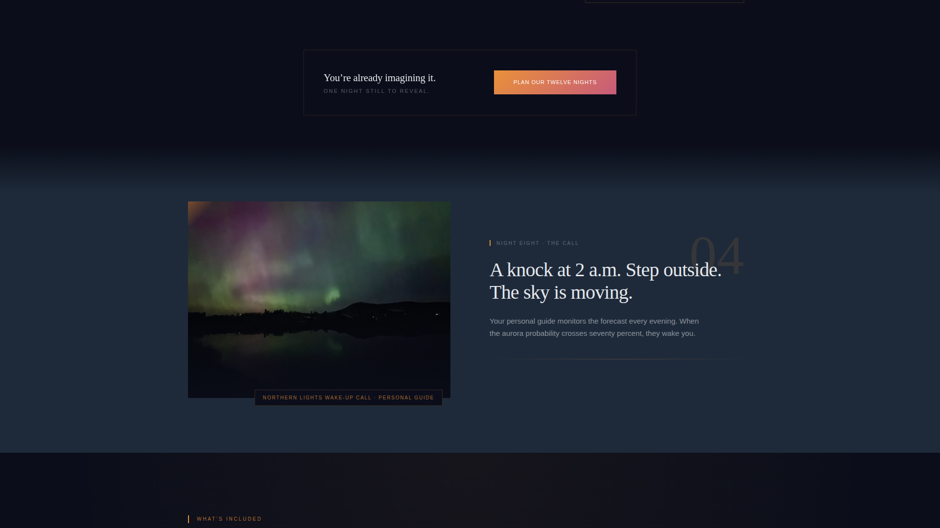
Curated Itinerary Reveal Flow
Each scroll step unveils one itinerary moment as a full-bleed photograph paired with a single descriptive sentence. The reveal sequence covers the private seaplane transfer, the cliffside glass cabin, the king crab feast, and the Northern Lights wake-up call. Staggered spacing mimics the slow, deliberate pace of the trip itself.
Dual Call-to-Action System
The primary call to action, "Plan Our Twelve Nights," appears after the third itinerary reveal and again as a fixed bottom bar once the visitor passes the page midpoint. A secondary path, "Download the Full Itinerary," captures an email address for couples who are still in the dreaming phase. Neither path uses a form on this page.
Sunset Gradient Color System
The palette moves from deep polar night through fjord slate to molten amber and lingering rose. Gradients appear sparingly, behind section transitions and inside call-to-action buttons, so every appearance carries visual weight. Text lives in a soft glacier white against dark backgrounds for clear contrast.
Generous Whitespace Pacing
Whitespace between itinerary reveals is deliberately wide. This slows the visual rhythm and encourages the visitor to linger on each moment before the next one surfaces. The pace of the page reflects the unhurried nature of the trip it is selling.
Click-Through Page Architecture
This is a click-through landing page with no embedded form. The primary call to action routes visitors to a short booking consultation page where they select travel month, cabin preference, and dietary needs. The clean single-column flow removes distractions and keeps attention on the itinerary story.
Page sections overview
| Section | Purpose |
|---|---|
| Hero Header | Sets intimate emotional tone with macro photograph and single headline |
| Itinerary Reveal One | Introduces the private seaplane transfer moment |
| Itinerary Reveal Two | Presents the cliffside glass cabin experience |
| Itinerary Reveal Three | Showcases the king crab feast pulled from the water |
| Primary call to action Block | First appearance of "Plan Our Twelve Nights" after reveal three |
| Itinerary Reveal Four | Delivers the Northern Lights wake-up call moment |
| Fixed Bottom Bar | Persistent call to action bar activates after visitor passes the page midpoint |
| Secondary call to action Path | "Download the Full Itinerary" email capture for undecided couples |
Design & branding system
The visual identity is built on a dark immersive theme that feels warm rather than cold. The palette draws from the long Norwegian twilight, where darkness and firelight exist together without contradiction.
- Colors: deep polar night (#0B0E1A) for backgrounds, fjord slate (#1E2A3A) for surface layers, molten amber (#E8913A) for gradient accents and button fills, lingering rose (#C75B7A) reserved for hover states and key accent lines, and glacier white (#E4E7EB) for body text
- Gradients are used sparingly and appear only behind section transitions and inside call-to-action buttons, preserving their visual impact each time they surface
- The macro close-up header concept prioritizes intimacy over scale, choosing texture and light over landscape and drone photography
Mobile & speed optimization
The single-column flow structure is inherently well-suited to smaller screens. The layout does not rely on complex grid arrangements that break on narrow viewports.
- Full-bleed section photographs and stacked reveal blocks translate cleanly to mobile without layout restructuring
- The fixed bottom bar call-to-action remains accessible at the bottom of the screen on all device sizes, keeping the primary conversion path always visible
- Generous whitespace between sections keeps the reading experience comfortable on both desktop and mobile displays
How this template helps you convert
Fjord converts by building desire through restraint. It never lists, never compares, and never counts down. It simply shows couples the trip until they are already inside it.
- The itinerary reveal structure delays the call to action until the visitor has experienced three full moments, so the prompt to book arrives when emotional investment is already high
- The dual call-to-action system captures two types of buyers: couples ready to consult now and couples still researching, ensuring no visit goes without a next step
Other information about this template
This template sits at the intersection of Norway travel and luxury honeymoon package design. It is built for a single, signature itinerary rather than a multi-option catalog page.
- The template style is Single Column Flow, which keeps the narrative linear and the visual hierarchy clear from top to bottom
- The creative direction is Curated Collection, meaning sections function as curated reveals rather than informational blocks
- The header concept is Macro Close-Up, a deliberate departure from wide-angle landscape photography that emphasizes intimacy and texture over scale
- The landing page direction is Click-Through, routing the primary conversion to a separate booking consultation page rather than handling form submission on-page
- The theme is Dark Immersive, a design choice that signals exclusivity and aligns with the dramatic natural lighting of the Norwegian midnight sun and Northern Lights environments
- This template is appropriate for presenting a single twelve-night Norway honeymoon package and is not structured for multi-destination or catalog-style travel offerings
Theme
Dark Immersive
Creative direction
Curated Collection
Color system
Sunset Gradient
Style
Single Column Flow
Direction
Click-Through
Page Sections
Macro Close-up Hero Section
Curated Itinerary Reveal Flow
Dual Call-to-action System
Sunset Gradient Color System
Click-through Page Architecture
Related questions
Does this template include a booking form?
Can I adapt this template for a different honeymoon destination?
What types of itinerary moments does the template support?
Who is the secondary call-to-action path designed for?
Is this template suited for a multi-package travel catalog?