Rheumatologist Professional Website Template
Flare is a single-column landing page template built for rheumatologists who want to educate and reassure patients. It presents autoimmune conditions in plain, sensation-first language, guides visitors through honest treatment pathways, and drives engagement with an eight-step symptom assessment and an inline newsletter opt-in. The design feels calm, clinical, and deeply human.
by Rocket studio
Quick summary
Flare is a calming, patient-focused landing page template for rheumatology condition and treatment libraries. It translates the complexity of autoimmune disease into readable condition profiles, honest treatment flowcharts, and a conversational symptom assessment. Built for single-column scroll, it moves visitors from fear and confusion toward clarity and action.
Who this template is for
This template is designed for rheumatologists, patient-education publishers, and digital health practices that want to meet newly diagnosed patients where they are, online, anxious, and searching for plain-language answers at any hour.
- Rheumatologists building a condition and treatment library for patients
- Digital health publishers creating autoimmune education resources
- Medical practices preparing patients for their first specialist appointment
What problem this template solves
Newly diagnosed autoimmune patients often encounter dense clinical language, scattered information, and no clear next step. This template replaces that experience with a structured, reassuring scroll that peels back medical opacity one layer at a time.
- Patients struggle to understand conditions like rheumatoid arthritis, lupus, and psoriatic arthritis in clinical terms
- Treatment options such as disease-modifying antirheumatic drugs and biologic escalation feel abstract without a clear visual sequence
- Visitors leave without acting because no clear, low-pressure conversion path exists
What you get with this template
You get a fully structured single-column landing page with five condition chapter cards, an eight-step symptom assessment modal, an inline newsletter opt-in section, and treatment pathway flowchart cards. Every section is built to feel warm, navigable, and trustworthy.
- Five condition profiles covering rheumatoid arthritis, lupus, psoriatic arthritis, gout, and ankylosing spondylitis
- An eight-step conversational symptom quiz with downloadable appointment summary output
- A persistent coral call-to-action bar and an inline newsletter opt-in between condition chapters
Feature list
This template packs a focused set of interactive and editorial features designed specifically for the rheumatology patient journey.
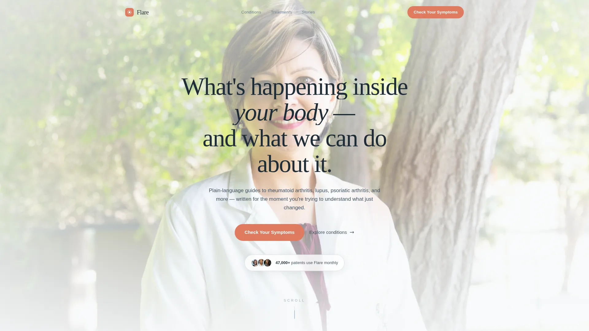
Portrait-Centered Hero Section
A softly lit, shoulders-up physician portrait sits at the top of the page with a shallow depth-of-field background. Below the portrait, a single reveal headline fades in to greet the visitor with calm authority and immediate human connection.
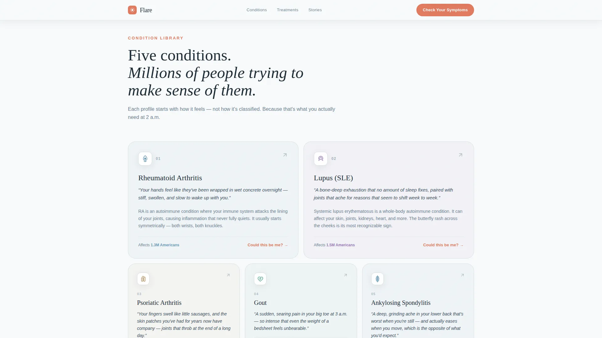
Sensation-First Condition Chapter Cards
Five condition cards present rheumatoid arthritis, lupus, psoriatic arthritis, gout, and ankylosing spondylitis using body-sensation descriptions instead of clinical definitions. Each card invites the visitor to click deeper into a condition profile.
Eight-Step Symptom Assessment Modal
The primary call-to-action opens a conversational eight-step quiz. It begins with a single disarming question about morning pain location, then progresses through duration, symmetry, family history, and current medications. Results map to two or three likely conditions with a confidence indicator and a printable appointment summary.
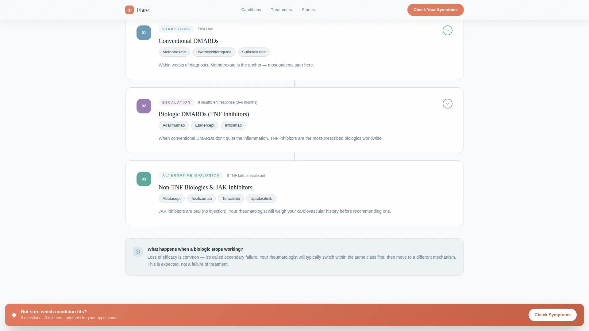
Treatment Pathway Flowchart Cards
Honest flowchart cards walk patients through first-line disease-modifying antirheumatic drug therapy, escalation to biologic treatments, and what happens when one approach fails. The language is plain and sequential, replacing fear with a sense of informed progression.
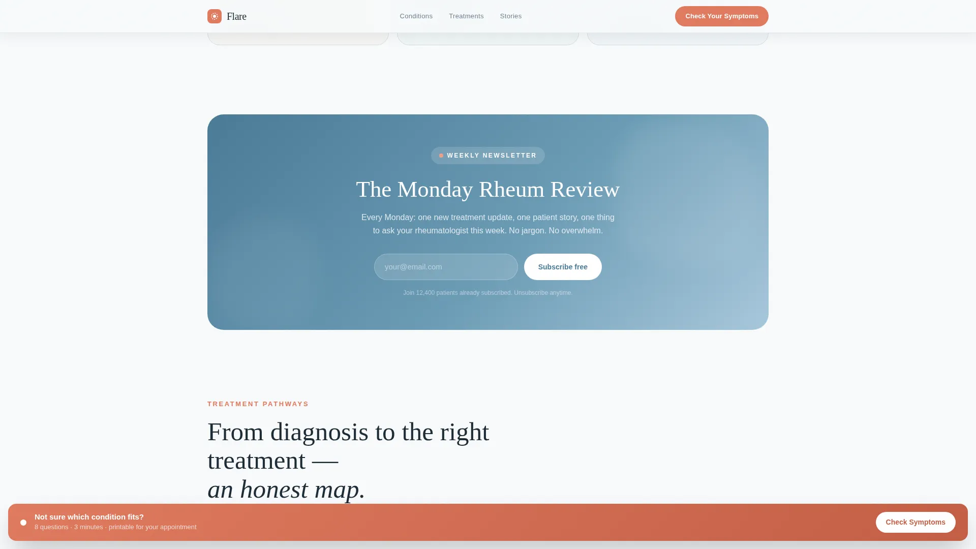
Inline Newsletter Opt-In
A "Monday Rheum Review" newsletter sign-up is embedded between condition chapters. It captures visitors who are not yet ready to take the full assessment, keeping them connected for ongoing patient education.
Persistent Coral Call-to-Action Bar
After the visitor scrolls past the second condition block, a coral-colored "Check Your Symptoms" bar appears at the bottom of the screen and pulses gently. It stays visible throughout the session, offering a low-friction re-entry point to the assessment at any time.
Page sections overview
| Section | Purpose |
|---|---|
| Hero portrait area | Introduces the physician and sets a calm, trustworthy tone |
| Condition chapter cards | Presents five autoimmune profiles in sensation-first plain language |
| Newsletter opt-in | Captures mid-funnel visitors with an inline email sign-up |
| Treatment pathway cards | Shows DMARD-to-biologic escalation in honest flowchart format |
| Patient voices | Reinforces trust with condition-specific testimonial quotes |
| Footer | Closes the page with horizontal flow branding and navigation |
Design & branding system
The visual identity follows an Organic Flow theme inspired by a Scandinavian physiotherapy clinic at dawn. The palette is light, breathing, and unhurried, using clinical whites and muted blues as a calm foundation, with coral reserved only for interactive prompts.
- Color palette: clinical snow (#F8FAFB) background, synovial blue (#6A9BB5) primary, living-warmth coral (#E07A5F) for interactive elements, and soft cartilage gray (#D6DDE3) for borders
- Typography: Fraunces serif for headlines to add warmth and depth, DM Sans for body copy to keep clinical text readable and approachable
- Scroll animation: GSAP ScrollTrigger powers staggered condition card reveals, clip-path text animations, and a parallax portrait effect in the hero
Mobile & speed optimization
This template is built mobile-first, recognizing that most autoimmune patients search for information on their phones, often late at night or between appointments.
- Single-column layout scales cleanly from small phone screens to large desktop displays without layout breakpoints disrupting readability
- Static sections use server-rendered components to keep the initial page load fast, while the assessment modal and scroll animations load as client components only when needed
How this template helps you convert
The page is designed around two conversion goals that respect where the visitor is emotionally. Every layout decision nudges toward one of those two actions without pressure.
- The persistent coral "Check Your Symptoms" bar activates after the second condition scroll, keeping the primary call-to-action visible without interrupting reading. The eight-step quiz ends with a downloadable summary the patient can bring to their appointment, giving the action real-world value.
- The inline newsletter opt-in sits between condition chapters, reaching visitors who are curious but cautious. It offers the "Monday Rheum Review" as a low-commitment entry point that builds an ongoing patient relationship.
Other information about this template
Flare is built as a Transparent Process template, meaning every design choice is oriented toward removing medical opacity rather than projecting clinical authority. The scroll feels like a slow, deliberate unveiling rather than a brochure.
- Template style: Single Column Flow for focused, distraction-free patient reading
- Header concept: Portrait-Centered hero with no stock photography or props, only a real physician face
- The assessment results feature a confidence indicator and a "Bring This to Your Appointment" downloadable summary for practical patient use
- Patient testimonial blocks include condition-specific quote context to reinforce credibility with visitors in similar situations
- Footer follows a horizontal flow pattern that keeps branding clean and closing navigation minimal
- The template is categorized under Health and Medical, specifically the Rheumatologist Website and Rheumatologist Condition and Treatment Library niche
Theme
Organic Flow
Creative direction
Transparent Process
Color system
Arctic White
Style
Single Column Flow
Direction
Quiz/Assessment
Page Sections
Portrait-centered Hero with Reveal Headline
Sensation-first Condition Chapter Cards
Eight-step Conversational Symptom Quiz
Treatment Pathway Flowchart Cards
Persistent Coral Call-to-action Bar
Inline Newsletter Opt-in Block
Related questions
Who is this landing page template designed for?
What does the eight-step symptom assessment produce for patients?
Can the template be used for fewer than five conditions?
What is the purpose of the inline newsletter opt-in?
What scroll and animation behavior does this template include?



