Chronic Pain Care Education Website Template
Flare is a single-column landing page template for a chronic pain digital therapy app. It combines an interactive five-question pain audit, evidence-backed science sections, and three progressive calls to action. Built on a Scandinavian clinical design system, it guides skeptical visitors from curiosity to free-trial signup through education rather than urgency.
by Rocket studio
Quick summary
Flare is a click-through landing page template for a chronic pain digital therapy app. It opens with a half-page hero, leads visitors through an interactive pain audit, explains the neuroscience behind pain retraining, and closes with a free-trial call to action. Every section earns trust through education before asking for any commitment.
Who this template is for
This template is built for digital health teams and solo founders launching a neuroscience-backed chronic pain app. It speaks directly to skeptical users who have already tried physiotherapy, medication, or generic wellness apps and found them lacking.
- Chronic pain app founders seeking credible, conversion-ready positioning
- Health product teams targeting office workers, fibromyalgia patients, or post-surgical recoverers
- Digital therapists or clinicians building a direct-to-consumer subscription product
What problem this template solves
Chronic pain audiences distrust wellness apps. They have seen too many vague promises and too few results. This template solves the credibility gap by leading with science, not marketing language.
- Visitors arrive skeptical; the pain audit immediately makes them feel seen and heard
- Generic landing pages fail to explain the method; this template names and explains graded motor imagery, pain neuroscience education, and somatic breathwork in plain terms
- Most health pages push a form too early; this template delays the ask until the visitor has already learned three techniques and seen the evidence
What you get with this template
You get a fully structured single-column landing page with five distinct content sections and a footer. Every section has a defined visual role and a clear narrative purpose, moving the visitor step by step from pain recognition to trial activation.
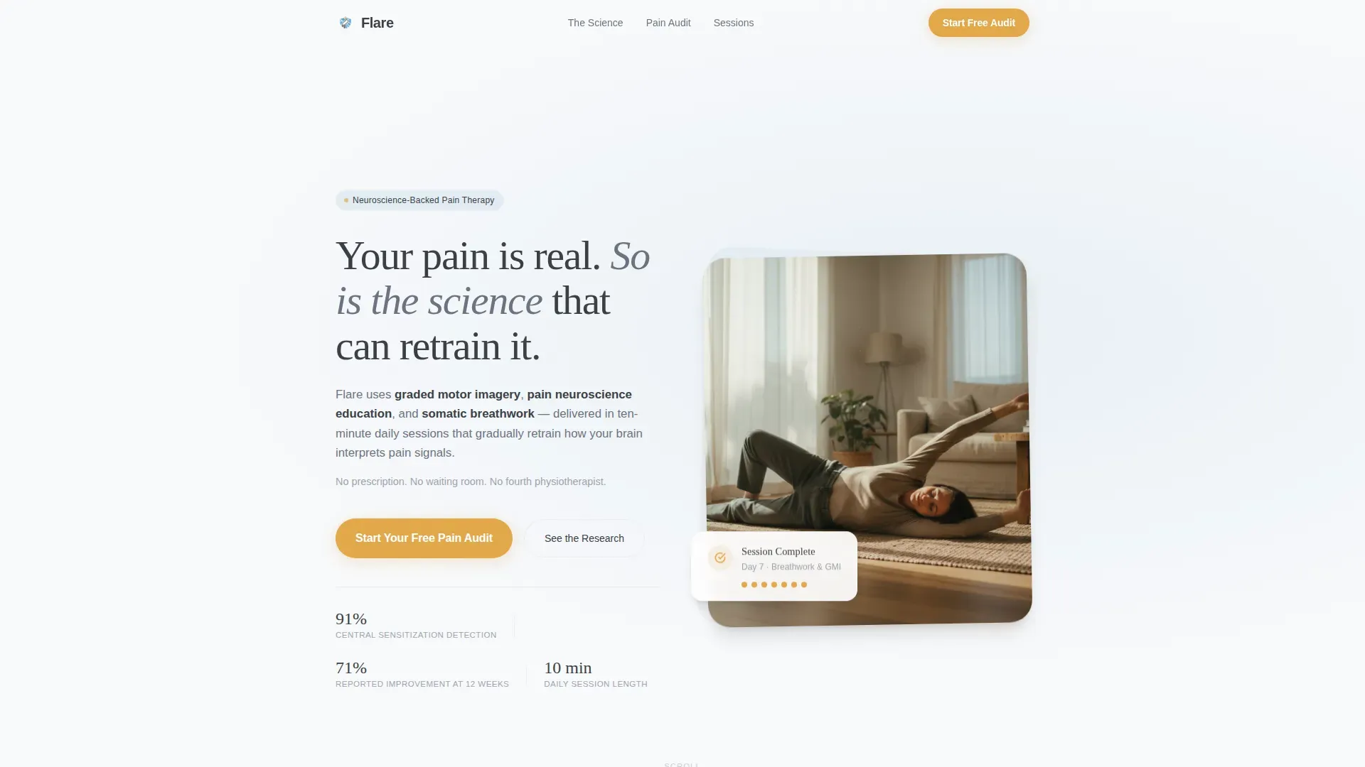
- A hero section with a parallax photo-and-text split, a glassmorphic audit card, and the primary amber call to action
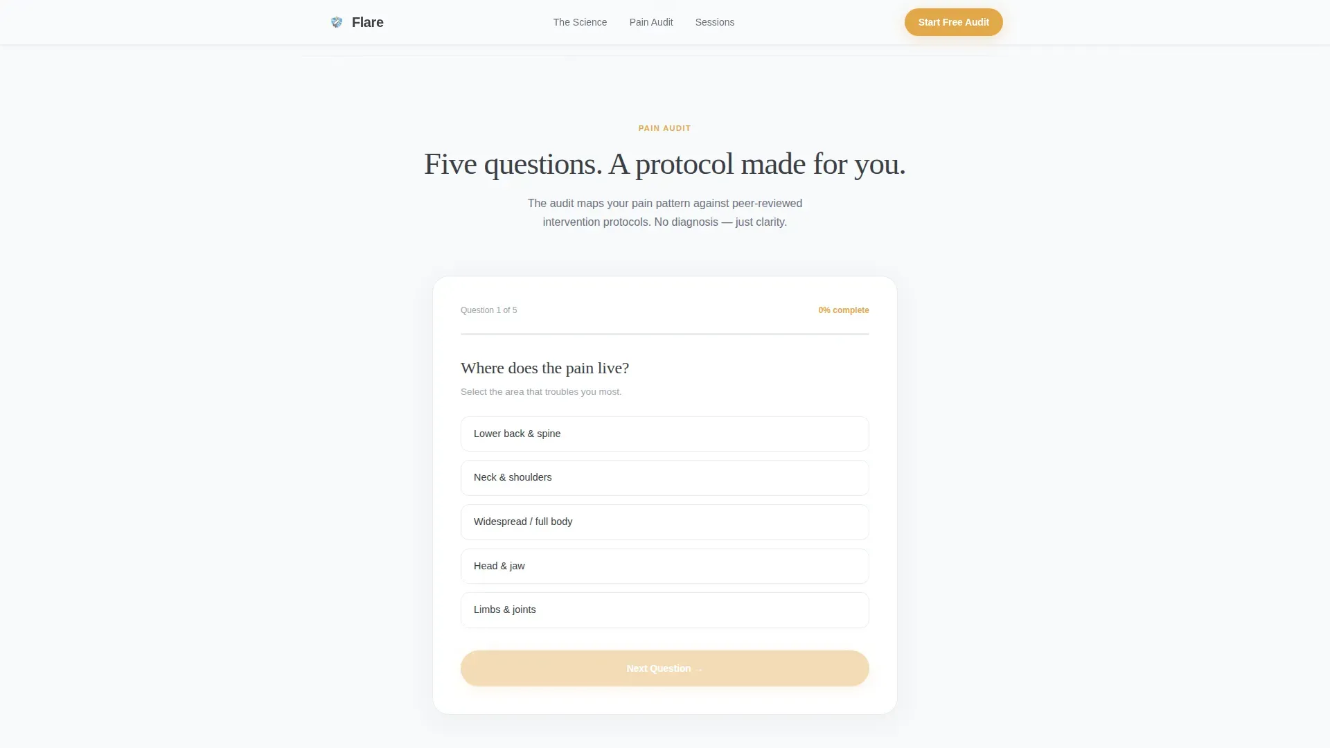
- An interactive five-question pain audit that transforms passive readers into active participants before the first scroll ends
- Three evidence-backed science blocks, a social proof section, a ten-minute session preview, and a finalizing call to action
Feature list
This template is built around a specific set of functional and visual components grounded in the source brief.
Interactive Five-Question Pain Audit
A quiz-style section that asks visitors where pain lives, how long it has stayed, and what they have already tried. Each answer maps to a later content section, making the page feel personally relevant rather than generic.
Three-Method Science Section
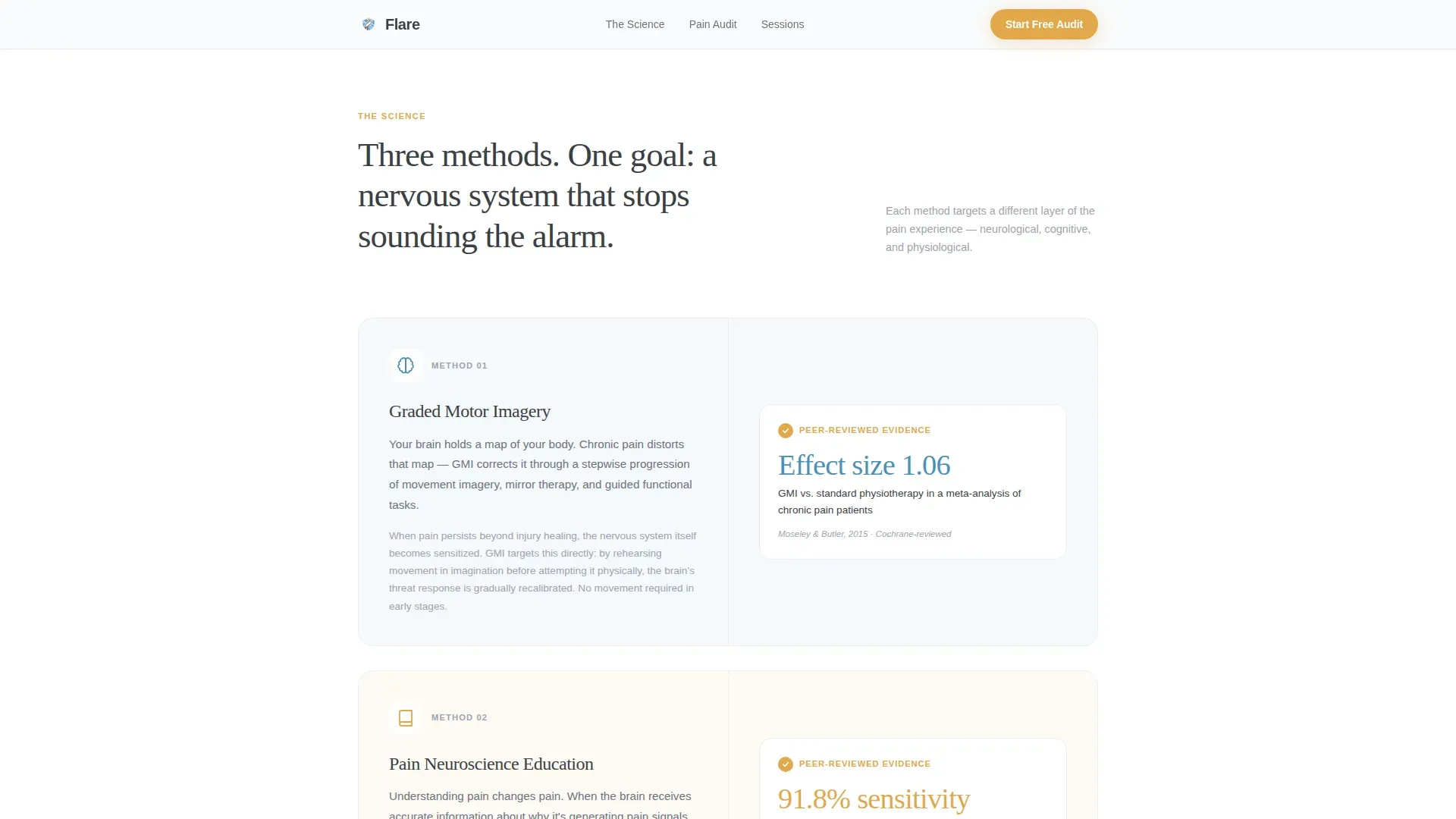
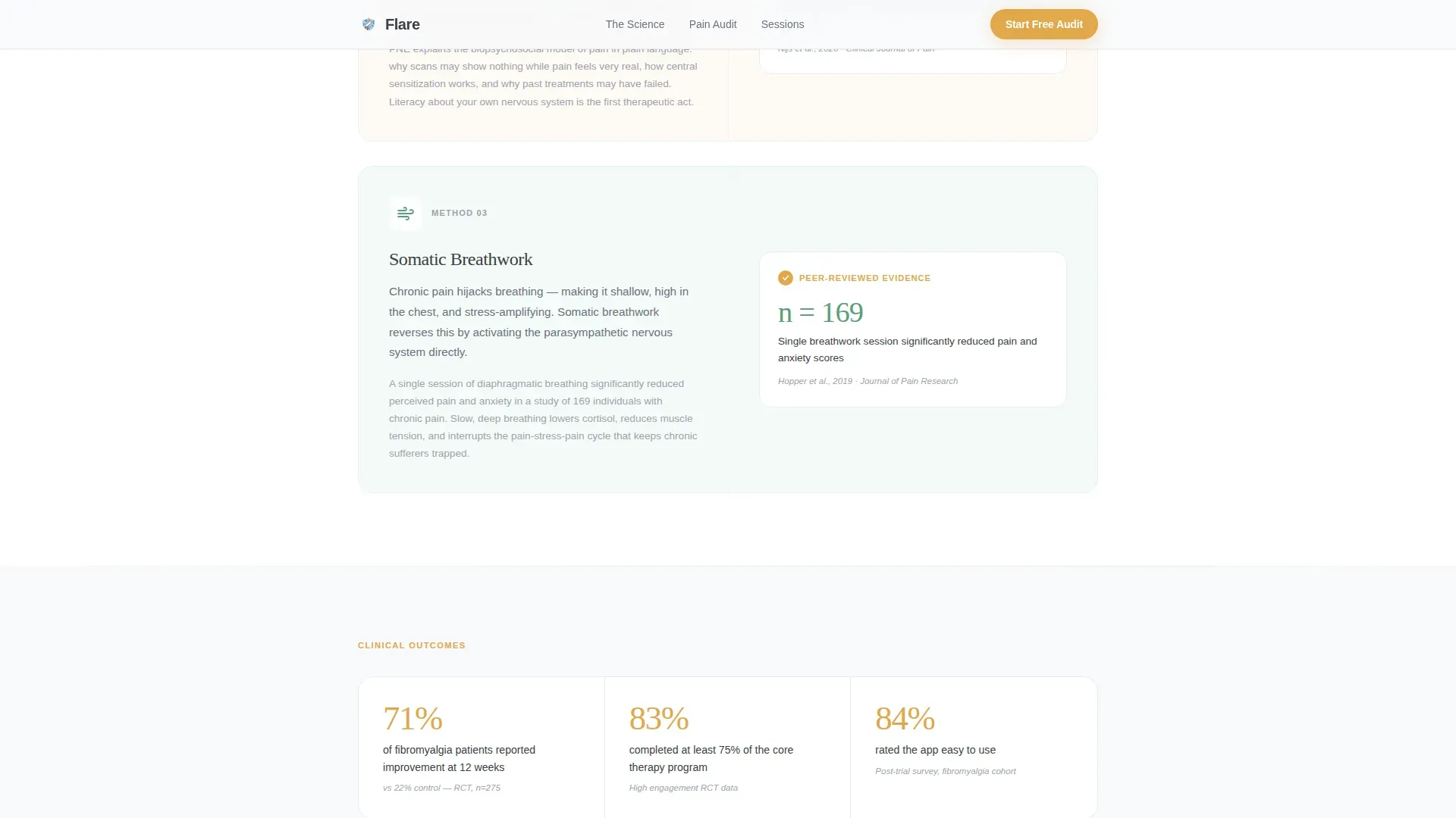
An asymmetric bento layout explains graded motor imagery (GMI), pain neuroscience education (PNE), and somatic breathwork. Each method includes an evidence card citing peer-reviewed outcomes, giving clinical weight to the app's approach.
Progressive Three-Stage Call to Action
The primary call to action appears three times: "Start Your Free Pain Audit" in the hero, "See Your Personal Protocol" after the quiz, and "Begin Your First Session Free" at the bottom. Each reappearance feels like the next natural step, not a repeated push.
Half-Page Parallax Hero
The header is a split composition with left-aligned headline text and a right-bleeding morning-light photograph. Scroll-triggered parallax and staggered reveal animations set the tone before the visitor reads a single word.
Session Preview Cards
A dedicated section shows what a ten-minute daily session actually looks like. Technique demo cards break down guided movement, breath protocols, and cognitive reframing exercises in a format visitors can scan quickly.
Social Proof with Clinical Specificity
Named user testimonials sit alongside randomized controlled trial outcome stats and peer-reviewed citations. This combination of personal story and clinical data addresses both emotional and rational skepticism in one section.
Page sections overview
| Section | Purpose |
|---|---|
| Hero split layout | Establishes credibility and launches the pain audit call to action |
| Interactive pain audit | Converts passive visitor into active participant through five guided questions |
| The science explained | Presents GMI, PNE, and breathwork with evidence cards and bento layout |
| Social proof block | Combines named testimonials with clinical outcome statistics |
| Session preview cards | Shows a concrete ten-minute session to reduce uncertainty |
| Footer horizontal flow | Closes the page with navigation links and final conversion pathway |
Design & branding system
The visual identity follows an Educational Guide theme with an Arctic White color system. The palette feels clinical enough to earn trust and warm enough to feel human, modeled on the aesthetic of a Scandinavian recovery clinic.
- Colors: clinical snow (#F8F9FB) and pale glacier blue (#D6E4EE) cover all backgrounds; soft graphite (#3B3F45) carries all body copy; amber relief (#E2A84B) appears exclusively on buttons and progress indicators
- Typography: DM Sans handles body text for clean readability; Fraunces serif display headlines give the page emotional weight and visual contrast
- Animation style: medium-intensity scroll reveals, staggered content entry, and parallax motion keep the page lively without overwhelming a user in pain-related distress
Mobile & speed optimization
The template is designed mobile-first, reflecting its core audience: people scrolling support forums at 2 a.m. on a phone. Every layout decision prioritizes legibility and usability on smaller screens.
- Single-column flow keeps the hierarchy intact on all screen sizes without requiring complex reflow
- Interactive quiz state is handled by client components while static content sections use server components, balancing interactivity with efficient rendering
- Typography and spacing scale are set to remain readable on mobile without zooming or horizontal scrolling
How this template helps you convert
Conversion is built into the page architecture through a deliberate rhythm of educate, prove, and invite. No form fields appear on the page; every call to action routes directly to a seven-day trial activation screen.
- The pain audit personalizes the experience immediately, making visitors feel the page understands them before any product claim is made
- Evidence cards and session previews lower perceived risk by showing exactly what the app delivers and citing the science behind it
- Three contextually placed calls to action meet the visitor at different points of readiness, so the final click feels like continuing a conversation rather than starting a transaction
Other information about this template
This template is part of the Health and Medical category under the Chronic Pain Care subcategory. It was designed specifically for the chronic pain digital therapy app niche and carries a high intersection match between its template style, creative direction, and conversion goal.
- Template style: Single Column Flow with an Educational Guide theme
- Creative direction: Checklist and Audit, where each scroll section maps to an audit answer
- Header concept: Half-Page Photo and Text with a glassmorphic overlay card
- Landing page direction: Click-Through, routing to a trial activation screen with no on-page form fields
- The Checklist and Audit creative direction makes this template adaptable for other evidence-led health or wellness products that need to build literacy before asking for a commitment
Theme
Educational Guide
Creative direction
Checklist & Audit
Color system
Arctic White
Style
Single Column Flow
Direction
Click-Through
Page Sections
Interactive Five-question Pain Audit
Three-method Science Section
Progressive Three-stage Call to Action
Half-page Parallax Hero
Session Preview Cards
Clinical Social Proof Section
Related questions
Does this template include the interactive quiz functionality?
Can I change the call-to-action labels and link destinations?
Is this template suitable for a health product that is not a pain app?
How many pages does this template include?
What typography and color system does this template use?



