Lupus Care Professional Website Template
Flare is a zigzag landing page template built for a lupus wearable monitor. It guides visitors through a scroll-based flare audit, pairing personal questions with device data visuals. A floating sidebar checklist accumulates as users scroll, and a click-through call to action routes them to a coverage-check tool. The Alpine Fresh color system keeps every section calm, clinical, and trustworthy.
by Rocket studio
Quick summary
Flare is a single-page landing page template designed for a lupus wristband that tracks inflammation markers, fatigue patterns, and joint stiffness in real time. The layout uses a zigzag alternating structure to guide visitors through a personal flare audit. By the final section, a floating checklist is complete and the visitor is ready to click through to a coverage-check tool.
Who this template is for
This template is built for MedTech teams and health-focused founders who need a landing page that earns trust before asking for action. It speaks equally well to patients, clinicians, and caregivers.
- Women managing lupus alongside full schedules who need flare trigger clarity
- Rheumatologists looking for objective data to review between quarterly appointments
- Caregivers trying to understand why a patient's condition shifts day to day
What problem this template solves
People living with lupus often struggle to communicate what happens between doctor visits. There is no consistent record of what triggered a flare, and standard symptom diaries rarely give clinicians anything useful to act on. This template addresses that communication gap directly.
- Visitors cannot easily explain their flare patterns without structured data
- Rheumatologists lack objective inter-visit evidence to guide treatment adjustments
- Caregivers feel helpless when they cannot identify what changed and when
What you get with this template
This template gives you a complete, conversion-focused landing page built around a scroll-linked audit experience. Every section is purposeful, and the layout is ready to deploy without rebuilding from scratch.
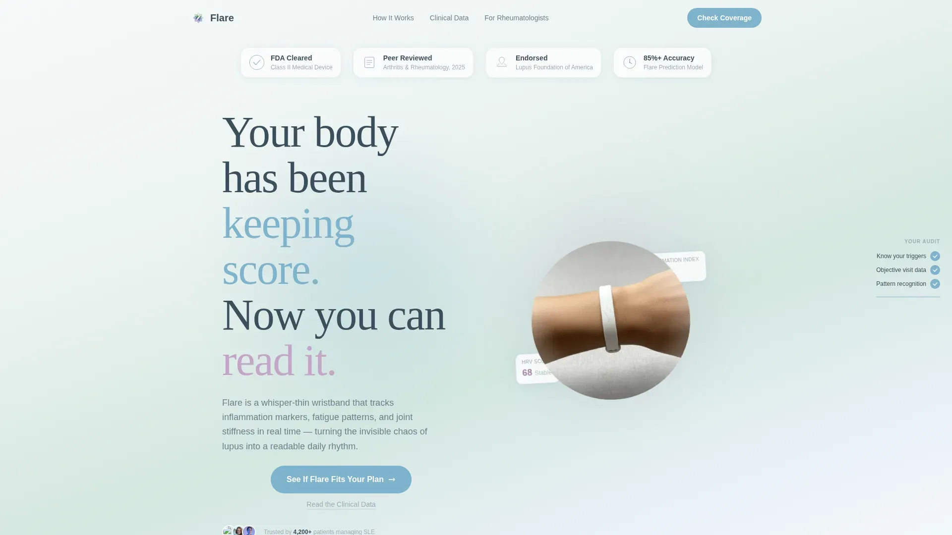
- A hero section with an award badge wall, a wrist shadow device image, and a fade-in headline
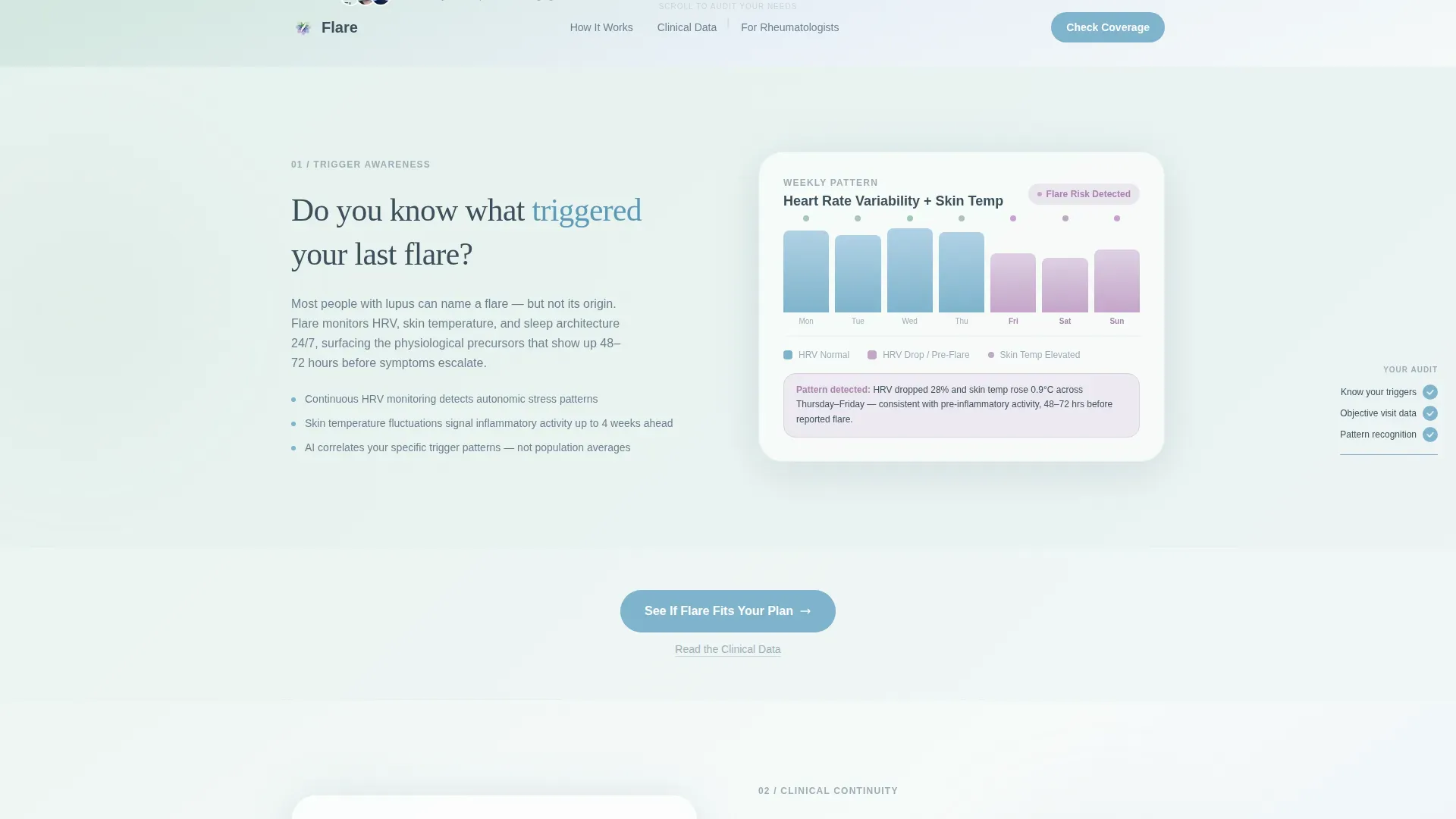
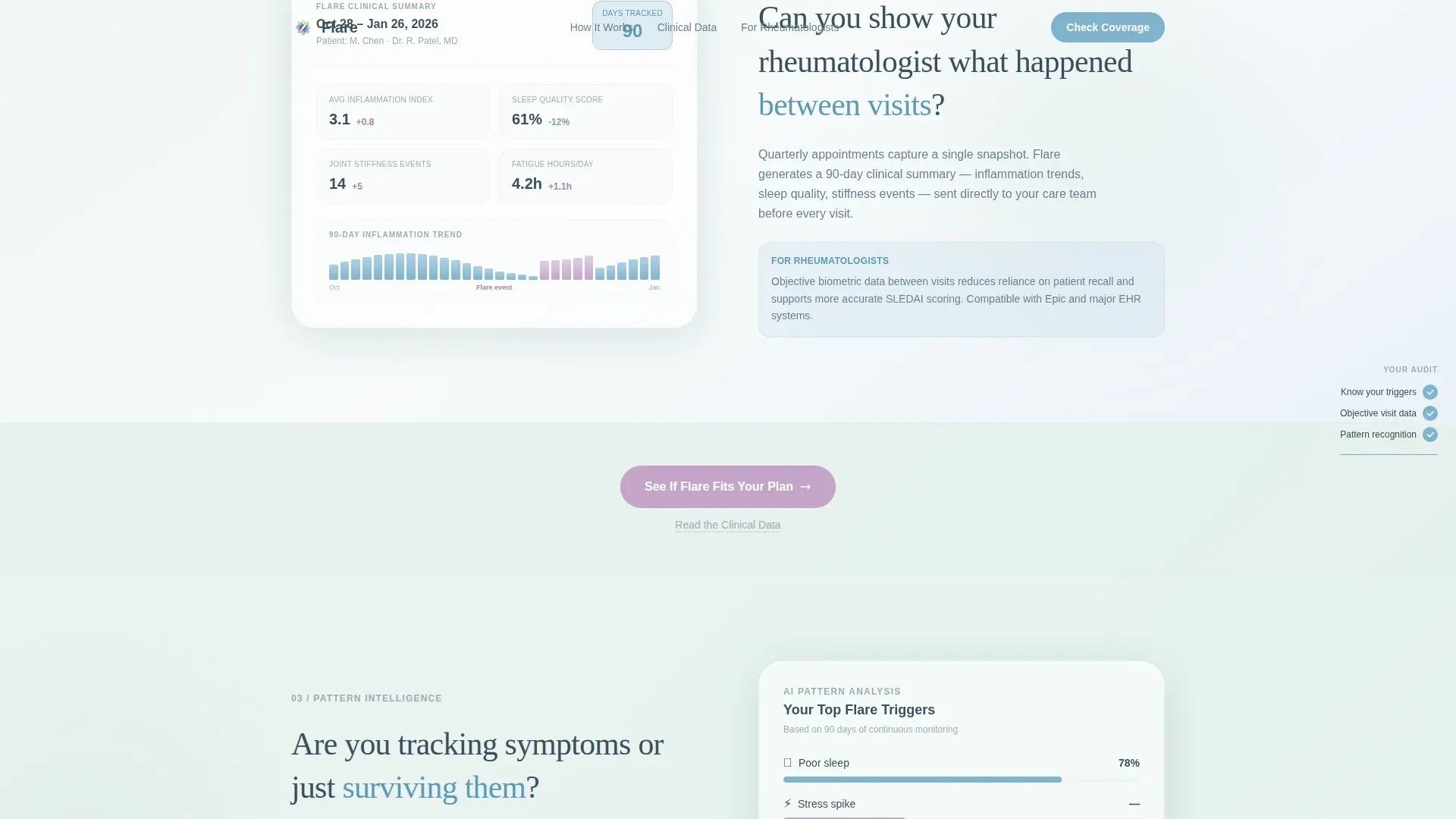
- Three zigzag content sections, each pairing a patient question with a device data visual or animation
- A floating sidebar checklist that fills progressively as the visitor scrolls down the page
- A repeating call-to-action button that shifts from glacier blue to heather as scroll depth increases
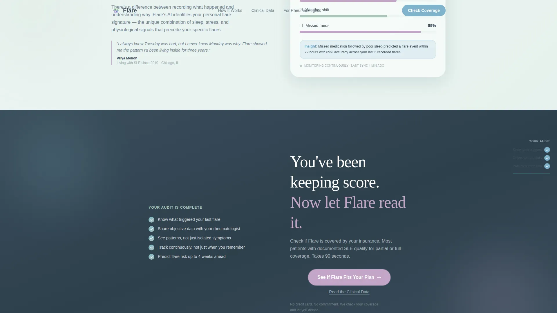
- A final emotional close section with a complete checklist and a click-through to a coverage-check tool
Feature list
This section covers the core built-in capabilities of the Flare landing page template.
Scroll-Linked Sidebar Checklist
A floating sidebar checklist accumulates checkmarks as the visitor scrolls through each zigzag section. Each check represents a problem the wristband solves. By the bottom of the page, the checklist is visually complete, reinforcing the emotional case before the final call to action appears.
Zigzag Alternating Layout
Three alternating content sections each pose a question the visitor already asks themselves. The opposing side of each section shows a device screen, a data visualization, or a short animation. This structure keeps the page scannable and creates a natural left-right reading rhythm.
Progressive Call-to-Action Color Shift
The primary call-to-action button, labeled "See If Flare Fits Your Plan," appears after the hero and repeats after every second zigzag section. Its color transitions from glacier blue to heather as the visitor moves deeper into the page, building subtle urgency without pressure.
Award Badge Wall Header
The hero opens with three to four award badges and clinical validation seals rendered in soft metallic line art. These include signals such as an FDA clearance badge, a rheumatology journal citation, and a patient advocacy endorsement. They are arranged across the top of the viewport against a white-to-sage gradient.
Dual Call-to-Action Pairing
Every primary call-to-action button is paired with a secondary text link, "Read the Clinical Data," positioned directly beneath it. This pairing serves skeptical visitors and clinicians who want validation before clicking through to the coverage-check tool.
Mobile-First Section Structure
The template is structured with a mobile-first priority. The primary user is someone managing a chronic illness on a phone between appointments. Each section stacks cleanly on small screens without losing the visual hierarchy or the checklist functionality.
Page sections overview
| Section | Purpose |
|---|---|
| Hero Badge Wall | Establish credibility with clinical validation seals and a fade-in headline |
| Zigzag One | Answer "Do you know what triggered your last flare?" with an HRV and temperature visualization |
| Zigzag Two | Answer "Can you show your rheumatologist what happened between visits?" with a clinical report mockup |
| Zigzag Three | Answer "Are you tracking symptoms or just surviving them?" with a pattern recognition animation |
| Final Call to Action | Close the audit loop with a complete checklist, emotional copy, and a coverage-check click-through |
| Footer | Horizontal flow footer for navigation, legal links, and secondary information |
Design & branding system
The visual identity uses the Alpine Fresh color system. Every hue is soft and gradient-blended, with no hard edges anywhere on the page. The overall feeling is clean and alive, like a high-altitude meadow at dawn.
- Color palette: snow melt white (#F7FAFA), high-meadow sage (#A8C5B8), glacier blue (#7EB3CC), and heather (#C4A5C9) for interactive states and data highlights; slate (#3B4F5C) for all body text
- Typography: Fraunces serif for headlines and DM Sans for body copy and interface elements
- Gradient backgrounds drift between snow melt and pale sage; buttons glow in glacier blue with heather hover states
Mobile & speed optimization
The template is built mobile-first to match the primary audience: someone checking their health data on a phone between appointments. The layout adapts across screen sizes without losing its visual warmth or interaction logic.
- Zigzag sections stack vertically on small screens, keeping questions and visuals paired and readable
- Scroll-linked animations and the floating sidebar checklist are handled by client-side components, keeping static sections lightweight
- Server Components power the non-interactive sections to reduce unnecessary rendering overhead
How this template helps you convert
This template earns the click by letting the visitor audit their own unmet needs before any action is requested. The structure is deliberate: trust first, then the ask.
- The badge wall and clinical seals establish credibility in the first viewport, before the visitor has read a single sentence of body copy
- Each zigzag section answers a question the visitor is already carrying, so by the third section they have self-diagnosed their information gap
- The progressive call-to-action color shift and the completed sidebar checklist work together to make clicking feel like a natural next step, not a sales push
Other information about this template
This template is part of a Health & Medical category set designed for the lupus care niche. It is built specifically for lupus wearable monitor products operating in a direct-to-consumer and clinical business-to-business-to-consumer market.
- The page routes visitors to a coverage-check tool where they enter their insurance provider and diagnosis date; there is no form on the landing page itself
- Social proof elements referenced in the template include an 85% or higher predictive accuracy statistic and a 120,000-patient community reference
- The footer uses a horizontal flow pattern suited to medical and clinical brand guidelines
- Animation intensity is medium-high, including scroll-linked checklist accumulation, section fade reveals, a floating badge entrance, and gradient drift effects
- The template is localized for the United States market with English copy, USD pricing context, and a balance of medical terminology and warm patient voice
Theme
Soft Gradient
Creative direction
Checklist & Audit
Color system
Alpine Fresh
Style
Zigzag/Alternating
Direction
Click-Through
Page Sections
Scroll-linked Sidebar Checklist
Zigzag Alternating Content Layout
Progressive Call to Action Color Shift
Award Badge Wall Hero
Dual Call to Action Pairing Per Section
Mobile-first Stacking Structure
Related questions
Does this landing page include a form or sign-up flow?
Who is the primary audience this template is designed for?
What interactive elements are built into this template?
Can I adapt this template for a different wearable or chronic illness product?
Does the template include placeholder visuals for the device and data screens?