Lupus Care FAQ Website Template
Flare is a lead generation landing page template built for telehealth lupus care practices. It features a bold typographic hero, an FAQ-driven scroll with a side-by-side comparison table, an urgent-visit protocol section, a care-team integration section, and an insurance eligibility form. The design follows a Corporate Precision style with a clinical teal, charcoal, and coral color system.
by Rocket studio
Quick summary
Flare is a single-page lead generation template designed for telehealth rheumatology practices focused on lupus care. It pairs a stacked typographic hero with a progressive FAQ layout, a comparison table, and two conversion paths: an insurance eligibility form and a gated PDF checklist. The result is a page that earns patient trust before asking for anything.
Who this template is for
This template is built for telehealth practices and remote rheumatology services that manage lupus patients online. It suits clinics replacing long in-person wait times with same-week digital appointments and lab reviews.
- Telehealth practices offering remote rheumatology care for lupus
- Clinics targeting rural patients or time-constrained women managing immunosuppressants
- Newly launched lupus telehealth services that need to establish clinical credibility fast
What problem this template solves
Lupus patients face a painful gap: specialist appointments take weeks, rural patients drive hours, and newly diagnosed individuals have nowhere to start. A generic medical landing page does not close that trust gap. This template is built specifically to meet patients at their real questions and answer with clinical specificity, not vague reassurances.
- Long specialist wait times and geographic barriers that keep patients from consistent care
- Patient skepticism about whether telehealth can handle a complex, fluctuating condition like lupus
- Friction in the conversion path caused by asking for commitment before answering objections
What you get with this template
You get a fully structured, single-page layout with every section pre-built and purposeful. Each block connects to the next in a logical patient journey, from first curiosity to form submission.
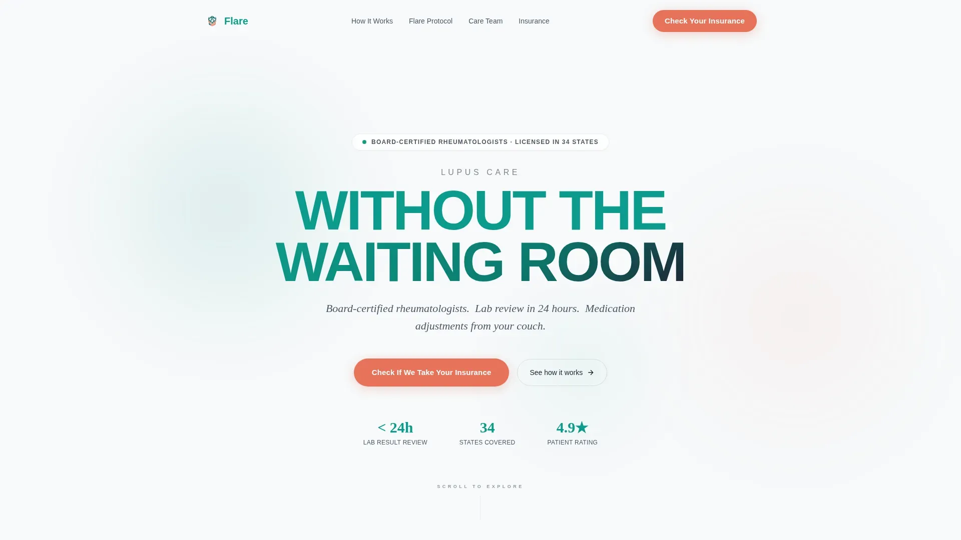
- A stacked typographic hero with a primary coral call-to-action button
- An FAQ-driven scroll with a tabbed in-person versus telehealth comparison table, an urgent-visit protocol timeline, and a care-team integration section
- A dual conversion block with an insurance eligibility check form and a gated PDF checklist capture
Feature list
This template delivers six purposeful components that work together as a complete patient acquisition page.
Stacked Type Tower Hero
The hero fills the viewport with pure typographic hierarchy. "LUPUS CARE" sits in thin tracked charcoal caps at the top. "WITHOUT THE WAITING ROOM" appears below in bold teal at twice the size. A single supporting line follows in body weight. No imagery clutters the message. White space surrounds every line like margins on a prescription pad.
FAQ-Driven Scroll Layout
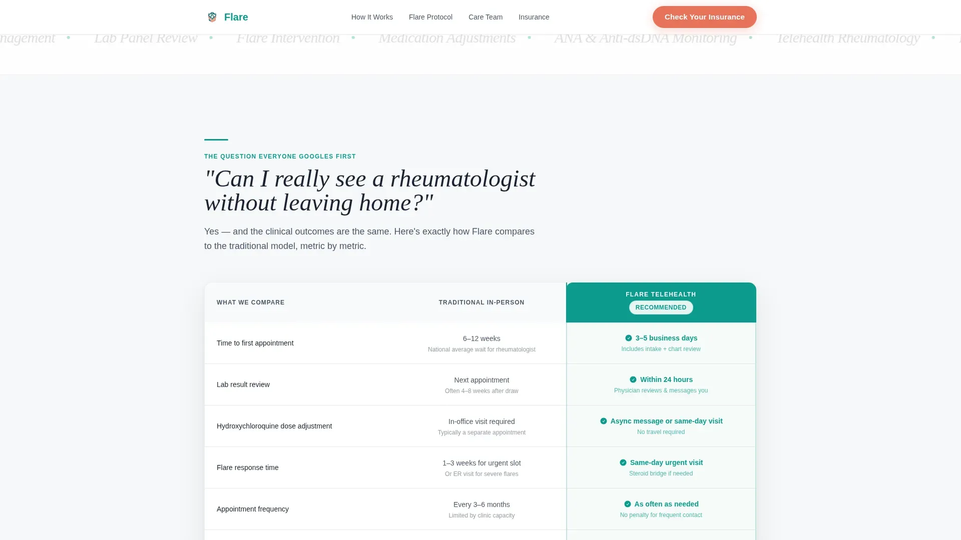
The page unfolds as a series of real patient questions, each answered with a specific content block. Questions escalate from practical convenience to clinical rigor to emotional safety. This structure matches how patients actually research at 2 a.m., meeting them with tables and timelines instead of reassurances.
Tabbed Comparison Table
The first FAQ answer includes a side-by-side comparison of in-person rheumatology versus telehealth care. The table covers wait times, appointment frequency, lab turnaround, and cost. Teal highlights active tab states. This section directly handles the most common patient objection before it is voiced.
Urgent-Visit Protocol Section
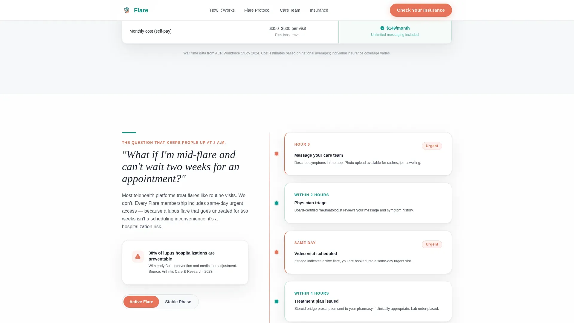
The second FAQ block reveals the mid-flare response protocol. A visual timeline shows exactly what happens when a patient reports a flare, making the clinical process transparent and reducing fear about remote care during a health crisis.
Care-Team Integration Section
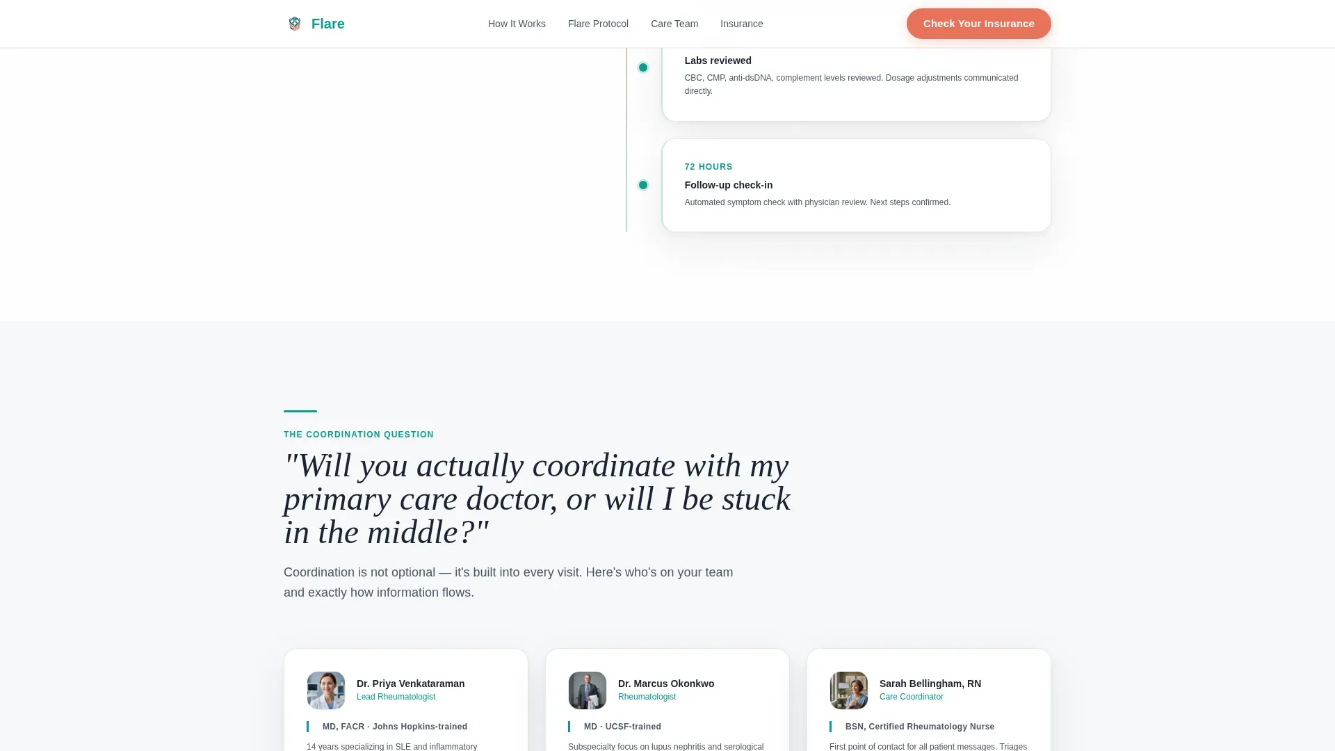
The third FAQ block addresses coordination with primary care doctors. This section reassures patients that telehealth does not mean isolated care. It shows how the rheumatology team communicates with existing providers.
Dual Conversion Block
The lead generation section provides two paths. The primary form asks for state of residence, insurance provider from a dropdown, and one open text field. The secondary path offers a downloadable PDF checklist gated behind email only. Both options lower the barrier to entry at different commitment levels.
Page sections overview
| Section | Purpose |
|---|---|
| Hero Type Tower | Establish authority and state the core value proposition immediately |
| FAQ: Remote Visit | Answer the first objection with a telehealth versus in-person comparison table |
| FAQ: Mid-Flare Protocol | Show the urgent-visit process to build clinical confidence |
| FAQ: Care Coordination | Address provider integration and reassure patients about continuity of care |
| Lead Gen Block | Capture insurance eligibility leads and PDF checklist email addresses |
| Footer | Provide a clean single-row closing with essential links |
Design & branding system
The template uses a Corporate Precision visual theme. Every color choice has a specific role, and the palette reads as clinical, trustworthy, and warm without becoming cold or bureaucratic.
- Clinical teal (#0D9B8C) drives interactive elements, table highlights, and the bold hero headline
- Deep charcoal (#1B2332) anchors every headline and authority-level text block
- Soft medical white (#F7F9FA) fills section backgrounds, creating breathing room between dense information blocks
- Warm catalyst coral (#E8725A) appears exclusively on primary calls to action and urgency indicators, used sparingly so every instance commands attention
- Typography pairs DM Sans for body and interface text with Fraunces as a serif display face for headline contrast
Mobile & speed optimization
The template is built mobile-first, reflecting the reality that most lupus patients check health information on a phone. The layout adapts naturally from narrow screens to desktop without losing the typographic hierarchy that makes the hero effective.
- Mobile-first layout with stacked sections that read cleanly on small screens
- GSAP-powered entrance animations, parallax effects, and staggered reveals handled via client components to keep static content fast
- Server Components used for static sections, reserving client rendering for interactive animations and form elements
How this template helps you convert
The page is structured around a deliberate objection-removal sequence. By the time a visitor reaches the form, every major concern has already been addressed with a specific, table-backed answer.
- The FAQ scroll answers real patient questions in order of increasing vulnerability, so trust builds progressively rather than being requested upfront.
- The primary call to action targets the actual conversion gatekeeper: insurance coverage. Asking "Check If We Take Your Insurance" removes the financial uncertainty that most patients silently carry.
- The secondary PDF checklist offer provides a low-commitment entry point for patients who are not yet ready to submit their insurance details, extending the conversion window without pressure.
Other information about this template
This template is built as a Next.js project using Server Components for static sections and client-side rendering for animations. It is designed for United States-based telehealth practices, with English copy, USD references, and US state dropdowns pre-configured in the form.
- The form includes a state-of-residence field first, reflecting the licensing requirements of US telehealth practice
- Social proof placements for board certification badges, patient outcome quotes, and lab turnaround statistics are included in the layout
- The footer follows a linear single-row pattern, keeping the closing section clean and minimal
- Animation uses GSAP for entrance transitions, parallax blob effects, and magnetic call-to-action behavior on interactive elements
- The PDF checklist conversion path is gated behind email capture only, lowering friction for patients who want information before committing
Theme
Corporate Precision
Creative direction
FAQ-Driven
Color system
Teal Catalyst
Style
Comparison Table
Direction
Lead Generation
Page Sections
Stacked Typographic Hero
Faq-driven Page Scroll
Tabbed Comparison Table
Urgent-visit Protocol Timeline
Dual Lead Generation Block
Corporate Precision Color System
Related questions
What type of medical practice is this template designed for?
Can I customize the comparison table to match my practice's data?
How does the insurance eligibility form work in the template?
Is this template suitable for a newly launched telehealth service?
What is the secondary conversion path included in the template?



