Arthritis Wearable Monitor Landing Page Template
Flare is a hub-and-spoke landing page template built for a wrist-worn joint inflammation monitor. It guides visitors through five anchored steps, Wear, Detect, Score, Share, Adjust, and routes them to a personalized eligibility quiz. The design blends clinical authority with understated warmth, targeting rheumatoid arthritis patients, osteoarthritis sufferers, and clinical trial coordinators.
by Rocket studio
Quick summary
Flare is a single-page, anchor-navigated landing page template for a wrist-worn arthritis inflammation sensor. It walks visitors through five narrative stages, from putting on the band to sharing data with a rheumatologist, and closes with a click-through call to action that routes to an eligibility quiz. The design feels measured, clinical, and quietly reassuring.
Who this template is for
This template is built for digital health teams and medical device marketers who need to explain a sophisticated wearable to a non-technical audience without losing clinical credibility. It speaks to patients, caregivers, and healthcare professionals in the same clear voice.
- Rheumatoid arthritis (RA) and osteoarthritis (OA) patients who need objective evidence of flare severity for their care team
- Clinical trial coordinators replacing paper diaries with continuous sensor data
- Rheumatologists and prescribing physicians evaluating a data-driven addition to their treatment workflow
What problem this template solves
Describing a medical wearable on a landing page is harder than it looks. You need to earn trust fast, explain unfamiliar technology clearly, and guide a cautious audience toward a next step without overwhelming them. Most generic templates cannot hold that balance.
- Visitors leave before they understand the product because the page lacks a clear narrative spine
- Clinical details get buried in walls of text instead of being revealed progressively at each scroll stage
- There is no structured path from curiosity to qualified action, so conversion stalls before the call to action
What you get with this template
You get a complete, production-ready landing page structure with five fully designed spoke sections, a pinned anchor navigation rail, a persistent bottom call-to-action bar, and a clinical visual system. Every section is built to carry one focused message before handing off to the next.
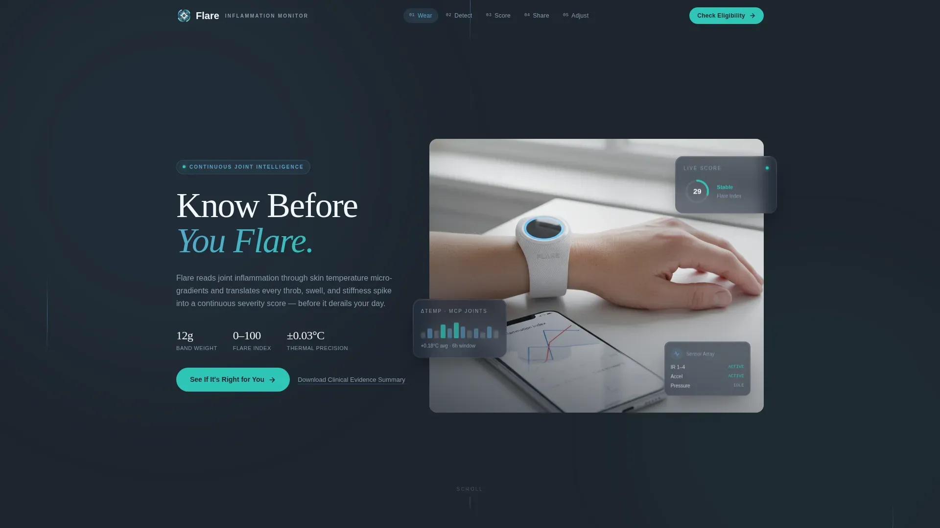
- Hero section with a portrait-centered wrist photograph, a floating live-data card overlay, and the headline "Know Before You Flare"
- Five anchor-linked spoke sections (Wear, Detect, Score, Share, Adjust) each ending with a consistent call-to-action prompt
- Persistent bottom bar with a primary "See If It's Right for You" button and a secondary "Download the Clinical Evidence Summary" text link
Feature list
This template is built around a tight set of purposeful components. Each one serves the medical device storytelling arc without adding visual noise.
Pinned Anchor Navigation Rail
A five-step top rail pins the labels Wear, Detect, Score, Share, and Adjust to the viewport as the visitor scrolls. It orients visitors instantly and lets them jump to the stage most relevant to their situation, whether that is the sensor technology or the physician workflow.
Portrait-Centered Hero Section
The hero uses a documentary-style photograph of a real patient's forearm and wrist. A slim monitor band is visible on the wrist, a phone propped beside it displays a live inflammation graph with a green "Stable" badge. The headline fades over the negative space above the hand, keeping focus on the image.
Flare Index Score Visualization
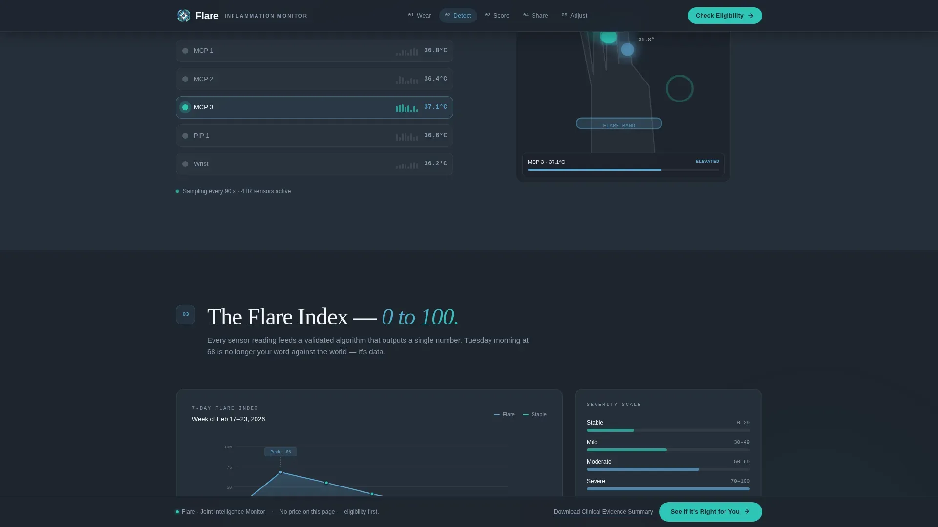
The Score section reveals a zero-to-one-hundred Flare Index with an animated historical trend chart. Spotlight cards highlight key severity thresholds. This is the core data story of the product, shown visually rather than explained in paragraphs.
One-Tap PDF Export Demo
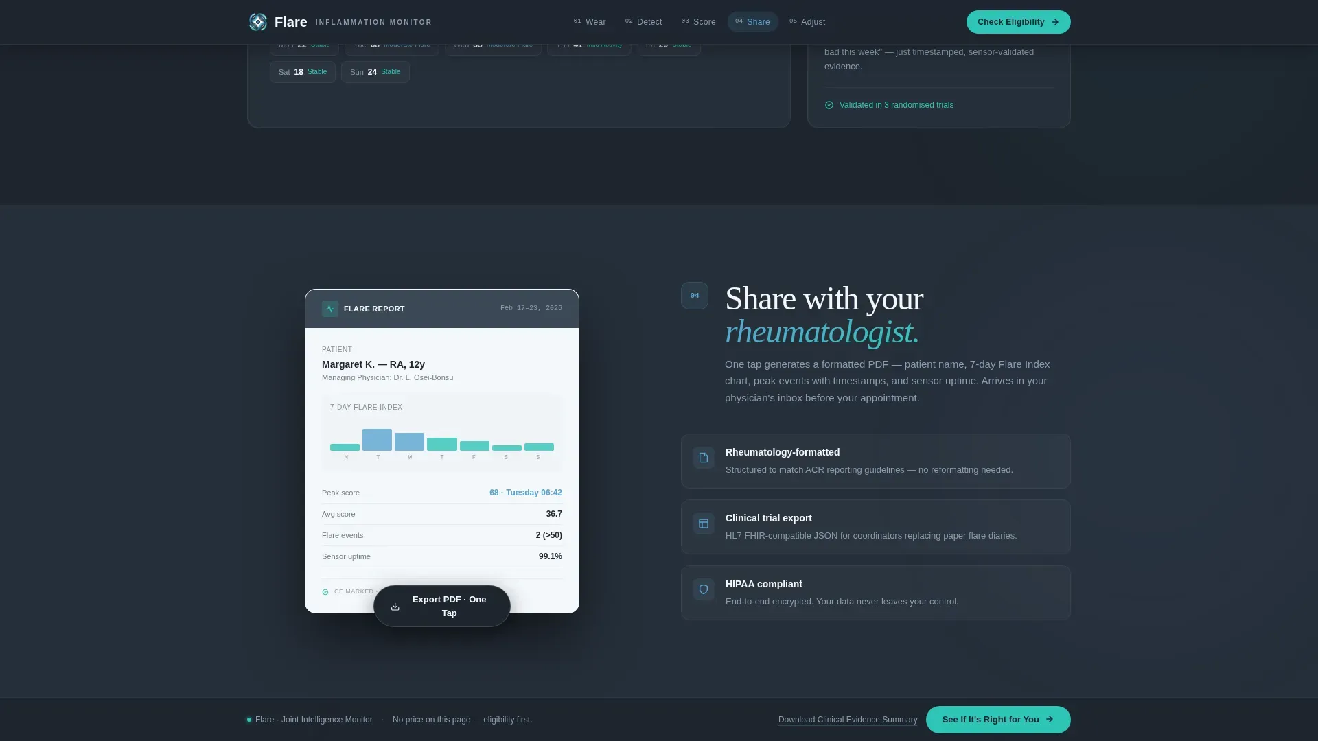
The Share section includes a demo card showing a one-tap PDF export formatted for rheumatology appointments. It shows physicians exactly how patient data arrives in their workflow, making the clinical handoff concrete and credible.
Persistent Click-Through Bottom Bar
A bottom bar stays fixed as visitors scroll through every section. The primary call to action reads "See If It's Right for You" and routes to a short eligibility quiz. A secondary text link below it offers the Clinical Evidence Summary for physicians and researchers who need peer-reviewed validation before engaging.
Physician Quote Closing Section
The Adjust section closes the narrative with a direct physician quote about how continuous sensor data changed a treatment plan. It anchors the page's final emotional beat in clinical authority rather than marketing language.
Page sections overview
| Section | Purpose |
|---|---|
| Hero / Know Before You Flare | Establish the product, tone, and central promise immediately |
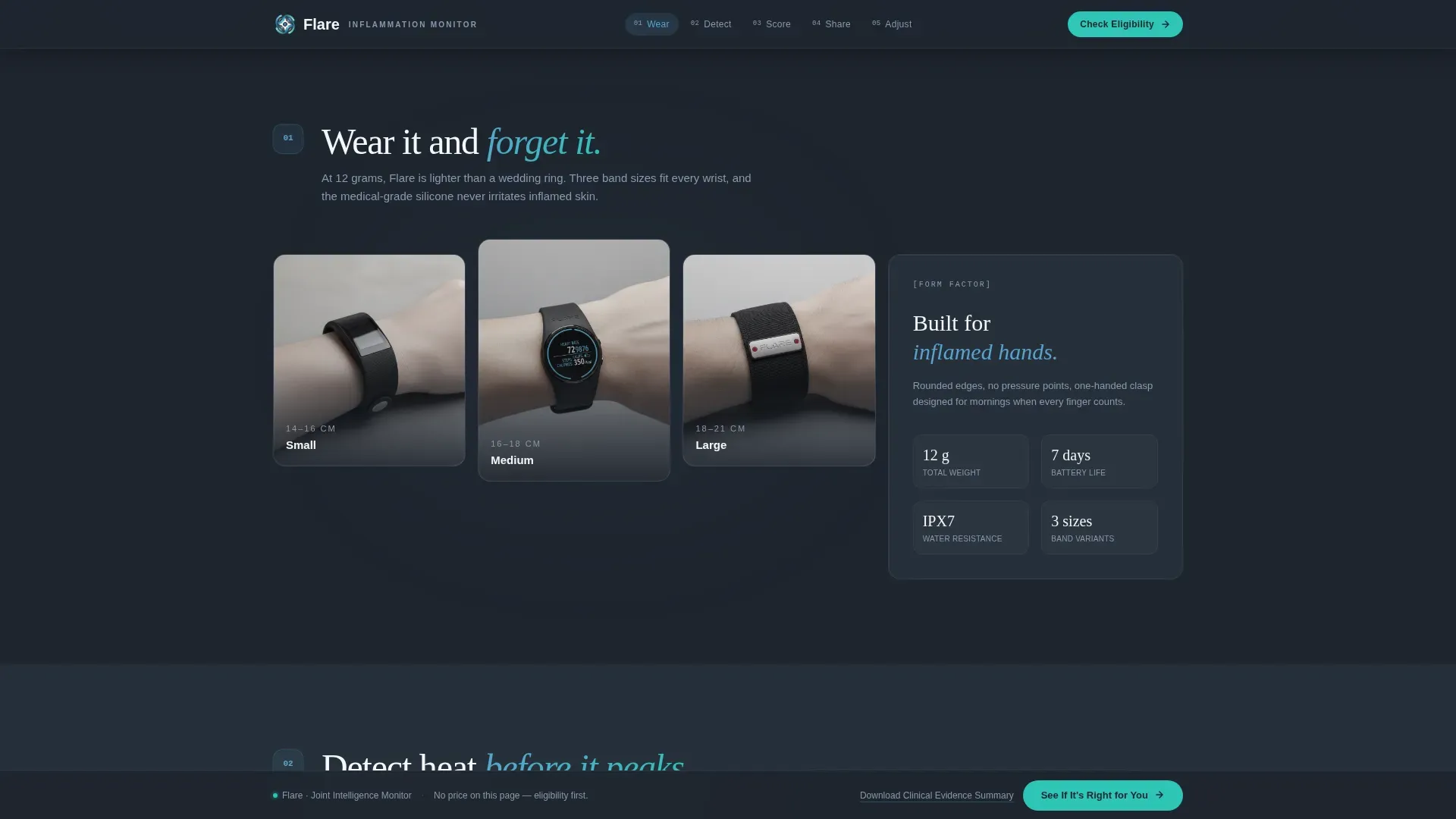
| Wear, Band Form Factor | Show the 12-gram sensor on different wrist sizes in a bento grid |
| Detect, Sensor Visualization | Animate infrared sensors reading joint heat in real time |
| Score, Flare Index | Reveal the 0, 100 index with animated trend lines and spotlight cards |
| Share, PDF Export Demo | Demonstrate one-tap PDF export formatted for rheumatology appointments |
| Adjust, Physician Quote | Close with clinical impact evidence and the persistent call-to-action bar |
| Footer | Linear single-row footer with supporting links |
Design & branding system
The visual identity follows a Corporate Precision theme. Deep clinical slate and instrument-panel charcoal form the authoritative base, while open-sky blue and cloud white open the layout to light. Signal teal fires on interactive moments only, keeping the accent meaningful.
- Color palette: deep clinical slate (#3B4856), instrument-panel charcoal (#1E252E), open-sky blue (#5BA4CF), cloud white (#F4F7FA), and signal teal (#2EC4B6) for hover and interaction states
- Typography pairing: DM Sans handles all body and user interface text for clean legibility; Fraunces serif display type anchors headlines with quiet authority
- Photography direction: documentary-grade, shallow depth of field, no stock warmth, the hero image reads like a medical device product still, not a lifestyle shot
Mobile & speed optimization
The template is built desktop-first to match the audience profile. Medical device researchers and rheumatology professionals skew toward desktop browsing. The layout adapts responsively for mobile without losing the step-by-step narrative structure.
- Server Components handle all static section rendering, keeping client-side JavaScript minimal across the page
- Scroll-linked reveals, float animations, the animated Flare Index chart, and the sensor pulse effect are layered in without blocking the initial page load
- The persistent bottom bar and anchor nav rail reflow cleanly at smaller viewports so the call-to-action path stays accessible on any screen size
How this template helps you convert
The page is structured as a progressive narrative, not a feature list. Each section raises the stakes before handing off to the next, so the visitor arrives at the call to action already convinced of the product's relevance to their specific situation.
- The anchor nav lets visitors self-select their entry point, a patient jumps to Score, a physician jumps to Share, so no one reads past irrelevant content before finding their reason to act.
- The persistent bottom bar with "See If It's Right for You" stays visible throughout, removing friction between the moment of conviction and the moment of click.
Other information about this template
This template is built for the health and medical category with a specific focus on arthritis care and the arthritis wearable monitor niche. A few additional details are worth noting for teams evaluating it.
- The eligibility quiz on the next page (linked from the call to action) asks for diagnosis type, current medication, and whether the visitor has a managing rheumatologist, the template routes to this quiz but does not include the quiz page itself
- The footer uses a linear single-row pattern, keeping the page's closing area clean and uncluttered
- No pricing or cart functionality appears on this page; the click-through model deliberately defers commercial information until after the quiz delivers a personalized recommendation
- The template is categorized under Health and Medical, Arthritis Care, in the Hub and Spoke (Anchor Nav) style with a Step-by-Step Guide creative direction
Theme
Corporate Precision
Creative direction
Step-by-Step Guide
Color system
Slate & Sky
Style
Hub & Spoke (Anchor Nav)
Direction
Click-Through
Page Sections
Pinned Five-step Anchor Navigation
Portrait-centered Hero Section
Animated Flare Index Visualization
One-tap PDF Export Demo Card
Persistent Click-through Bottom Bar
Physician Quote Closing Section
Related questions
Does this template include the eligibility quiz page?
Can I update the Flare Index range or the chart data in the Score section?
Is this template a good fit for a clinical trial recruitment page?
What animations are included in this template?
What does the secondary 'Download the Clinical Evidence Summary' link do?



