Multiple Sclerosis Care Booking Website Template
Flare is a sidebar companion landing page built for a multiple sclerosis telehealth service. It opens with three stark diagnostic statistics, walks visitors through a problem-to-solution arc, and ends with a single clear call to action: book a same-day neurology consult. The design is clean, clinical, and intentionally calming for patients in the middle of a health crisis.
by Rocket studio
Quick summary
Flare is a click-through landing page template designed for a multiple sclerosis telehealth service. It pairs a data-driven hero section with a scrolling problem-to-solution arc and a sticky sidebar patient journey timeline. The goal is simple: show a visitor who is scared and overwhelmed that a neurologist is available today, not in six months.
Who this template is for
This template is built for healthcare providers and digital health teams who need to convert anxious, newly diagnosed patients into booked telehealth appointments. It is especially useful when your audience does not have the time, energy, or mobility for in-person care.
- Telehealth neurology practices offering same-day MS specialist consultations
- Patient acquisition teams targeting newly diagnosed adults, long-haulers managing fatigue, and caregivers coordinating multi-specialist care
- Digital health marketers who need a trust-first, data-backed landing page without a lengthy contact form
What problem this template solves
People living with multiple sclerosis face a fragmented care system. A new symptom flare can appear overnight, but the average neurology referral wait is 72 hours, and the average time to an MS diagnosis stretches to 4.7 years. Most landing pages for healthcare services ignore this reality. Flare confronts it directly.
- Patients arrive already exhausted and skeptical; generic healthcare pages fail to meet them where they are
- Fragmented specialist communication means caregivers have no single place to see the full care picture
- Standard booking flows bury the most important information and lose visitors before they ever click
What you get with this template
Flare delivers a fully structured, single-page layout with every section mapped to a specific conversion moment. From the opening statistics to the final call to action, each block does one job and hands off cleanly to the next.
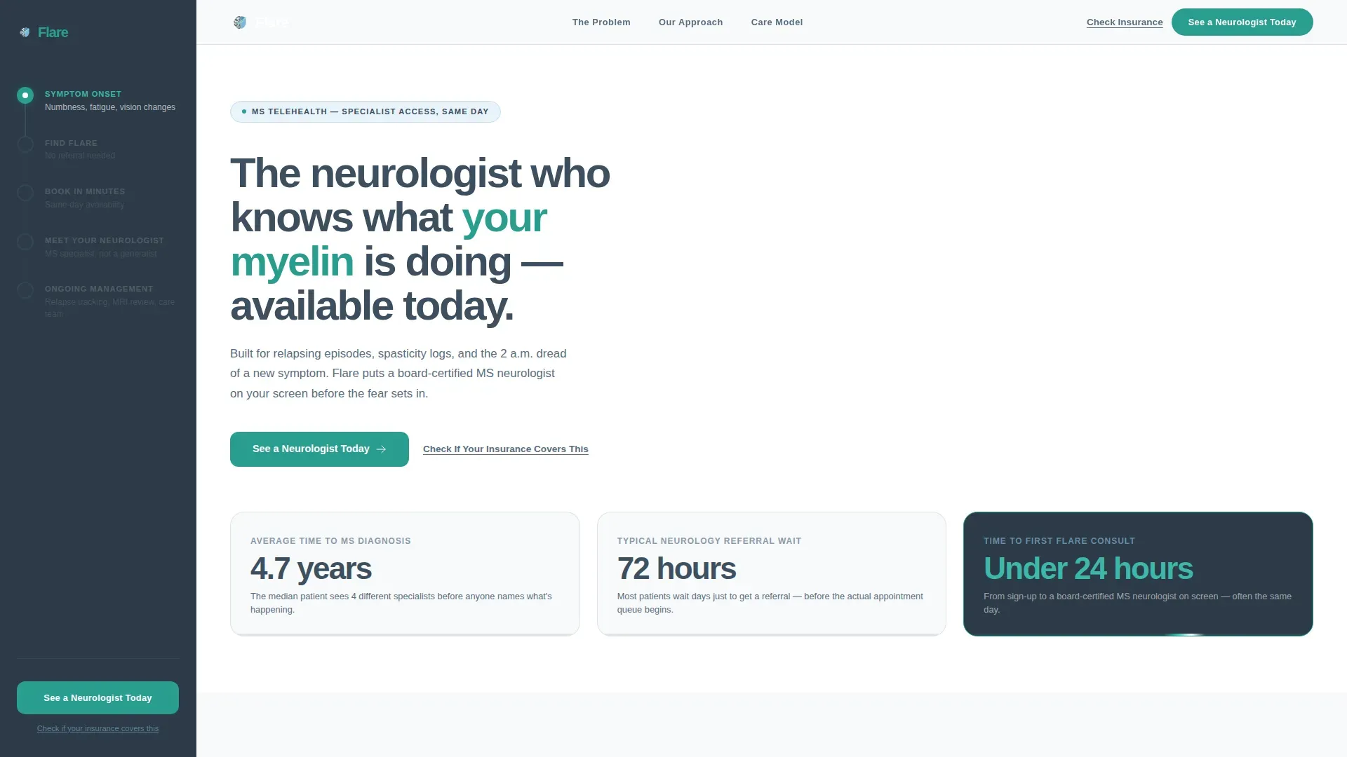
- A hero section with three large-format diagnostic statistics and a primary "See a Neurologist Today" call-to-action button
- A scrolling problem-to-solution arc with matched pain points and specific resolutions, anchored by a sticky sidebar timeline that completes as the visitor scrolls
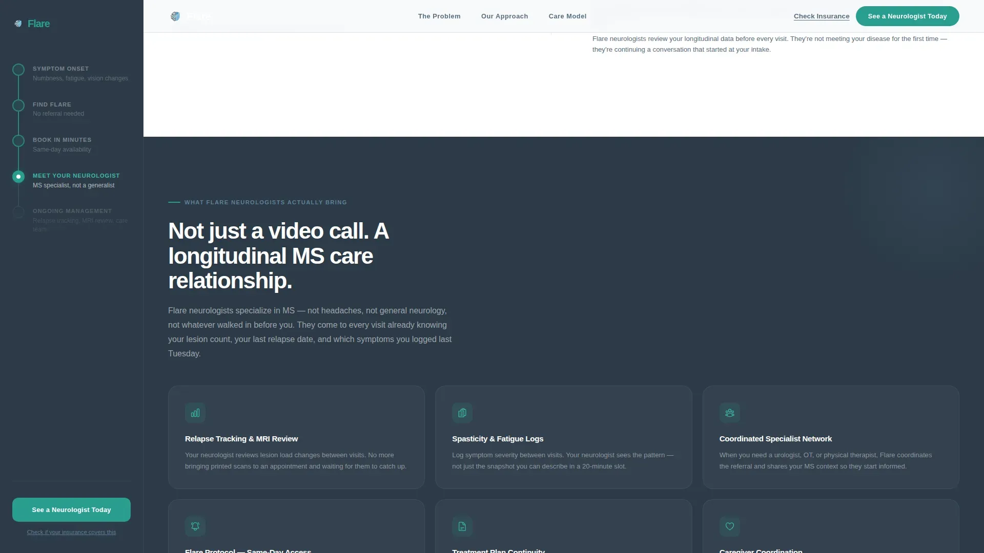
- A care model section detailing what MS-specialist neurologists bring, including spasticity logs, MRI lesion count tracking, and relapse history review
Feature list
This template includes the following built-in components and interaction patterns.
Stats-Driven Hero Display
The header presents three large-format numbers: 4.7 years average time to MS diagnosis, 72 hours for a typical neurology referral, and under 24 hours to a first consult on this platform. Each stat sits on a white card with a single-line slate descriptor beneath it. A thin sky-blue animated line runs across the card bottoms, evoking a nerve signal firing. No stock photography is used.
Sticky Sidebar Journey Timeline
A persistent sidebar panel tracks the visitor's scroll position through a simplified patient journey, from sign-up to ongoing management. The sidebar uses a deeper slate background (#2C3A47) to feel anchored. It fills in progressively as the visitor moves through each section, giving a sense of forward momentum without requiring any action.
Problem-to-Solution Arc Layout
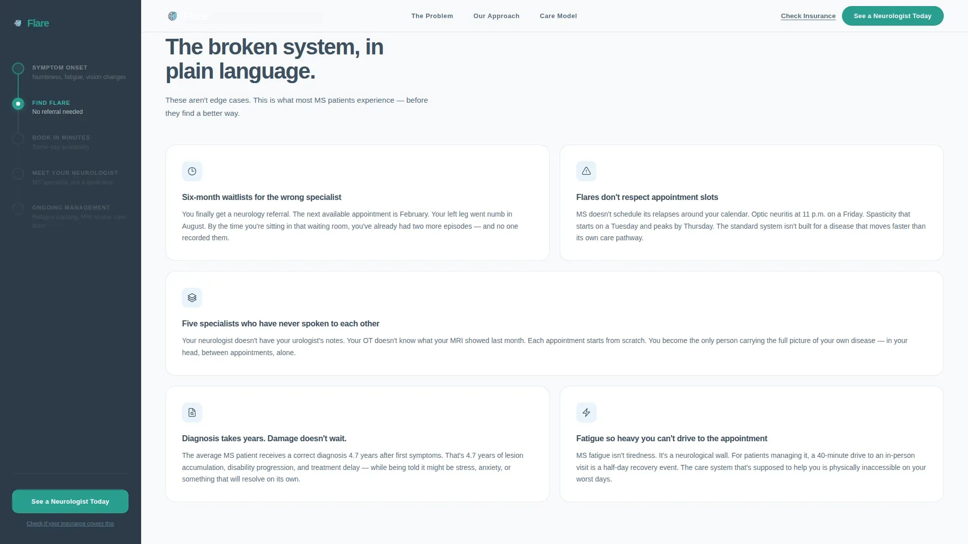
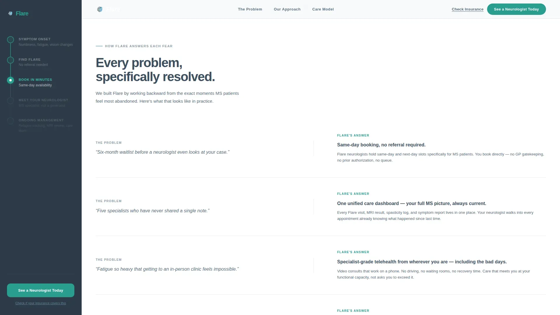
The main content area opens with four specific MS care pain points, each paired with a muted slate icon. A horizontal sky-blue rule divides the problem half from the solution half. Every fear raised in the problem section is answered directly below it, with the same structure. Waitlists become same-day booking. Fragmented records become a unified care dashboard.
Pulsing Teal Call-to-Action Button
The primary call-to-action button, labeled "See a Neurologist Today," appears in the hero and again in the sticky sidebar. When the visitor scrolls past the solution section, the sidebar button pulses once with a teal highlight. This draws attention at the exact moment trust is highest without being disruptive.
Insurance Eligibility Modal Link
A secondary text link, "Check If Your Insurance Covers This," sits beneath the primary call to action throughout the page. Clicking it opens a modal for a quick eligibility lookup. This addresses the single biggest hesitation for cost-aware patients without derailing the primary conversion path.
Scroll-Triggered Section Reveals
Built with GSAP ScrollTrigger logic, each content block animates into view as the visitor scrolls. Problem cards, solution panels, and care model details appear progressively rather than all at once. This pacing mirrors the emotional rhythm the page is designed to create: slow buildup of trust, then a clear release into action.
Page sections overview
| Section | Purpose |
|---|---|
| Hero Stats Display | Opens with three diagnostic numbers to establish the care gap immediately |
| Problem Arc Cards | Names the exact pain points MS patients and caregivers face |
| Solution Mirror Panel | Directly resolves each problem raised, one for one |
| Care Model Detail | Shows what Flare neurologists specifically track and manage |
| Final Call to Action | Drives the booking click with a reinforced primary and secondary link |
| Footer Linear Row | Closes with a compact single-row footer pattern |
Design & branding system
The visual identity follows a Medical Clarity theme. The palette is designed to feel like a hospital window on a clear morning: clinical enough to build trust, warm enough to let a frightened patient exhale. Every color has a specific role and does not stray from it.
- Slate (#3D4F5F) dominates body text, section dividers, and icon fills; deep sidebar slate (#2C3A47) anchors the persistent panel
- Sky blue (#7FB3D3) washes across section backgrounds in soft gradients and appears as the animated nerve-signal line beneath the stat cards
- Teal (#2A9D8F) is reserved exclusively for buttons, progress indicators, and the pulsing call-to-action moment; white (#F7F9FB) holds all content panels clean and readable
Mobile & speed optimization
The template is built desktop-first to accommodate the sidebar companion layout, with a full mobile fallback that collapses the sidebar into an inline progress indicator. Scroll-triggered animations and the sticky panel are handled through client components, while static content sections use server component rendering for faster initial load.
- The sidebar timeline converts to a horizontal progress bar on smaller screens, preserving the journey metaphor without requiring sidebar space
- GSAP ScrollTrigger animations are scoped to non-essential decorative reveals, so the page remains fully readable if JavaScript is slow to load
- Typography uses Plus Jakarta Sans for body and user interface elements and DM Sans for headlines, both optimized for screen legibility at small sizes
How this template helps you convert
Every structural decision in Flare is built to reduce the gap between a scared visitor and a booked appointment. The page does not ask for information before it earns trust.
- The hero statistics create immediate credibility by showing the broken system in hard numbers, making the platform's 24-hour access feel not like a promise but like proof.
- The problem-to-solution mirroring technique means every fear a visitor carries onto the page is specifically addressed before the call to action appears again, reducing hesitation at the moment of decision.
- The insurance eligibility modal removes the cost uncertainty that stalls hesitant visitors, keeping them on the conversion path without sending them to a separate page.
Other information about this template
This template is categorized under Health and Medical, specifically within the multiple sclerosis care subcategory. It is designed for the multiple sclerosis telehealth service niche and is a strong fit for US-based B2C patient acquisition campaigns. All date formats, currency references, and copy defaults use United States English conventions.
- The page uses English (US) localization with USD currency references and MM/DD/YYYY date formatting throughout
- The footer follows a linear single-row pattern, keeping the page's close lightweight and uncluttered
- This template supports a click-through flow, meaning no form fields appear on the page itself; all intake happens in the linked scheduling interface
- The intersection match score for this template against the Health and Medical, Multiple Sclerosis Telehealth Service niche is 13, indicating a tight alignment with the category and audience
Theme
Medical Clarity
Creative direction
Problem→Solution Arc
Color system
Slate & Sky
Style
Sidebar Companion
Direction
Click-Through
Page Sections
Stats-driven Hero with Animated Line
Sticky Sidebar Journey Timeline
Problem-to-solution Arc Layout
Pulsing Teal Call-to-action Button
Insurance Eligibility Modal
GSAP Scroll-triggered Reveals
Related questions
Does this template include a booking form?
Can the sidebar be removed for a simpler layout?
Is this template specific to multiple sclerosis, or can it be adapted for other conditions?
How does the insurance eligibility link work?
What animation library does this template use?



