Lupus Care Education Website Template
Flare is a split-screen lupus patient education landing page built for clarity and trust. It guides newly diagnosed patients, veteran lupus patients, and caregivers through a structured learning arc, from immune system basics to medication literacy. The Organic Flow visual identity, calm Slate and Sky palette, and slow scroll animations make complex health information feel approachable and human.
by Rocket studio
Quick summary
Flare is a single-page lupus education template built around one purpose: turning overwhelming diagnosis confusion into real understanding. It uses a 50/50 split-screen layout, a Problem to Solution scroll arc, and a warm Organic Flow design system. Every section earns visitor trust before asking for a single, considered click toward a personalized learning path.
Who this template is for
This template is built for health education platforms, chronic illness advocacy organizations, and patient empowerment projects focused on lupus care. It serves teams who need to communicate complex medical information without sounding clinical or cold.
- Newly diagnosed lupus patients in their twenties and thirties seeking clarity after an overwhelming diagnosis
- Veteran patients managing overlapping medications who need a trusted resource for lab results and drug interactions
- Caregivers trying to understand treatment plans and symptom patterns on behalf of someone they love
What problem this template solves
Most lupus resources either drown patients in medical jargon or reduce a life-altering condition to a short pamphlet. Neither approach helps a person sitting in a waiting room trying to understand what is happening inside their own body. This template solves the communication gap between diagnosis and understanding.
- Patients arrive confused and leave with a clear path forward, without needing a medical degree to follow it
- The scroll arc mirrors the real patient journey so each section feels relevant, not generic
- Caregivers get a resource they can share and revisit at any hour, not a wall of disclaimers
What you get with this template
You get a fully structured, single-page layout with every section planned and every design decision made. The template is ready to adapt to your content without rebuilding the information architecture from scratch.
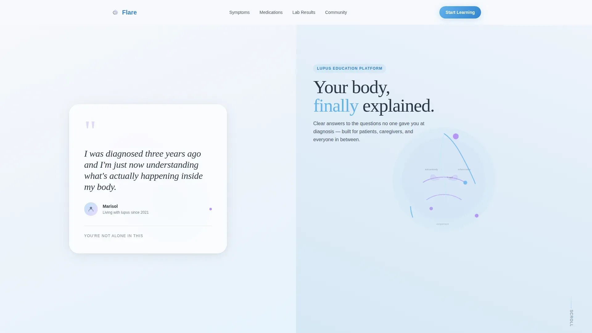
- A split-screen hero with a testimonial card on the left and an animated immune system illustration on the right
- Five planned content sections that escalate from body biology to medication literacy, ending with a primary call to action
- A Linear Single-Row footer pattern and a secondary browse link for visitors who are not yet ready to commit
Feature list
This template includes the following built-in capabilities drawn directly from the design brief.
Split-Screen Testimonial Hero
The hero splits 50/50: the left panel holds a warm oversized testimonial card with a handwritten-style patient quote and a small avatar silhouette. The right panel shows a slow, animated illustration of the immune system rendered in flowing organic lines. No stock photography is used anywhere on the page.
Problem to Solution Scroll Arc
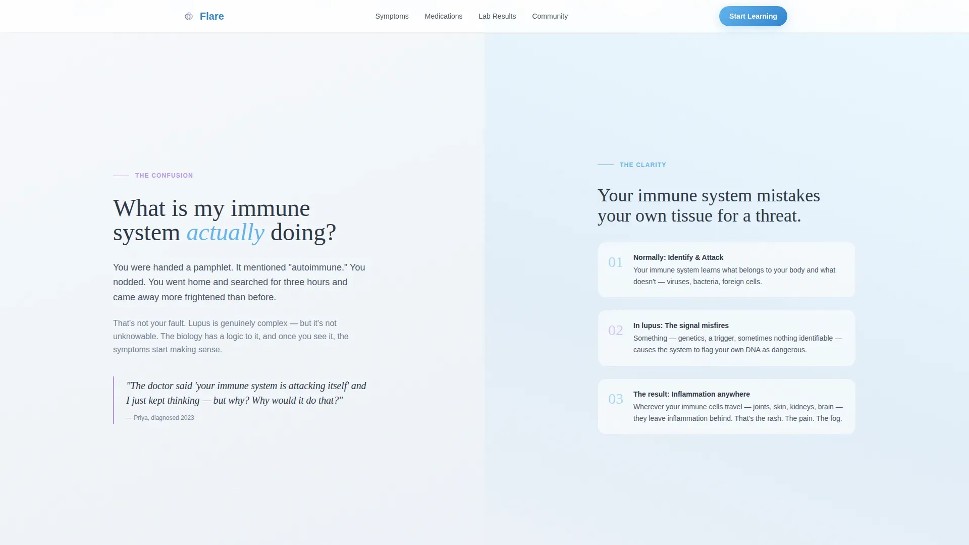
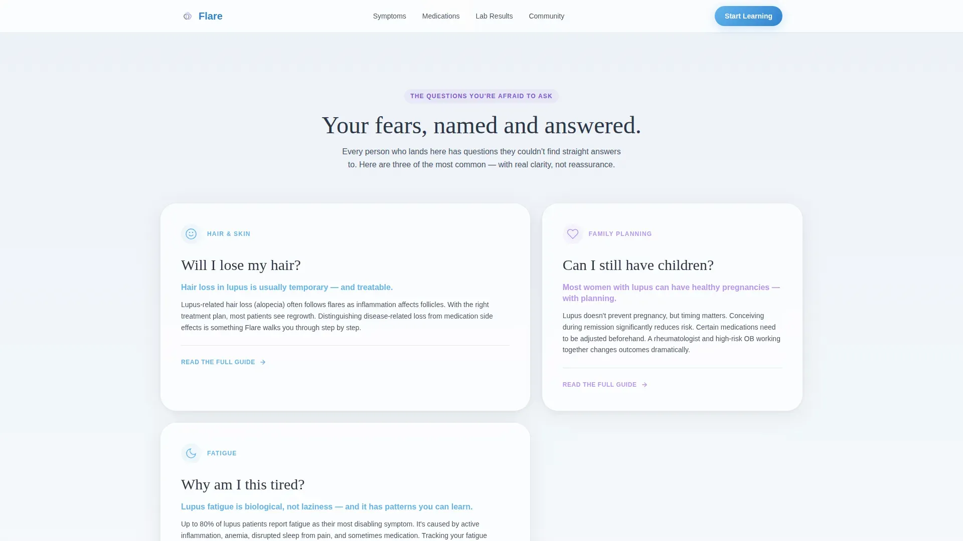
Each scroll section names a specific patient fear on the left panel, such as hair loss, fatigue, or fertility concerns, and answers it with a clear illustrated explanation on the right. The tone escalates naturally from basic biology to medication literacy, mirroring how real patients actually learn over time.
Medication Literacy Section
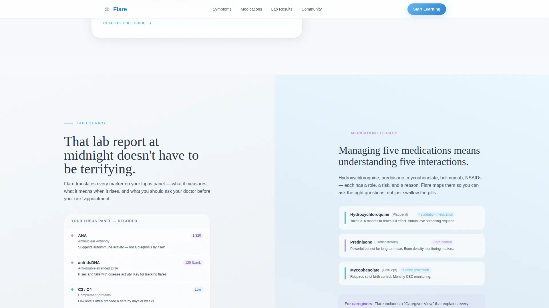
A dedicated section decodes lab results, explains drug interactions, and presents the information in a format caregivers can follow at midnight. It is the most information-dense part of the page, written to be understood without a clinical background.
Organic Flow Animation System
Scroll-observer reveals, breathing SVG pulse animations, and slow organic drift transitions are built into the template. Motion feels unhurried, like elements settling into place rather than snapping. Hover states and a marquee interaction layer add quiet interactivity without distraction.
Click-Through Call to Action Architecture
The primary call to action, "Start Your Learning Path," appears only after the third scroll section, once the visitor has absorbed enough context to act with confidence. A secondary quiet link, "Browse the Symptom Library," sits beneath it for visitors who want to explore before committing. There is no form on the page.
Graceful Mobile Stack Layout
The desktop-first split-screen layout collapses into a clean vertical stack for mobile visitors. Each panel reorganizes logically so the content hierarchy is preserved without sacrificing readability on smaller screens.
Page sections overview
| Section | Purpose |
|---|---|
| Hero Testimonial Card | Opens with a real patient quote and animated immune illustration to create immediate emotional recognition |
| Body Biology Explainer | Answers the question of what the immune system is actually doing using organic illustrated visuals |
| Fear and Answer Arc | Names three specific patient fears, hair, fertility, fatigue, and answers each one clearly |
| Medication Literacy Panel | Decodes lab results and drug interactions for patients and caregivers alike |
| Primary Call to Action | Presents "Start Your Learning Path" and secondary "Browse the Symptom Library" link |
| Linear Footer Row | Closes the page with a clean single-row footer pattern |
Design & branding system
The visual identity follows an Organic Flow theme built around the Slate and Sky color system. Every design choice prioritizes calm and intimacy over clinical efficiency. The palette feels like weather clearing after an overcast stretch, not aggressively cheerful, just the quiet return of light.
- Weathered slate (#4A5568) for body text and grounding elements, soft cloud gray (#E2E8F0) for backgrounds, open-sky blue (#63B3ED) for interactive highlights and progress indicators, and a single breath of lavender (#B794F4) reserved for moments of emphasis
- Typography pairs DM Sans for body copy with Fraunces for display text and patient quotes, creating a warm, literary tone that feels unhurried
- Illustrated organic line art replaces photography throughout, keeping the page intimate rather than decorative
Mobile & speed optimization
The template is built desktop-first to honor the 50/50 split-screen layout, but it degrades gracefully for mobile visitors. The split panels stack vertically in a logical reading order so no content is lost or buried on smaller screens.
- Server Components handle static sections to minimize JavaScript load and keep the page responsive
- Scroll-observer reveals and SVG animations are implemented with performance in mind, using minimal JS to drive motion
- The mobile stack preserves the Problem to Solution arc so the emotional journey reads correctly on any device size
How this template helps you convert
This landing page is designed around a single, deeply considered click rather than form fills or aggressive prompts. Every section builds the case for that click before the call to action ever appears.
- The hero testimonial creates instant emotional recognition so visitors see themselves in the page before they read a single explanation
- The Problem to Solution arc earns credibility section by section, so that by the time "Start Your Learning Path" appears, clicking it feels like a natural next step rather than a commitment
- The secondary "Browse the Symptom Library" link captures visitors who are curious but cautious, keeping them engaged rather than bouncing
Other information about this template
This template is built specifically for the lupus patient education niche within the broader Health and Medical category. It is category-matched to Lupus Care and designed to serve the unique emotional and informational needs of that audience.
- The intersection match score for this template is 13, reflecting a tight alignment between the creative direction, header concept, layout style, and niche audience
- The template uses a Click-Through landing page direction, meaning the goal is a single onboarding click rather than a data-capture form
- The Testimonial Card header concept is intentional: it leads with patient voice rather than product features, which is the right trust-building sequence for a health education context
- The Fraunces and DM Sans typography pairing is chosen specifically to avoid the sterile feel common in medical web design
Theme
Organic Flow
Creative direction
Problem→Solution Arc
Color system
Slate & Sky
Style
Split Screen (50/50)
Direction
Click-Through
Page Sections
Split-screen Testimonial Hero
Problem to Solution Scroll Arc
Medication Literacy Section
Organic Flow Animation System
Click-through Call to Action Architecture
Graceful Mobile Stack Layout
Related questions
Who is this template built for?
Does this template include real patient content?
Is there a form or sign-up on this page?
Can the color palette and typography be changed?
How does the mobile layout handle the split-screen design?



