Rheumatology Medicine Professional Website Template
Flare is a hub-and-spoke landing page template built for rheumatology support communities. It opens with a four-step personalized assessment, guides visitors through plain-language content on diagnosis, treatment, and daily living, and closes with a community invitation. The Arctic White design system and teal call-to-action accents keep the experience calm, clear, and trustworthy.
by Rocket studio
Quick summary
Flare is a single-page rheumatology support template designed around a Problem-to-Solution content arc. A multi-step assessment greets visitors the moment they arrive, then a sticky anchor navigation guides them through four spoke sections. Every section answers a real patient question in plain language, building from clinical clarity to community belonging.
Who this template is for
This template is built for organizations and individuals running patient-centered communities focused on autoimmune and inflammatory conditions such as rheumatoid arthritis (RA), lupus, and psoriatic arthritis (PsA).
- Health educators or patient advocates launching a rheumatology support group
- Community managers building a hub for newly diagnosed patients and their caregivers
- Healthcare communicators who need a structured, empathetic entry point for condition-specific guidance
What problem this template solves
People living with RA, lupus, and PsA often search for answers late at night, overwhelmed by medical jargon and scattered information. A generic website does not meet them at that emotional starting point. Flare solves the gap between clinical appointments and everyday understanding.
- Replaces confusing medical language with calm, plain-language answers
- Removes the pressure of joining by offering a "Browse Without Joining" secondary path
- Organizes condition information, treatment context, and community in one scrollable flow
What you get with this template
Flare delivers a complete, ready-to-customize landing page with every structural element already in place. The layout is opinionated in the right places and flexible where it matters.
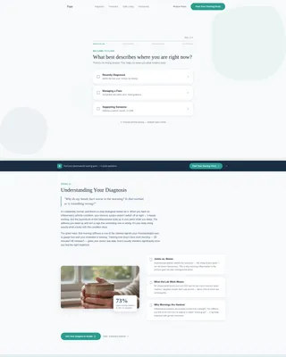
- A four-step assessment hero with a teal progress bar and illustrated selection cards
- Four anchor-linked spoke sections covering diagnosis, treatment, daily living, and community
- A sticky bottom call-to-action bar and a sticky horizontal anchor navigation bar
Feature list
This template ships with several purpose-built features that work together as a cohesive patient experience.
Four-Step Assessment Hero
The header is a multi-step form, not a static image. Step one asks visitors where they are right now and offers three illustrated cards: Recently Diagnosed, Managing a Flare, and Supporting Someone. Each subsequent micro-step narrows the picture further, collecting condition type, treatment status, and top daily challenge, all above the fold.
Teal Progress Bar
A left-to-right filling teal progress bar runs across each assessment card. It gives visitors a visible sense of forward motion. This small detail reduces form abandonment by making completion feel close and achievable.
Sticky Anchor Navigation Bar
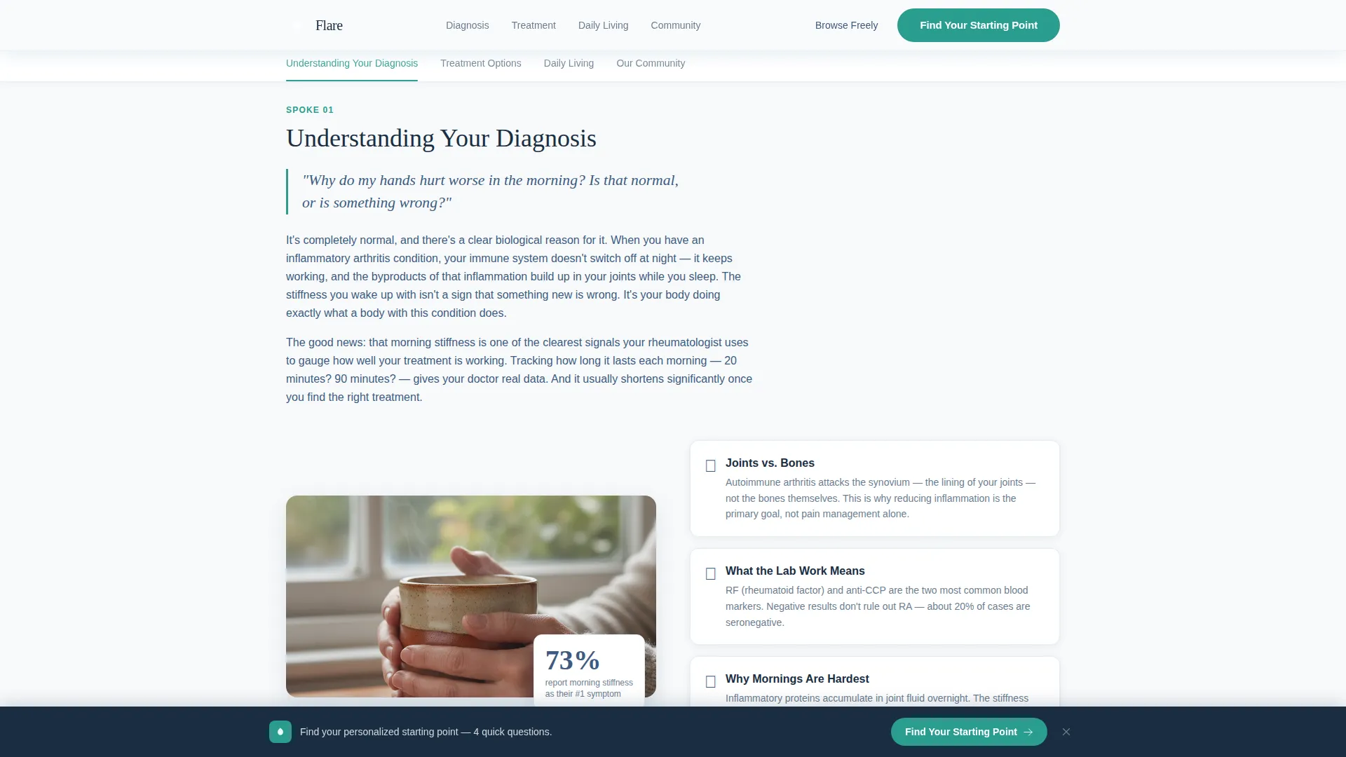
A horizontal sticky navigation bar sits below the hero. It labels the four spoke topics clearly: Understanding Your Diagnosis, Treatment Options, Daily Living, and Our Community. Active states highlight the current section as the visitor scrolls, keeping orientation effortless.
Spoke Section Content Layout
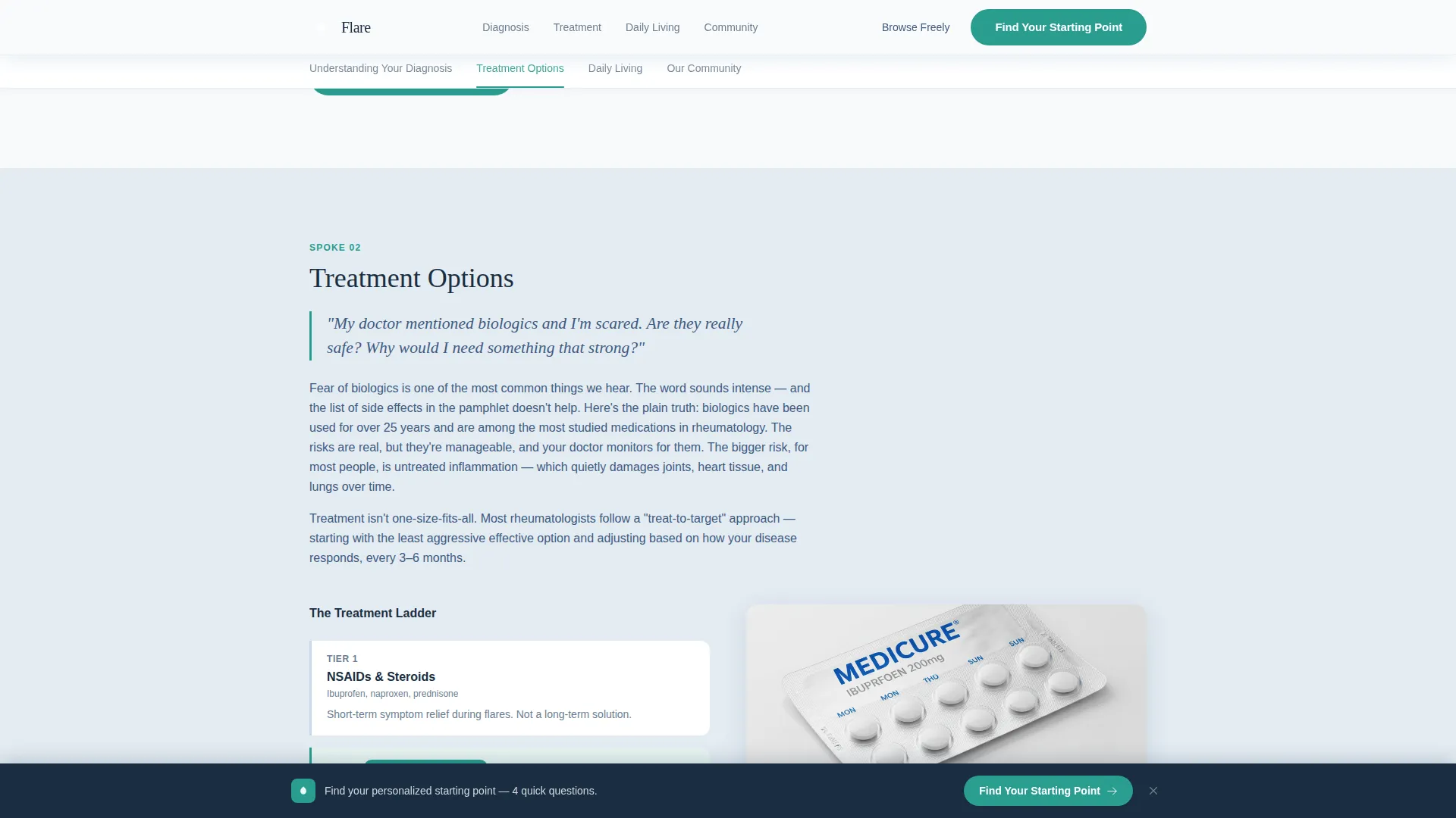
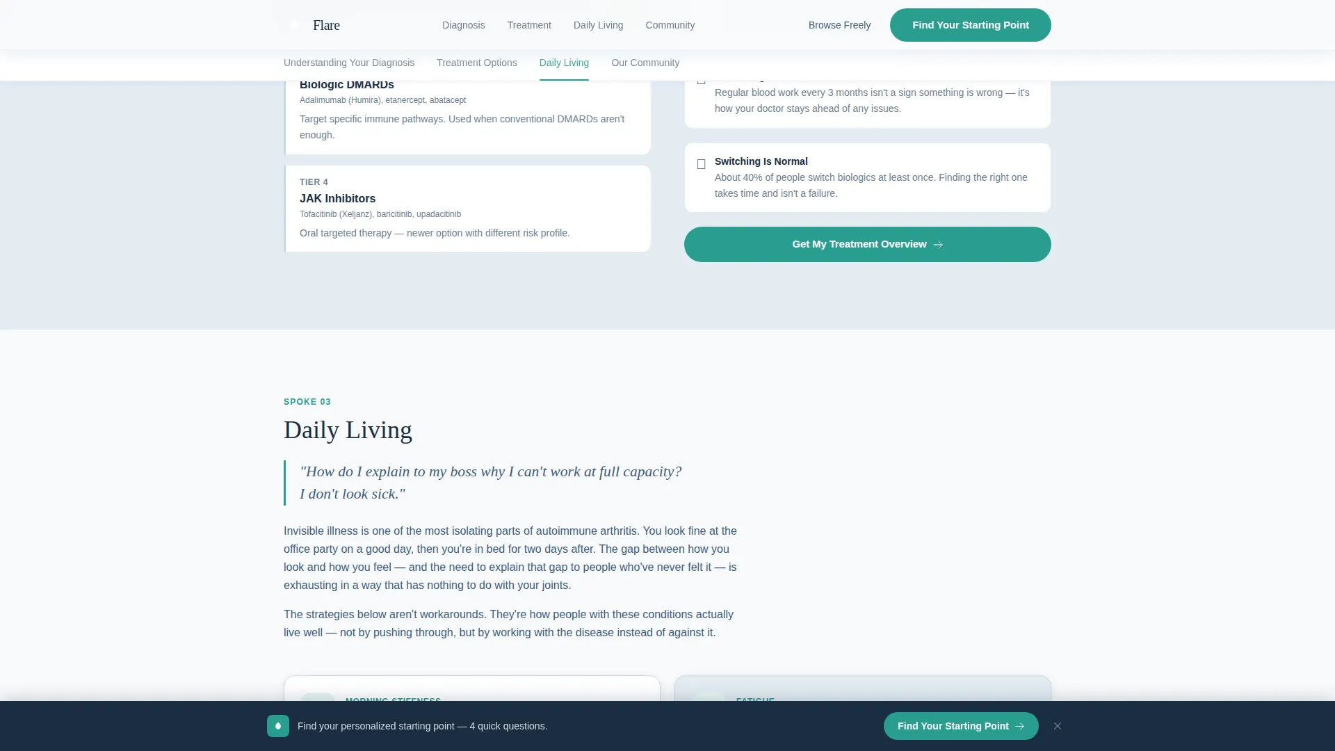
Each of the four spoke sections opens with a real patient question in italic type, followed by two clean paragraphs of plain-language answers and a supporting illustration. The emotional arc builds from clinical facts to lifestyle impact to community belonging.
Personalized Resource Bundle Results
When a visitor completes the assessment, the template delivers a personalized resource bundle and a community subgroup recommendation based on their answers. This output gives the visitor an immediate, relevant reason to engage further.
Sticky Bottom Call-to-Action Bar
After the visitor scrolls past the hero form, a sticky bottom bar reappears with the primary call to action "Find Your Starting Point." It keeps the assessment accessible throughout the entire page without disrupting the reading experience.
Page sections overview
| Section | Purpose |
|---|---|
| Assessment Hero Form | Personalized entry point via four-step micro-assessment |
| Sticky Anchor Nav | Keeps visitors oriented across all spoke sections |
| Understanding Your Diagnosis | Answers core diagnostic questions in plain language |
| Treatment Options | Explains biologics and treatment tiers clearly |
| Daily Living Spoke | Covers morning stiffness, fatigue, and communication strategies |
| Our Community Spoke | Introduces forum, live Q&A calendar, and member stories |
| Footer | Single-row linear footer with key links |
Design & branding system
The visual identity follows a Medical Clarity theme. The palette is sterile enough to trust and warm enough to stay. Typography pairs Fraunces serif display headings with DM Sans body text for a calm, readable contrast.
- Arctic White (#F8FAFB) backgrounds and Soft Frost (#E3EBF2) card surfaces create open, uncluttered layouts
- Steady Slate (#3D5A80) handles all body text and navigation labels for strong legibility
- Reassuring Teal (#2A9D8F) is used exclusively on buttons, progress indicators, and active navigation states
Mobile & speed optimization
Flare is built mobile-first because the target audience most often scrolls on a phone late at night. The layout stacks cleanly at small screen sizes without sacrificing the assessment experience.
- The multi-step assessment and glassmorphic selection cards are fully functional at mobile widths
- GSAP ScrollTrigger reveal animations and step slide transitions are scoped to medium intensity to keep motion smooth
- Server Components handle static spoke content while Client Components manage the interactive assessment form
How this template helps you convert
The entire page is structured around a single conversion goal: getting the right visitor to start the assessment and find their community entry point.
- The assessment hero captures attention immediately by asking a personal, low-pressure question rather than making a hard sell, and the "Browse Without Joining" secondary path keeps cautious visitors in the flow.
- The sticky bottom call-to-action bar and the sticky anchor navigation work together to ensure the primary action is always one tap away, no matter how far down the page the visitor scrolls.
Other information about this template
Flare is suitable for any organization that runs patient communities or condition-specific support groups, not just those focused on rheumatology. The hub-and-spoke layout and anchor navigation structure can support a wide range of health education use cases.
- Social proof elements include member count statistics, testimonial cards with real member stories, and community activity indicators
- The page is localized for English (United States) and designed within a general North American healthcare context
- Animation intensity is set to medium, using GSAP ScrollTrigger for scroll reveals and slide transitions between assessment steps
- The footer follows a linear single-row pattern, keeping the exit experience clean and uncluttered
Theme
Medical Clarity
Creative direction
Problem→Solution Arc
Color system
Arctic White
Style
Hub & Spoke (Anchor Nav)
Direction
Quiz/Assessment
Page Sections
Four-step Assessment Hero
Teal Progress Bar Indicator
Sticky Anchor Navigation Bar
Hub and Spoke Content Layout
Personalized Resource Bundle Results
Sticky Bottom Call-to-action Bar
Related questions
Who is this template designed for?
Can I use this template without a design background?
What does the four-step assessment deliver to the visitor?
Does the template include live forum or calendar functionality?
Can visitors explore the page without completing the assessment?



