LGBTQ+-Owned Business Portfolio & Case Study Website Template
The Flex curated bundle gallery landing page template is built for LGBTQ+-owned fitness studios that want to sell class bundles and attract a community-first clientele. It combines a warm Citrus Burst color scheme, a scrollable class gallery with slide-in detail panels, a persistent cart bar, and a pronoun-inclusive sign-up form into one focused, high-converting landing page.
by Rocket studio
Quick summary
Flex is a gallery and detail landing page template designed for an LGBTQ+-owned fitness studio. It presents three curated class bundles as a hero, then opens into a scrollable class gallery where every tile reveals instructor details, intensity levels, and member testimonials. The page closes conversions through a persistent bottom-bar cart and a pronoun-inclusive three-field form.
Who this template is for
This landing page template is built for studio owners and fitness entrepreneurs who serve queer, nonbinary, and trans communities. It suits anyone who wants a landing page that feels warm and curated rather than clinical and corporate. The right layout here is one that leads with identity, community, and choice rather than a generic class schedule.
- LGBTQ+-owned fitness studios selling class bundles or membership packages
- Independent wellness instructors who want to draw a specific audience with affirming, community-first messaging
- Studio operators moving their booking and bundle purchase flow onto a dedicated landing page
What problem this template solves
Many fitness studio landing page options are built around a one-size-fits-all aesthetic: fluorescent, mirror-heavy, and identity-neutral. That visual language actively pushes away potential customers who have experienced exclusion in traditional gym environments. This template addresses those pain points directly through every design choice, from the absence of mirror imagery to the pronoun selector built into the sign-up form.
- Visitors who belong to queer and trans communities often feel unseen on generic studio websites, which drops conversion rates before a page even loads
- Bundle purchasing typically requires multiple page visits or a clunky checkout flow; this page consolidates discovery, selection, and purchase into one page
- New visitors need trust signals fast; the template surfaces instructor pronouns, member testimonials, and a studio philosophy section to build that trust without delay
What you get with this template
This page template delivers a complete, ready-to-customize landing page built around bundle discovery and purchase. Every component is designed to serve a specific need in the buying journey, from the first-impression hero through to the final cart submission. You get a warm, sun-drenched aesthetic with all the interactive components wired up and ready to go.
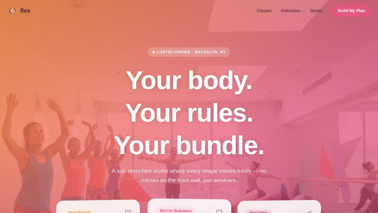
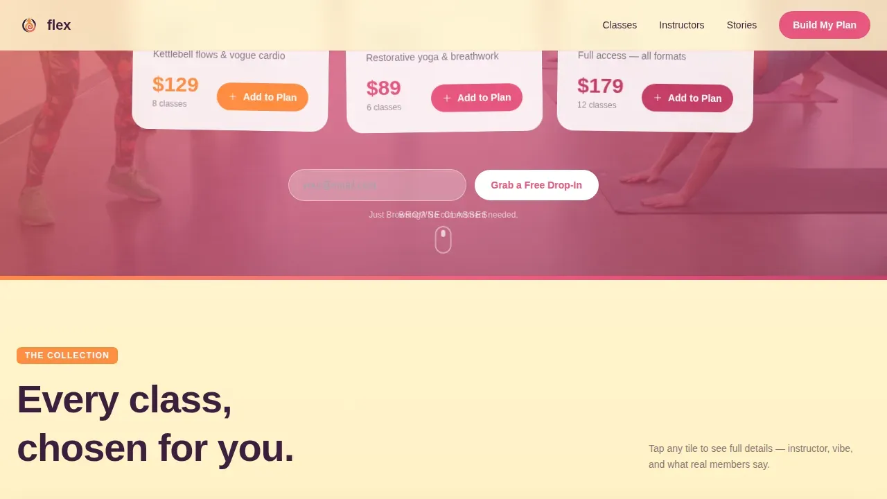
- A hero section with three named bundle cards (Burn, Restore, Electric) floating over a warm gradient background, each with a hand-illustrated icon, class count, and price
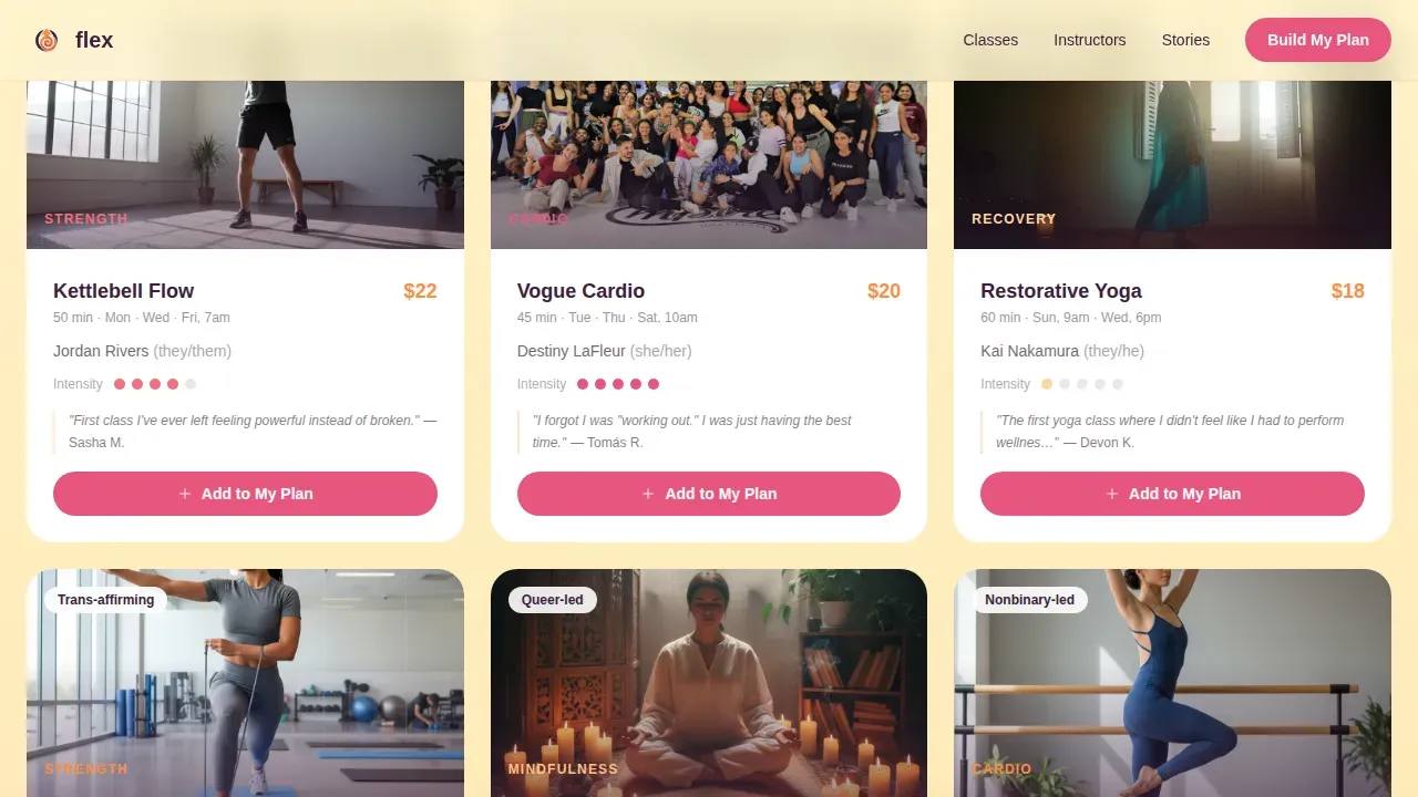
- A scrollable class gallery with slide-in detail panels that display instructor name, pronouns, a one-line philosophy, gradient-dot intensity indicators, and a real member mini-testimonial per tile
- A persistent bottom-bar cart that tallies selected classes and total price in real time, with a "Lock In My Bundle" call to action that expands into a three-field form featuring a pronoun selector
Feature list
This landing page template is packed with components that match the specific needs of a curated, community-first fitness store. Each feature below is drawn directly from the template brief, so what you see described is what you get when you download and deploy the page.
Curated Bundle Hero with Gradient Cards
The header section displays three themed bundles arranged like a curated gift set. Each card is rounded, features a hand-illustrated icon, a bundle name, a class count, and a single price. Cards float over a tangerine-to-grapefruit gradient background with a soft-focus photo of real members behind them, making high quality images the visual anchor rather than stock photography.
Scrollable Class Gallery with Slide-In Detail Panel
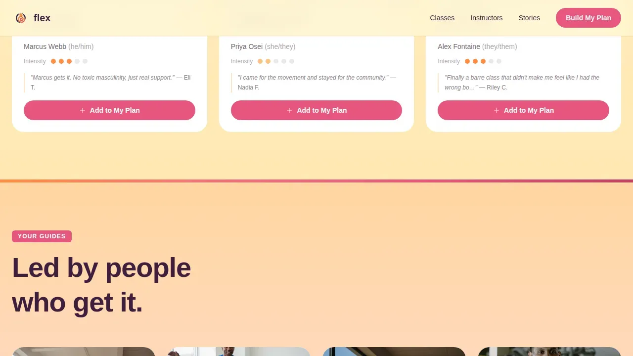
Below the hero, a gallery of individual class tiles lets visitors browse like they are scanning a carefully arranged shelf. Clicking any tile opens a detail panel that slides in from the right. This panel functions similarly to a modal window, revealing instructor name and pronouns, a personal philosophy quote, gradient-dot intensity level, and a mini-testimonial from a named member. The curated gallery approach reduces cognitive load and makes it faster for customers to make a confident purchase decision.
Persistent Cart Bar with Real-Time Tally
Every bundle card and class tile carries its own "Add to My Plan" button. Selections accumulate in a sticky bar pinned to the bottom of the page. The bar updates class count and total price in real time. This sticky call-to-action bar is one of the most essential components for optimizing conversion rates on a multi-selection landing page, keeping the purchase path visible without interrupting the browsing flow.
Pronoun-Inclusive Three-Field Sign-Up Form
When a visitor taps "Lock In My Bundle," the cart bar expands into a compact form with three fields: first name, email, and a pronoun selector displayed as soft pill toggles. This is a crucial design decision for a studio whose value proposition is identity as the baseline assumption, not an afterthought. The form is clean, focused, and free of unnecessary friction.
Free Drop-In Secondary Conversion Path
A secondary call to action sits beneath the hero bundles: "Just Browsing? Grab a Free Drop-In." This path captures an email address alone, lowering the barrier for visitors who are not ready to commit to a bundle purchase. It is a handy way to grow the studio's contact list while keeping the primary bundle conversion flow uncluttered.
Gradient-Shifting Section Bands
Full-width gradient bands separate each major section, shifting hue from tangerine to grapefruit to lemon cream as the visitor scrolls. These bands create visual rhythm and give the page a breathing, living quality. They also serve as implicit section dividers that maintain a consistent brand color scheme without requiring hard borders or drop shadows.
Page sections overview
| Section | Purpose |
|---|---|
| Hero Bundle Cards | Presents three named class bundles with price, icon, and class count over a warm gradient |
| Free Drop-In call to action | Captures email from visitors not ready to commit to a full bundle purchase |
| Class Gallery Tiles | Scrollable grid of individual class options with warm photography and tile details |
| Slide-In Detail Panel | Opens per tile to display instructor, pronouns, intensity, philosophy, and testimonial |
| Instructor Cards | Asymmetric cards with pronouns, philosophy quotes, and class-type tags |
| Member Stories | Named testimonial section featuring specific member transformations |
| Studio Philosophy Band | Full-width gradient section communicating core studio values |
| Persistent Cart Bar | Sticky bottom bar tallying selected classes and total price in real time |
| Bundle Form Expansion | Three-field sign-up form with pronoun pill toggles triggered by cart confirmation |
| Page Footer | Horizontal flow footer with studio navigation and secondary links |
Design & branding system
The design language of this page template is warm, anti-clinical, and unapologetically alive. The Citrus Burst color scheme was chosen to feel like cold-pressed juice in morning light rather than a corporate wellness brand. Every visual choice reinforces the studio's identity as a community space, not a performance arena.
- Color palette: sun-warmed tangerine (#FF8C42), ripe grapefruit pink (#E8567F), fresh lemon cream (#FFF4CC), and deep açaí (#3D1F3C) used for headlines, navigation anchoring, and interactive hover states
- Typography: Plus Jakarta Sans for headings and DM Sans for body copy, both loaded via Google Fonts, creating a readable and modern pairing that supports the warm, curated aesthetic
- Visual style: no stock photography, no mirror imagery; warm natural-light photography at chest height with real members, hand-illustrated icons on bundle cards, and gradient-dot intensity indicators throughout
Mobile & speed optimization
Studio discovery happens on phones between commutes, on lunch breaks, and after a friend's recommendation. This page template is built mobile-first, meaning every section, every detail panel, and every cart interaction is designed to work cleanly on mobile devices before being scaled up to wider screen sizes. Fast loading speed is crucial for any landing page, and the template's Server Components handle static gallery data efficiently while Client Components manage live cart state.
- Responsive layout adapts naturally across all screen sizes, from small phone displays to large desktop browsers, without layout breakage or content overflow
- The persistent cart bar, slide-in detail panel, and pronoun toggle form are all touch-optimized, so users on mobile devices can complete a full bundle purchase without pinching, zooming, or fighting a cramped interface
How this template helps you convert
This landing page template is engineered around multiple, layered conversion paths rather than a single product page with one call to action. Every element, from the bundle cards to the free drop-in path, is focused on moving visitors toward a decision that matches where they are in their journey. Effective landing page design means meeting users at their level of readiness, and this template does exactly that.
- The hero section immediately presents three clear bundles with price and class count visible, so visitors can evaluate options without scrolling. Social proof from member photos behind the cards and mini-testimonials per class tile reinforces trust at every decision point, lifting conversion rates before a visitor even reaches the cart.
- The persistent cart bar and "Lock In My Bundle" call to action keep the purchase action visible at all times. The secondary "Just Browsing? Grab a Free Drop-In" path means even visitors who are not ready to purchase leave a contact detail, so no visit is wasted and the studio can follow up to drive future sales.
Other information about this template
This template is an excellent choice for studio owners who want to create a polished online store experience without building from scratch. Using templates for landing pages can save significant time and effort compared to commissioning fully custom web design. The flex curated bundle gallery landing page template is a strong example of how focused, identity-led design can serve as a powerful marketing tool for a niche business.
- The template is built with Tailwind CSS, a utility-first framework that lets developers customize styles and add custom components without fighting predefined CSS rules. Tailwind CSS makes it straightforward to match the color scheme, adjust typography, and extend the layout without writing large amounts of custom code.
- For studios running their booking or purchase flow through a Shopify store, this landing page template can serve as a dedicated campaign page that drives traffic from social media or email directly to a bundle purchase. Landing pages are crucial for driving conversions and user engagement in Shopify stores, and this template is designed with that goal in mind. A Shopify store benefits from having a standalone landing page that removes navigation distractions and keeps focus on the bundle offer.
- The template also suits teams exploring how to optimize a WordPress site with a dedicated landing page for a specific campaign or seasonal bundle promotion. Whether the underlying store runs on a Shopify store setup or a WordPress site, the page template's components are clean enough to adapt to either platform context.
- Flexible layout options, including grid and masonry-style display for the class gallery, allow for various image sizes and aspect ratios without breaking the visual flow.
- A/B testing different bundle card arrangements or call-to-action copy is straightforward because the template's components are modular and cleanly separated by section.
- The secondary free drop-in path is a handy add-on for studios running targeted marketing campaigns, capturing leads from visitors who are not ready to purchase but are curious about the studio's offerings.
- Positive feedback from member stories and class-level testimonials gives new visitors the social proof they need to feel confident. Strategic placement of customer ratings and reviews specifically for each bundle enhances trust prior to a purchase decision.
- The template's interactive elements, including hover pulses on calls to action, the slide-in detail panel, and gradient-shifting section bands, draw visitors deeper into the page and encourage longer time-on-page, which supports healthier user behavior metrics.
- Teams who want to download the template and customize it for a different wellness niche, such as a yoga-only studio or a dance fitness brand, will find the color scheme, icons, and typography easy to swap out while maintaining the overall structure.
Theme
Soft Gradient
Creative direction
Curated Collection
Color system
Citrus Burst
Style
Gallery + Detail
Direction
Marketplace/Multi
Page Sections
Curated Bundle Hero with Gradient Cards
Scrollable Class Gallery with Slide-in Panel
Persistent Cart Bar with Real-time Tally
Pronoun-inclusive Sign-up Form
Free Drop-in Secondary Conversion Path
Gradient-shifting Section Bands
Related questions
Can I customize the bundle names, prices, and class counts?
Does the slide-in detail panel work like a modal window?
Is this landing page template suitable for a Shopify store?
How does the free drop-in path work?
Can I add a short video to the hero or gallery sections?



