Arthritis Digital Therapy App Landing Page Template
Flex is a sidebar companion landing page for an arthritis digital therapy app. It guides visitors through a self-scored joint-health audit, then converts them with a five-question "Check Your Joint Score" quiz. Built for three distinct arthritis audiences, it pairs educational checkpoints with app feature screenshots across a warm, clinically grounded design.
by Rocket studio
Quick summary
Flex is a single-page sidebar companion landing page for an arthritis digital therapy app. It walks visitors through a personal joint-health audit using numbered checkpoints, builds quiet urgency, and converts with a five-question progressive quiz. The layout uses a persistent sidebar for navigation and progress tracking, anchoring the experience from first scroll to final click.
Who this template is for
This template is built for digital health teams and solo developers launching an arthritis management app. It speaks directly to three real user types and gives each one a reason to keep reading.
- Newly diagnosed women in their forties managing medication side effects and looking for daily structure
- Retirees whose morning stiffness consistently takes two or more hours to ease
- Remote workers quietly managing psoriatic flare-ups and needing discreet, practical daily tools
What problem this template solves
Most health app landing pages feel generic. They talk about wellness broadly, but never speak to the specific rhythm of chronic joint pain. Visitors who live with arthritis leave quickly because nothing on the page reflects their actual experience.
- There is no clear structure to help someone self-identify why the app is relevant to them
- Standard pages bury the call to action and give visitors no reason to stay engaged long enough to convert
- Generic layouts cannot carry the tone of clinical warmth that arthritis audiences need to trust a digital product
What you get with this template
This template gives you a fully structured, scroll-driven landing page with a sidebar layout and high-interactivity quiz conversion flow. Every section is purposefully sequenced to move a visitor from awareness to action.
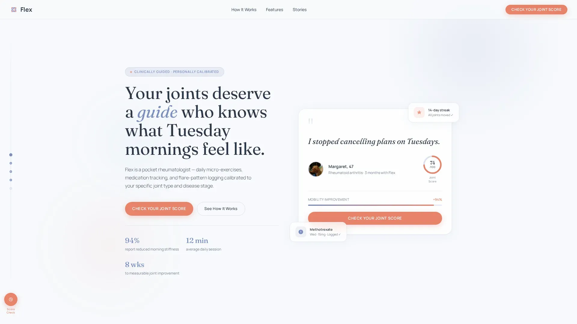
- A floating testimonial card header with an animated joint-mobility score ring and a persistent "Check Your Joint Score" call-to-action button
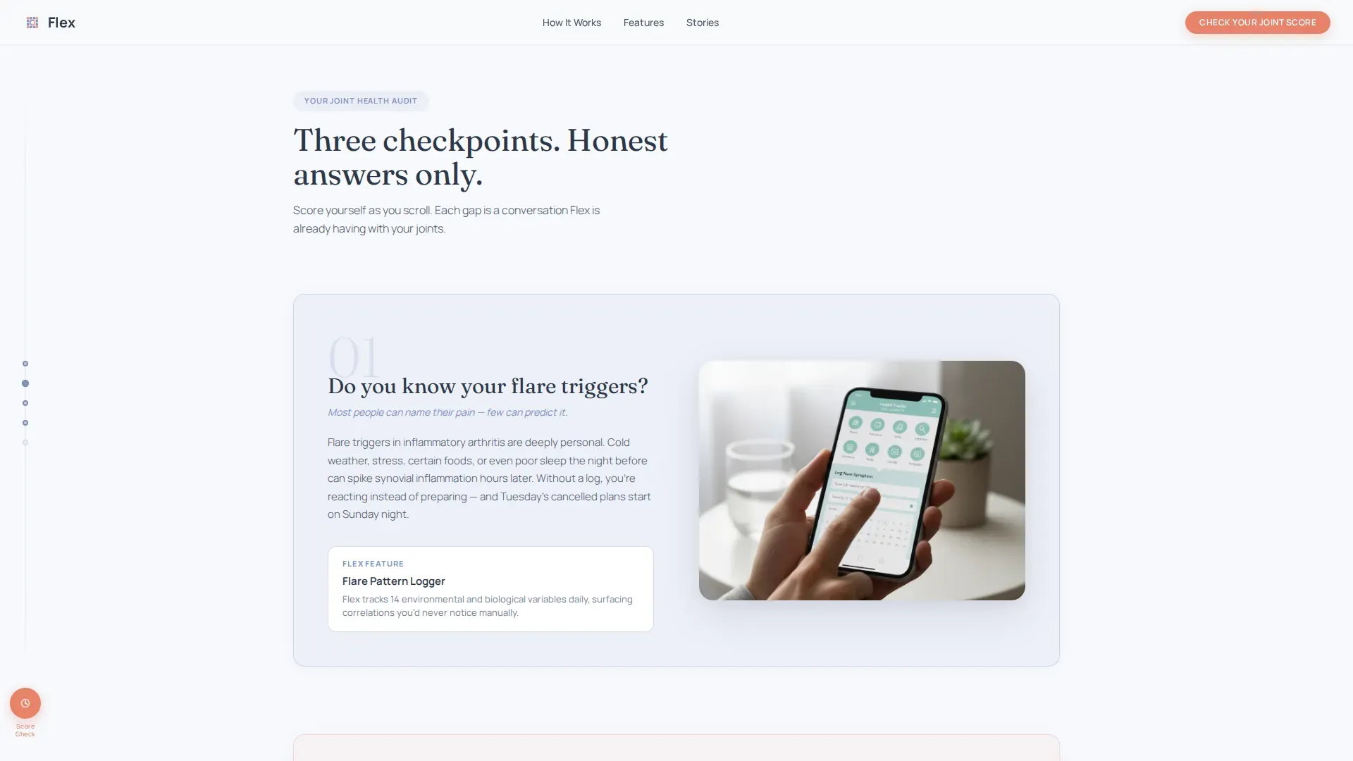
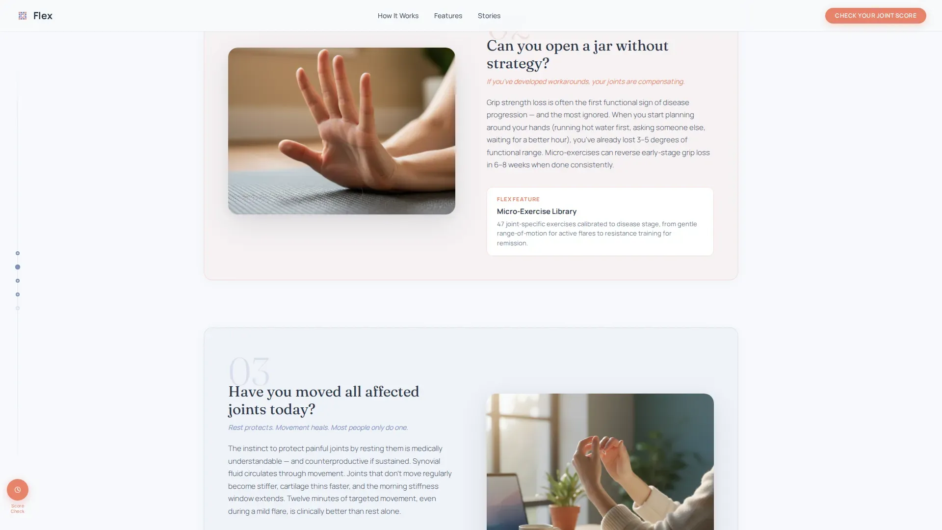
- Three numbered joint-audit checkpoints with educational copy and paired app feature screenshots
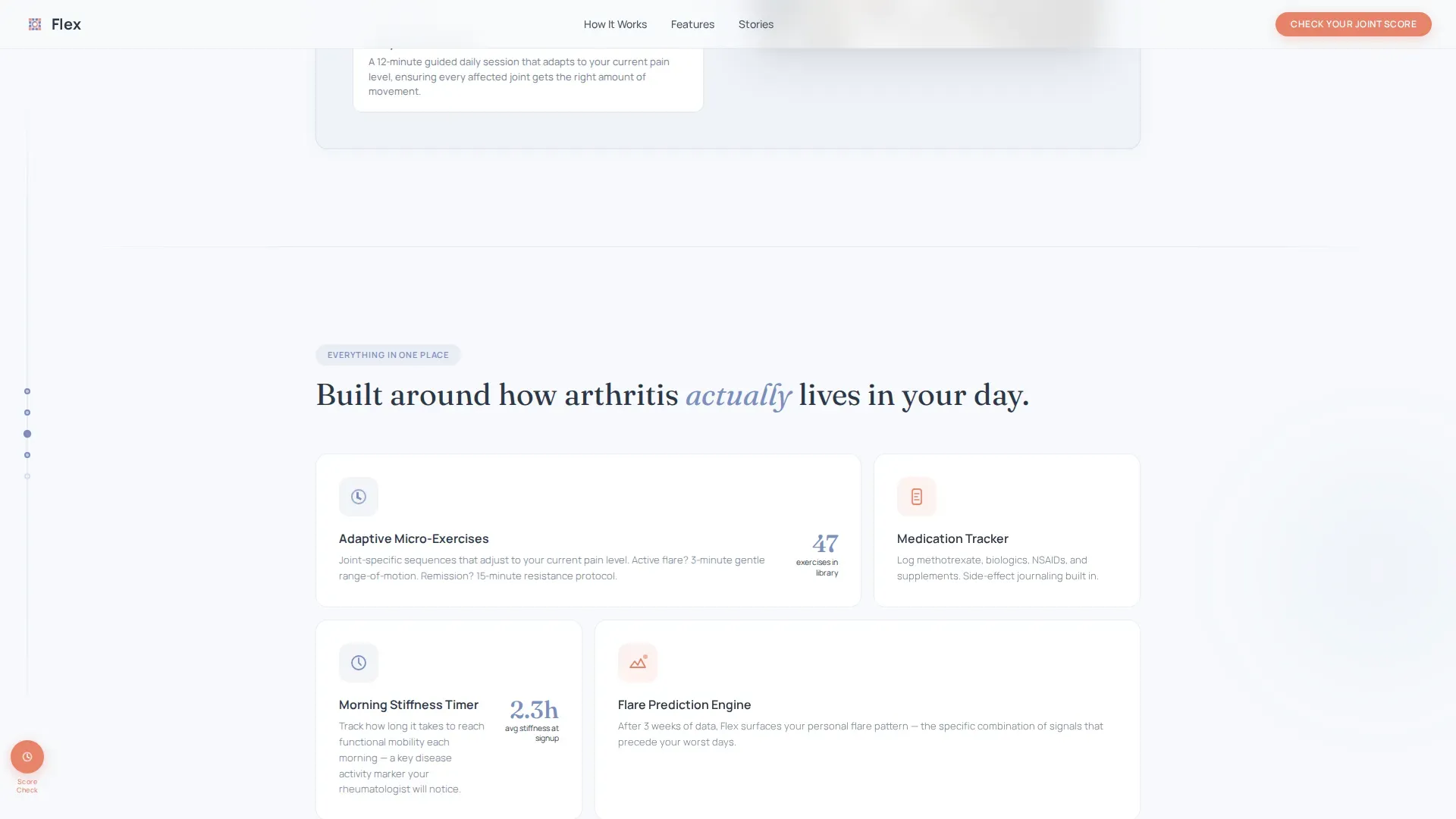
- An asymmetric feature bento grid, an ICP-matched testimonials section, and a five-question progressive quiz modal
Feature list
This template is built around specific, prompt-defined components that work together as a conversion system for a health app audience.
Animated Testimonial Card Header
The hero area is a single oversized card floating on a soft white background. It displays a real user quote, a first name and age, a circular portrait of hands holding a coffee mug, and an SVG ring that animates from a joint-mobility score of 38 to 74 over two seconds. No stock photography is used.
Sidebar Progress Navigation
A persistent left-side navigation anchors the entire page. As the visitor scrolls through each checkpoint, small filled circles fill in to reflect progress. The sidebar also hosts a persistent "Check Your Joint Score" button so the call to action is always one click away.
Joint-Audit Checkpoint Sections
Three numbered self-assessment checkpoints guide the visitor down the page. Each presents a question the user mentally scores themselves against, followed by a short educational paragraph and a screenshot of the app feature that addresses that specific gap. Tone moves from awareness to urgency to relief.
Five-Question Progressive Quiz Modal
Clicking the primary call to action opens a multi-step quiz that feels like a clinical intake form. Questions cover affected joints via a tap-to-select body map, morning stiffness duration via a slider in minutes, current treatment type, biggest daily frustrations via multi-select, and an email field for personalized results.
Feature Bento Grid
An asymmetric bento layout presents three core app capabilities: the micro-exercise library, the medication tracker, and the flare-pattern log. Each tile is visually distinct and calibrated to show the app's depth without overwhelming the visitor.
ICP-Matched Testimonials Section
Three testimonial blocks each carry a direct quote, a first name, an age, and a condition tag. The quotes are written to reflect the language real arthritis patients use, reinforcing trust before the quiz call to action appears.
Page sections overview
| Section | Purpose |
|---|---|
| Hero Testimonial Card | Opens with a real quote and animated mobility score to build immediate emotional trust |
| Sidebar Progress Nav | Anchors navigation and persists the primary call to action throughout the scroll |
| Joint Audit Checkpoints | Three self-scored questions escalate awareness and pair each gap with an app screenshot |
| Feature Bento Grid | Shows the micro-exercise library, medication tracker, and flare log in one visual pass |
| Trust Testimonials | Three condition-tagged quotes reinforce credibility before the quiz |
| Quiz Modal | Five-question intake flow collects joint data and email for a personalized score |
| Footer | Single-row linear footer closes the page cleanly |
Design & branding system
The visual identity follows an Educational Guide theme using a Cloud Canvas color system. The palette feels clinical enough to earn trust and human enough to feel like care.
- Colors: soft cumulus white (#F7F9FC) for backgrounds, morning-mist lavender (#D6DCED) for subtle depth, calm-sky periwinkle (#7B8FBF) as the primary interface color, and warm-touch coral (#E8836B) reserved for active buttons and progress indicators
- Typography: Fraunces serif is used for all headlines to add warmth and authority, while Manrope handles body text and user interface elements for clean legibility
Mobile & speed optimization
The layout is designed desktop-first to support the sidebar navigation and bento grid structure. It stacks responsively for smaller screens without breaking the checkpoint flow.
- The sidebar collapses into a mobile-friendly progress indicator so smaller screens retain the self-audit experience
- Static sections use server-side rendering while the quiz modal, SVG ring animation, and sidebar progress circles are handled as client components for smooth performance
How this template helps you convert
Every structural decision in this template serves the single goal of getting the right visitor to click "Check Your Joint Score" and fill in their email.
- The checkpoint audit format creates self-identification before the call to action appears, so visitors already feel understood by the time they reach the quiz
- The progressive quiz is framed as a clinical intake experience, using specific language about joints, stiffness, and treatment that signals this is not a generic wellness product
- The persistent sidebar button keeps the conversion path visible at all times without interrupting the reading experience
Other information about this template
This template is built specifically for the arthritis care niche within the broader health and medical category. It is not a general wellness layout and should not be repurposed for unrelated conditions without significant content adjustment.
- The template is categorized under Health and Medical, Arthritis Care, and is designed for arthritis digital therapy app use cases
- The Educational Guide theme and Checklist and Audit creative direction are deliberately chosen to mirror the experience of a guided clinical conversation
- The Quiz and Assessment landing-page direction means conversion depends on the quiz modal working correctly; the template is structured so every section feeds curiosity toward that modal
- Animation intensity is high: the SVG score ring, scroll-triggered checkpoint reveals, quiz modal transitions, and sidebar circle fills are all part of the intended experience
- The footer uses a linear single-row pattern, keeping the close of the page minimal and uncluttered
Theme
Educational Guide
Creative direction
Checklist & Audit
Color system
Cloud Canvas
Style
Sidebar Companion
Direction
Quiz/Assessment
Page Sections
Animated Testimonial Card Hero
Persistent Sidebar Navigation
Numbered Joint-audit Checkpoints
Five-question Progressive Quiz Modal
Asymmetric Feature Bento Grid
Icp-matched Testimonial Blocks
Related questions
Who is this landing page template built for?
Can I change the quiz questions to match my app's intake flow?
Does the sidebar navigation work on mobile devices?
What does the animated joint-mobility score ring show?
Is this template suitable for a multi-condition chronic illness app?



