Arthritis Exercise Program Landing Page Template
Flex is a zigzag landing page template built for physiotherapy-led arthritis exercise programs. It opens with a three-step conversational form, guides visitors through a Problem→Solution arc that names real daily frustrations, and closes every second section with a teal "Book Your Assessment" call to action. The design feels like a warm consultation room, not a clinic brochure.
by Rocket studio
Quick summary
Flex is a single-page landing page template designed for guided arthritis exercise programs. It pairs a warm Medical Clarity visual identity with a high-interactivity layout: a multi-step intake form at the top, alternating problem-and-solution zigzag sections through the scroll, and a sticky booking bar that follows the visitor all the way down.
Who this template is for
This template speaks directly to physiotherapy practices and health professionals who run structured arthritis exercise programs and need a page that earns trust before asking for a booking.
- Physiotherapists and allied health clinics offering graded joint mobility programs
- Health coaches or exercise physiologists targeting adults with arthritis-related pain
- Adult children or family members researching safe movement programs on behalf of a parent
What problem this template solves
Many health program pages feel either too clinical or too vague. They list credentials without addressing the real fear: "What if movement makes my pain worse?" This template solves that directly.
- Visitors arrive with specific, named frustrations and leave with a clear picture of what happens next
- The page addresses fears around dependency, surgical risk, and isolation before the visitor has to ask
- The booking flow removes friction by confirming a 30-minute, no-referral assessment as the first step
What you get with this template
You get a fully structured single-page layout with every section planned and sequenced. The design system, interactive components, and conversion flow are all built into the template.
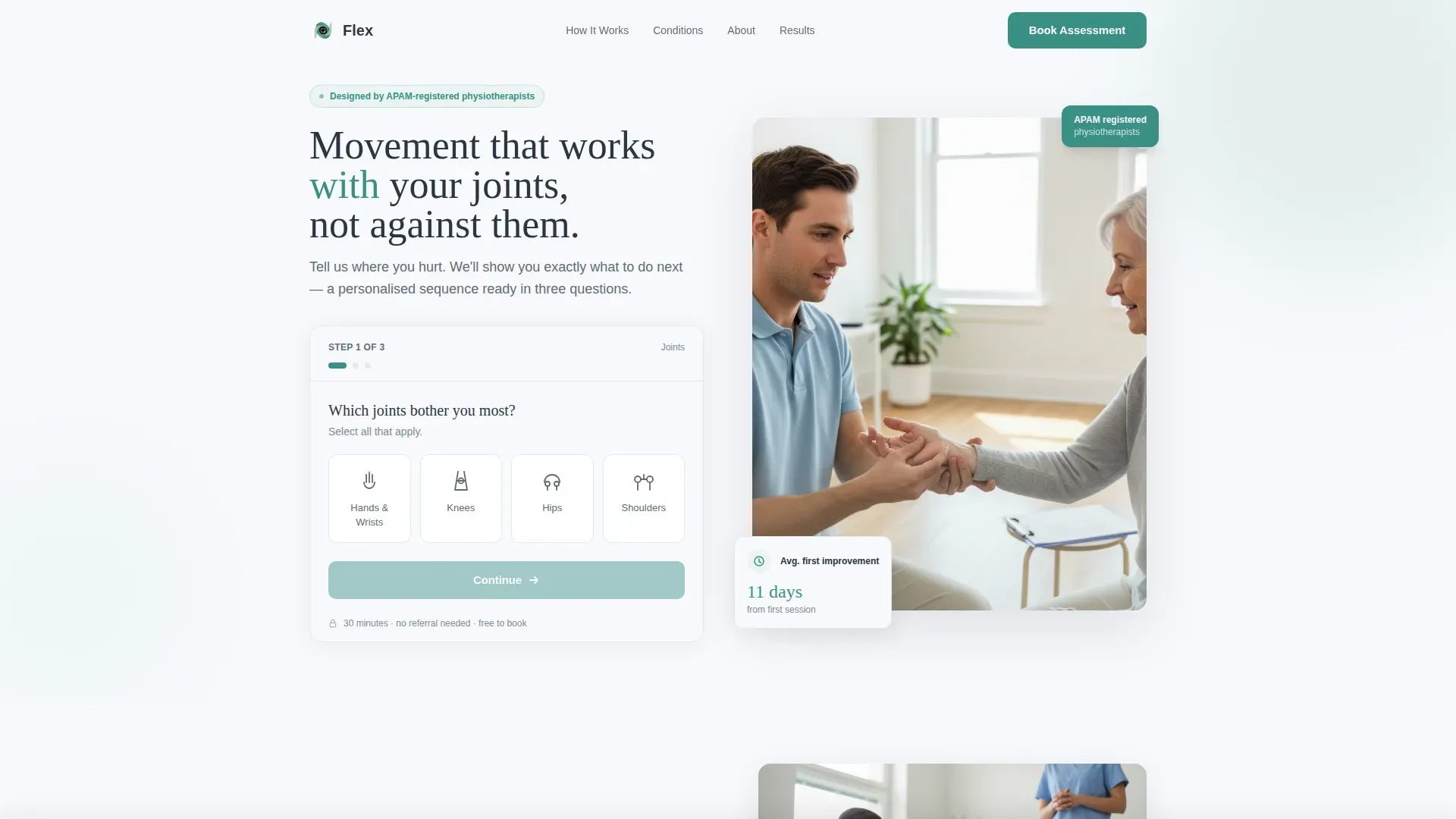
- A three-step conversational header form with illustrated joint selectors and plain-language daily-impact options
- Four zigzag content sections each pairing a named patient frustration with a specific program answer
- A sticky bottom bar with a simplified "Choose a Time" button and an embedded calendar link
Feature list
This template includes the following built-in components and design features, all grounded in the source brief.
Three-Step Intake Form
The header form opens with a body-map selector for hands, knees, hips, and shoulders. Step two asks how pain affects daily tasks using plain-language options. Step three collects a preferred session time. The form feels like a conversation, not a medical intake sheet.
Zigzag Problem and Solution Layout
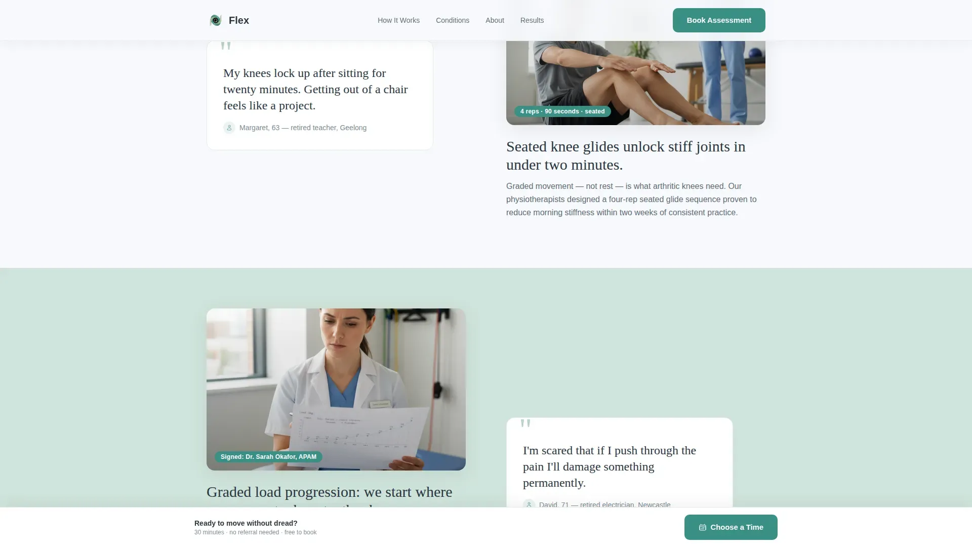
Each alternating section pairs a specific patient frustration on one side with the program's concrete answer on the other. Short looping video placeholders, physio-signed paragraphs, and rep-count overlays give each pair clinical weight without becoming dense.
Sticky Booking Bar
A bottom bar appears as the visitor scrolls. It carries a simplified "Choose a Time" button linked to an embedded calendar. This keeps the booking action visible without interrupting the reading flow.
Repeating Assessment Call to Action
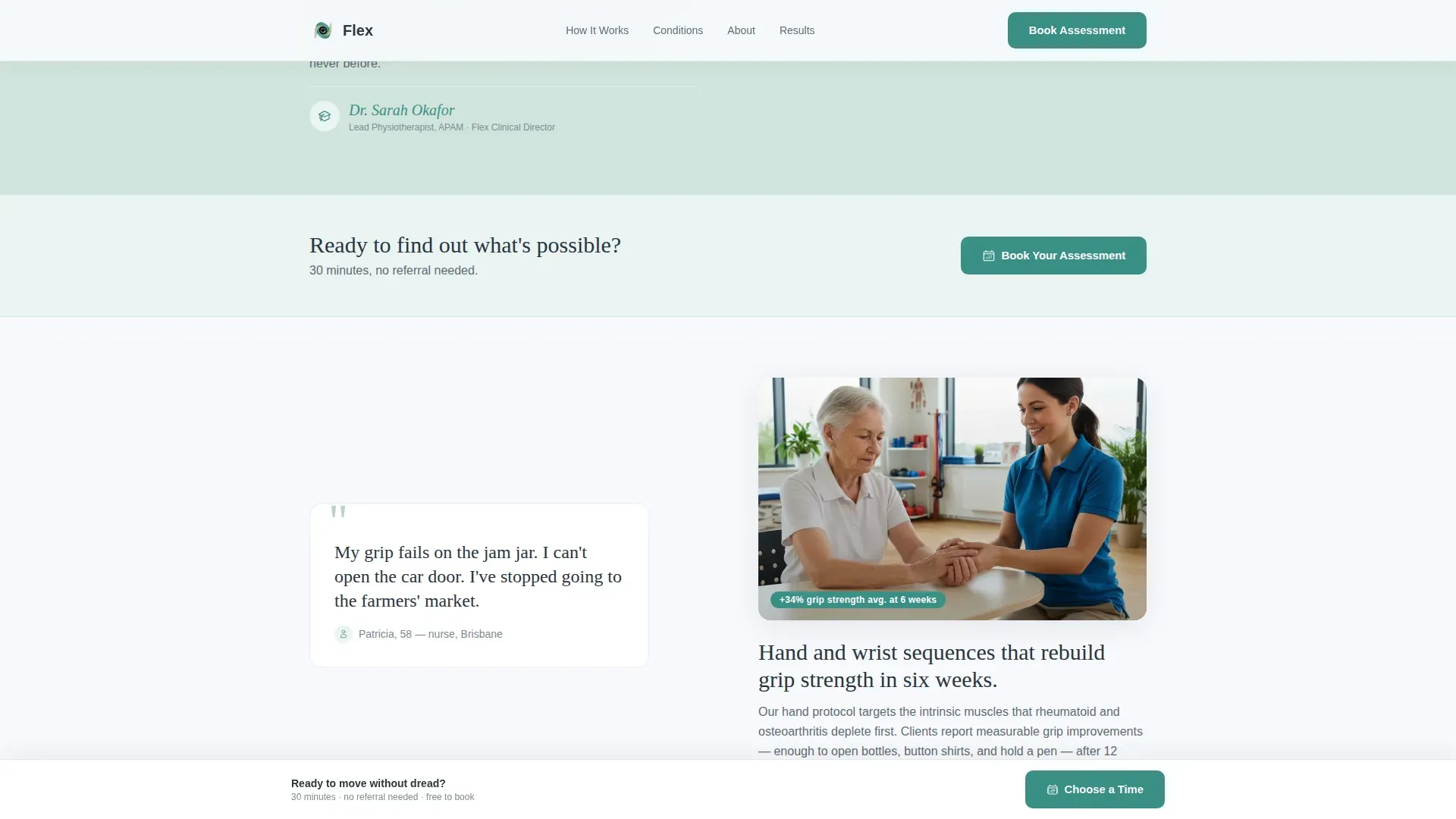
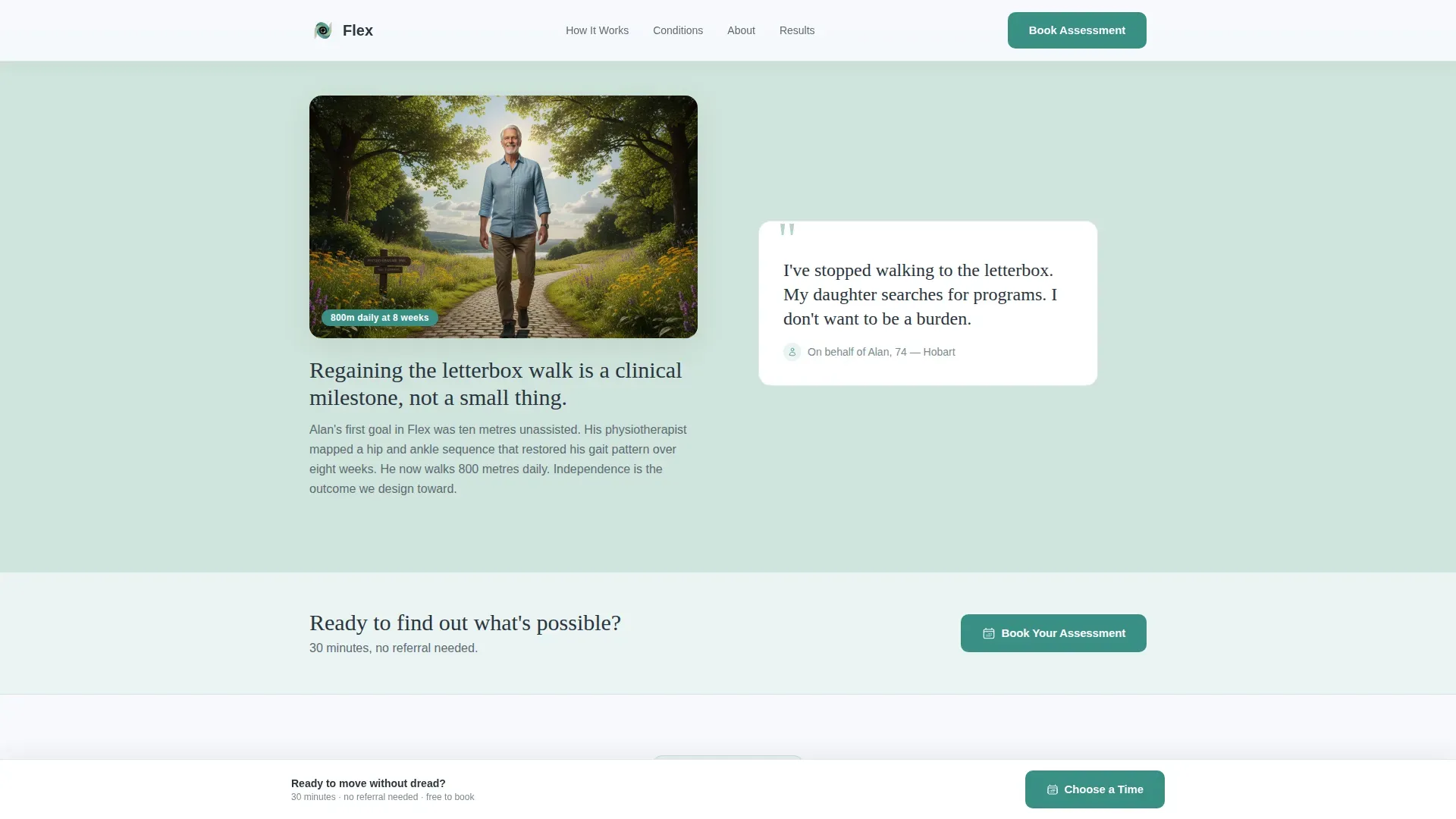
"Book Your Assessment" appears after every second zigzag pair, always in teal, always paired with the line "30 minutes, no referral needed." The repetition normalises the next step rather than pressuring the visitor.
Warm Clinical Photography Layout
The hero section is designed as a split layout. One side holds the intake form. The other holds a photograph of a physiotherapist guiding a patient's wrist in natural light. The visual signals care and competence together.
Testimonials Section
A dedicated section carries named patient outcomes with specific detail. This section is placed after the problem-solution arc, when the visitor is already primed to believe the results are real.
Page sections overview
| Section | Purpose |
|---|---|
| Hero with Form | Opens with three-step intake and warm consultation photo |
| Problem Pair 1 | "Knees lock after sitting" paired with seated knee glide video |
| Problem Pair 2 | "Afraid I'll make it worse" paired with graded progression explainer |
| Problem Pair 3 | Isolation and dependency fears paired with clinical credibility content |
| Booking Call to Action | Teal call to action repeated after every second pair with assessment details |
| Testimonials Section | Named patient outcomes with program-specific results |
| Footer | Linear single-row footer with program links and contact info |
Design & branding system
The template uses a Medical Clarity theme built on a Soft Mist color system. The palette is deliberately restrained, saving the most active color for moments that require a decision.
- Clinical white (#F7F9FC) dominates all backgrounds; pale eucalyptus (#D0E4DC) washes alternate zigzag sections to create gentle rhythm without visual noise
- Quiet slate (#5E6B75) carries all body text for readability without the coldness of pure black
- Reassuring teal (#3A8F85) appears only on buttons, progress indicators, and interactive highlights, so every teal element signals an action
Mobile & speed optimization
The template is built mobile-first, which directly matches the target audience. Adults in their fifties and older are more likely to search and scroll on a phone or tablet than on a desktop.
- Static content sections use server-rendered components for faster initial load on lower-powered devices
- Interactive elements including the multi-step form and sticky booking bar are client-side components, keeping the rest of the page lightweight
- Scroll reveal animations are set to medium intensity, smooth enough to feel considered without slowing navigation on older devices
How this template helps you convert
The page is engineered around one outcome: a booked 30-minute assessment. Every structural decision supports that goal.
- The multi-step header form diagnoses the visitor's specific joint pain pattern before any commitment is requested, making the eventual booking feel personally relevant rather than generic
- The Problem→Solution arc escalates from minor daily annoyances to deeper fears, resolving each one with clinical specificity, so the visitor feels understood rather than sold to
- The sticky booking bar and repeated "Book Your Assessment" call to action ensure the conversion path is always visible, whether the visitor is at the top, middle, or bottom of the page
Other information about this template
This template is built for the Flex arthritis exercise program concept and can be adapted for similar physiotherapy or guided movement offerings. A few additional notes for context.
- Typography uses DM Sans for body text and user interface elements, and Fraunces for editorial headlines, creating a contrast between warmth and clinical clarity
- The footer follows a linear single-row pattern, keeping the bottom of the page clean and uncluttered
- Scroll reveal animations and form step transitions are set at medium intensity throughout the layout
- The page is localized in English with pricing and context suitable for Australian markets, though the structure works equally well for other English-speaking regions
- The overall tone is designed to feel like a warm consultation room where a practitioner listens carefully, draws a clear diagram, and explains the next step
Theme
Medical Clarity
Creative direction
Problem→Solution Arc
Color system
Soft Mist
Style
Zigzag/Alternating
Direction
Booking/Scheduling
Page Sections
Three-step Conversational Intake Form
Zigzag Problem and Solution Sections
Sticky Bottom Booking Bar
Repeating Teal Booking Call to Action
Warm Split Hero Layout
Named Patient Testimonials Section
Related questions
Who is this landing page template designed for?
Can I adapt the problem-and-solution sections for a different condition?
What does the multi-step form collect from visitors?
How does the sticky booking bar work?
How many times does the booking call to action appear on the page?



