Kids Magazine Landing Page Template
Flipside is a scroll-reveal landing page template built for a children's print magazine subscription. It opens with an illustrated quiz, guides visitors through interactive puzzle and parallax moments, and closes with a clear subscription call to action. Designed for parents and gift-givers, it lets the audience experience the magazine before they buy.
by Rocket studio
Quick summary
Flipside is a single-page, scroll-reveal template for a children's monthly magazine subscription. It draws visitors in with a playful character quiz, then unfolds the magazine experience section by section through drag interactions, parallax page stacks, and handwritten testimonials. By the final call to action, visitors have already played with the content.
Who this template is for
This template is built for anyone launching or promoting a children's print magazine subscription. It works equally well for a new publication finding its first subscribers and an established title refreshing its online presence.
- Parents of five-to-eleven-year-olds looking for a screen-free monthly gift
- Grandparents and relatives wanting a meaningful, hands-on activity to share
- Publishers and independent creators selling a kids magazine direct to families
What problem this template solves
Selling a print magazine online is tricky. A static page listing features rarely captures the warmth and tactile joy that makes a kids magazine worth buying. Visitors need to feel what the magazine is like before they commit to a subscription.
- Parents scrolling quickly on a phone need instant engagement, not long paragraphs
- Gift-givers need to picture a child's reaction, not just read a product description
- The template bridges that gap by letting visitors interact with actual content before they reach the checkout button
What you get with this template
You get a complete, ready-to-customise scroll-reveal landing page with six purposeful sections built from the brief up. Every section is designed to move the visitor one step closer to clicking "Pick Their First Issue."
- A letter-by-letter animated hero headline and three 3D flip character quiz cards
- A draggable puzzle interaction, a parallax illustrated page stack, and a handwritten testimonial carousel
- Subscription pricing cards, a gift subscription path, a sticky call-to-action button, and a horizontal-flow footer
Feature list
A short paragraph introduces the features: each component below was specified in the brief and built to serve a distinct moment in the visitor's journey from curious to converted.
Animated Quiz Hero
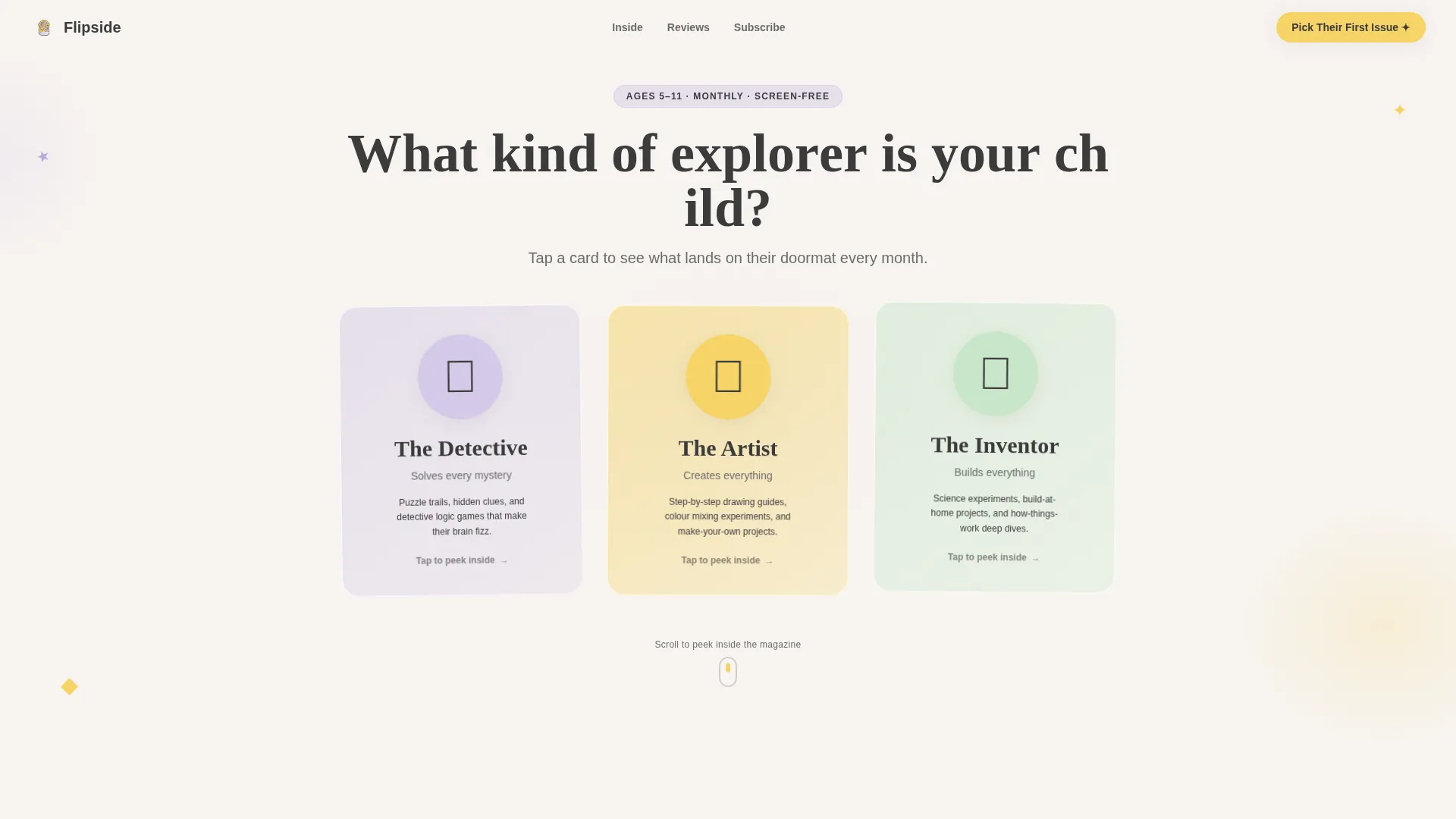
The page opens with a headline that types itself letter by letter: "What kind of explorer is your child?" Three large illustrated character cards sit below it. Each card wobbles gently as if freshly hand-drawn. The visitor taps one, the card flips in 3D, and a sample magazine spread appears tailored to that curiosity type.
Draggable Puzzle Interaction
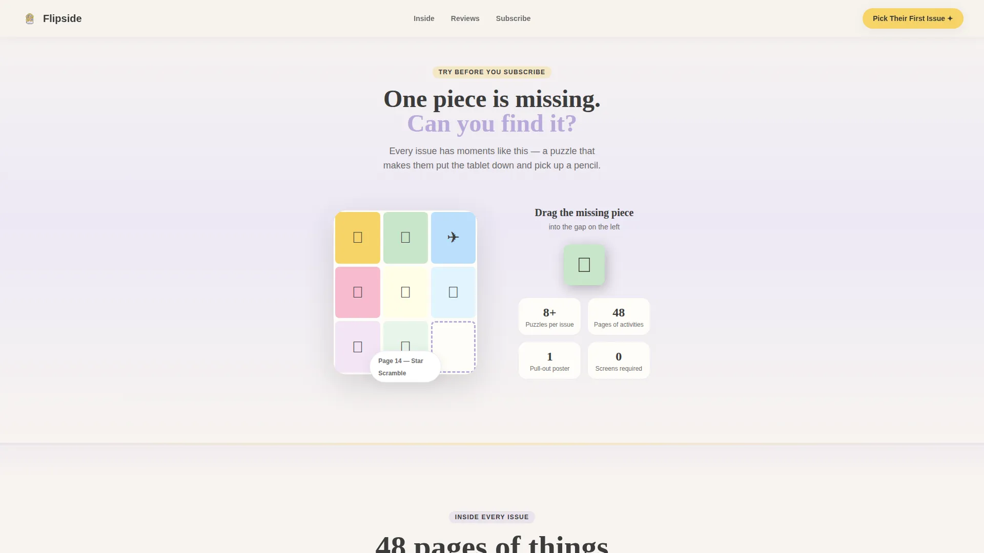
After the quiz result, a single magazine puzzle appears with one piece missing. The visitor drags the missing piece into place. This moment is brief and tactile, designed to replicate the feeling of sitting with the magazine at a kitchen table.
Parallax Magazine Stack
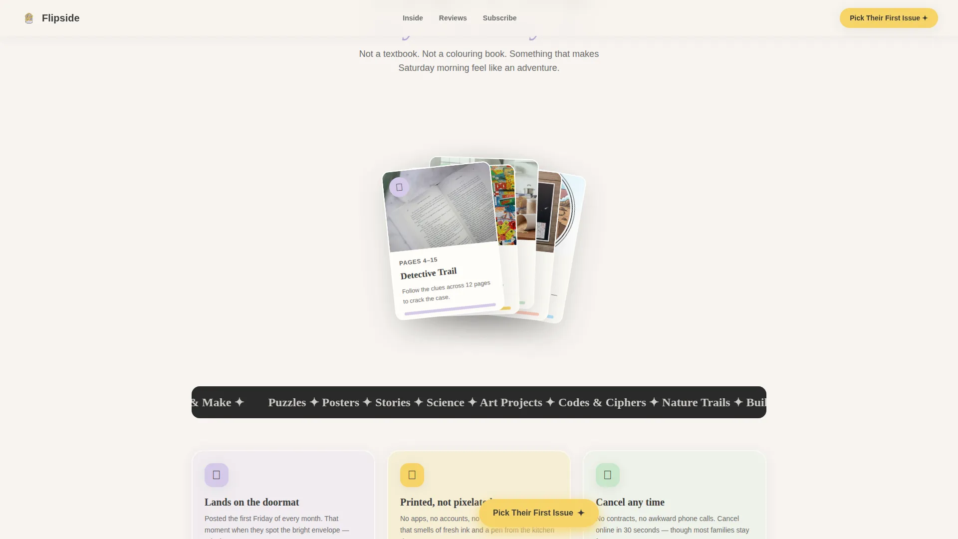
Illustrated pages fan open like a real magazine as the visitor scrolls. The parallax layering gives each page depth and movement, making the content feel physical even on a screen.
Handwritten Testimonial Carousel
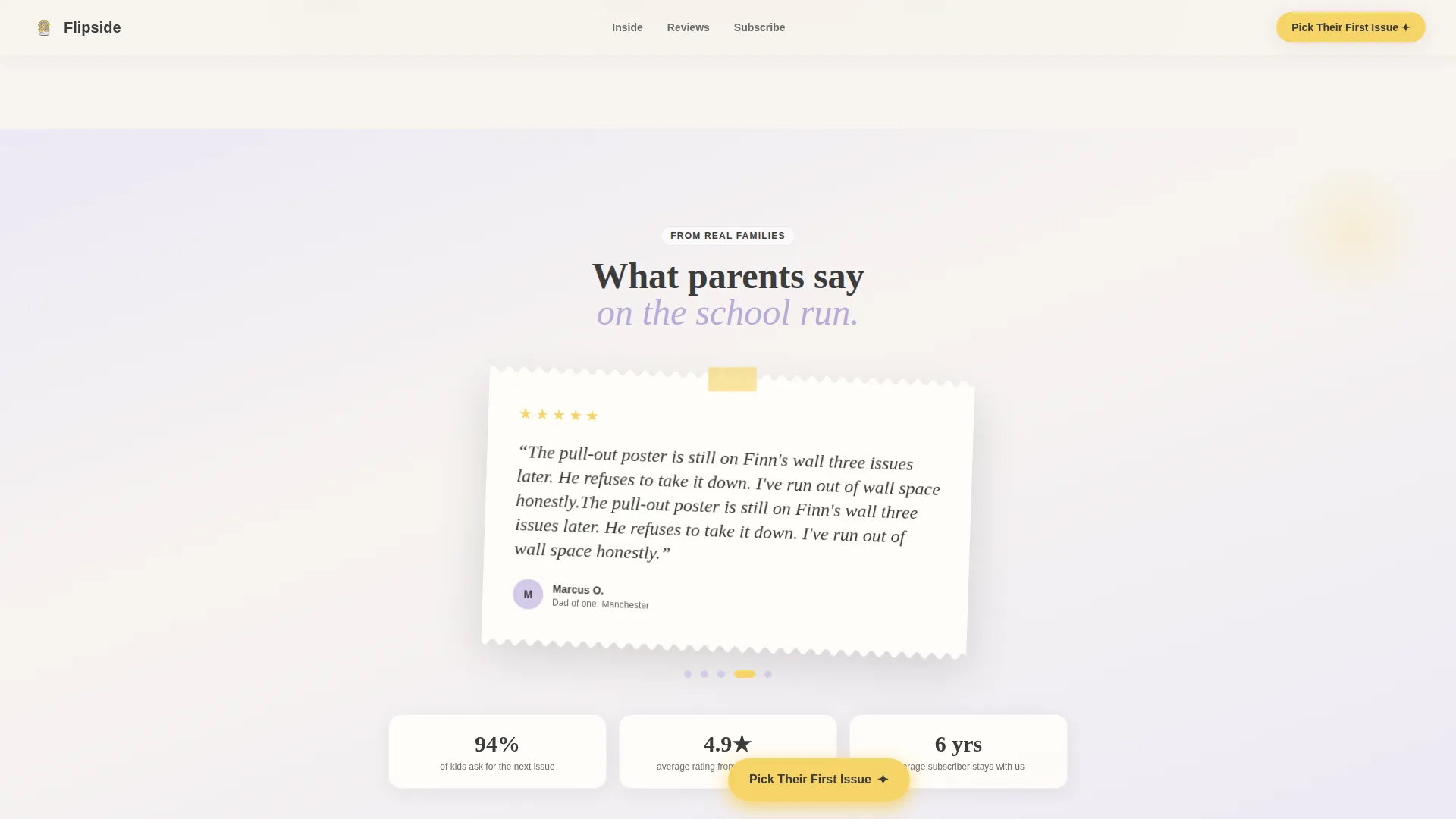
Parent quotes appear styled as handwritten notes on torn notebook paper. Each testimonial references a specific child age and activity, making the social proof feel personal rather than generic.
Sticky Call-to-Action Button
Once the visitor scrolls past the puzzle section, a sticky "Pick Their First Issue" button appears and stays visible. It carries the visitor's chosen explorer type as a parameter, so the linked subscription checkout opens with the correct age range pre-selected.
Gift Subscription Path
A secondary call to action, "Send a Gift Subscription," surfaces beside the final pricing section. It gives grandparents and relatives a clear, separate route to purchase without interrupting the primary subscriber flow.
Page sections overview
| Section | Purpose |
|---|---|
| Hero Quiz | Animated headline and three flip character cards to personalise the experience |
| Puzzle Interaction | Draggable puzzle piece gives a tactile preview of magazine content |
| Magazine Parallax | Illustrated pages fan open as a scrolling stack to show depth |
| Testimonial Carousel | Handwritten parent quotes build trust with specific, relatable detail |
| Pricing and call to action | Subscription cards and gift path with primary and secondary actions |
| Footer | Horizontal-flow pattern closing the page cleanly |
Design & branding system
The visual identity follows a warm, watercolour-editorial style described as Family First. Every colour choice and type pairing reinforces the idea that this magazine belongs on a kitchen table, not a corporate shelf.
- Colour palette: cloud white (#F7F4F0) backgrounds, washed lavender (#D5CAE8) section dividers, dandelion yellow (#F6D365) buttons and interactive highlights, soft charcoal (#3B3B3B) body text
- Typography: Fraunces serif for display headings and Plus Jakarta Sans for body copy, pairing editorial warmth with clean readability
- Illustration style: hand-drawn characters, torn paper textures, and intentionally imperfect details throughout
Mobile & speed optimization
The template is built mobile-first, reflecting the primary audience: a parent checking their phone during a school activity. Scroll animations use native CSS scroll behaviour with no external scroll library dependency.
- Layout and interactions are optimised for one-handed mobile use with large tap targets on quiz cards and the sticky button
- CSS-native scroll reveal and parallax keep the animation stack lightweight on smaller devices
- The sticky call-to-action button stays accessible without interrupting the reading and interaction flow on any screen size
How this template helps you convert
The page is structured so that each scroll stage raises the visitor's emotional investment before showing a price.
- The quiz personalises the experience immediately, making the magazine feel relevant to their specific child before any selling begins.
- The puzzle drag and parallax stack let the visitor experience the product directly, replacing descriptive claims with hands-on evidence.
- The sticky button and gift path ensure that when the visitor is ready to act, the route to checkout is always one tap away with their preferences already carried forward.
Other information about this template
This template is part of the Soft Mist colour system collection and was built under the Interactive Explorer creative direction. It uses the Quiz Starter header concept, a scroll-reveal progressive template style, and a click-through landing page direction, all of which are documented in the broader template series for cross-reference.
- Template style: Scroll Reveal (Progressive)
- Header concept: Quiz Starter
- Creative direction: Interactive Explorer
- Colour system: Soft Mist
- Landing page direction: Click-Through
- Theme: Family First
- Localisation: UK English, Great British Pound currency, DD/MM/YYYY date format
- Typography stack: Fraunces (display) and Plus Jakarta Sans (body)
Theme
Family First
Creative direction
Interactive Explorer
Color system
Soft Mist
Style
Scroll Reveal (Progressive)
Direction
Click-Through
Page Sections
Animated Quiz Hero with Card Flip
Draggable Puzzle Piece Interaction
Parallax Illustrated Page Stack
Handwritten Testimonial Carousel
Sticky Call-to-action with Explorer Parameter
Gift Subscription Secondary Path
Related questions
Can I replace the quiz characters with my own illustrations?
Does the draggable puzzle work on touchscreens?
How does the explorer type get sent to the subscription checkout?
Can I add a second gift path for relatives buying a one-off issue?
Is the template suited to a magazine that publishes seasonally rather than monthly?