Disability-Owned Pre-Launch Website Template
Flourish is a masonry-style adaptive beauty quiz landing page template built for disability-owned beauty brands. It pairs a five-step personalized quiz, a flash deal countdown, and a staggered Pinterest-style grid to help disabled beauty shoppers find their perfect adaptive match. Obsidian, gold, and violet give every scroll moment a luxury-compact feel that is confident, inclusive, and genuinely fun.
by Rocket studio
Quick summary
The Flourish adaptive beauty quiz landing page template converts disability-community beauty shoppers through a five-step personalized quiz, a live flash deal countdown, and a masonry grid of products, videos, and community proof. Deep obsidian, molten gold, champagne cards, and electric violet accents create a luxury feel. Every section is built mobile-first so users on phones and tablets feel the full experience.
Who this template is for
This template is purpose-built for adaptive and accessible beauty brands. It suits disability-owned direct-to-consumer businesses that want to engage shoppers through personalized discovery rather than a flat product catalog. It also works for allies and gift-buyers who want thoughtful, smarter products.
- Disability-owned beauty brands selling adaptive packaging products direct to consumers
- Small business founders who want to highlight magnetic closures, one-handed caps, and braille-embossed labels
- Beauty marketers who want to segment their audience through quiz responses and drive higher average order value
What problem this template solves
Standard beauty landing pages treat every shopper the same. They show a grid of products and expect visitors to self-select. That approach leaves wheelchair users, chronic pain shoppers, visually impaired beauty lovers, and people with limited dexterity feeling overlooked. The result is high bounce rates and low trust.
- Disabled shoppers cannot easily map standard product pages to their specific accessibility needs
- Generic templates offer no quiz flow to collect data on grip, dexterity, vision, or seated reach
- Without personalized feedback responses, visitors cancel interest early and leave before a purchase
What you get with this template
You get a complete, launch-ready landing page that weaves quiz logic, flash deal urgency, and community proof into one flowing layout. The template is structured so users answer five targeted questions and receive a curated bundle recommendation with a discount auto-applied.
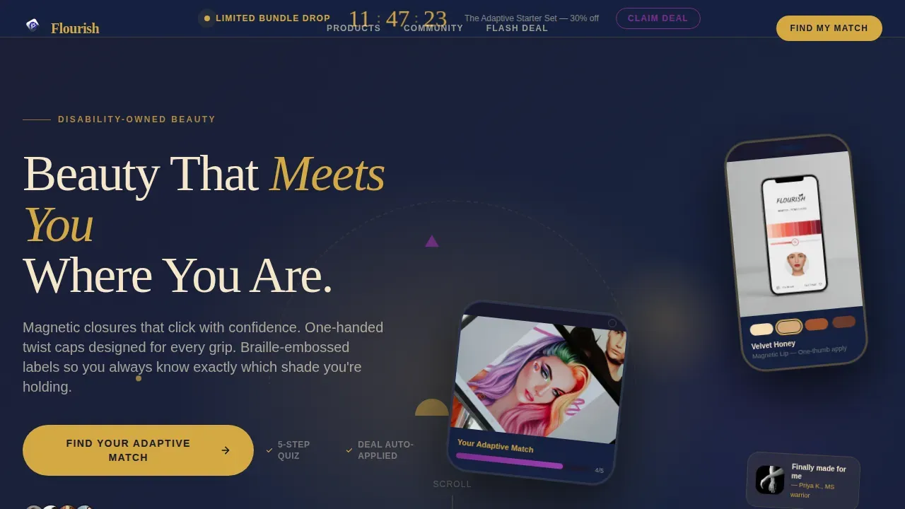
- A hero section with floating device mockups, geometric orbit shapes, and a champagne headline fade-up animation
- A five-step adaptive match quiz with multiple choice answers, a swatchable gradient slider, and an optional product upload field
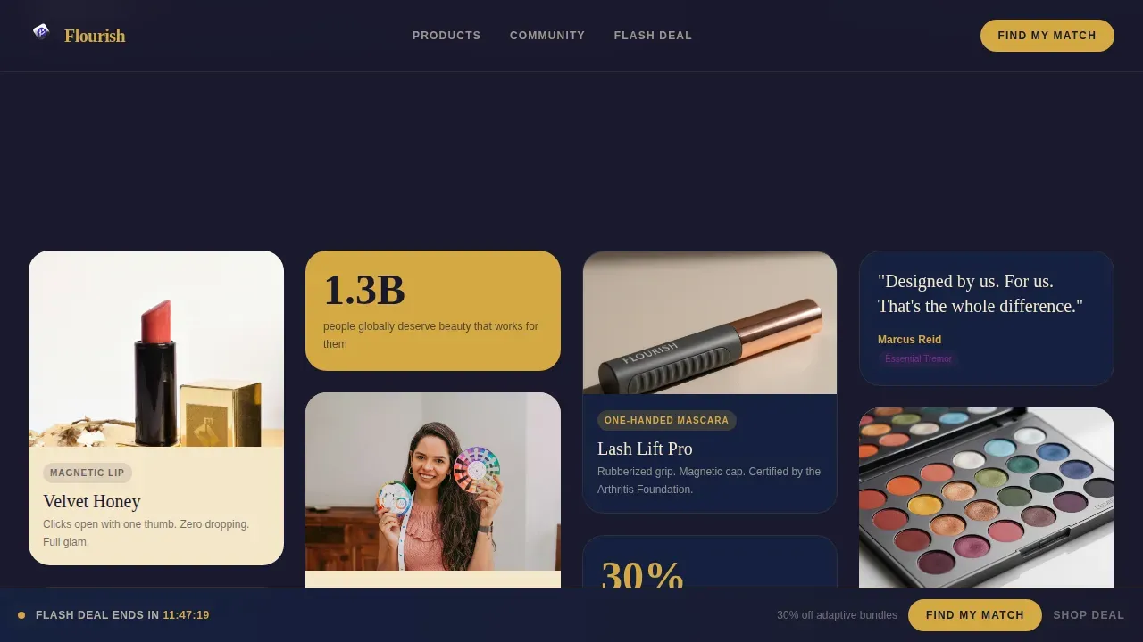
- A masonry grid with staggered columns of product images, looping videos, customer selfies, and oversized pull-quote cards
Feature list
The template bundles every component an adaptive beauty brand needs to launch a high-converting quiz landing page. Each feature below maps directly to a section or interaction described in the source brief.
Five-Step Adaptive Match Quiz
The quiz guides users through five illustrated steps: accessibility need, skin tone via a swatchable gradient slider, routine complexity, texture preference, and an optional product upload. Each step displays one question per screen to reduce cognitive load. The violet progress bar fills with each completed step, which helps reduce dropout rates by showing users how close they are to their personalized result. Quiz scoring then maps answers to a curated bundle, and the flash deal discount is auto-applied on the results card.
Masonry Grid with Geometric Wipe Reveals
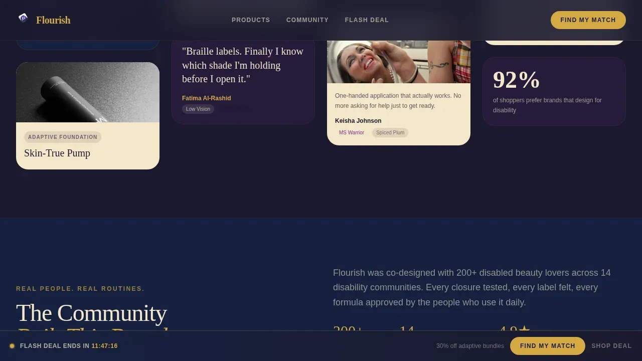
The staggered grid uses alternating columns of product close-up images, short looping videos of one-handed application, customer selfies with disability and shade tags, and bold pull-quote cards in oversized type. Cards enter view with a geometric wipe animation. The rhythm tightens as users scroll deeper, building the energy of a sample sale before the grid clears to reveal the quiz invitation. The grid format naturally highlights the brand story without a wall of text.
Flash Deal Countdown Banner
A gold pulsing countdown ticker sits at the top of the page and announces a limited bundle drop. The sticky bottom bar mirrors the urgency by displaying the remaining minutes at all times. This keeps the time-sensitive value of the offer displayed consistently so users do not lose sight of the deal while browsing the masonry grid.
Community Proof Section
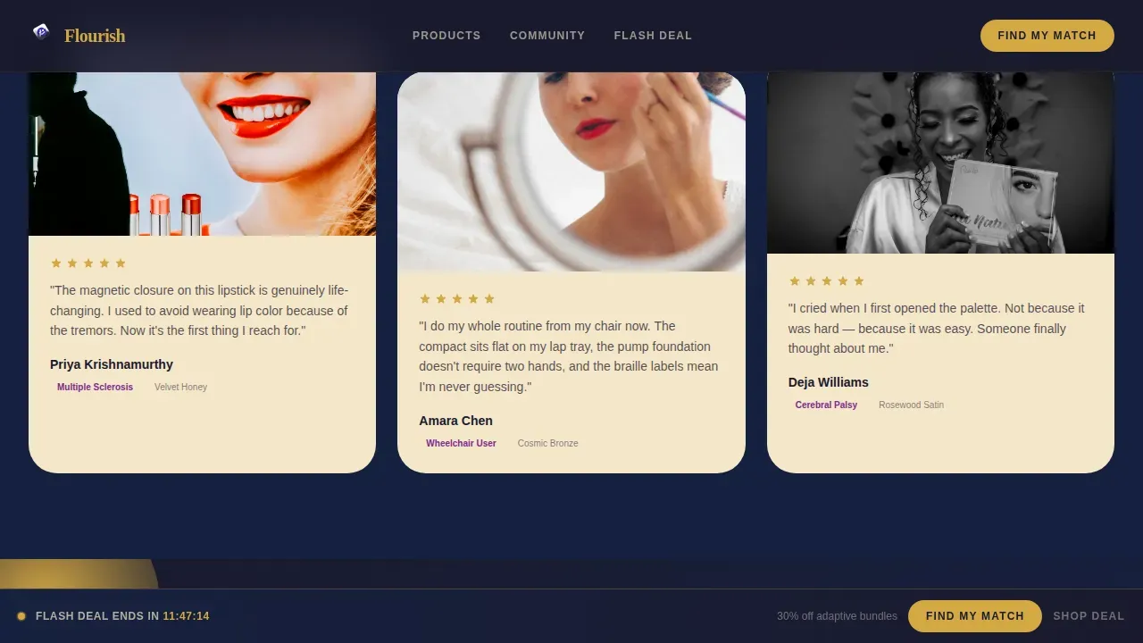
Authentic testimonials feature customer selfies tagged with their disability and shade match. Short videos and pull-quotes sit inside the same masonry flow, so social proof feels like part of the browsing experience rather than a separate section. Limiting recommendations on the results card to three or four items avoids choice overload, which keeps feedback responses positive and completion rates high.
Personalized Results with Email Gate
After users answer all five questions, the results card addresses them by name, delivers a curated product bundle, and auto-applies the flash deal discount. An email opt-in gate collects the shopper's address before sending the full detailed results, helping the brand build its list. Quiz answers are saved so the brand can use that data to create personalized follow-up campaigns.
Mobile-First Geometric Layout
The layout is designed mobile-first. The phone and tablet device mockup in the hero shows the brand app in use. Touch-friendly interactive elements, large tap targets, and optimized settings across the masonry grid ensure that users on mobile devices get the full visual and quiz experience without friction.
Page sections overview
| Section | Purpose |
|---|---|
| Hero Device Mockup | Introduces brand with floating phone and tablet mockups, geometric orbit shapes, and a headline fade-up |
| Flash Deal Banner | Gold countdown ticker announces the limited bundle drop and sets urgency from the first scroll |
| Masonry Product Grid | Staggered columns of product images, videos, selfies, and pull-quotes build engagement and trust |
| Community Proof | Customer testimonials with disability and shade tags provide authentic social validation |
| Quiz Call to Action | Five-step illustrated quiz invitation with violet progress bar and personalized results card |
| Sticky Urgency Bar | Bottom bar keeps countdown minutes displayed so time value stays visible throughout the session |
| Footer Stripe | Compact two-row footer closes the page with brand links and legal text |
Design & branding system
The visual identity follows a Playful Geometric theme. Every color choice and type pairing is intentional. Gold headlines float on obsidian sections, champagne cards tile in the masonry grid, and violet sparks reward every interaction like confetti popping open at a party.
- Colors: deep obsidian black (#1A1A2E) for backgrounds, molten honey gold (#D4A843) for headlines and countdown digits, soft champagne (#F5E6CA) for card backgrounds, and electric violet (#7B2D8E) as the hover accent and quiz progress bar fill
- Typography: DM Serif Display for headlines and Manrope for body text, creating a luxury-meets-approachable reading line across every section
- Geometric shapes including triangles, half-circles, and dotted arcs orbit the hero device mockups; the same geometric vocabulary carries through wipe reveal animations and the quiz progress bar style
Mobile & speed optimization
Mobile-first design ensures the entire interface is optimized for mobile users from the hero down to the results card. This is especially important for the disability community, where many shoppers browse primarily on phones and tablets.
- Touch-friendly interactive elements across the quiz modal, masonry hover states, and magnetic button effects keep the experience smooth on smaller screens
- The mobile layout targets a fast, responsive feel to accommodate beauty shoppers browsing on phones, with server components handling static sections and client components managing the countdown, quiz, and animations
- One question per screen in the quiz keeps focus tight and reduces cognitive load, which directly supports completion on mobile devices
How this template helps you convert
A high-converting landing page for an adaptive beauty quiz requires engaging design, a clear value proposition, and interactive, personalized, mobile-friendly elements. This template delivers all three in a single scrollable flow.
- The five-step quiz segments the audience by accessibility need, skin tone, routine complexity, and texture preference. Quiz answers power curated bundle recommendations and can inform follow-up marketing campaigns, increasing average order value through personalization rather than pressure.
- The flash deal countdown and sticky urgency bar create time-sensitive value that is earned through the quiz experience, not imposed as a generic pop-up. Visitors who skip the quiz can still shop the countdown deal directly via the secondary call-to-action path, so no shopper is left without a clear next step.
- The community proof section with tagged selfies, short videos, and pull-quotes builds trust fast. Authentic testimonials with photos and short videos of real customers help new visitors verify that the brand delivers on its adaptive promise before they commit to a purchase.
Other information about this template
This section covers additional practical details that help you decide if this template fits your build plan and brand strategy.
- The template is fully customizable. You can adjust the color settings, swap default placeholder images for your own product photography, and rewrite all copy to match your brand voice without touching code.
- The quiz format supports multiple choice answers and a gradient slider, which are the two primary answer types used in the five-step flow. Advanced scoring maps each set of answers to the correct result bundle, and the results card is one of several custom finish cards the template includes for different outcome paths.
- A/B testing different headline formats or quiz entry points can help you find the best-performing variation. The template's structure makes it straightforward to preview alternate versions before you publish.
- The side panel and tabs inside the quiz modal keep each step visually distinct. Users can cancel and restart the quiz at any time without losing their place on the landing page, which reduces frustration.
- The masonry grid supports gifs and short looping video clips alongside static images. This makes it easy to embed product demonstration content directly into the browsing flow.
- The template draws inspiration from the idea that beauty should be fun and effortless for every shopper. Its design language was built to reflect the satisfaction of a magnetic palette snapping open, that small moment of joy that defines the Flourish brand.
- Flourish as a concept maps to a global inclusive beauty audience. The brand's adaptive product line has relevance across many countries, including markets across the African continent where disability representation in beauty is growing. Regions from the Democratic Republic of Congo to South Africa and across sub-Saharan Africa represent an underserved but growing audience for adaptive beauty. The template's clean layout and mobile-first approach translate well across these countries and regions where mobile browsing dominates.
- The template works with no-code quiz builders that allow users to create interactive quizzes without extensive coding skills. These tools provide templates that can be customized to fit a brand's needs and can integrate with e-commerce platforms. Users can collect data from quiz responses to improve their marketing strategy and gather leads through the email opt-in gate.
- An artificial intelligence (AI) assisted scoring layer can be connected to map quiz answers to product bundles, though the base template handles scoring through defined rules. This gives brands the ability to define precise result paths without relying on a developer.
- The dashboard available in compatible quiz platforms lets you filter responses by answer type, review feedback data by region, and track how many users completed each step before dropping off. You can save filtered segments for follow-up campaigns and verify which product lines perform best by chart type.
- Charts and map visualizations available in connected analytics tools let you see response data by region. For example, you can pull a bar chart to compare quiz completion rates across countries, or use a map chart to highlight which geographic areas engage most with specific shade recommendations. These figures help you define future product and marketing priorities.
Theme
Playful Geometric
Creative direction
Flash Deal
Color system
Obsidian & Gold
Style
Masonry/Pinterest
Direction
Quiz/Assessment
Page Sections
Five-step Adaptive Match Quiz
Masonry Grid with Wipe Reveals
Flash Deal Countdown and Sticky Bar
Community Proof with Tagged Selfies
Personalized Results with Email Gate
Mobile-first Geometric Visual System
Related questions
Does the quiz support multiple choice answers and other input types?
How does the results card work after users answer all five questions?
Can I customize the template colors and quiz settings without coding skills?
What kind of social proof is built into the template?
Can visitors skip the quiz and still access the flash deal?



