Geriatric Medicine Practice Website Template for Older Adults
Flourish is a geriatric medicine practice landing page built for clinics that treat older adults with genuine unhurried care. The sidebar companion layout walks visitors through a clear four-step process, from intake call to ongoing partnership, and moves them toward scheduling an appointment. It suits adult children, retirees, and hospital discharge planners who need to trust a physician before they click.
by Rocket studio
Quick summary
Flourish is a single-page, sidebar companion landing page for a geriatric medicine clinic. It uses a step-by-step process narrative to demystify care for older adults. The fixed sidebar orients visitors as they scroll, and every section builds toward one goal: earning a scheduled appointment with a physician who listens.
Who this template is for
This template is built for geriatric medicine physicians and specialty clinics that serve older adult patients with complex care needs. It speaks directly to the people doing the research, not just the patients themselves.
- Adult children between roughly 45 and 65 years old who are researching care for an aging parent with a long or complicated medication list
- Retirees between 65 and 80 who are trying to understand whether what they are experiencing is normal aging or something worth a physician's attention
- Hospital discharge planners who need to refer patients to a geriatrician who will do more than renew prescriptions
What problem this template solves
Most physician practice pages describe credentials and then ask for a click. Patients researching geriatric care need something slower and more reassuring. They arrive with real questions and real uncertainty, and a generic page sends them away.
- Visitors do not understand what a geriatric medicine appointment actually involves, so they hesitate to schedule
- Adult children and retirees often feel rushed by healthcare systems and distrust that a new physician will truly listen
- Discharge planners need a quick, confident read of a physician's philosophy and availability before making a referral
What you get with this template
The template delivers a fully structured, desktop-first landing page with a persistent sidebar that tracks a visitor's reading progress through four defined care steps. The layout is warm and unhurried by design.
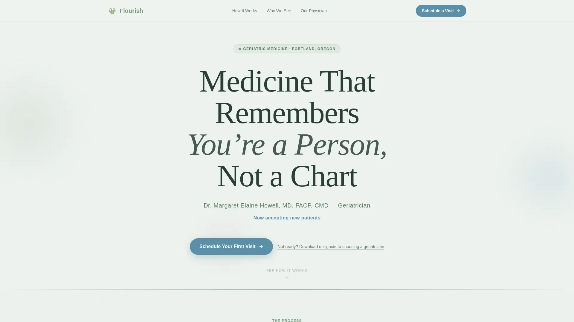
- A giant centered serif headline on a frost-white field, paired with the physician's name, credentials, and availability statement
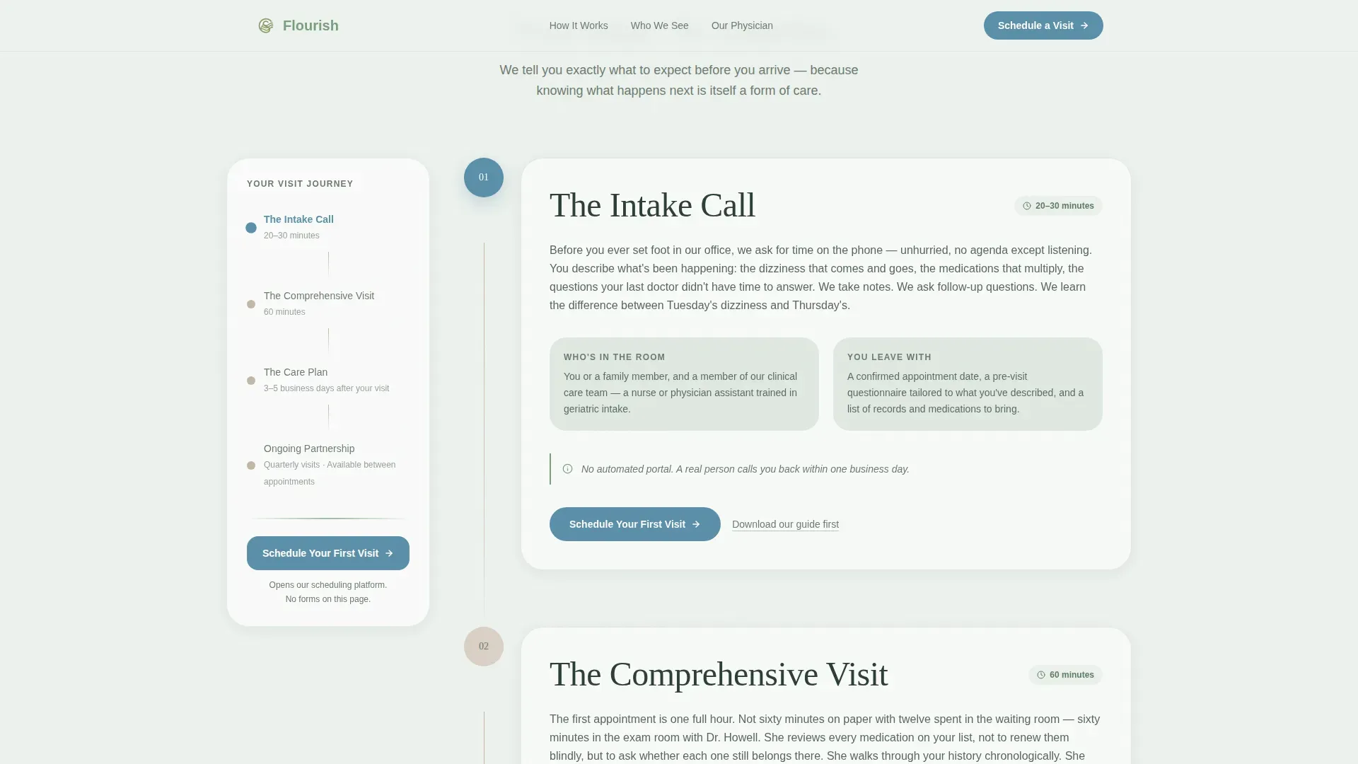
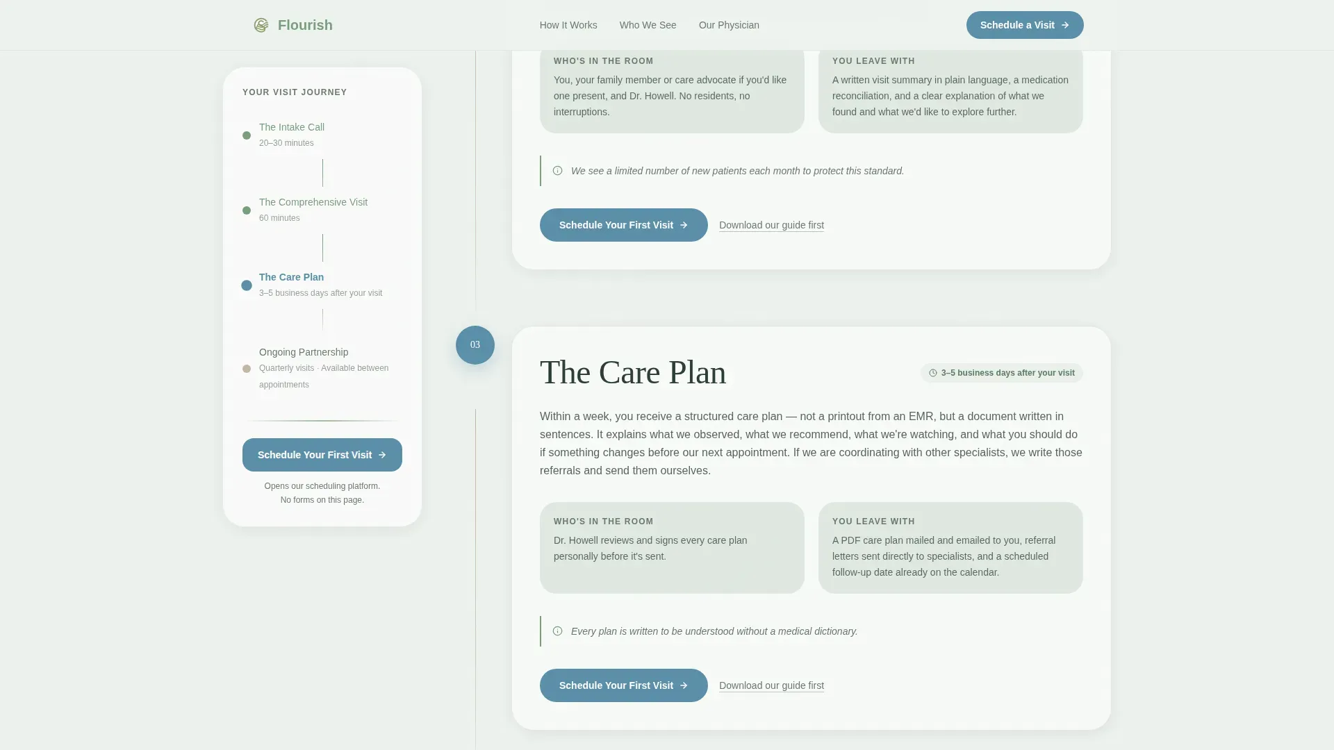
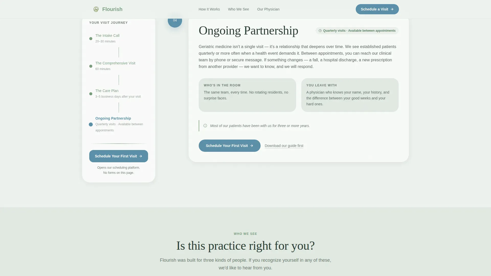
- Four narrative step sections, each with a short descriptive paragraph, a primary call-to-action button, and scroll-linked sidebar highlighting
- A physician profile section, patient-type cards, a primary scheduling call to action, and a secondary PDF download link for earlier-stage visitors
Feature list
A paragraph introducing the features: Every component in this template is chosen to reduce hesitation and build trust. The features below reflect the specific layout, interaction design, and conversion logic described in the brief.
Giant Centered Serif Headline
The hero section opens with a large warm-serif headline on a clean frost-white field. No image competes for attention. The whitespace communicates the practice's unhurried character before a single word is read.
Fixed Sidebar Step Navigator
A persistent sidebar anchors to the left of the page and highlights the current step in alpine stream blue as the visitor scrolls. Visitors always know where they are in the process, which mirrors the orientation the practice promises its patients.
Four-Step Process Narrative
Four clearly labeled steps walk the visitor through the full patient journey: The Intake Call, The Comprehensive Visit, The Care Plan, and Ongoing Partnership. Each step includes a short descriptive paragraph explaining who is in the room, how long it takes, and what the patient leaves with.
Patient-Type Cards
Three card blocks identify the specific kinds of patients this practice welcomes. Each card uses a warm birch surface and speaks directly to the reader's situation, making visitors feel recognized rather than generic.
Click-Through Scheduling Flow
No form lives on the page. The primary call-to-action button opens an external booking platform where appointment type, insurance, and preferred contact method are captured. This keeps the page light and the experience intentional.
Secondary PDF Download Link
A soft text link below the primary call to action offers a downloadable guide to choosing a geriatrician. This captures earlier-stage visitors without competing with the scheduling goal.
Page sections overview
| Section | Purpose |
|---|---|
| Hero Headline | Establish tone and physician availability |
| Step 1: Intake Call | Describe the first point of contact |
| Step 2: Comprehensive Visit | Explain the 60-minute appointment structure |
| Step 3: Care Plan | Show what the patient receives after the visit |
| Step 4: Ongoing Partnership | Communicate long-term care continuity |
| Who We See | Identify the three patient types with cards |
| Physician Profile | Build trust with credentials and philosophy |
| Call to Action | Drive scheduling and PDF download clicks |
| Footer | Single-row linear navigation and contact |
Design & branding system
The visual identity follows an Organic Flow theme using the Alpine Fresh color system. The palette feels natural and calming, built around four specific tones that each carry a specific role.
- Frost white (#EDF2EE) dominates all backgrounds; meadow sage (#7A9E7E) anchors section dividers and the fixed sidebar; weathered birch (#C4B6A6) warms card surfaces and testimonial blocks
- Alpine stream blue (#5B8FA8) appears only on interactive elements and calls to action, so every clickable element stands out cleanly without competing with the calm overall feel
- Typography pairs Fraunces, a warm display serif, for headlines and step titles, with DM Sans for body text, creating a clinical-but-human reading experience
Mobile & speed optimization
The template is built desktop-first around its sidebar companion layout, but it is designed to collapse gracefully on smaller screens. The sidebar becomes a compact top navigator on mobile so the step orientation is never lost.
- On mobile, the fixed sidebar reflows into a horizontal progress indicator at the top of the viewport, keeping step context visible without crowding the content
- Gentle scroll-linked fade-ins and sidebar step highlighting use low-to-medium animation intensity, keeping the page feeling alive without adding visual weight
- Static content sections use server-rendered components while the scroll-tracking sidebar logic runs on the client side, keeping the interactive layer minimal
How this template helps you convert
The page is structured as a deliberate trust-building sequence. Each section does one job on the way to earning the scheduling click.
- The four-step narrative removes uncertainty about what a geriatric medicine appointment involves, so by the time a visitor reaches Step 4 they have already mentally walked through the front door and feel ready to schedule.
- The sidebar call-to-action button locks into place after Step 2 and travels with the reader, so the scheduling option is always visible without feeling aggressive or pushy.
- The secondary PDF download link captures visitors who are not yet ready to schedule, turning an exit into a lead through a low-commitment offer that matches their research stage.
Other information about this template
This template is designed specifically for the geriatric medicine specialty within the broader health and medical category. It reflects the real concerns of patients and families navigating complex aging-related care.
- The template supports English-language content with United States date formatting (MM/DD/YYYY) and USD pricing context where relevant
- The page is categorized under Doctor and Physician Practice and is well suited to any internist or specialist who focuses on the care of older adults
- The sidebar companion layout is a distinct template style that works especially well when a process or journey needs to be communicated in sequence, making it a strong fit for specialty practices that want to differentiate through transparency
- The footer follows a linear single-row pattern, keeping the bottom of the page clean and uncluttered
Theme
Organic Flow
Creative direction
Step-by-Step Guide
Color system
Alpine Fresh
Style
Sidebar Companion
Direction
Click-Through
Page Sections
Giant Centered Serif Headline Hero
Fixed Sidebar Step Navigator
Four-step Care Process Narrative
Patient-type Recognition Cards
Click-through Scheduling Call to Action
Secondary PDF Download Link
Related questions
What type of medical practice is this template designed for?
Does the template include an appointment booking form on the page?
Can the physician name, credentials, and step content be customized?
Who are the intended visitors for this landing page?
What happens to visitors who are not ready to schedule an appointment?



