Ceramic Pet Fountain Landing Page Template
Flow is a single-column landing page template built for a handcrafted ceramic pet water fountain. It guides apartment-dwelling pet parents through illustrated vignettes, a sticky reservation bar, and a scheduling form with glaze and ship-week options. The warm Dopamine Pop palette and Gallery Walk layout make the product feel crafted before a single price appears.
by Rocket studio
Quick summary
Flow is a single-column landing page template for a ceramic pet water fountain. It uses illustrated vignettes, a sticky reservation bar, and two scheduling paths to turn curious scrollers into confirmed buyers. The Community Hearth theme and Dopamine Pop palette make every section feel warm, handmade, and trustworthy from the first scroll.
Who this template is for
This template is built for small-batch pet product sellers who lead with craft and story. It suits founders who want their page to feel like a makers-market booth rather than a big-box product listing.
- Ceramic or handcrafted pet fountain makers selling direct to pet parents
- Gift-focused pet brands targeting cat and small-dog owners
- Apartment-living pet parents shopping for something that looks like home decor, not plastic hardware
What problem this template solves
Most pet product pages go straight to specs and shipping tables. They skip the emotional hook that turns a browser into a buyer. Flow flips that order entirely.
- Pet parents need to feel the product fits their home before they check the price
- Senior cat owners and first-time kitten owners need reassurance, not a feature grid
- Gift shoppers need a page that communicates craft and care at a glance
What you get with this template
You get a fully structured single-column landing page with illustrated storytelling sections, two distinct conversion paths, and a sticky call-to-action bar that appears at the right moment in the scroll.
- A viewport-filling custom illustration header with a hand-lettered headline
- Four illustrated vignettes covering anatomy, daily use, customer photos, and a product comparison
- A sticky tangerine reservation bar with a scheduling form and a secondary gift path
Feature list
This template ships with every section and interactive element described below.
Viewport-Filling Illustrated Header
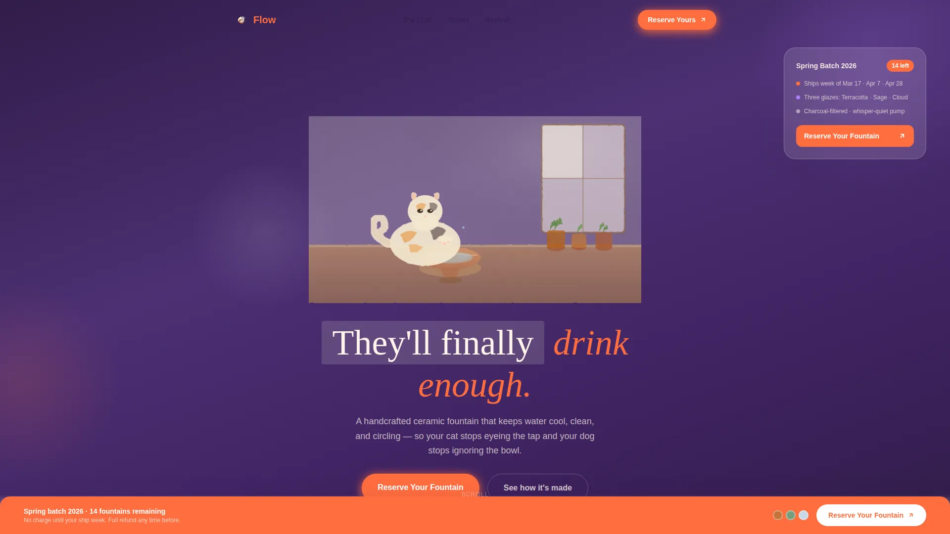
A loose ink-and-watercolor scene fills the entire opening viewport. It shows a calico cat mid-drink from a rounded ceramic fountain on a sunny kitchen counter. Visible brush strokes and ink bleed signal handcraft before any copy loads. The headline "They'll finally drink enough." drifts in below the cat's chin.
Four Illustrated Vignette Sections
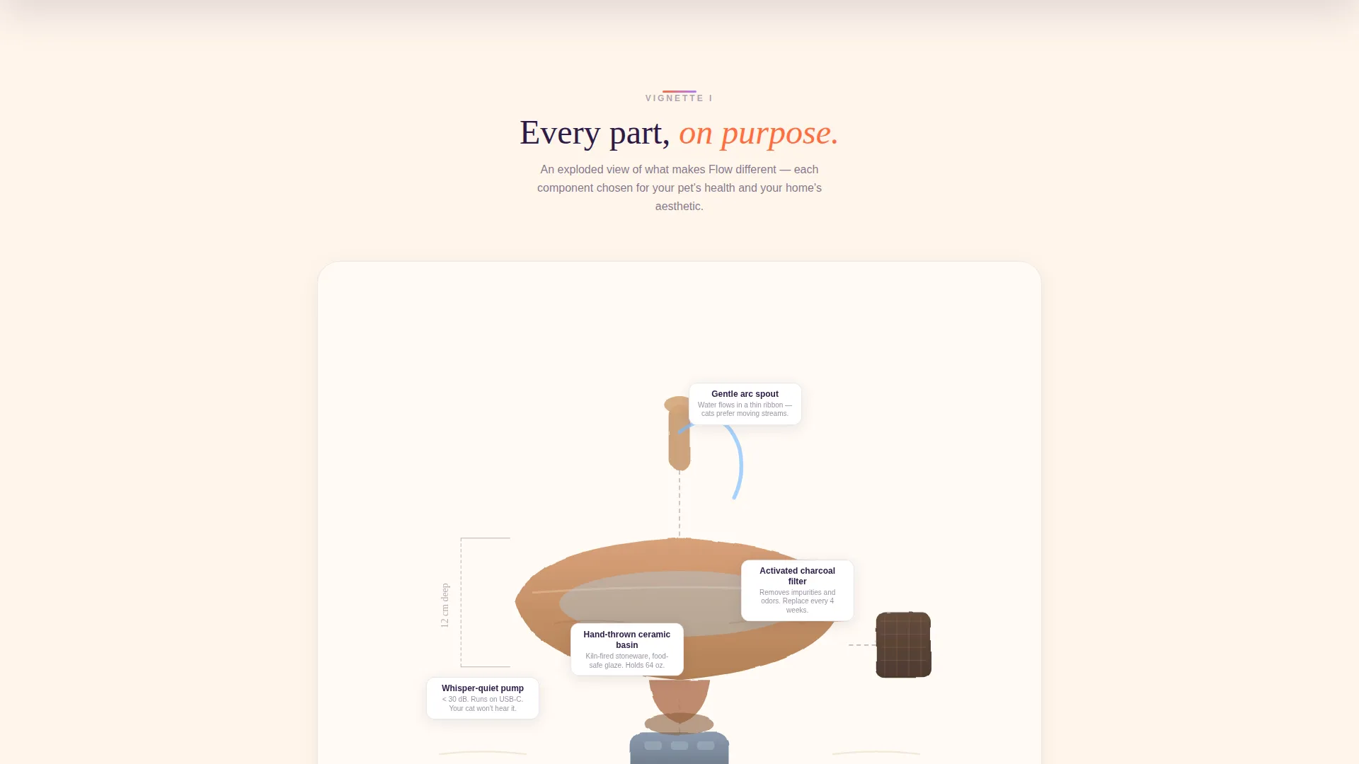
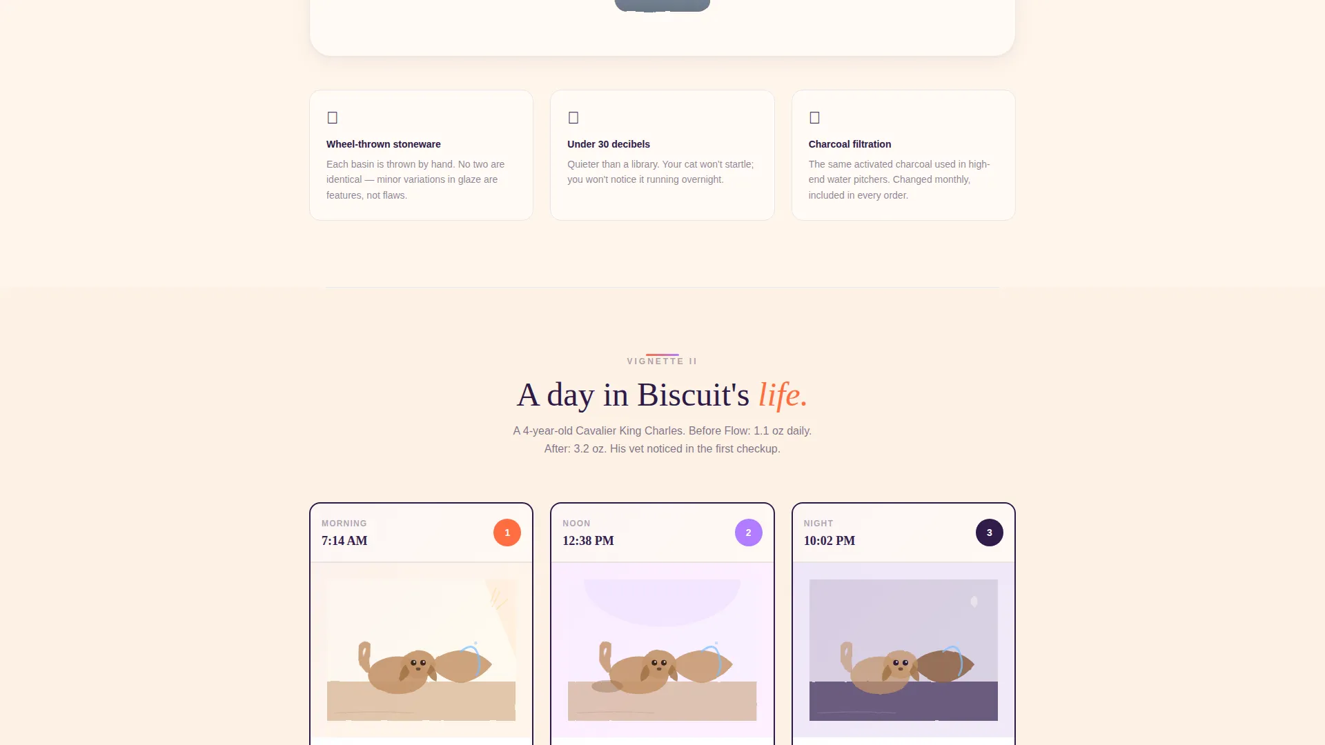
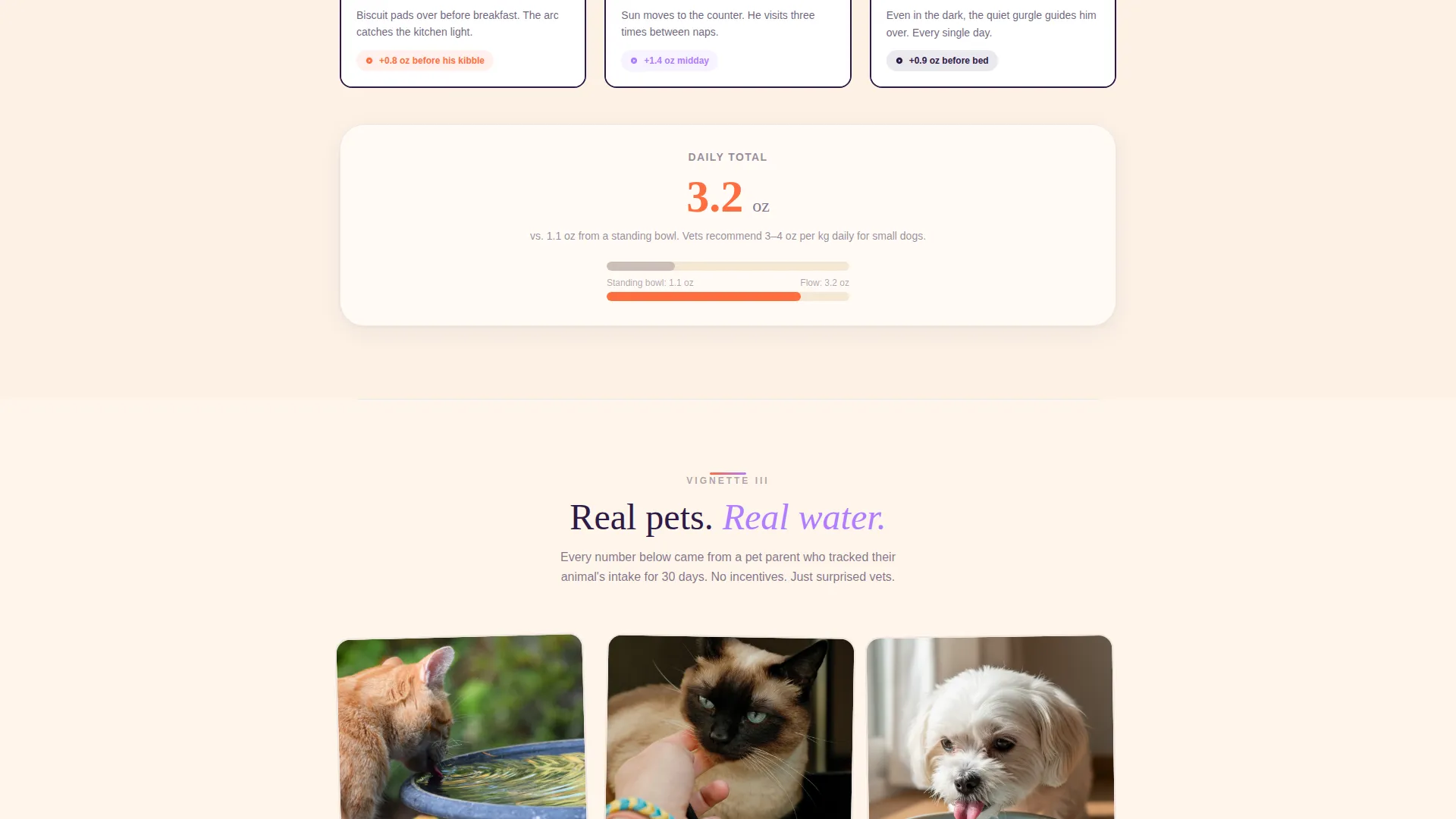
Each scroll section is a framed vignette, like a gallery exhibit with generous cream space between frames. The first shows an exploded-view drawing of the fountain's anatomy. The second is a time-lapse comic strip across morning, noon, and night. The third is a customer photo mosaic with pet names and water-intake captions. The fourth is a side-by-side watercolor still life contrasting a stagnant bowl with a flowing fountain.
Sticky Reservation Bar
A tangerine sticky bar locks to the bottom of the viewport after the visitor passes the second vignette. It carries a single "Reserve Your Fountain" call-to-action button. Clicking opens a short scheduling form with three glaze color swatches, a ship-week calendar picker, and name and email fields.
Secondary Gift Path
Below the customer photo mosaic, a "Gift One Instead" link opens a simplified version of the scheduling form. This form adds a handwritten note field, making the gifting experience feel personal and considered rather than transactional.
Dopamine Pop Color System
The palette uses sun-warmed tangerine (#FF6D3F), electric lavender (#B07CFF), soft cream (#FFF5EB), and deep plum (#2E1A47). Cream dominates the background, tangerine fires every button and price callout, lavender highlights testimonials and hover states, and plum grounds all body text.
Community Hearth Gallery Walk Layout
The single-column flow spaces each vignette with generous cream gaps, mimicking the pacing of a gallery wall. This structure lets the eye rest between stories, building emotional investment before the sticky bar ever appears.
Page sections overview
| Section | Purpose |
|---|---|
| Illustrated Header | Opens with a calico-cat watercolor scene and lead headline |
| Fountain Anatomy Vignette | Labels ceramic basin, whisper-quiet pump, and charcoal filter |
| Daily Use Comic Strip | Shows a small dog returning to the fountain across one day |
| Customer Photo Mosaic | Displays real pet photos with names and water-intake increases |
| Bowl versus. Fountain Still Life | Contrasts stagnant bowl with flowing fountain in watercolor style |
| Sticky Reservation Bar | Anchors the "Reserve Your Fountain" call-to-action after vignette two |
| Reservation Scheduling Form | Collects glaze choice, ship-week, name, and email |
| Gift Path Form | Simplified reservation form with handwritten note field |
Design & branding system
The visual language is built around a Community Hearth theme expressed through a Dopamine Pop color palette. Every color decision has a functional role, so nothing is decorative without purpose.
- Soft cream (#FFF5EB) covers the background, keeping the page airy and letting illustrations breathe
- Sun-warmed tangerine (#FF6D3F) activates every button, price callout, and the sticky bar to draw the eye at decision points
- Electric lavender (#B07CFF) highlights testimonial blocks and hover states, adding warmth without competing with tangerine
- Deep plum (#2E1A47) anchors all body text, creating strong contrast on cream so copy stays readable at a glance
Mobile & speed optimization
The single-column flow layout is naturally suited to narrow screens. Each vignette stacks cleanly without requiring horizontal scrolling or layout shifts.
- The sticky reservation bar remains accessible at all screen sizes, keeping the primary call-to-action always within thumb reach
- Generous cream spacing between vignettes gives mobile readers clear visual breaks, preventing scroll fatigue on smaller displays
How this template helps you convert
Flow earns the click by showing craft and story before asking for a commitment. The page architecture is designed so trust builds gradually across each vignette.
- The illustrated header and opening story frames create emotional connection before any price or form appears, reducing bounce from cold visitors
- The sticky reservation bar appears only after the second vignette, timing the ask to the moment visitors have already imagined the fountain on their own counter
- The dual conversion paths let gift shoppers follow their own route without friction, widening the pool of buyers without cluttering the main flow
Other information about this template
Flow is categorized under Pet and Animal, specifically within the Pet Tech and Wearable subcategory, with a niche focus on the pet water fountain market. It is built as a single-column flow template using the Gallery Walk creative direction and the Community Hearth theme.
- The template style is Single Column Flow, making it straightforward to adapt for any maker-style pet product with a strong visual identity
- The landing page direction is Booking and Scheduling, so the core conversion action is a reservation with glaze and ship-week options rather than an instant checkout
- The header concept is a Custom Illustration, which means the opening visual is a crafted scene rather than a product photograph, setting a handmade tone from the first frame
Theme
Community Hearth
Creative direction
Gallery Walk
Color system
Dopamine Pop
Style
Single Column Flow
Direction
Booking/Scheduling
Page Sections
Viewport-filling Illustrated Header
Four Illustrated Vignette Sections
Sticky Tangerine Reservation Bar
Secondary Gift Scheduling Path
Community Hearth Gallery Walk Layout
Dopamine Pop Color System
Related questions
Who is this landing page template designed for?
What conversion action does this template support?
Can I use this template for a gift-focused product campaign?
Does the page work without custom illustrations?
What makes this layout different from a standard product page?